
This week, John invites us to immerse ourselves in the captivating realm of “cool” in all its diverse nuances. For my contribution, I’ve opted to explore the serene and tranquil allure of the color blue. By intentionally keeping the accompanying text succinct, I aim to encourage each viewer to discern and derive their own unique impressions and emotions from the evocative imagery. In my perception, the predominant use of blue exudes a sense of serenity and invites a state of relaxation. I’m curious to know if you share in this interpretation and whether it resonates with your own sentiments.
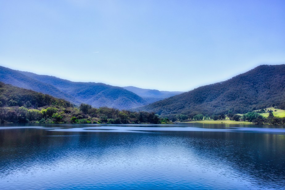
Talbingo reservoir lake in NSW Australia – Blue lake
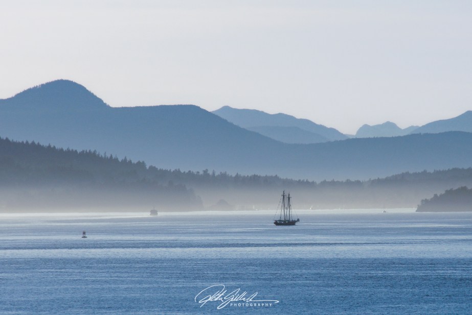
Mountains and sea just before sunset in BC Canada
Last week, Sofia guided us through the wonders of adding a sense of scale to our photos. It once again brought attention to the composition of images and how important it is.
This week, it is John’s turn to focus on cool colors. He provides excellent directions and terrific images to illustrate the challenge. Above was my take on it, hope to see yours.
When you post your response, please remember to link to John’s post and use the Lens-Artists tag. Next week, Anne will host the challenge, I wonder what the mood will be in her post, so look out for her post next week.
Please see this page to learn more about the Lens-Artists Challenge and its history.

A splendid selection on various cool colour tones of Blue, Ritva. Excellent display!
Excellent pic.
Amazing shots, Ritva.
Beautiful selection of pictures!
Lovely!
Featured image my favourite!
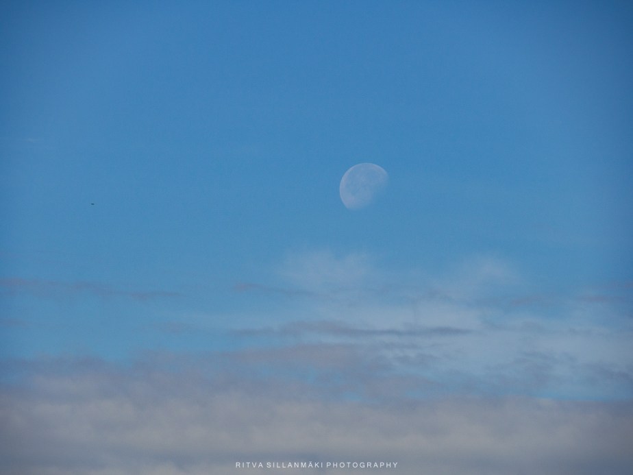
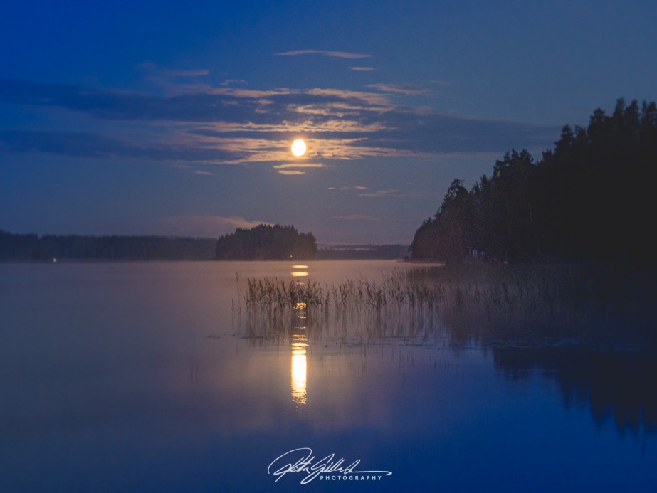
Serene, all of them! I love that moon shot!
Gorgeous images Ritva!
Great selection, Ritva – love the evening mountains
These are all so beautiful
The serenity expressed through these photos is addictive. My favourite two are:
Talbingo reservoir lake in NSW Australia – Blue lake, and
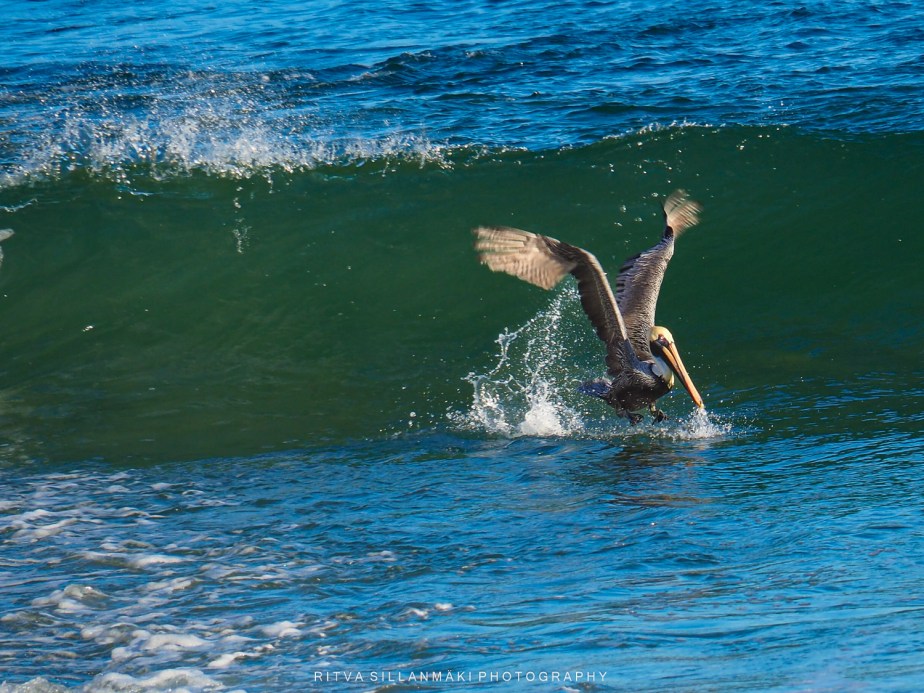
Blue sea in Florida and a pelican
Nature indicates to us that our God is an awesome God!
Thank you for your comment, I appreciate you stopping.
You are welcome.
Very cool images Ritva. All were relaxing and beautiful.
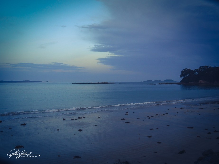
These are all so beautiful and keeping the text to a minimum helps them stand out even more. I particularly like the Batehaven shot, so peaceful!
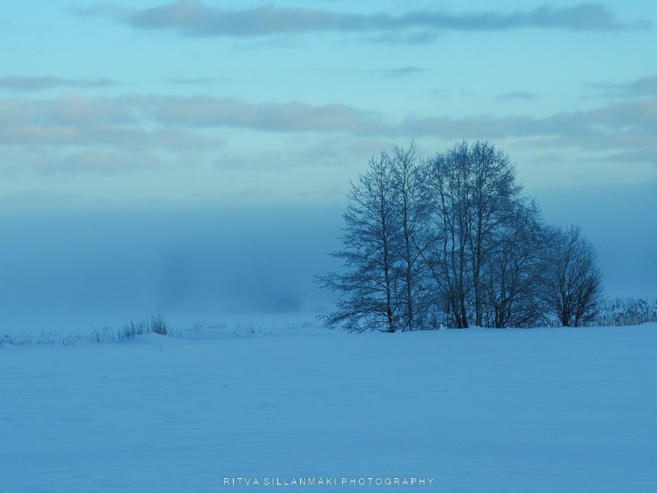
I actually find some blues to be warm colours, but your last two photos are definitely cool. Love the layering of the mountains and that particular blue tint that often occurs when photographing snow.
Fantastic collection of blue images!
These are fabulous, Ritva! Especially those night blues.
Beautiful use of blues, Ritva.
Yes, it is peaceful and very serene from start to finish. What beautiful images you shared!
So many photos to enjoy Ritva. The Lake Ruuhijärvi, in Finland is my favourite
Very beautiful collection of pictures 🤩
This is a well depicted tranquil post on blue🤩👏🏻
It’s a wonderful start to the day to see your wonderful cool landscapes, Ritva. You have such a way to show us their beauty.
What a lovely set. Each more beautiful than the others, if that is possible
Wonderful collection, Ritva. So peaceful, calm and soothing! I especially love your images from Finland. And of course, Australia is always a favorite too!
Thanks Patti, we have lots of blues with our 187,888 lakes 😀 in Finland
Lovely and peaceful!!
Great photos Ritva. I like ’em all.👏
Beautiful set of blues this week Ritva – I loved them all. I also like that you focused solely on blue and yet found so much glorious variety.
Serenely beautiful all – the nordic light is gorgeous.