
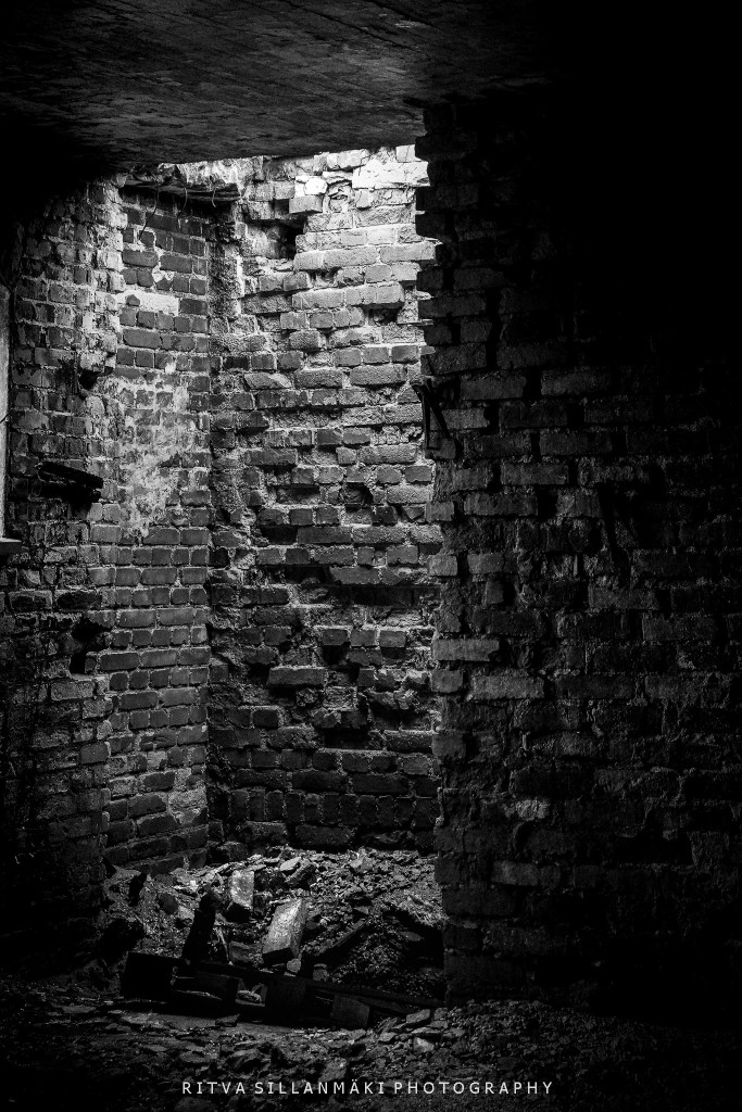
Today, I’m merging two challenges in a single post. I hope this is suitable for both of you wonderful hosts who continually inspire us with fresh ideas and motivate us in our photography: Leanne’s Monochrome Madness and Becky’s November Shadows.
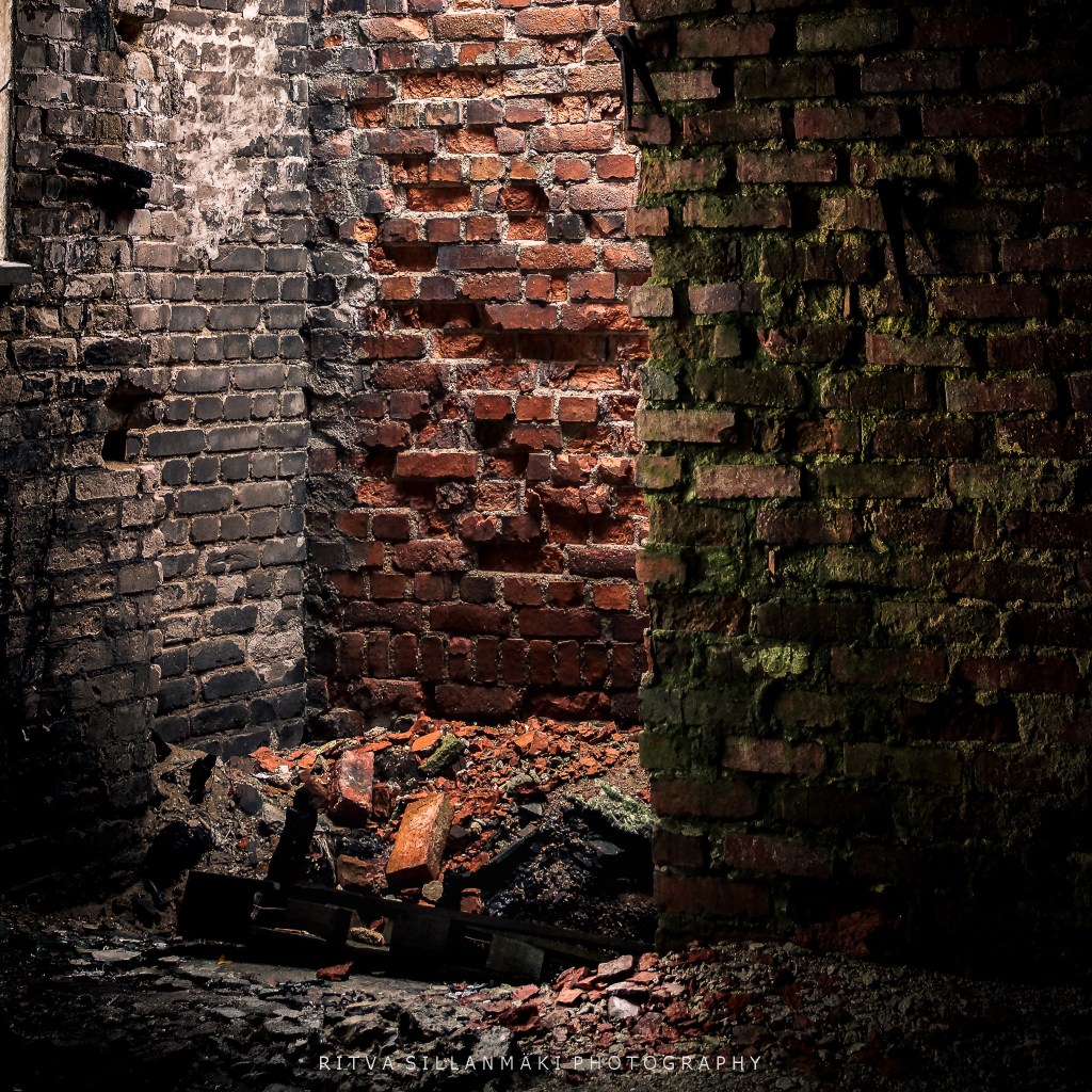
This image is ideal for this post, effectively highlighting its shadows, striking contrast, and the textured richness of the bricks that delivers a compelling visual effect. The contrast between light and dark accentuates the fine details of the worn corner, revealing depth and dimensionality that’s frequently missed in more straightforward images.

love how the light falls on the fallen brick, highlighted of course by the shadows. Superb
I love this.
Thanks 😀 Margaret
WOW! First of all, these colours fascinated me, MY colours’ tones… So impressive, great capture. Thank you, Love, nia
Love your eye!
Beautiful capture of light and color Ritva!
Thanks Anne, glad you are able to sit. Just take it easy…<3
I can sit reclined a little on the couch, but not at the desktop computer where I’d have to sit up straight. Can’t do anything but take it easy!
❤️
Wonderful contrasts Ritva.
Thank Brad. Old brick have so much more variants in them
Character.
👍
That worked beautifully, Ritva. The bricks are lovely.
Thanks Janet 😀
Great textures, especially effective in monochrome!
Thanks Sarah, glad you liked it
Great experiment Ritva, I like how the colour one almost looks like monochrome too. Great textures as well.
It was so suitable for this.
Fabulous photo and edits Ritva
Big thanks Brian
Dear friend Ritva, beautifully striking image! The shadows and textures really bring the brickwork to life. Such a powerful use of contrast — simple, yet so full of depth.
There is so more variety of of shades in old bricks. Thanks Dinesh for commenting