
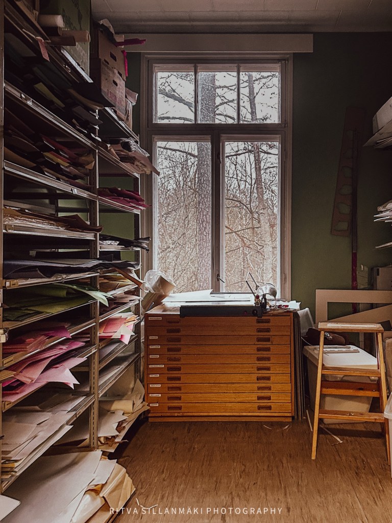
I initially had this photo in mind for NovemberShadows, but let’s be real—there was no way it could work as a square. Doing that would totally lose the key aspect that sticks with me—the story behind the space. The scene has so much depth that it pulls you in, making you want to dive deeper into the tale that plays out through the light and shadows. On the flip side, this image fits perfectly for the Monday Window project, which is all about windows acting as cool portals into different times and places. I genuinely think the way this photo is framed matches the vibe of the Monday Window initiative, giving a sneak peek into another world and encouraging you to really think about and appreciate the story of that space. Which do you prefer color or black and white version?
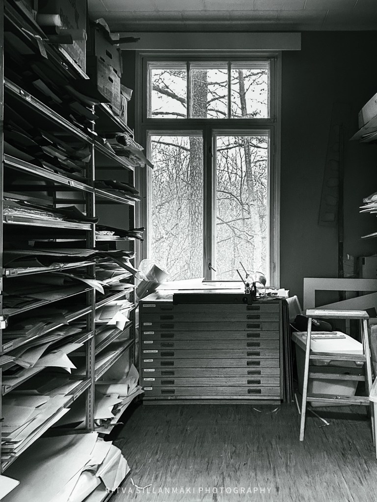

A great window and scene to be inspired by 😀 The monochrome is my preference, there’s no distraction of the papers colours. It changes what the eye wants to see
Upea ikkuna ja maisema, josta voi inspiroitua. Yksivärisyys on suosikkini, paperin värit eivät häiritse. Se muuttaa sitä, mitä silmä haluaa nähdä.
Kaunis kiitos Brian 😀 Mustavalkoisuus välittää tunteen hyvin,
Ole hyvä Ritva 😀
Great window scene. The room tells its own story while the outside view tells another.
Thanks, I like how you worded the image
😊
A great shot. In this case I prefer the colour, as the scene inside coontarsts more obviously with the chilly outside.
The chill was in the air, the room warm in its greens and papers
I think I prefer b&w. The photo tells such a story. Great shot.
Thanks Rebecca, B&W captures often the essential of the image and mood
You are right, Ritva – it’s perfect for Monday Window. I like the monochrome version more than the colored one. Thanks for sharing with Monday Window!
😀 Thanks PR