
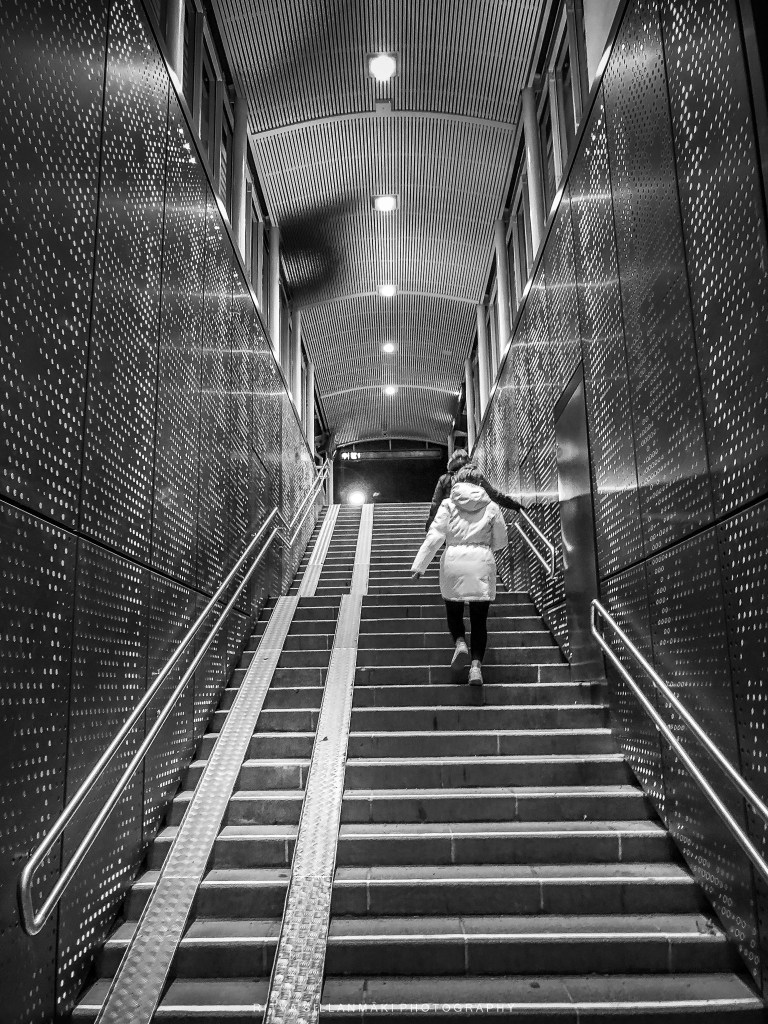
During the dark season the entrance and stairs at our local railway station in Kirkkonummi provides some bright colors and it is a nice contrast to the dark days. I have to say even so I prefer the monochrome images to the color ones. the Leading lines and structure is more defined. Thoughts?
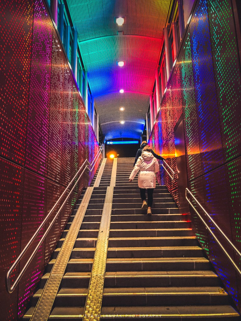
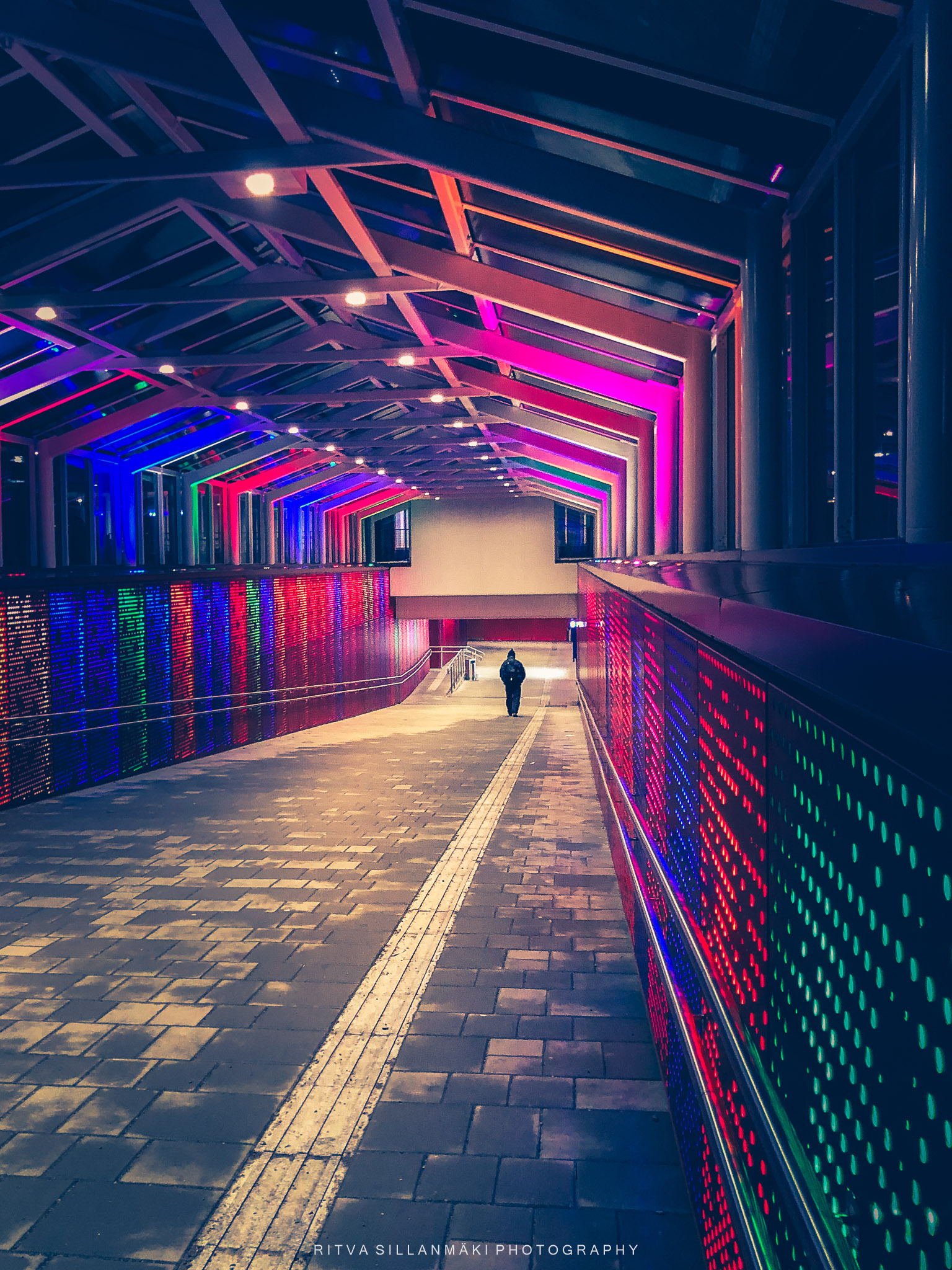
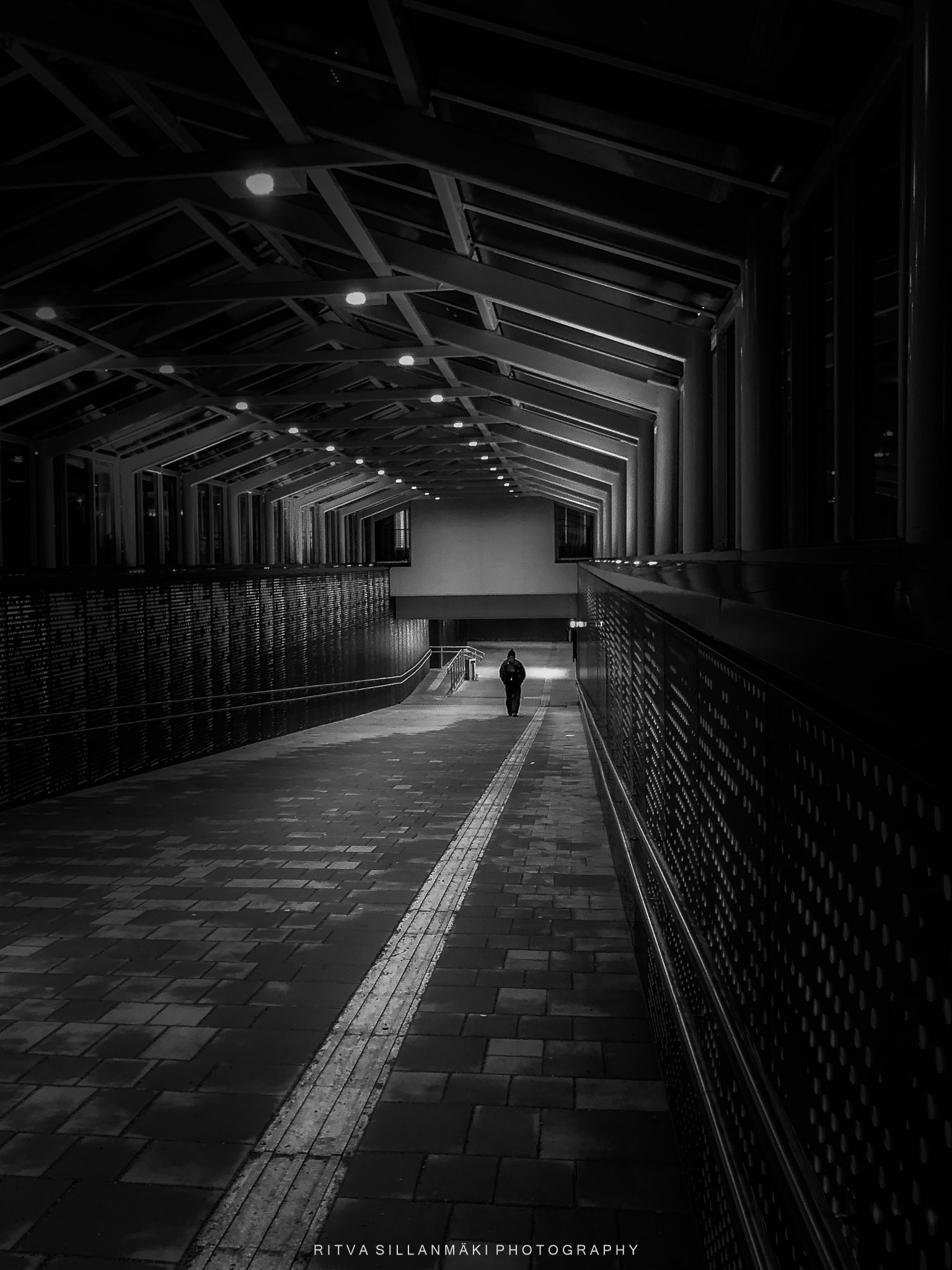
The ramp down and the stair in color in monochrome. Totally different mood

Beautiful 🌹
Thanks 🙂
Not only do I love the view, I prefer the beauty of the monochrome version.
Thanks Frank, it is more defined and artistic in my opinion too
I like these warm colors in the dark but… as a picture, I also can appreciate the monochrome versions.
I agree as a pic, the BW is much better
Love the monochrome versions, as you say, they really emphasise the leading lines and the structures are more defined
Thanks Sue, glad you agree 🙂
😊😊
Lovely comparisons
Love these views
Thanks 🙂 so much
You are welcome.
This is a tough one Ritva. Your photography and subject are beautiful in color and monochrome. But, I think you said it that the monochrome is more moody and gives a different dimension to the image. But the, the color version is bright and cheerful–a different mood. As an art piece, I’d chose the monochrome.
Thanks Anne for wording it out so beautifully ( don’t know if that correctly said)
😊