
Glass door at the top of the stairs in Monte Carlo Casino in Monaco. I did too edits of just because, no other reason, which one resonates with you? The color or the black, white and red one – with a touch of blue ?
I have to admit, for a door photo the door doesn’t look like the main point. Well, that what it is a glass door at the stop of the stair that has blue light behind it.

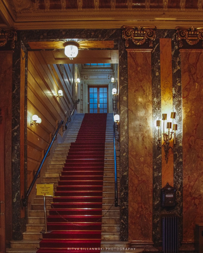
Posted for Dan’s Thursday Doors

That’s a stunning photograph! With the change from color to monochrom, I go from a feeling of being welcomed to a little scary.
Thanks Dan, my aim for dramatic worked then, Thank you!
It did indeed!
Amazing photo Ritva! I like the color image better because is shows the richness of the stairway and is more inviting. I agree with Dan that the black and white with spot color is a little eerie. I guess it depends on what message you want to convey.
Anne I was practicing dramatic 😀
Then Black and White it is!
Think about this for a badge entry next year, Ritva. It is a beauty–both versions!
SO kind Lois, Thanks!
The B&W brings more the attention to the door and the blue light, for this reason it’s the best for me Ritva.
Rudi, and hides some things better too
What glorious, rich, jewel-like colors, Ritva! No monochrome for me for this beauty!
Janet, noted, thanks!
Each one conveys a totally different mood. I like them both
Thank you VJ
Welcome!
I hate this kind of question, because I’m always so wishy-washy, Ritva. I’m going for glorious colour, as I usually do, but I do like the black and white too.
Maybe I shouldn’t ask, but it helps me to have a sense of what works and what not. Thanks for voicing your opinion
🤗🩷
I like the more sombre almost monochrome edit best, as it has more atmosphere to me. Also, the sign at the foot of the stairs is less distracting in that version!
Sarah, yes it comes out more dramatic in B&W, I was too lazy to edit the sign out.