
For this week’s Lens- Artists challenge , you are to select one color (excluding black and white). Share a maximum of 6 photos where your chosen color is the prominent hue, or alternatively, you may share one photo featuring each of the following captivating colors in their various shades: red, blue, green, purple, orange, and yellow.
Different cultures and different times throughout history connected various emotions to colors. And though we might argue about which color represents which emotion, we have to admit that adding color to a photo brings a whole new vitality to it.
We see color all the time, but we do not always notice it. Unless a particular amazing sunset catches your eye or you find yourself in a field of poppies or rows and rows of lavender. For this week we are not only looking for color but also paying attention to how subtle shades or bold colors affect our mood and perception of the world.
Your chosen color should be dominant in your photo, but colors are often paired with other colors in photos. So play with the different color relationships such as complementary colors, warm and cold colors, analogous colors and triadic colors.
Isolate your chosen color with monochromatic photography where you use a color scheme that is comprised of variations of one color.
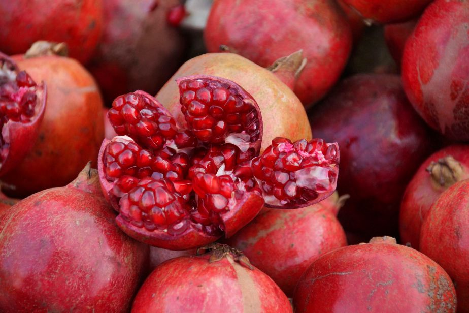
The color red, for instance, embodies sensations of desire, passion, blood, and transgression, while also representing bravery, selflessness, passion, love, and beauty.
Monochrome photography is frequently linked to black & white visuals, yet it truly encompasses any single hue, providing photographers with an expansive array of creative possibilities. This includes captivating images in shades such as red, blue, green, purple, orange, and yellow.
Blue, In Western societies, it often symbolizes calmness, stability, and tranquility. In art, the use of blue can evoke a sense of depth and distance, creating immersive and serene scenes. In contrast, some Eastern cultures associate blue with spirituality, wisdom, and the divine.

The color green offers a variety of meanings, symbolizing growth and representing nature, environmental concerns, naivety, envy, and wealth. Its interpretations can differ across cultures, symbolizing prosperity in some and illness in others.
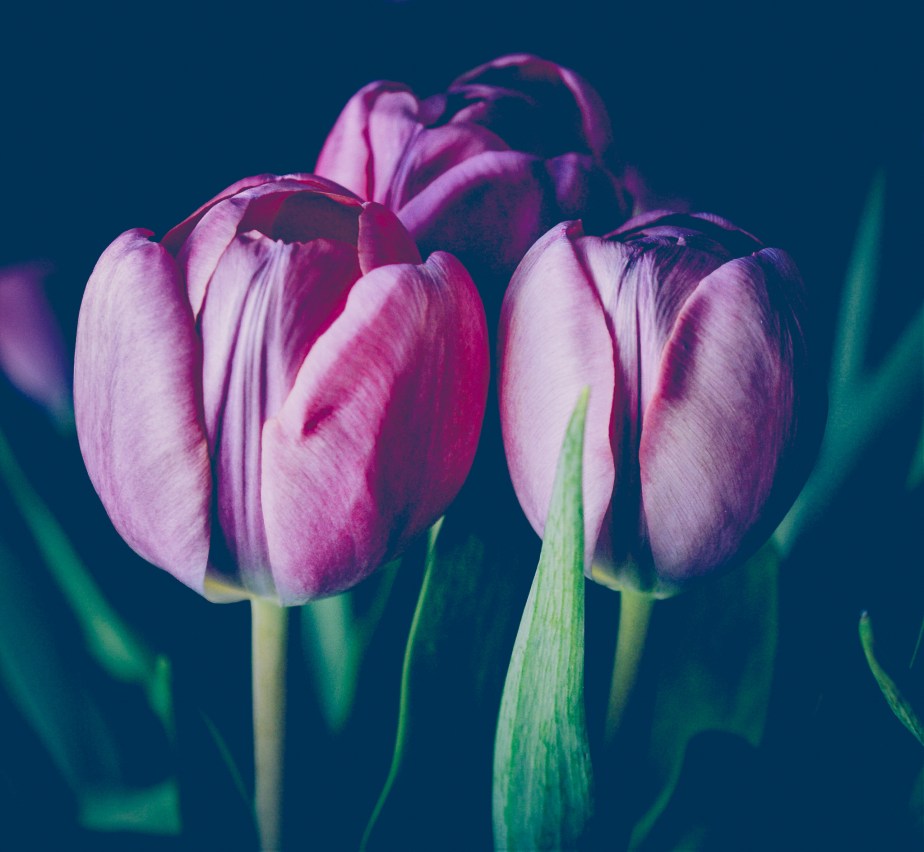
Historically tied to royalty due to the steep cost of its dye, purple is an elite color that lends a regal air to your photographs.
Orange, named after the fruit, signifies vitality and warmth, appearing gentler than red, which can symbolize anger. It exudes cheerfulness and approachability while still attracting notice, evident in its frequent use for warning signs.

.
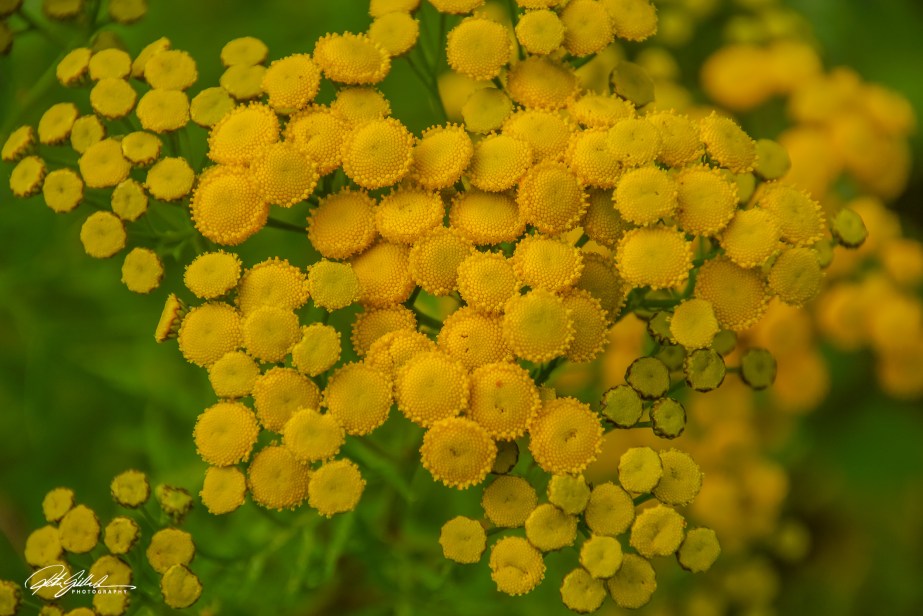
Yellow embodies both happiness and negativity, presenting opposing connotations; it signifies joy and optimism but also suggests cowardice, deceit, and aging.
Here is a quick guidance to colors start you off.
Finding triadic colors in nature involves practice and observation, exemplified by the Scarlet Macaw. A triadic scheme comprises a subject color and two complementary colors, like Orange, Teal, and Pink, or Red, Blue, and Yellow, which is beneficial in food and product design.
Ambiguous colors are hues lacking clear definitions, changing based on context and evoking various interpretations and emotions in art and design.
The traditional color wheel includes primary (red, blue, yellow), secondary (green, violet, orange), and tertiary colors formed by mixing them. Colors can be categorized into cool, associated with water and grass, and warm, linked to fire and sun. Warm colors can evoke feelings of anger, happiness, and excitement, while cool colors promote soothing and calming effects.
A huge thank you to Anne for the Texture challenge last week! The diversity of textures in your posts provided us with a wealth of inspiration for the future. Next week, it will be Egídio’s turn to lead us, so make sure to visit his site for more creative ideas.
Please see this page for more information about the Lens-Artists Challenge and its history. If you don’t want to miss any future challenges, please consider subscribing to the team members’ websites.
We are the Lens-Artists: Tina, Patti, Ann-Christine, John, Sofia, Anne, Egidio, Beth, and I, Ritva.
Until then, let’s keep exploring, broadening our horizons, and maintaining a positive mindset

Wonderful last line, Ritva. Yes, to all of those! Lovely photos, too–especially the red one, which is my favorite.
Thanks Lois, that one is one of my favorite reds also.
Ritva, you have given us a wonderful challenge with excellent examples. My favorite is the purple tulips.
Thanks Beth, the elegance of tulips is always a winner for me too
This is a fun and creative challenge with gorgeous images Ritva. How come you get to show all the colors and we only get one?😃
Brad, I am the challenger ?
😃
Wow, these are wonderful!
Thanks Dawn!
Wonderful examples Ritva. I like the Tulips
Here’s my contribution. Decided on one colour
Thanks Brian, tulips are an elegant choice, even in the colors choice
Agreed
I love the subtlety of the Header and the vibrancy of the pomegranate, Ritva. Sometimes it’s easier to pick favourites than others xx
Jo, yes it is, but I am glad you found one you liked
I can always find photos here that I like, Ritva xx
💚
All of your images are lovely as always Ritva but your opener is so vibrant one wants to jump into the image and taste them! Loved your challenge. My response is here https://travelsandtrifles.wordpress.com/2026/05/16/lens-artists-challenge-386-choose-a-color/
Thanks Tina, I also really like that photo.
Marvelous photos and a wonderful discussion, Ritva.
Thanks Janet 😊
What a wonderful challenge, Rtiva. The image of the pomegranates is my favorite. I love the variations of red.
Red, it is a passionate color, and so is the image too. Thanks Donna
Yes! Yes! Yes! I loved this challenge thank you Ritva and even better, I learned a lot from your narrative. Thank you so much! My favourite, natch, are the Tansies! pp
Pam, glad I was able to give so new information. Yellow, so sunny and warm
Thank you for this challenge Ritva. Your gallery is stunning, particularly your take on orange. Which just happens to be my color choice.
https://lifeinmyyears.com/2026/05/16/lens-artists-challenge-398-i-choose-orange/
Thanks Paul, The Older I get the more I like orange.
Great challenge, Ritva. And very very well illustrated. I had similar coloured tuplips on my shorlist for purple but decided to go for a close-up of a bird so that I don’t just show flowers. But yellow and red just had to be flora: https://picturesimperfectblog.com/2026/05/17/decisions/
Flora is the easiest way to show colors, and most beautiful too in many cases. Glad you like the challenge
This is interesting Ritva, a lot like a natural monochrome. I really like your examples.
Thanks Leanne, you are right😊 Natural monochrome
thanks for the inspiration, Ritva. Here is my Melbourne in Green https://wanderingteresa.com/shades-of-green/
Green is such a lovely color and the different shades is endless
Ritva, thanks for the wonderful examples. Your photos are so vivid and gives us plenty to work with for the challenge. Here’s my entry:
https://throughbrazilianeyes.com/a-different-green-every-spring/
Thanks Egidio, glad you enjoy it. Your post is just lovely
Fun challenge. 😊
Thanks Pepper
This is a great challenge, and beautifully described and introduced. I keep changing my mind about which colour to choose – it’s hard, isn’t it?
it is, but this time of the year is is the fresh green for me.
👍
Superb photos, Ritva to illustrate a really cool challenge. Your explanations are clear and inspiring too. I’ve just read your reply to Margaret’s comment, it is the same for me, as you’ll see with my post:
Green it the theme at the moment
Your photos provide great examples for your challenge. I don’t know whether I’ll pick one color to feature or provide one photo of the six colors… hmm! Great challenge!
I will see it soon and be surprised 😂
All so beautiful!
https://dailymusing57.com/2026/05/17/lens-artist-challenge-choose-a-color/
Thank you!
A wonderful and insightful theme, Ritva. I love the pomegranate’s rich depth of field and the opulent feel to the tulips’ photo…truly outstanding work. Inspiring!
Thank you Suzette, love that you used the word, opulent. Glad you enjoyed the post
You are very welcome, Ritva. You are an excellent photographer, a lot of thought goes into each image.
Thanka Suzette
An interesting theme and fascinating information related to various colours. Lovely illustrations, Ritva.
Thank you Rupali
Beautiful captures. Love the pomegranates. Mine is here: https://inprimopianophoto.wordpress.com/2026/05/17/avocados/
Thanks Marina, fruit for us both
Yellow will always be a happy color for me 🙂 Those flower simply brings joy.
I chose tranquility for me https://photos.nenskei.com/2026/05/17/turquoise-for-tranquility/
Great challenge. I chose red as my color. You offer great examples — I love your pomegranate and your yellow flowers best. I considered both red and yellow but decided to color inside the lines of the challenge and pick one. My challenge offering is here– Lens-Artists Challenge #398 – Choose A Color | The View From Here
Thank you for hosting Ritva and selecting a great subject. That confetti shot is superb and I really like the pomegranate close up 🙂
The pomegranate seems to resonate with most, so passionate 😂 and it pays to go to concerts Thanks Steve.
found it in the spam, with many other ones.
Beautiful collection of images Ritva, love the timing of it for colours with spring warmth and growth! Blue is so very calming! Fantastic purple tulips!
Thanks Pamela, I am happy you enjoyed my post
Here is my post, thank you for another inspiring theme! https://yourlifeasartphotography.com/2026/05/18/lens-artists-challenge-398-colour/
Thanks for joining with your beautiful post Pamela
Fantastic challenge and examples, Ritva. I’ve learned how many colors I’m fond of. However, I chose green: https://beingamazedcom.wordpress.com/2026/05/19/%f0%9f%93%b8lens-artists-398-green-magic/
Thank you, your take was lovely.
This is a lovely challenge, Ritva. Color is always something that inspires photographers. I love your pomegrantes and your top picture, which is so rich and interesting. The electrifying one was fun. It’s hard to find all one color of lights like that – fireworks or something. I’ll have something turquoise for you tomorrow. 🙂 xxx
Thank you Marsha, colors are more important to us than we think. Glad you liked examples. Looking forward to seeing yours
That’s so true. Usually the earthy tones color of your first photo aren’t my favorite, but in your case, the photo was stunning.
Thanks Marsha, that also if one of my favorite shots, even though its not my most liked colors
Isn’t that interesting, how something that is not a favorite can be the most stunning? I don’t get it, but it’s the way it is.
Wonderful colors. I especially like your very first one of the seedpods..a wonderful blending of a unique color! Here are mine: https://judydykstrabrown.com/2026/05/20/colors-for-lac/
A beautiful gallery Ritva, I especially love the way you captured the light and shades in your opening image ❤️ Our contribution for this week’s lovely challenge is here: https://tranature.com/2026/05/20/wordless-wednesday-songs-of-green/
Thank you Xenia
Ritva – can’t believe I forgot the link – and my comment! Because i made the post in advance…
Love this challenge in my heart and soul. Wonderful examples and your header is a gem. Thank you!
Thanks, I have made postcards of the header :-D, so I happy you like it
I was particularly struck by your electrifying orange, so of course I had to do an ‘orange’ post: https://elizabatz.com/2026/05/21/bright-orange-says-look-at-me/
It’s clear we’ve all had fun with this challenge: I know I have. Here’s mine: https://margaret21.com/2026/05/22/and-just-for-you-ive-chosen-blue/
Glad to her that Margaret.
Thanks to Margret, I got aware of the Chalenge. Great photos, indeed.
These are mine:
https://juckplotz.de/2026/05/22/lens-artists-photo-challenge-pick-a-colour/
Thanks for joining us, your entry was lovely and green.
A great challenge. I particularly like pomegranate – so vibrant
Wonderful color palette, Ritva. Thanks for the challenge https://fakeflamenco.com/2026/05/23/purple-is-unquestionably-my-color-choice/