
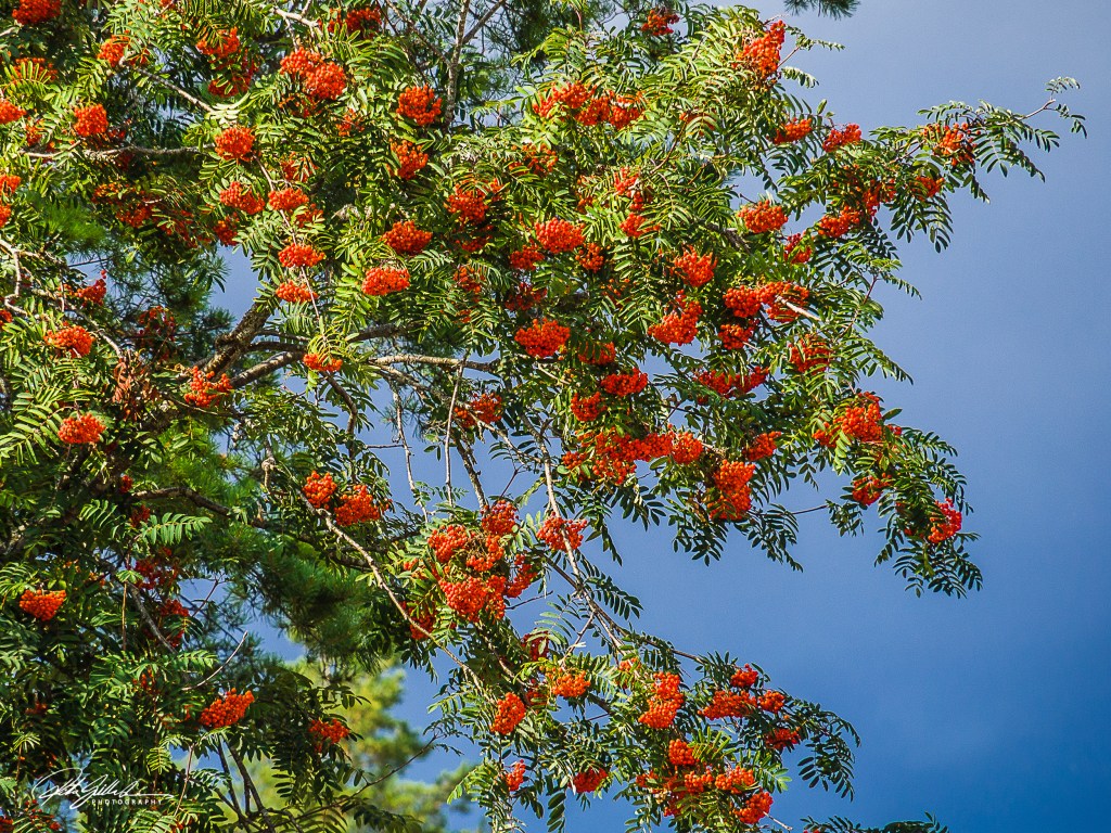
It’s always nice to get a little reminder about how complementary colors work and how to use them in your photography, art, and even fashion choices. As most of us know, complementary colors are those that sit opposite each other on the color wheel, and they really make things pop, enhancing the viewer’s experience and helping the subject stand out. Nature does a fantastic job of this on its own, showing off these awesome color combos in landscapes, flowers, and wildlife. As you notice them in nature artists and photographers can find interpretation of how to use it . By understanding the science and feelings behind these colors, you can really step up your artistic game and whip up some eye-catching compositions and get attention and leave a lasting impression.
Please Check out the introduction from Egídios Through Brazilian Eyes lovely blog and join us by linking your post to his and using the Lens- Artists tag so you post can be easily found.
Complementary colors are basically the ones that sit right across from each other on the color wheel. When you use them in your photography, they create awesome color contrast, making your images really stand out. Think of classic combos like red and green, magenta and green, yellow and violet, or orange and blue. You don’t have to stick to colors that are exactly opposite, though. Just like how the color wheel smoothly shifts from one shade to another, you can mix in some nearly opposite colors. But hey, the most stunning results will come from those perfect opposites!

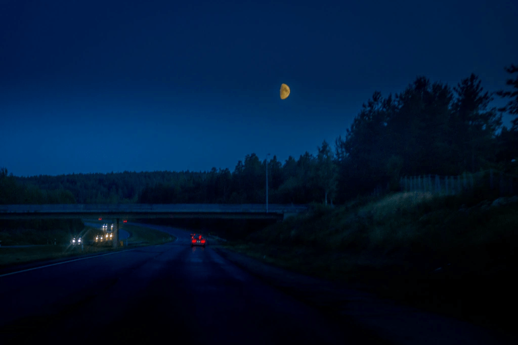
I think the yellow moon against the blue sky works well.
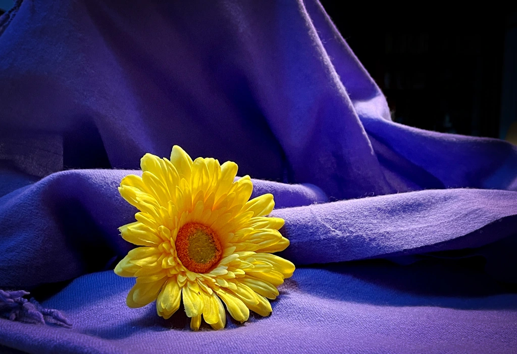
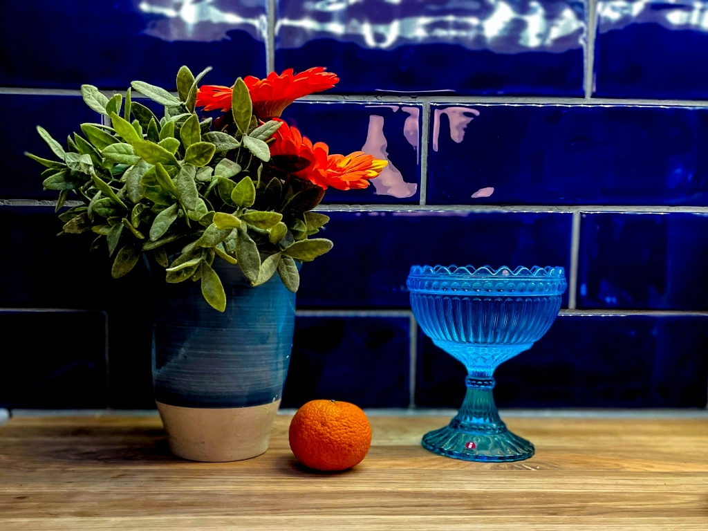
Using complimentary colors in Still life

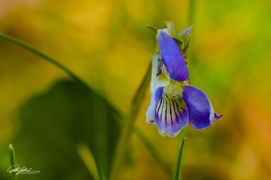
Viola canina against yellow, green hues
That is what we enjoy mostly in Finland ”bilberry” tai ”wild blueberry” Blueberry is apparently from a bush. Well anyway – nature knows it’s complimentary colors

Thanks for joining me and looking at things out from above; it’s been an a delightful! I appreciate everyone for sharing your amazing macro shots of nature and stunning views from rooftops or hills. The photos were not just pretty; they highlighted the beauty of our world from unique angles. I’m glad if I could inspire you to consider shooting from above, as those viewpoints often reveal little details we might miss on the ground. It’s incredible how changing your perspective can enhance how we see and appreciate our surroundings, encouraging us to explore and find hidden gems nearby.
Next week, Tina returns with her first new challenge for the year. It will go live at noon EST in the USA. Tune in to find out another exciting challenge.
Don’t forget to use the “lens-artists” hashtag when creating your post so we can easily find it in the Reader and linking it to original post.
Please see this page to learn more about the Lens-Artists Challenge and its history


