
I will go straight to what John wrote” One of my favorite things is to take the images I captured from my camera and put them in a workflow through two or three different photo editing applications”. I love doing this too. He asks us to feature three or four images in your gallery that you tweaked for whatever reason and the original image out of the camera. Here are my Before and After
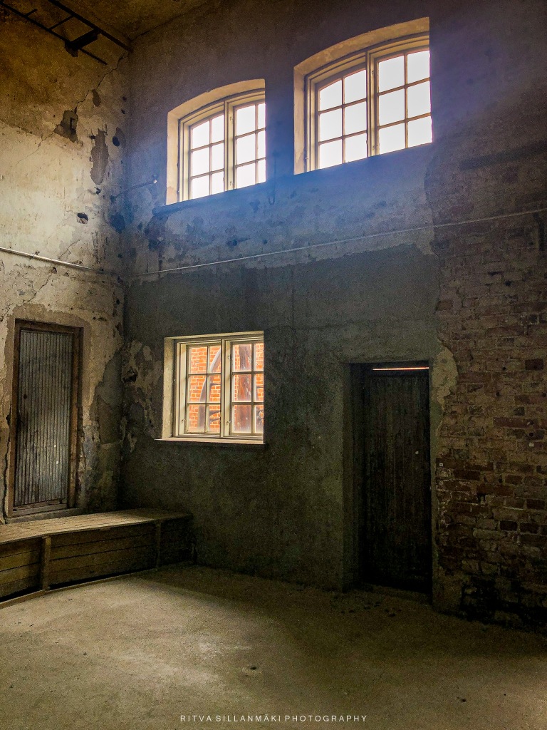
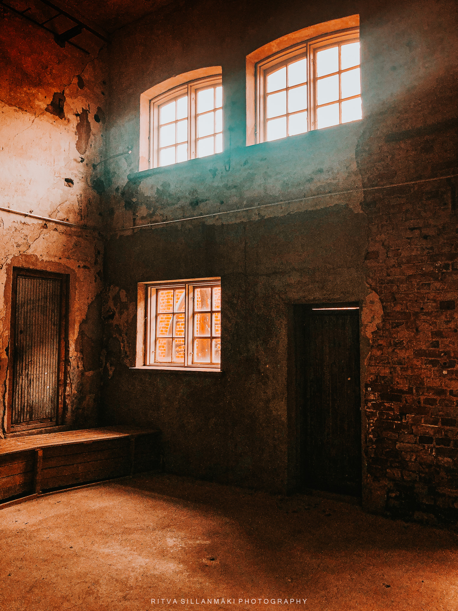
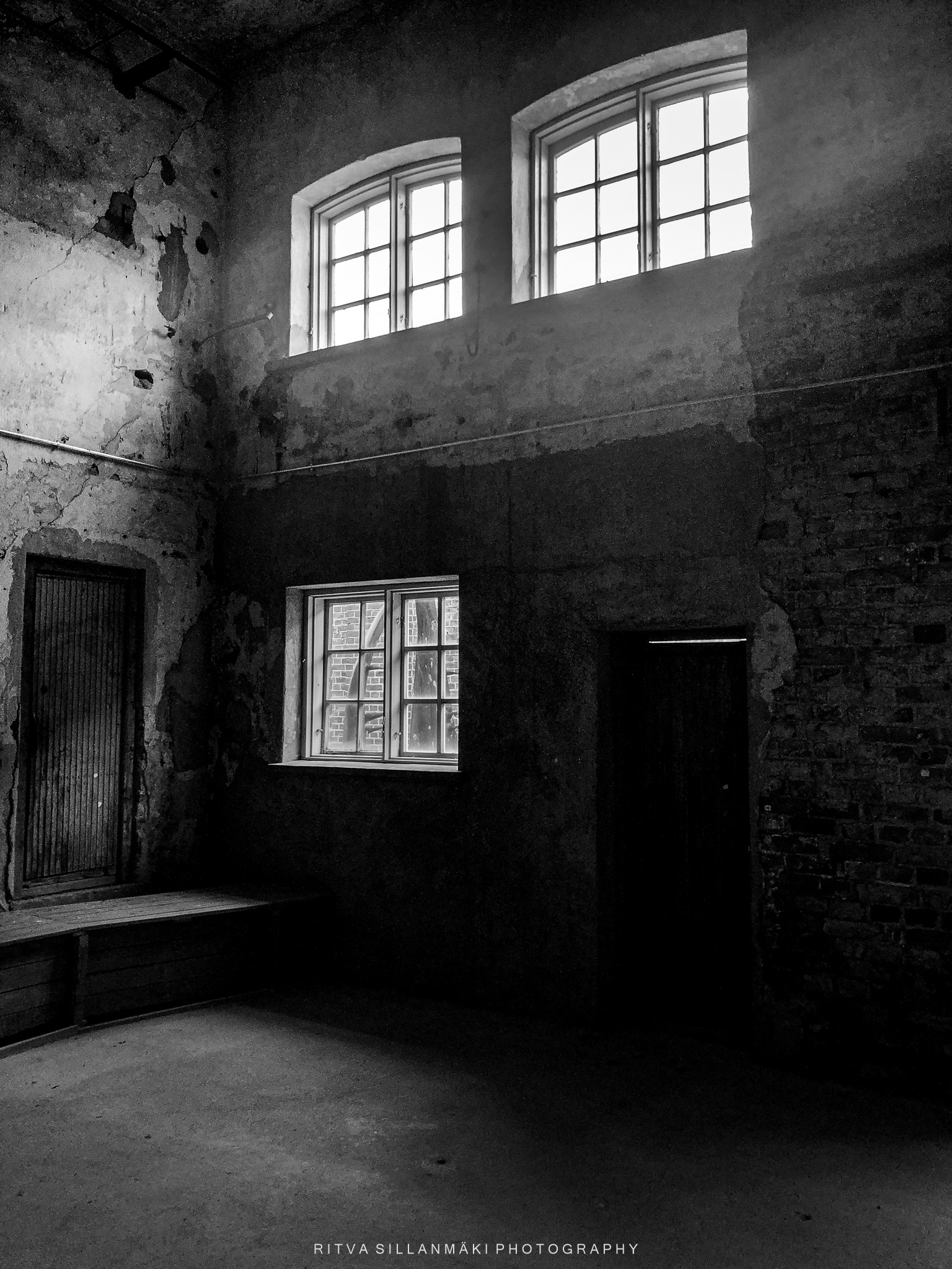
I was going through some old photos, and this corner in an old building with light coming in from above, the texture of the walls set my creativity to flow and edited it for this challenge. With this first photo I am giving you more details to explain the edits I did.

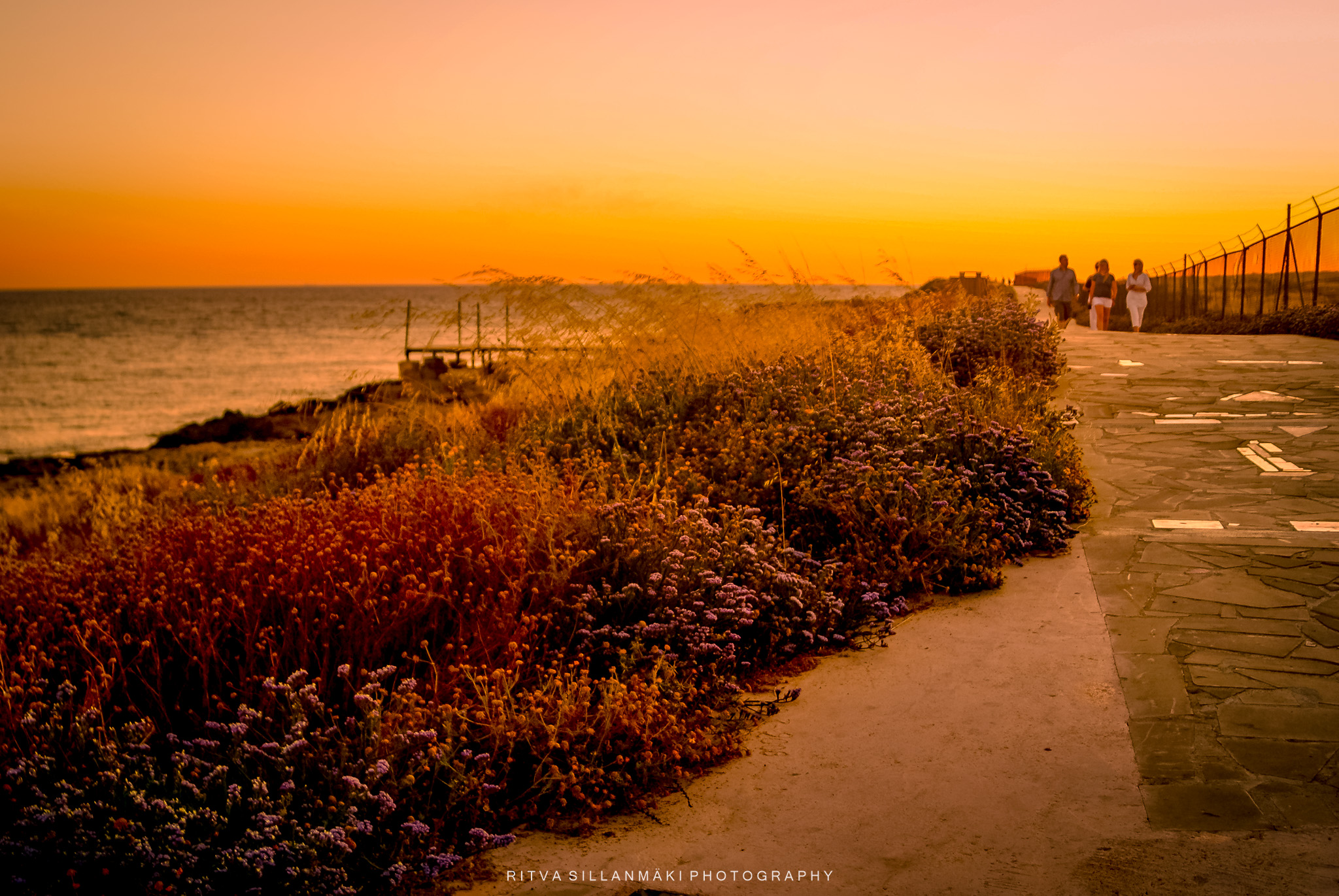
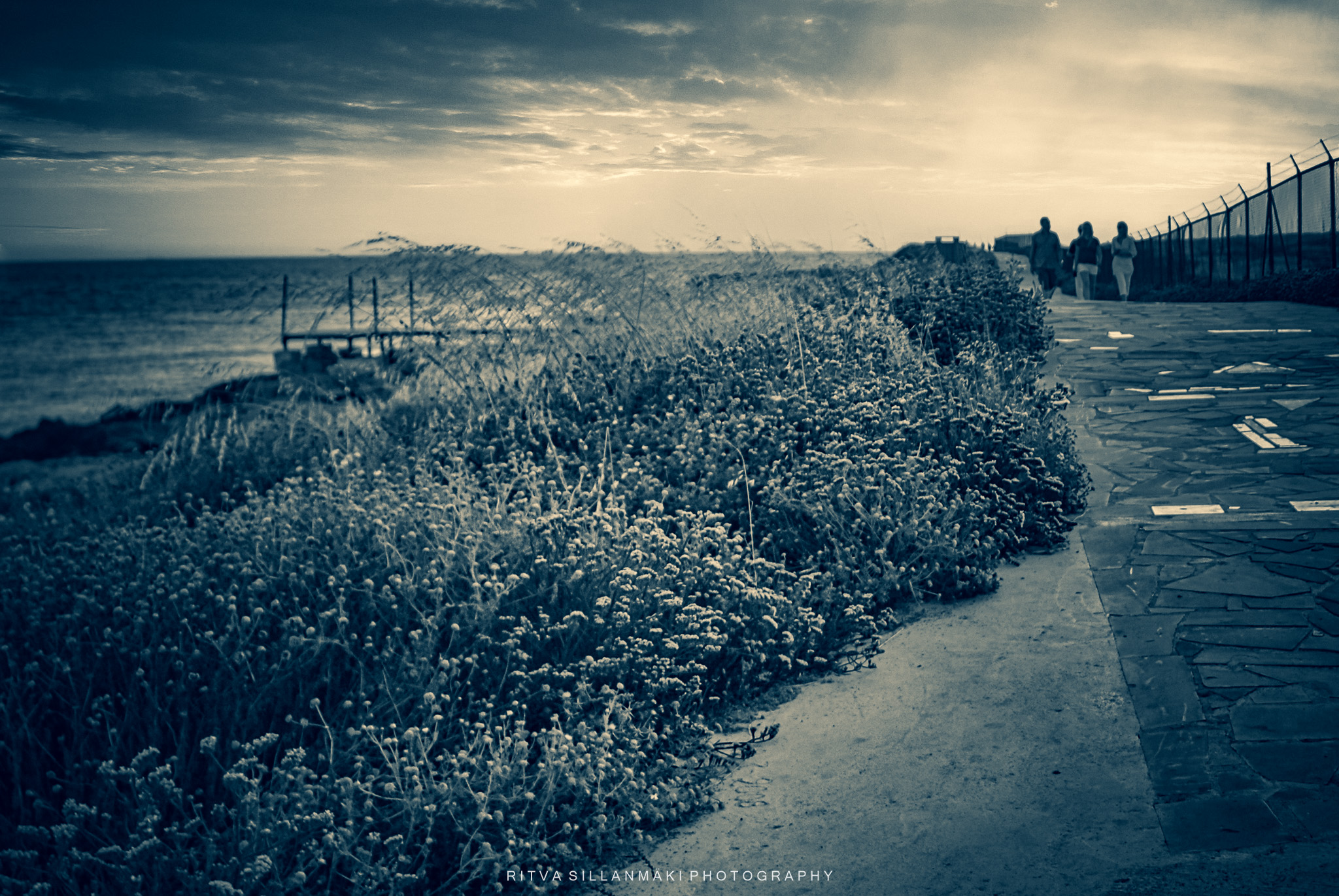
This shot I took while running to the seaside to capture the sunset at Páfos in 2011. The original is very bland, but with my newfound editing skills I was able to bring the warm tones of the moment into the photo.
I adjusted the exposure and contrast down as well as the highlights and blacks. I toned down the texture, but added clarity and dehaze. Touch of added vibrance and saturation. Added touch of orange to highlight and midtones. Then inspired by John I changed the sky and did lots of little fixes and had an enhanced version, that I then converted to black and white. I have very rarely changed skies, because I try mostly keep it real – well the way I see it – or in this case remember seeing it.


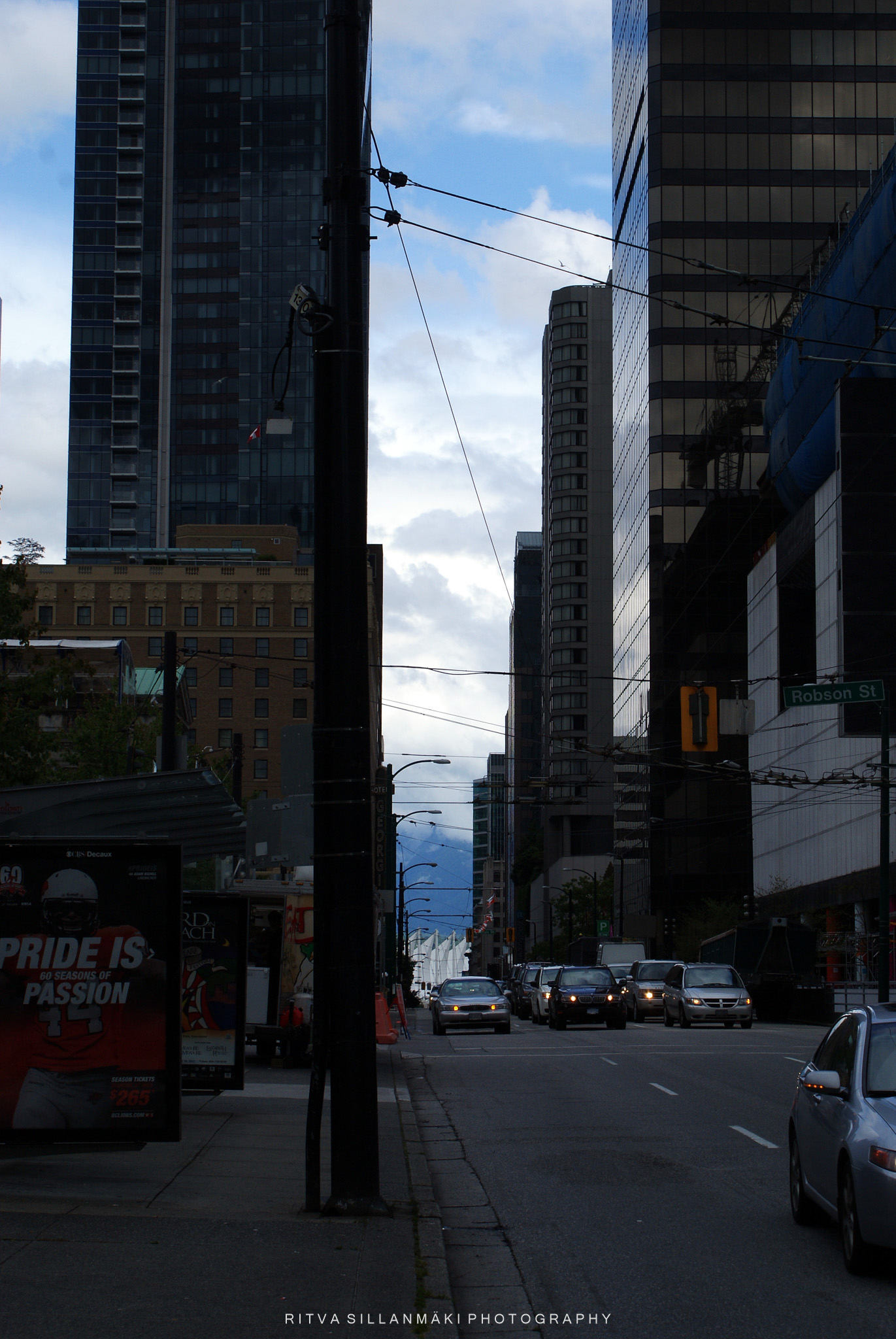
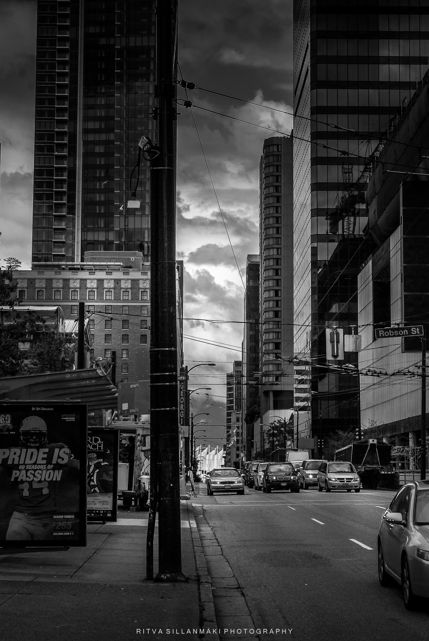
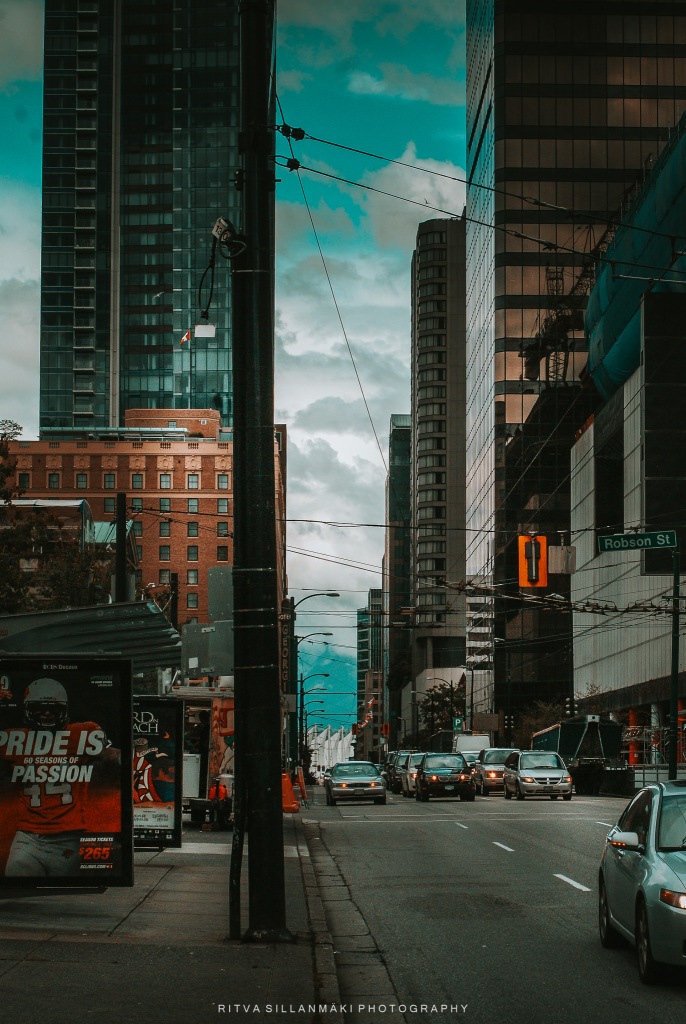
This is a street view from Vancouver that I converted to monochrome – I am a big fan of B&W images. The last one is trying to replicate the style lots of movies and TV shows now use, with teal and orange colors. In both edits I have also edited the exposure, contrast and shadows and light.
Last week we enjoyed the inspiration from Sofia – Water motions , it was a theme I really enjoyed. I saw so many wonderful posts about it. Next week Donna is bringing us a new challenge, looking forward to seeing what she comes up with. Until then, keep smiling ☺
To participate in this challenge, you should link to or leave a comment on the week’s host’s original challenge post and please use the #Lens-Artists tag in your own post, so the post is easily found in the Reader.
And if you want even more information on the Lens-Artists Challenge, please click here.

Ritva, I always enjoy your style of editing. I hadn’t noticed the teal and orange versions elsewhere. I like the look. I’ll have to try some experiments.
❤️Thank you John, once you pay attention to it you can spot it in so many shows and movies
Always amazed at the difference but I don’t always like it. My favourite is the black and white Vancouver shot- really superb 🤗🖤
Yes, many times changes can be overdone, it is a trend at the moment. Black and white images stay in fashion all the time. Glad you liked that one.
🤗🩵
Fun response Ritva. I agree with Jo about the B&W Vancouver. I preferred your original and the B&W in the old building which is a great subject!
Thanks Tina, old buildings are great when converted or shot as black and white
You shine when it comes to editing Ritva. I like the B&W conversion in both the building interior and Vancouver street scene.
Thanks Anne, so nicely said, black and white is classic and i am glad I have succeeded doing them well
😊
Wow, Ritva! I have to borrow a page from your book. These are fantastic edits. I can’t figure out if I have a favorite. However, some do stand out. First off, the monochromes are superb. Then, next I’ll go with the warm tones. Love those photos.
Thanks Egídio, the warm tones are the trend at the moment if you follow photographs in social media. And well black and white is classic and it is one of my favorite styles.
hello ritva
i like the way you chose your pictures for the theme, especially the first four and the last three.
many greetings robert
Thanks Robert, I appreciate your comment. Glad you enjoyed them
Amazing colours.
❤️Thank you Anna!
Love the warmth of your edits, Ritva.
Teresa❤️Thank you!
Excellent. Love the colors in the header shot, and the movie style city. Well done.
Thanks John.
Vey nice. Ritva. I love that you gave us various edits to bring life to your photos. Anne said it best. You shine! I especially love the green and orange changes to the building . Your feature was nice too. With different edits I noticed the people differently.
Thanks Donna, now that you mentioned it, the people are more visible with the new sky. Glad you enjoyed my warm tones
always…
Lovely! I like the B&W conversions. In the first one, the addition of light looks good to me. The teal and orange work – that I didn’t know of before – looks very artistic 🙂.
Thanks PR, yes the warm tones do make a artistic look. Glad you enjoyed them.
All your edits are really effective. I like the way you have of enhancing texture in your shots. The B&W shot of the empty building is probably my favourite but I like both B&W and added sky versions of your coastal sunset too 🙂
Thanks Sarah, I do like to add texture to photos, and black and white is a style I really like. Happy to you found them effective ❤️
Wonderful Ritva, I like the way you did several edits to the one image. I remember a challenge many years ago from Robyn Crosby, I think that was her name to do one image four ways. You got some great results.
Thanks Leanne, I have a bad tendency to over do it, trying different versions to bring out what I think looks good. But then I again love creativity of the editing process
Beautiful editing on these photos 😀
Thanks Cee!
Cool edits
Thanks Nora
You excel again, Ritva – love your edits to the full. I do have favourites though – as you say B&W shines, but also your warmer tones. The Vancouver teal and orange is a hit with me!
Thanks, I do love playing with the edits unlike you 🙂
Well, I love playing with for example double exposures, but this task I feel is of a more serious kind. It matters how they come out, which makes me a bit nervous…
Ritva, I loved having this opportunity to see how you create that so unique style that you have. It made me try to be a bit bolder too 🙂