
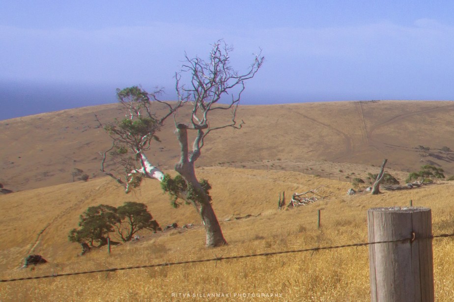
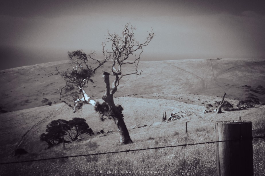
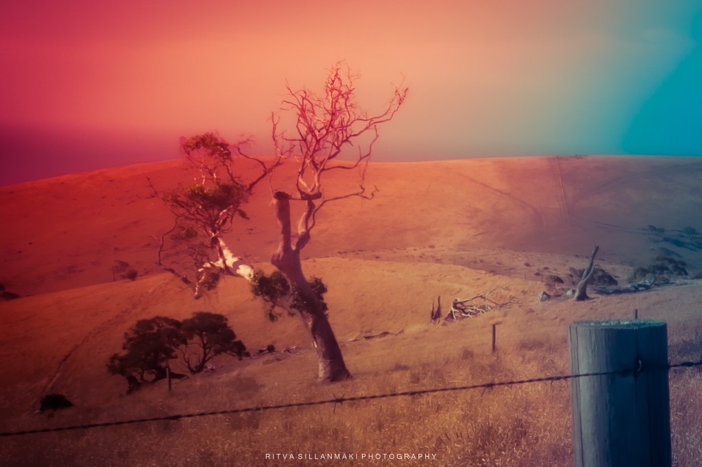
I played with this image of a gnarled tree on the hills in South Australia, capturing the rugged beauty and unique character of the landscape. The first photo is the edited original, which tell a story of resilience against the elements. Following this are three distinct color variations; one is a monochrome that emphasizes the stark contrasts and shadows, allowing the viewer to focus on the shape and form of the tree, while the others offer vibrant hues that breathe life into the scene, both highlighting different aspects of the surrounding environment. Or just having fun with artistic liberties 🙂
This is my contrubution for One-to-Three Photo Processing Challenge: April 2025

Fun images and experiment Ritva! I think I like the last one best.
You are a wild on Brad, thanks 🙂
🙂
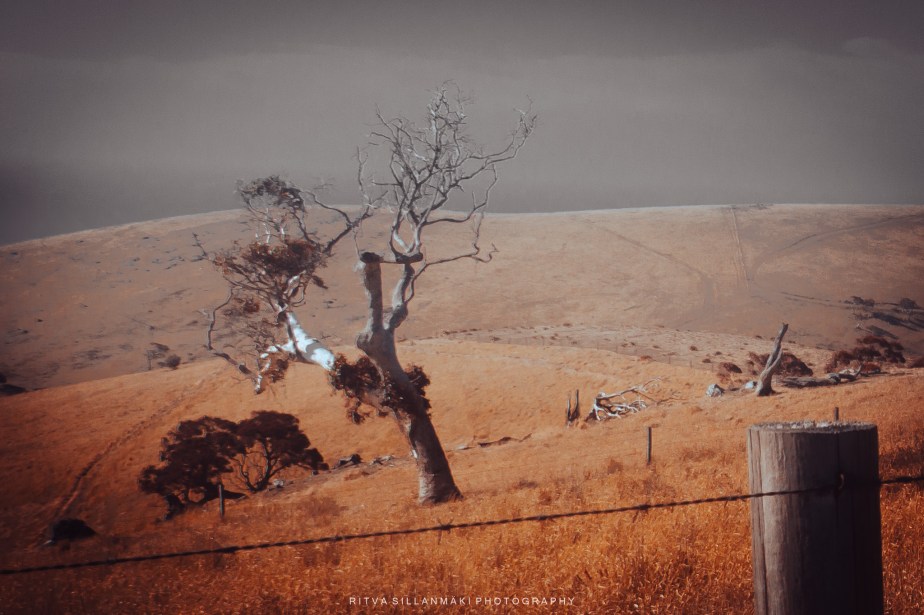
I really like the second one.
Thanks Sandy, mee too 🙂
Probably prefer the mono, but you had some fun!
Sue, I did enjoy the process 🙂
Good!
You had fun here! But boring old me: I prefer the original, followed by the mono.
That is okay, mostly mono is a safe and sure bet.
Fun image experiment. I like the second one. The darker sky allows the brighter foreground and subject to stand out more.
With the original, the blue sky competes with the subject and the foreground for attention.
The monotone image has kind of a lonely feel to it compared to the others. The color versions seem to convey more emotion.
Thanks Randy for giving so much thought to these images, I prefer the second one too. I love the interpretation – lonely mood for the mono
Beautiful photo. Very classic look. I like all of your variations, but particularly the monochrome.
Thanks, mono is a safe bet, as it it keeps it simple
Especially with classic subjects.
I with those who like the second one. It really conveys the feel of South Australia 😀
Thanks Brian, love your comment – if I have captured that I’ve done well.
Local knowledge helps 😁
The lovely tones in the 2nd image are stunning. I wouldn’t mind that as a print hanging on my lounge wall.
You’ve captured the essence of many Australian country landscapes.
(dare I say better than the original colour version, but I find that often with the harsh sunlight in Australia).
I think I prefer that too, the original is bland that is one of the reason I did variations on it. Thanks Vicki, I ❤ that you would hang it on your wall, that says so much
Beautiful and artistic, Ritva!
Thanks Anne ❤
I like the different moods you captured in each edit.
Thanks ❤
A clever illustration of the impact different edits can have 🙂 My favourite is the monochrome one but I also like the one with the red foreground fading to a grey sky.
Thanks Sarah
I love the variations and understanding your thought process.
Thanks, I have sometimes understanding my thought process 😂
🫢🏄♂️
🙂