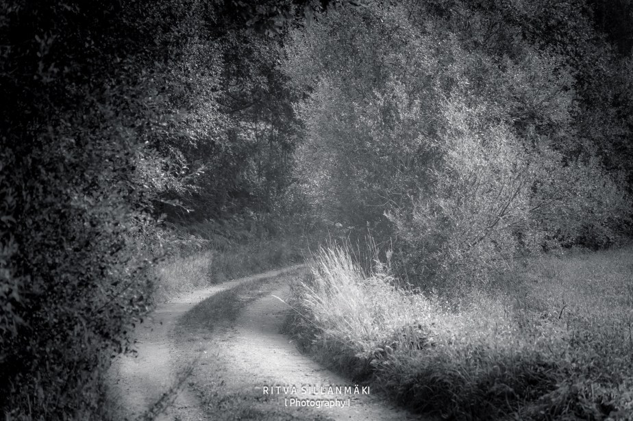
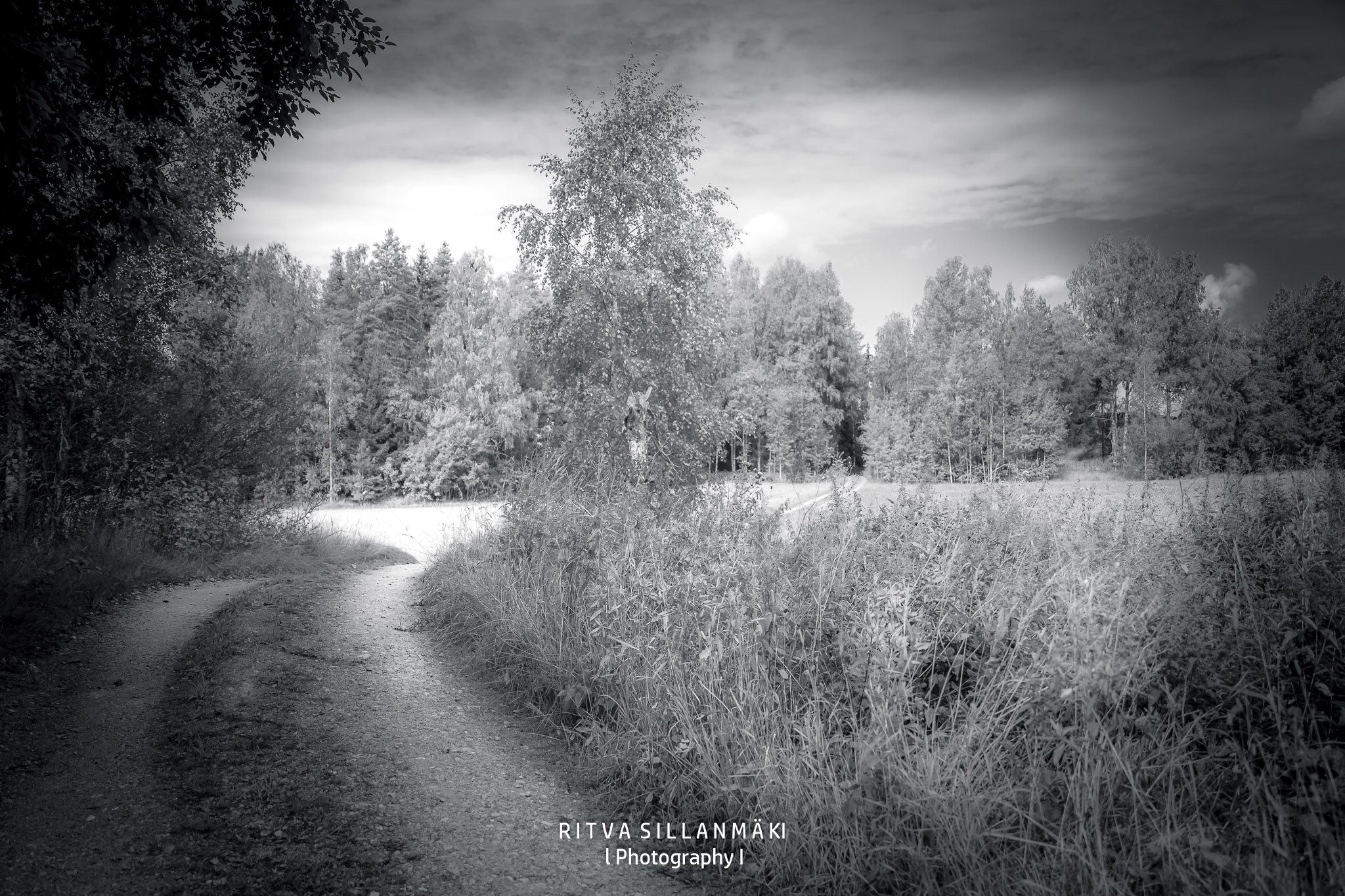
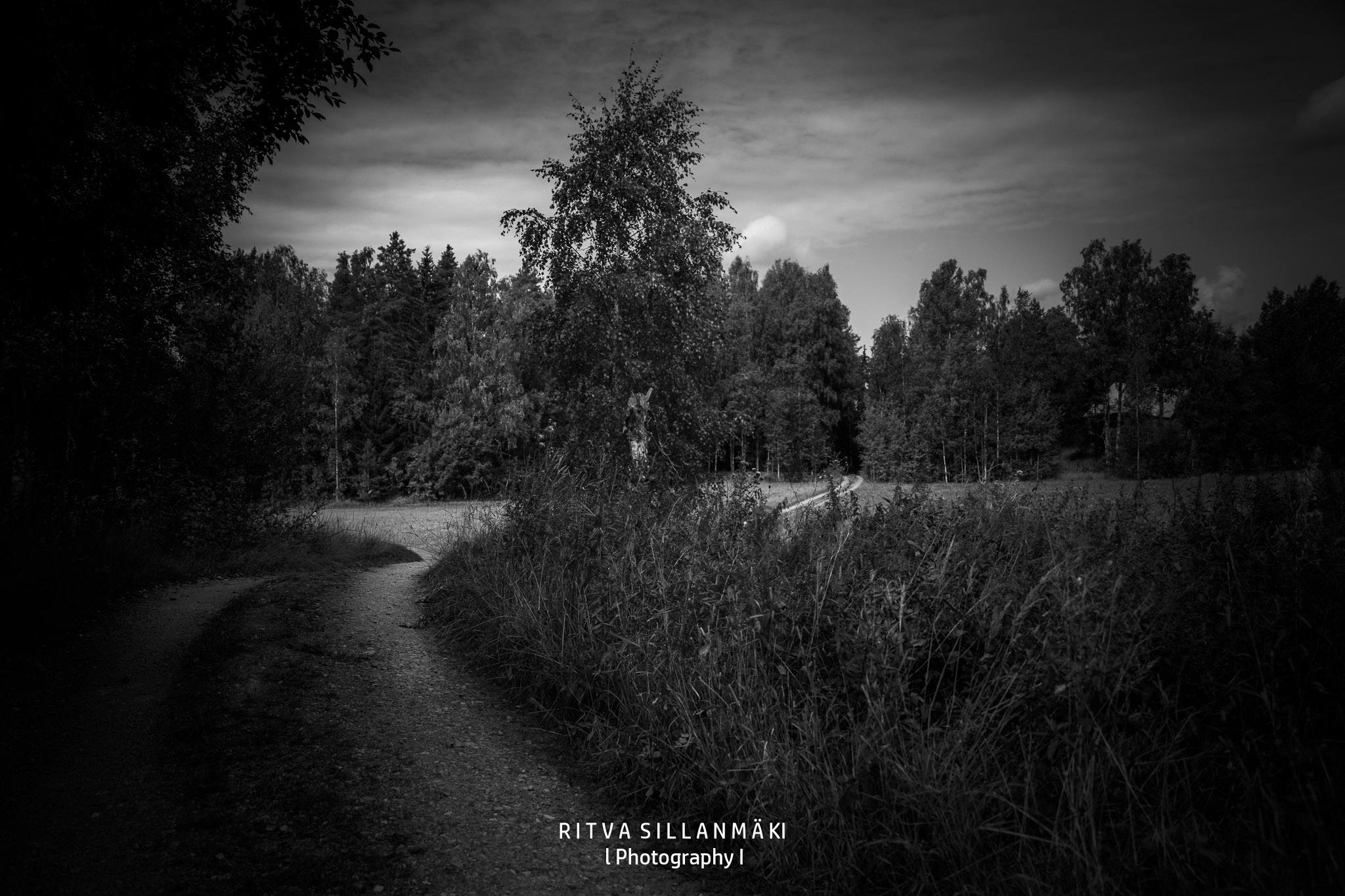
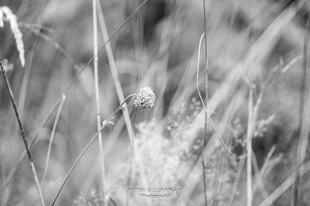
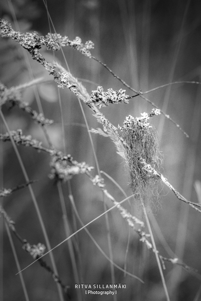
Monochrome Madness and here I am with another free week, and you might have thought I’d wrapped it all up after my stroll down Meadow Road. But no, we’re back at it! This time, I’m excited to share two versions of the images I snapped along the road where I found those beautiful flower photos—my pathway to my joyful retreat, my summer oasis. I’ve also included two monochrome takes of the plants I saw there to jog your memory.
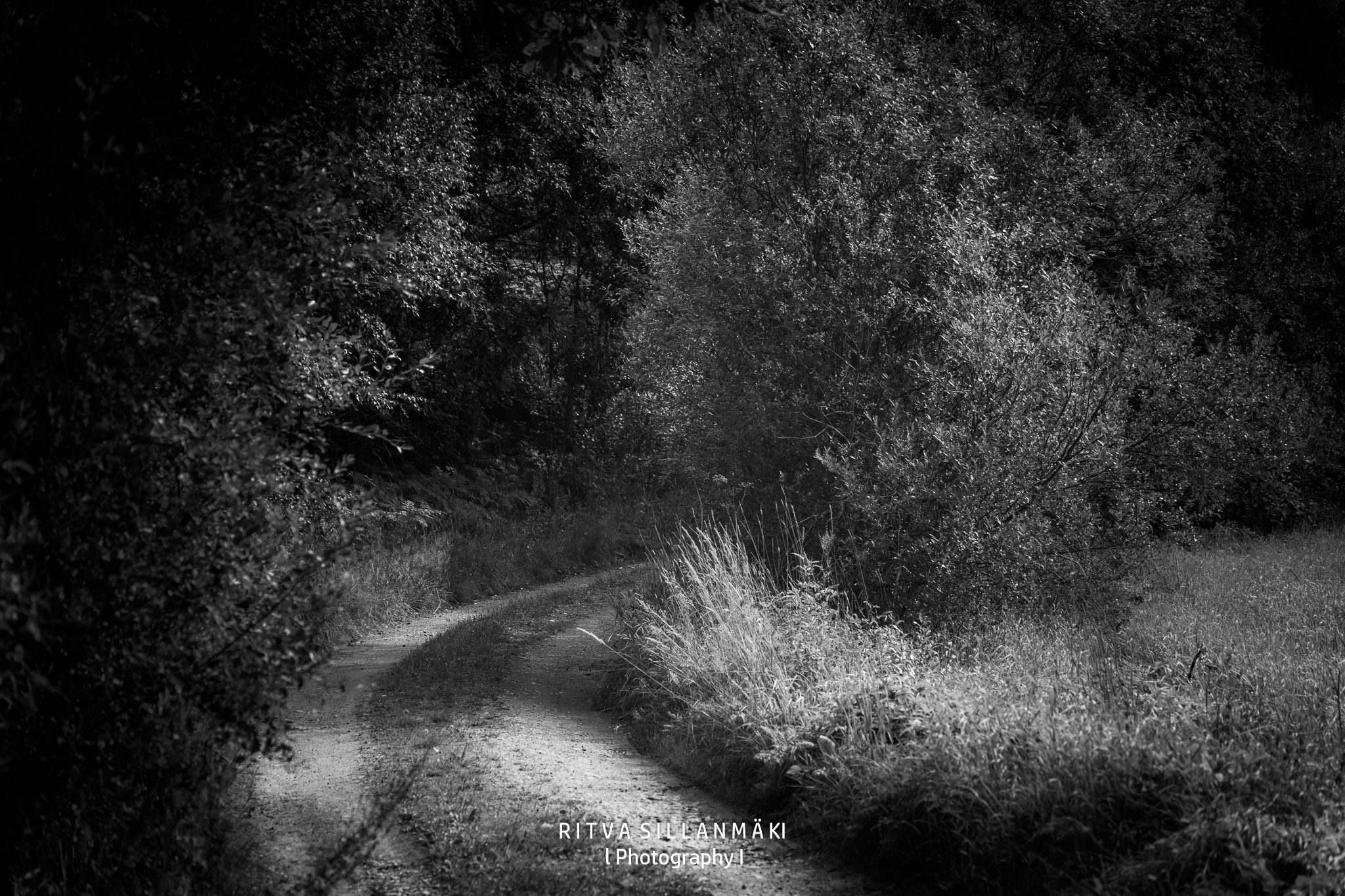
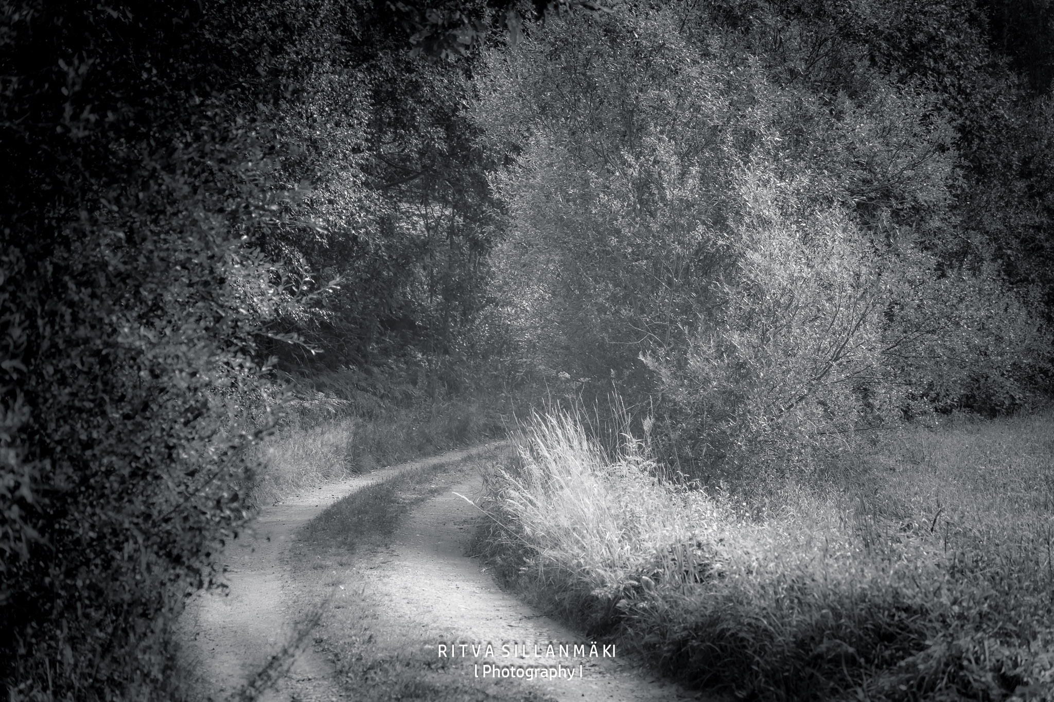
Which version do you prefer, the darker or the lighter one, and what’s the reason for it?


Beautiful photos
Thank you 😊
You’re welcome 🙂
So beautiful 🦋✨
thank you
Lovely photos, but I prefer the lighter edits. Tey well lighter in mood too, and expose more detail.
That is true Margaret, I initially did the darker versions – so I am leaning towards them myself
I prefer the ethereal nature of the lighter one, but since I am so short-sighted maybe the darker version is helpful for my lack of vision.
These are stunning Ritva, I really like how you have processed them. There is a softness to the last two which I think works well. With the first two, I like the darker version in the first, but the softer in the second. Great experiments.
Thanks, as you know I like playing with my edits
I like the lighter in the first two sets because I can see the details better.
Yes, that is true, maybe more mood in the darker ones
Such beautiful photos. I loved the darker edits. So moody and mysterious.
Good 😉, I initially did the darker versions – so I am leaning towards them
I like the lighter version of both images. However, somewhere in between would be the best for me.
Okay, I will have to think about that
In the first pair of images I like the darker version best as it has a real sense of mystery – what is around that bend? But in the second pair I prefer the lighter one as I find the darker one just too dark and therefore a bit flat. Just my opinion of course!
Your opinion is good as any Sarah 😁 I initially did the darker versions – so I am leaning towards them
So wonderful Ritva. The dark path number one and the light version number two photo. The macro of the grass seeds are marvellous
Thanks Brian, for also noticing the nature shots
Bearing in mind, please, that I’ve nowhere near your level of experience or expertise, in the first road image I like the darker shot better. The light is hitting (highlighting?) the road and the darkness makes it seem a bit mysterious. It urges you to explore. But… In the second image, I think I like the lighter version better but honestly, I can’t put my finger on the reason.
Lovely post, Ritva! Thank you for sharing your beautiful images. pp
Thanks Pam, I am not sure, but I initially did the darker versions – so I am leaning towards them
Beautiful images, I personally prefer the darker more contrast images.
Thanks Pamela, I initially did the darker versions – so I am also leaning towards them
👌🏻 Interesting to compare the 2 edits.
The first 2 images I prefer the lighter edit it seems more ethereal to me and I like the lighter ‘feel’ when looking at that composition.
The second set of images I prefer the darker edit – simply because I like the contrast of the dark trees against the sky.
🤔 Which do you prefer?
I initially did the darker versions – so I am leaning towards them
Beauty in black and white
Thanks 😀