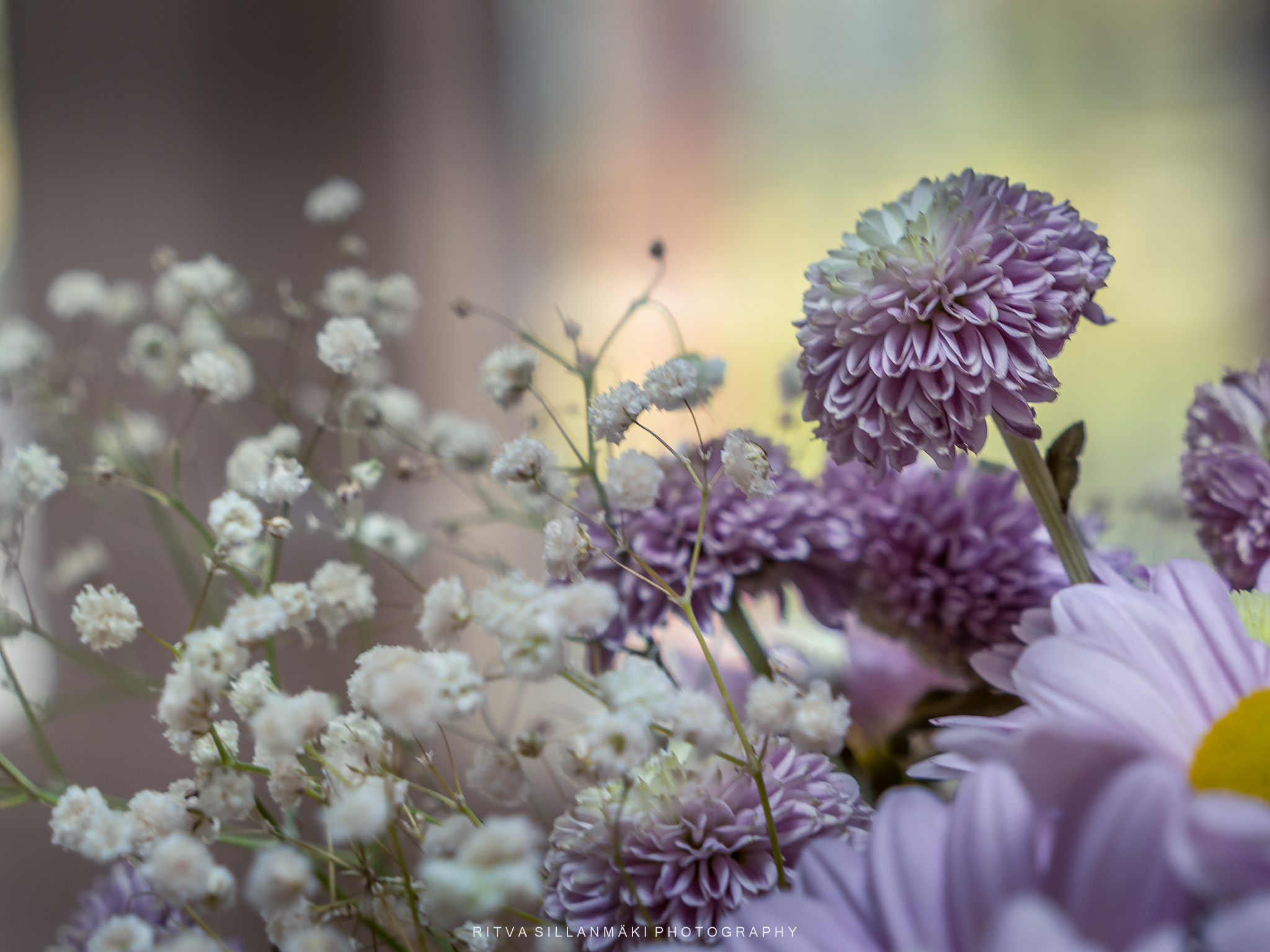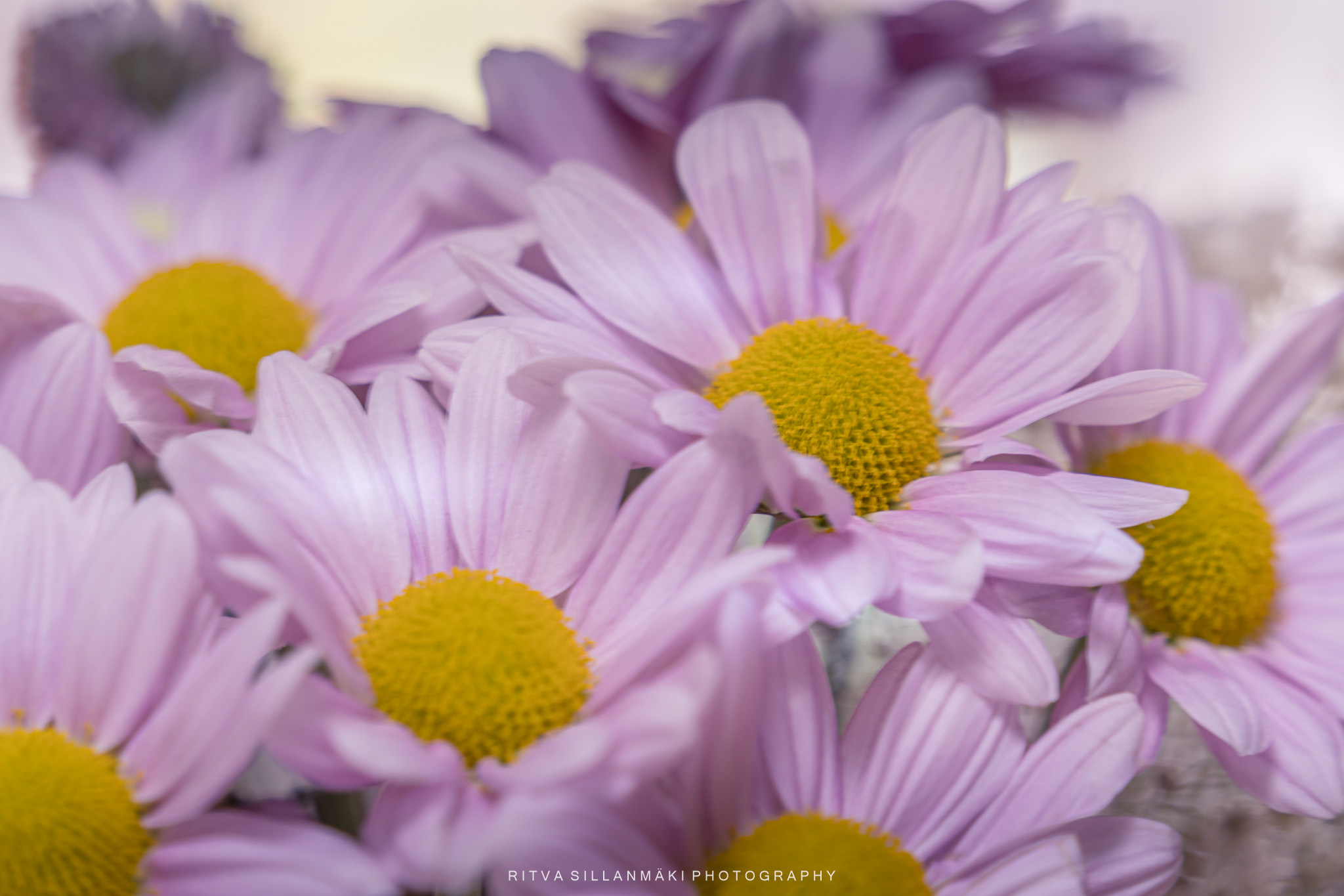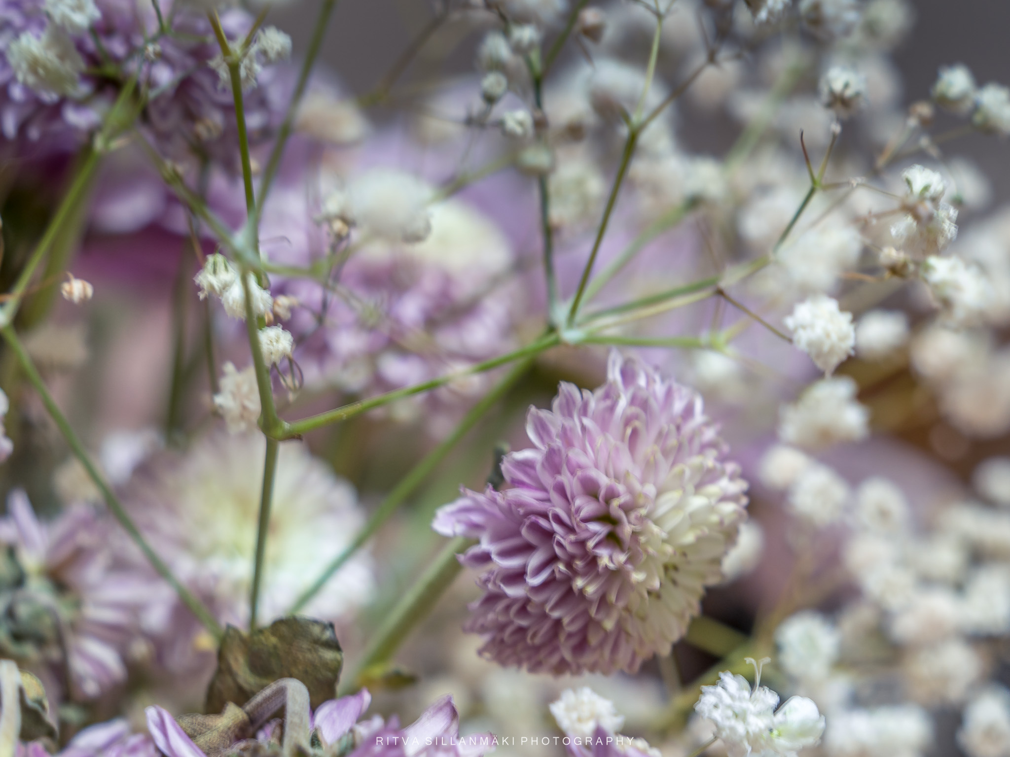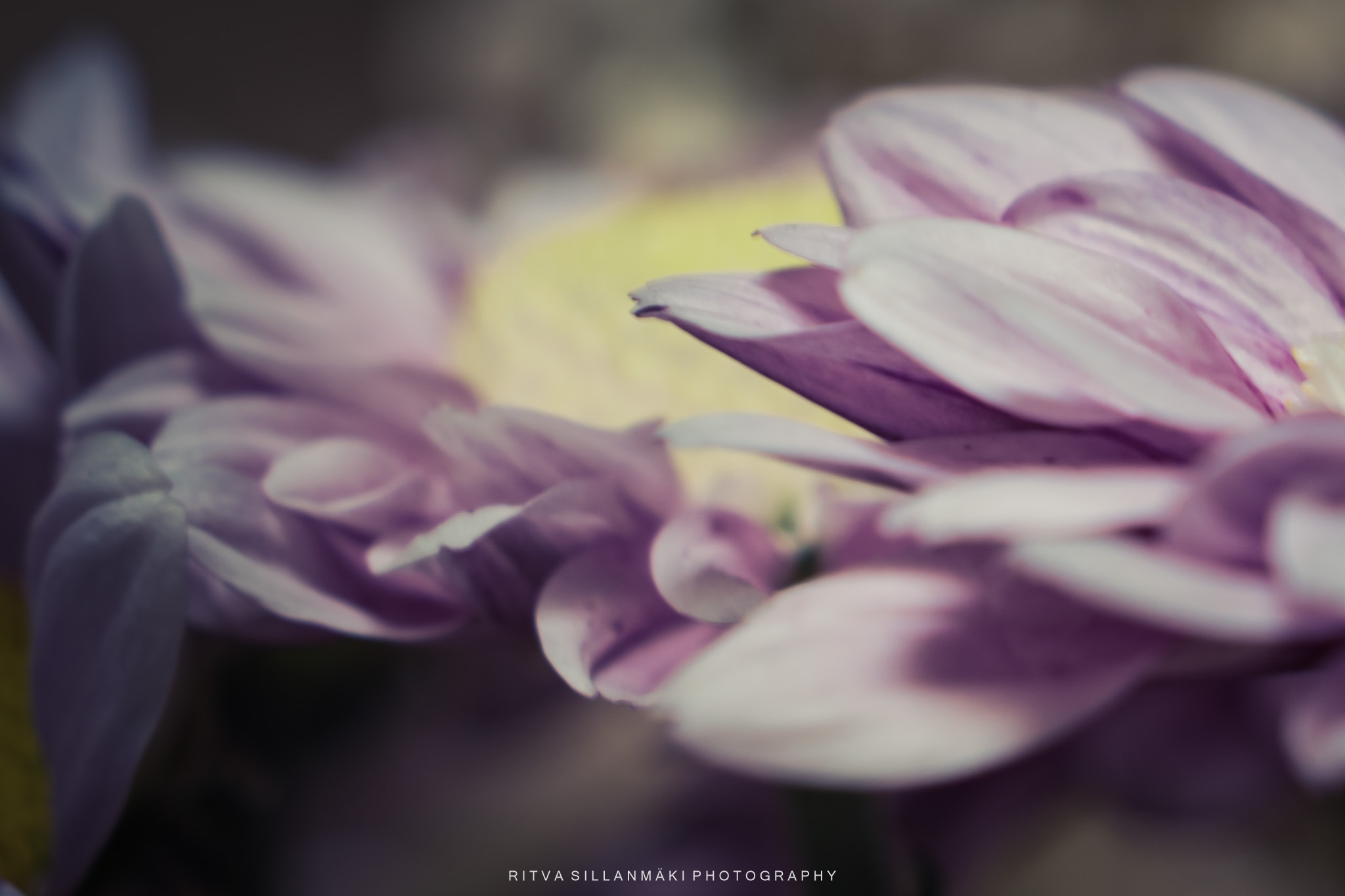

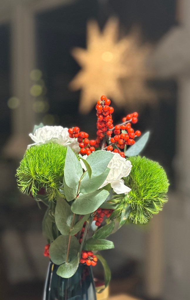
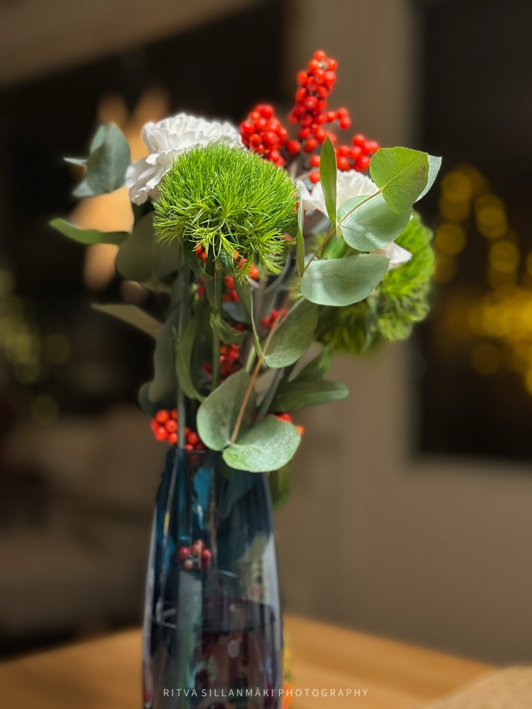
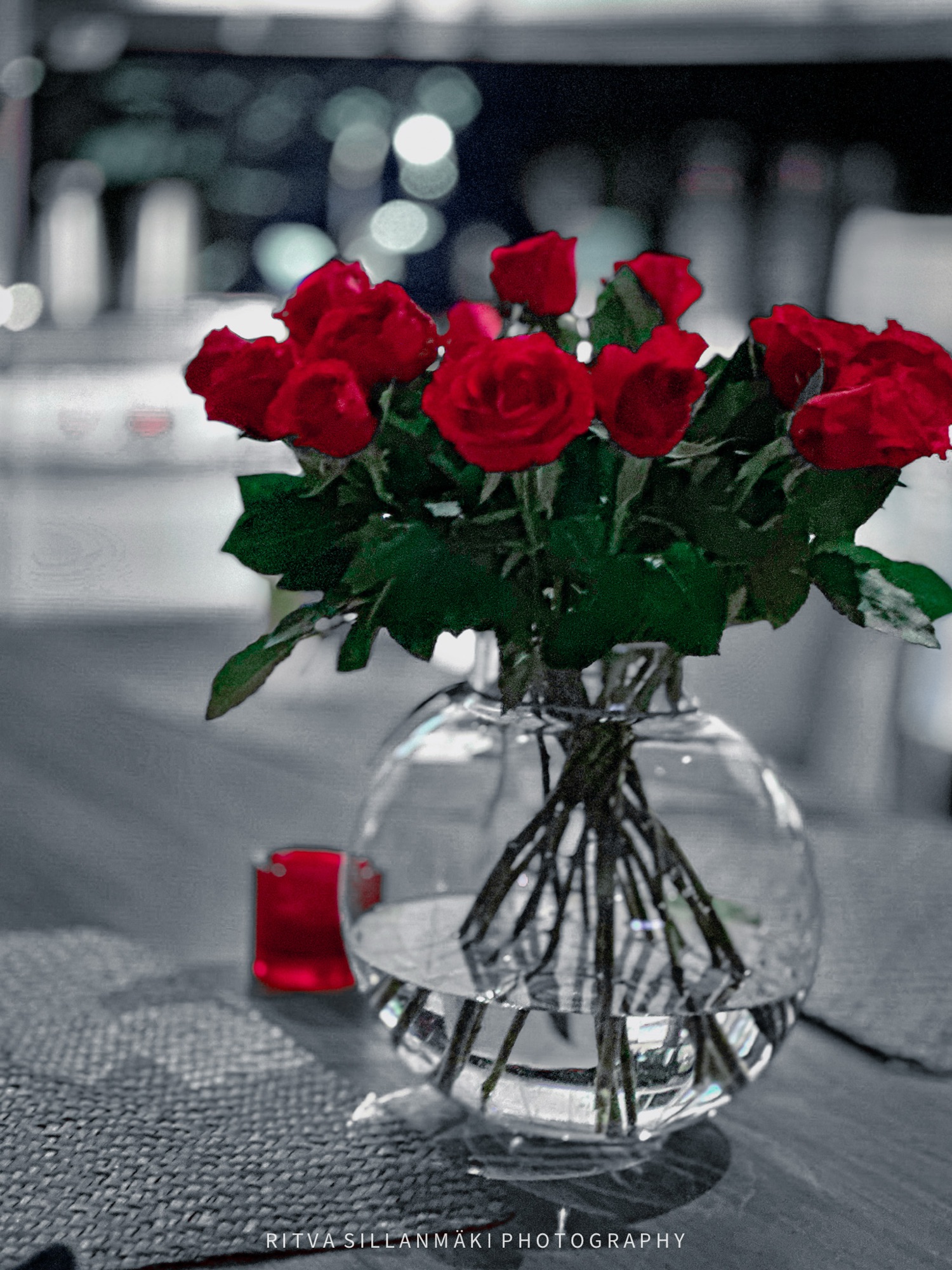
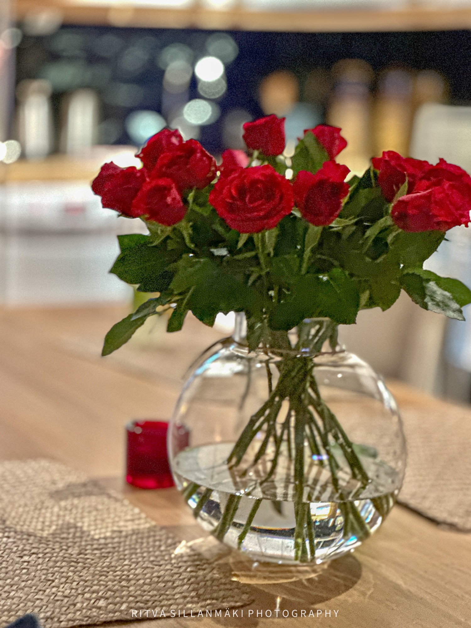
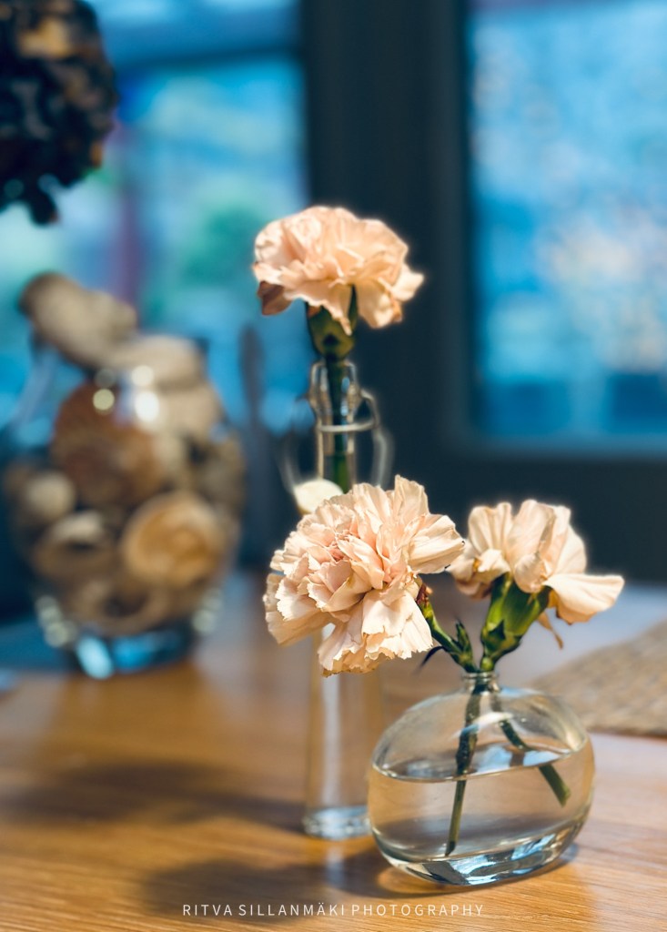
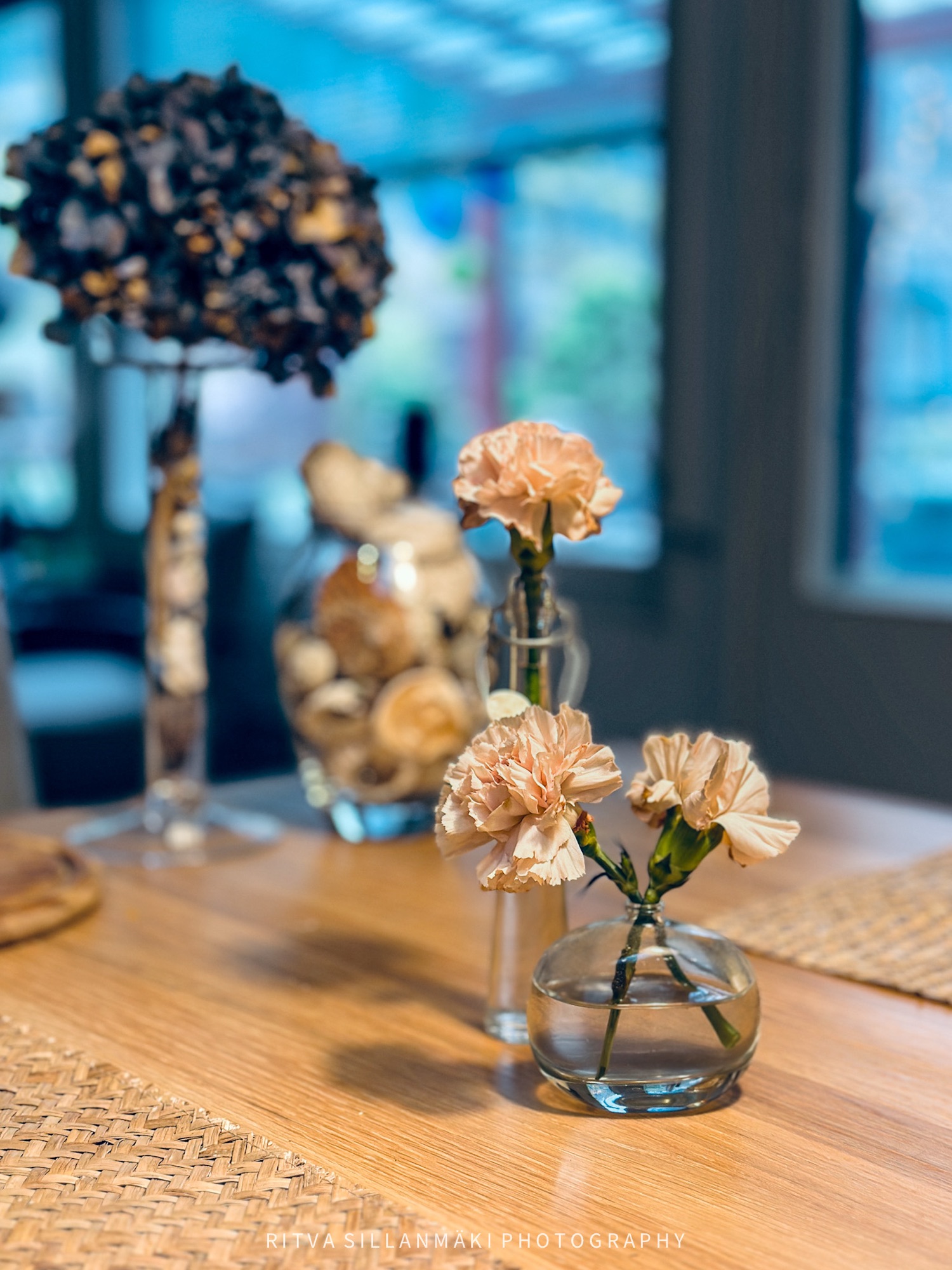
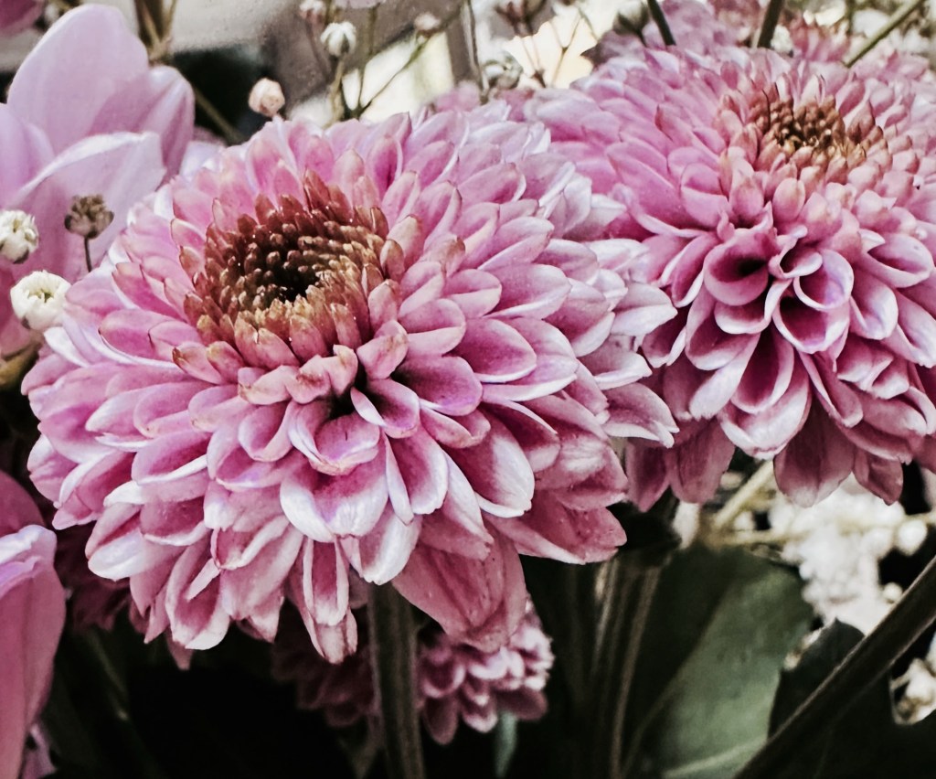
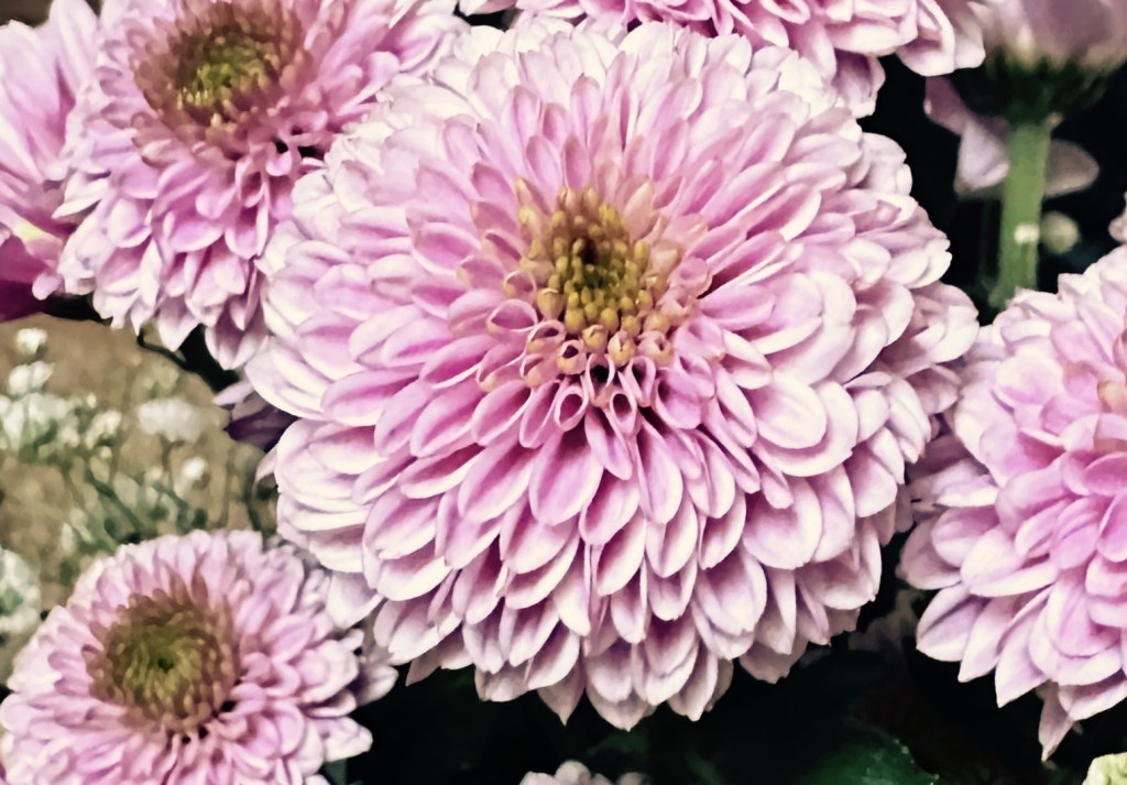
It’s this time of the year here participating in The Flower Hour 13.01.26
It’s this time of the year here participating in The Flower Hour 13.01.26
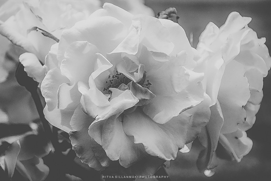
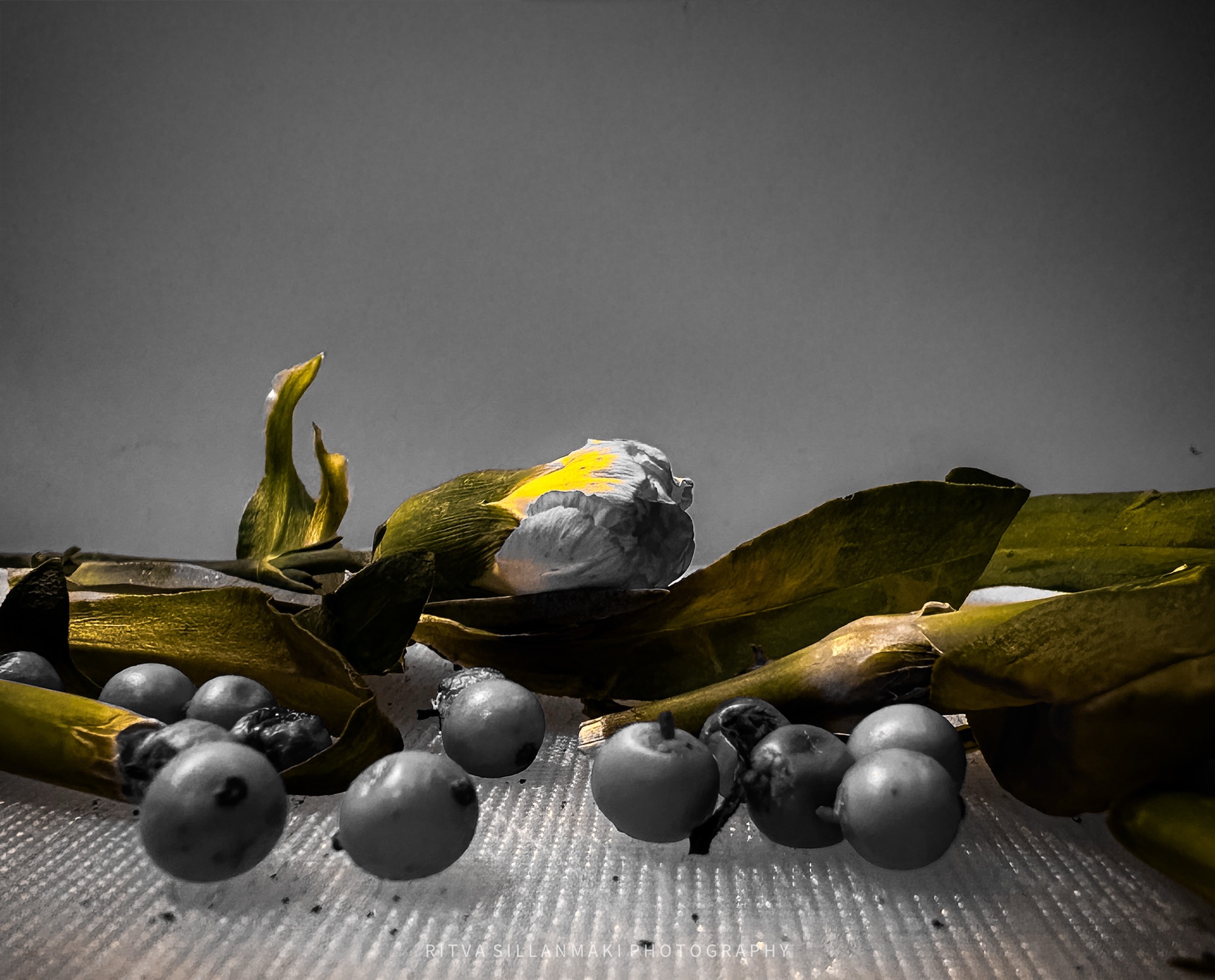
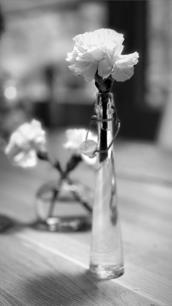
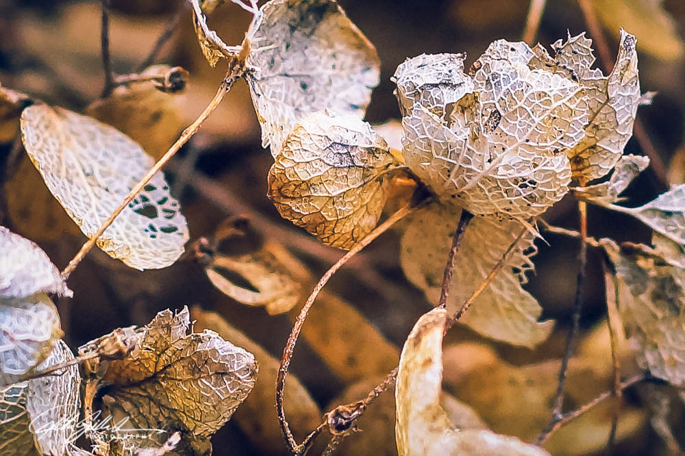
Posted for Leanne’s Monochrome Madness
Let’s kick of the year 2026 for The Flower Hour with a beautiful rose from my archives, showcasing its lively petals. Flowers, they offer us beauty and joy. Particularly during this season when they are so often found only in bouquets, so expect posts of past summer photos,
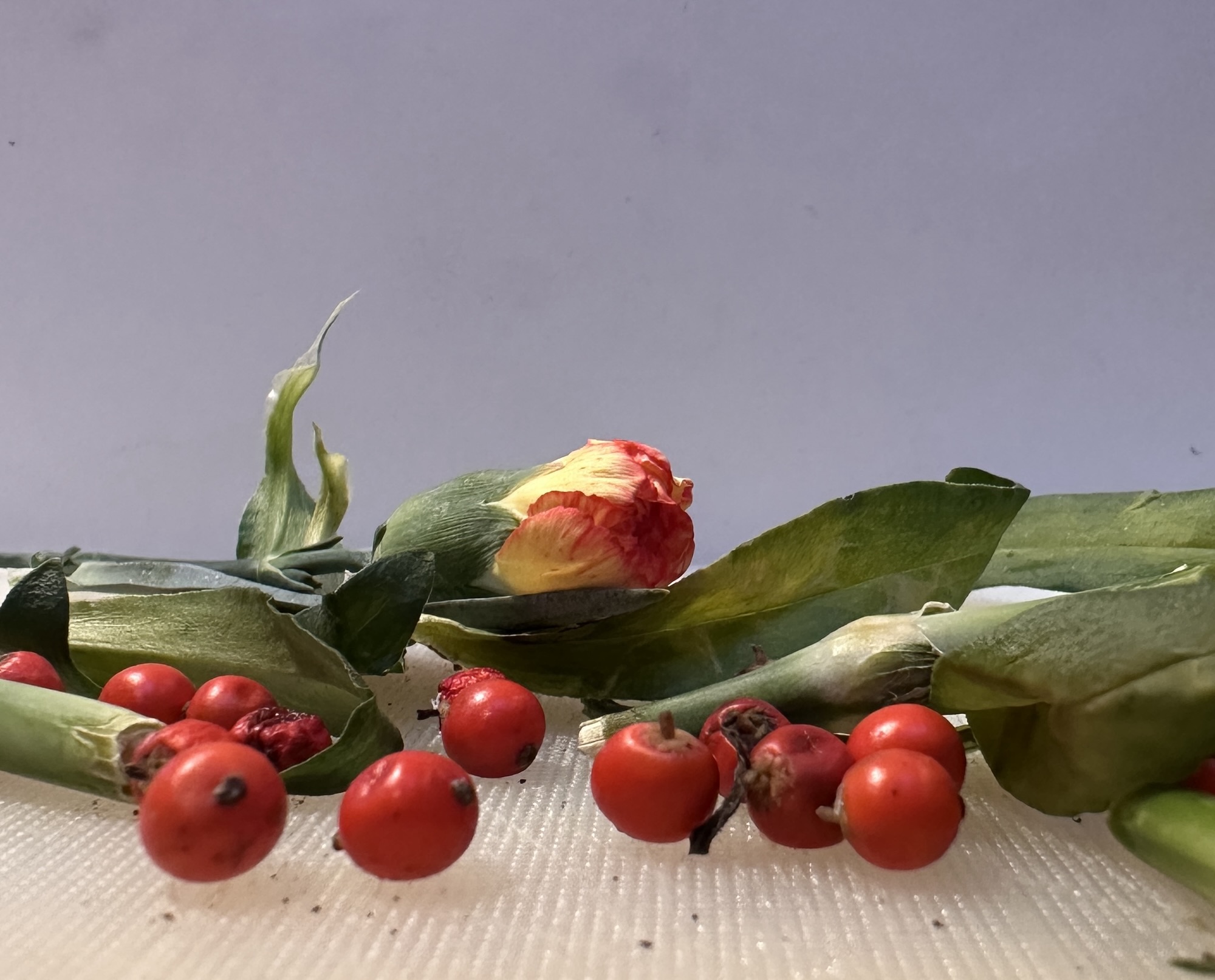
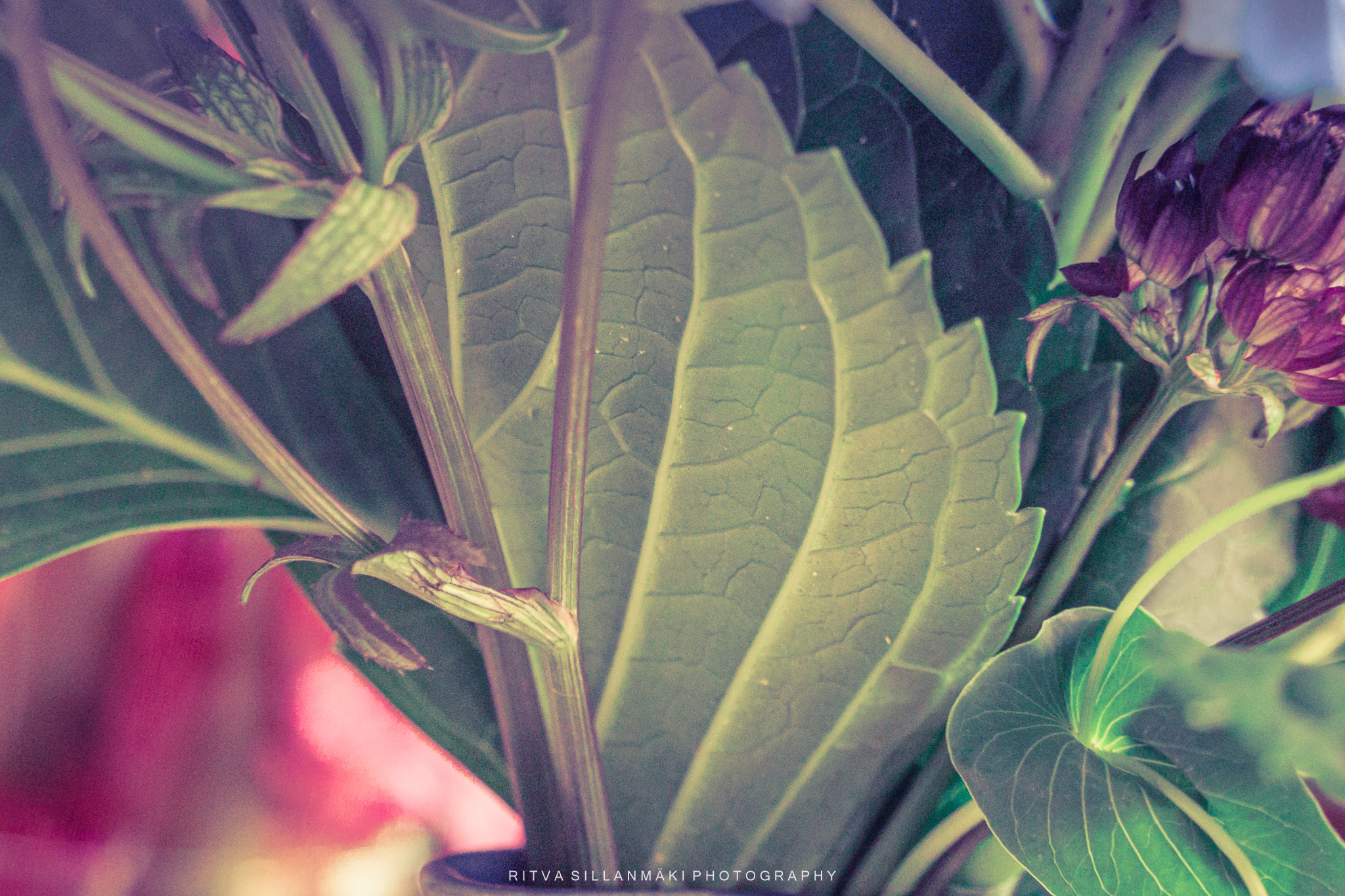
Flowers are often a theme on Tuesdays, a ritual I cherish that brings a touch of beauty to my week. My last bouquet needed to be freshened up with some new flowers as some of them had been way too soon withered, their vibrant colors fading into dull reminders of their former glory, so I needed to remove them with care. As I was doing this, I looked at the cutting board I was using and had an opportunity to share with you the pretty cuttings on it, the remnants of petals and leaves that tell a story of their own. Each little piece seemed to reflect both the fragility and resilience of life. This shows you I have time on my hands and nothing grand going on, just mundane everyday life that often gets overlooked. However, when all is said and done, these small moments, like arranging flowers and contemplating their beauty, bring a sense of calm and joy, reminding me that finding pleasure in simplicity is truly a good thing.
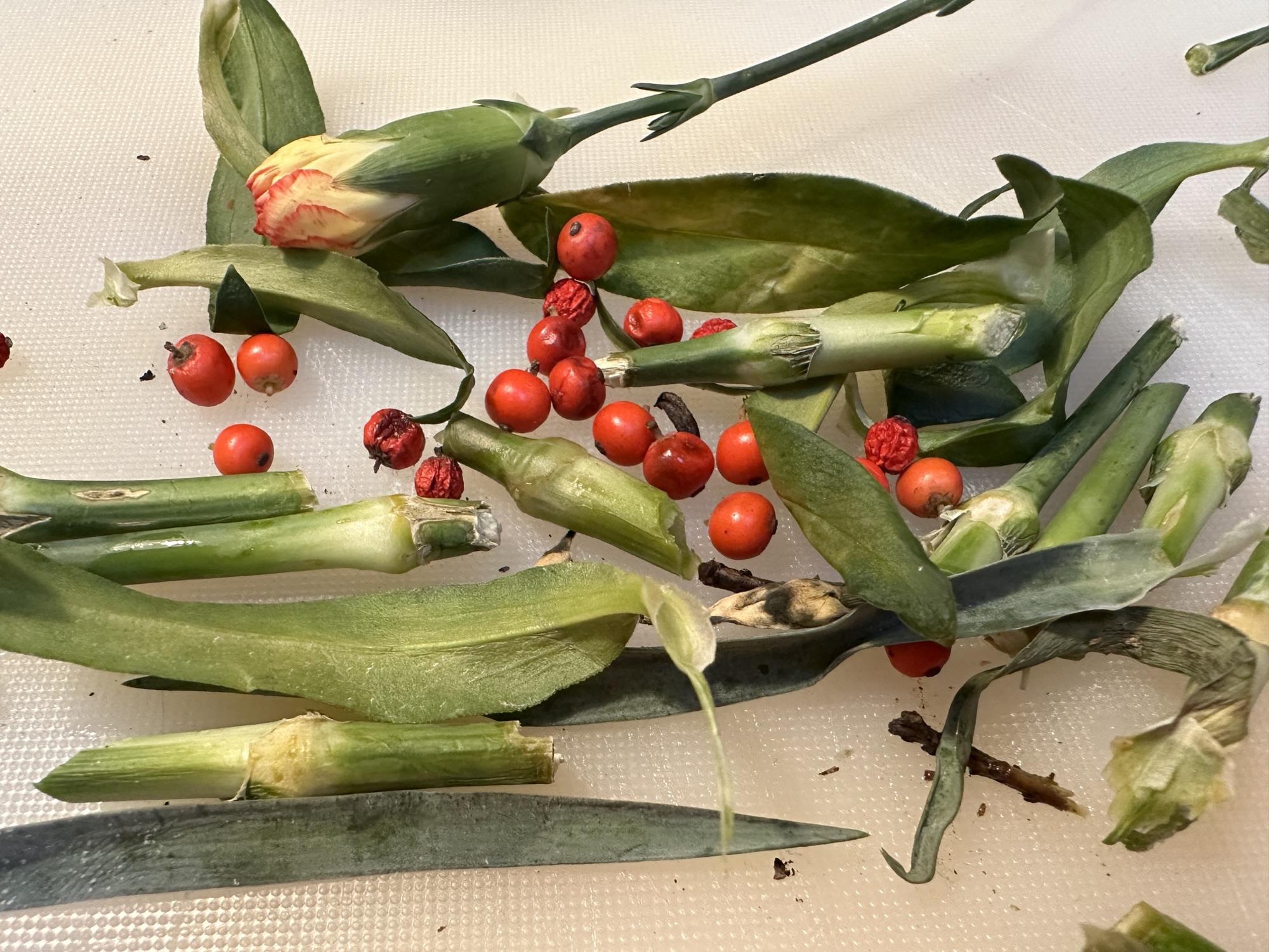
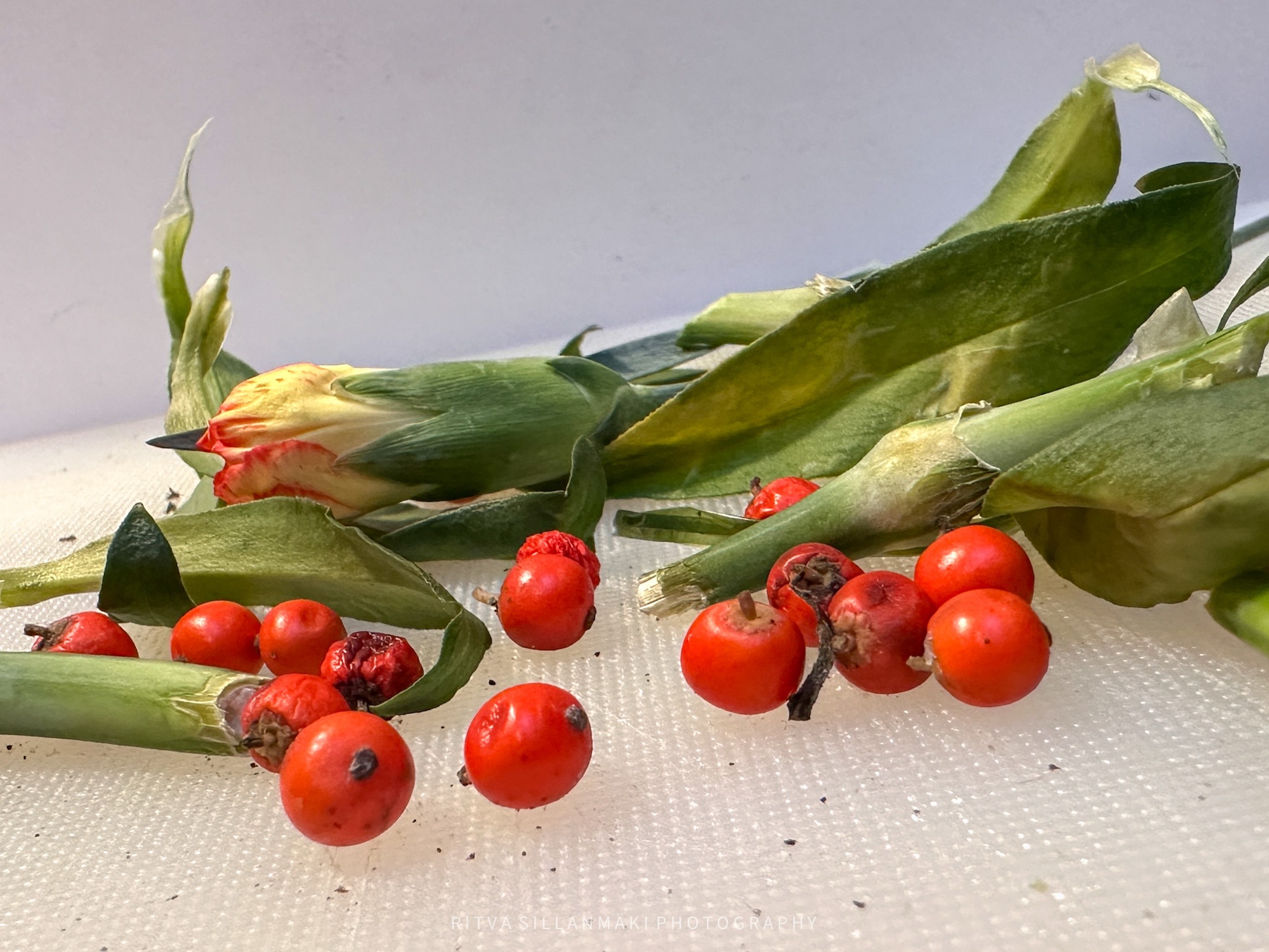
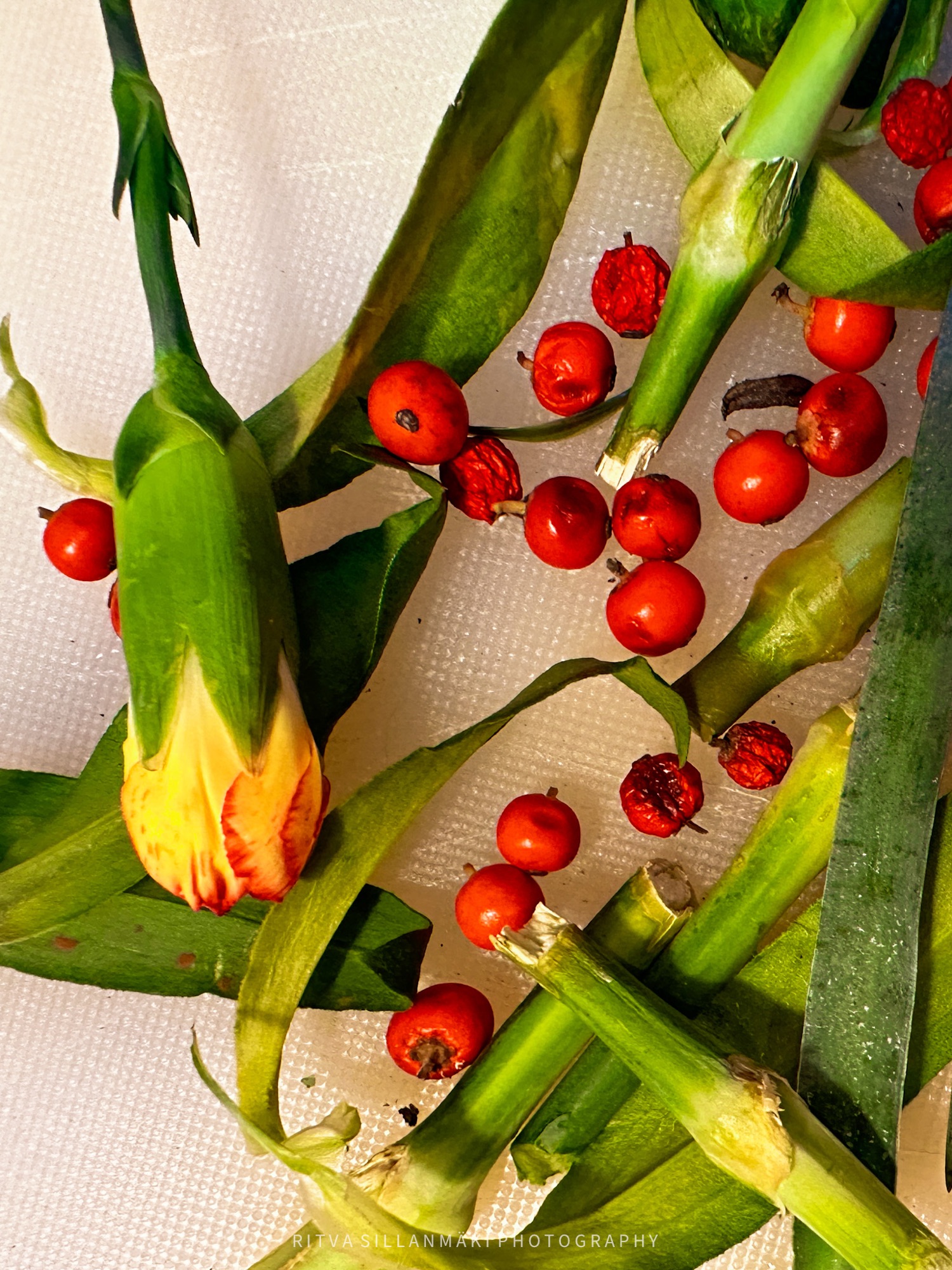
Even they can make for a nice photograph. Or not. But for some reason, I saw something pretty here.
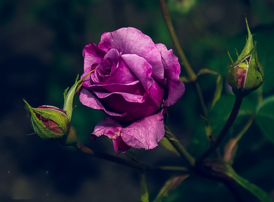
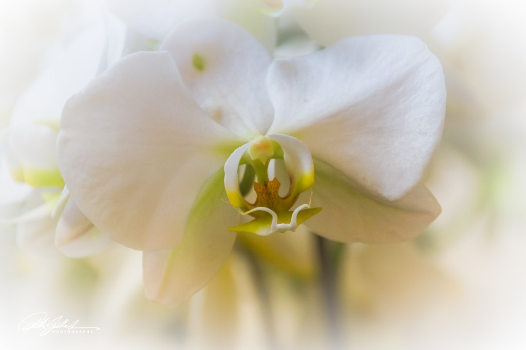
Posted for Cee’s Flower of the Day
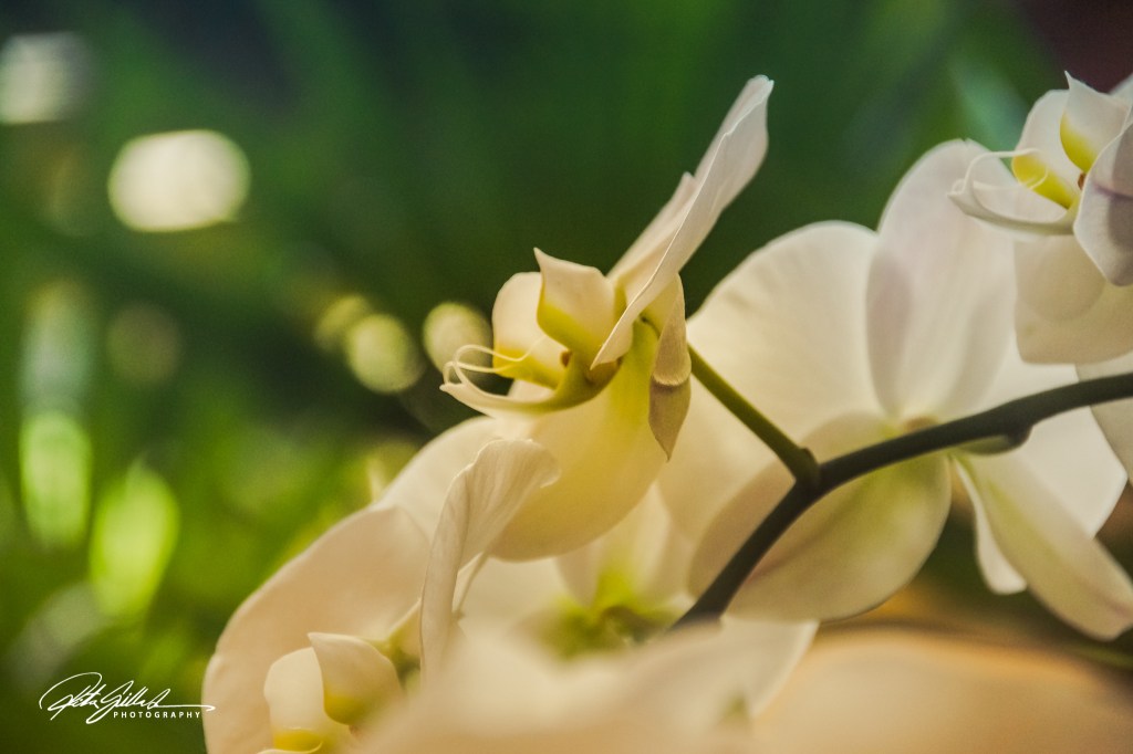
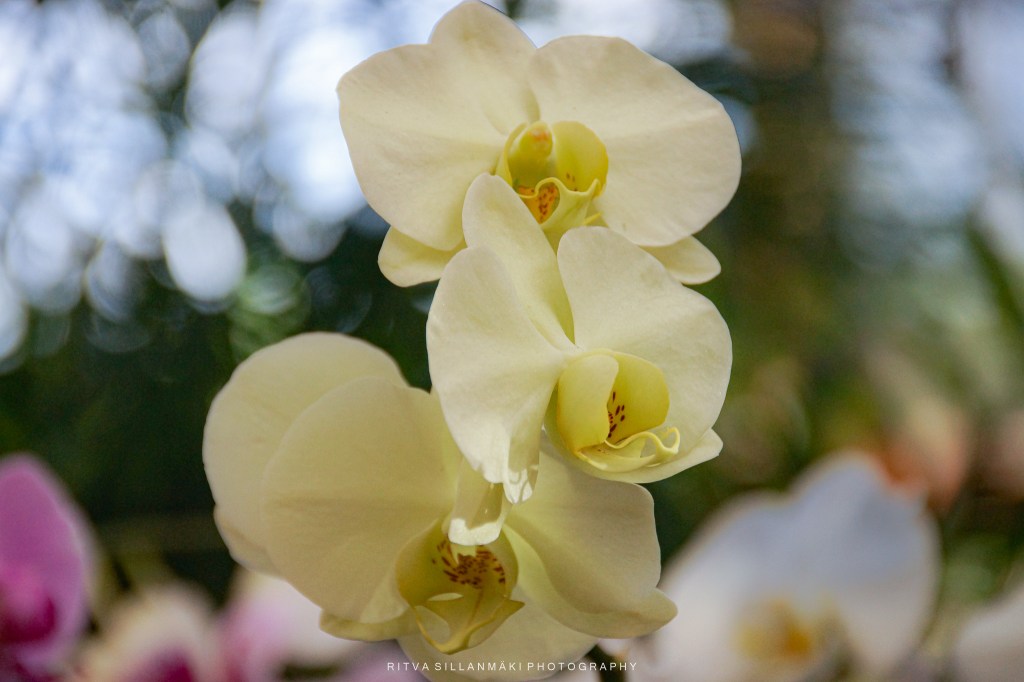
The delicate beauty of white orchids captivates all who encounter them, showcasing their ethereal elegance with every blossom. From their slender stems to the gentle curves of their petals, white orchids embody a tranquil essence. Furthermore, their significance in various cultures, often associated with love, fertility, and strength, enhances their allure, making them not just a visual delight but also a meaningful floral gift.
For Terri’s Flower Hour. See more responses here.
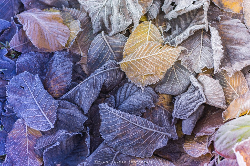
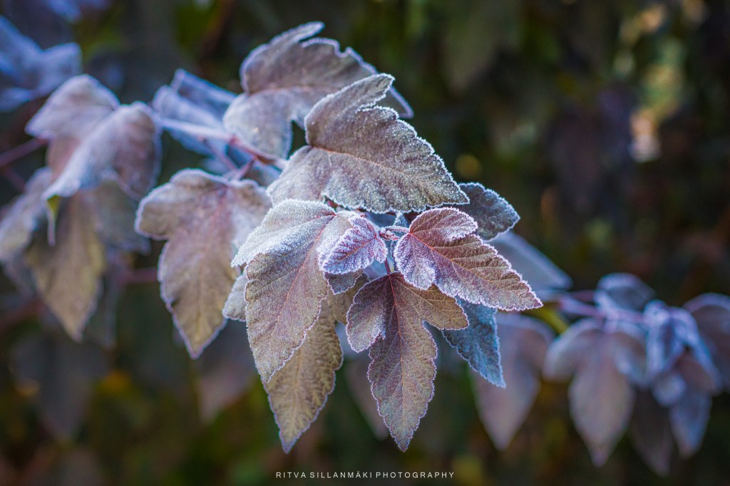
Frost-kissed leaves in silence lie,
A muted palette beneath a gray sky.
Brown and gold decay, whispers of gray,
Purple hues linger, fading away.
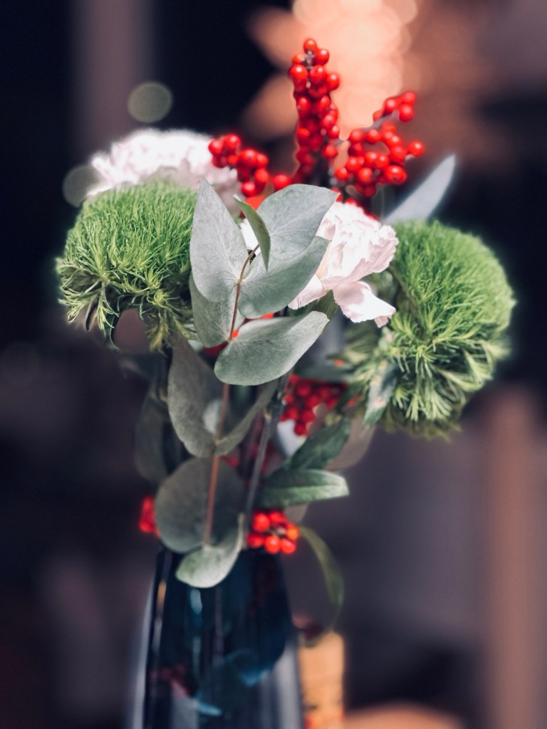
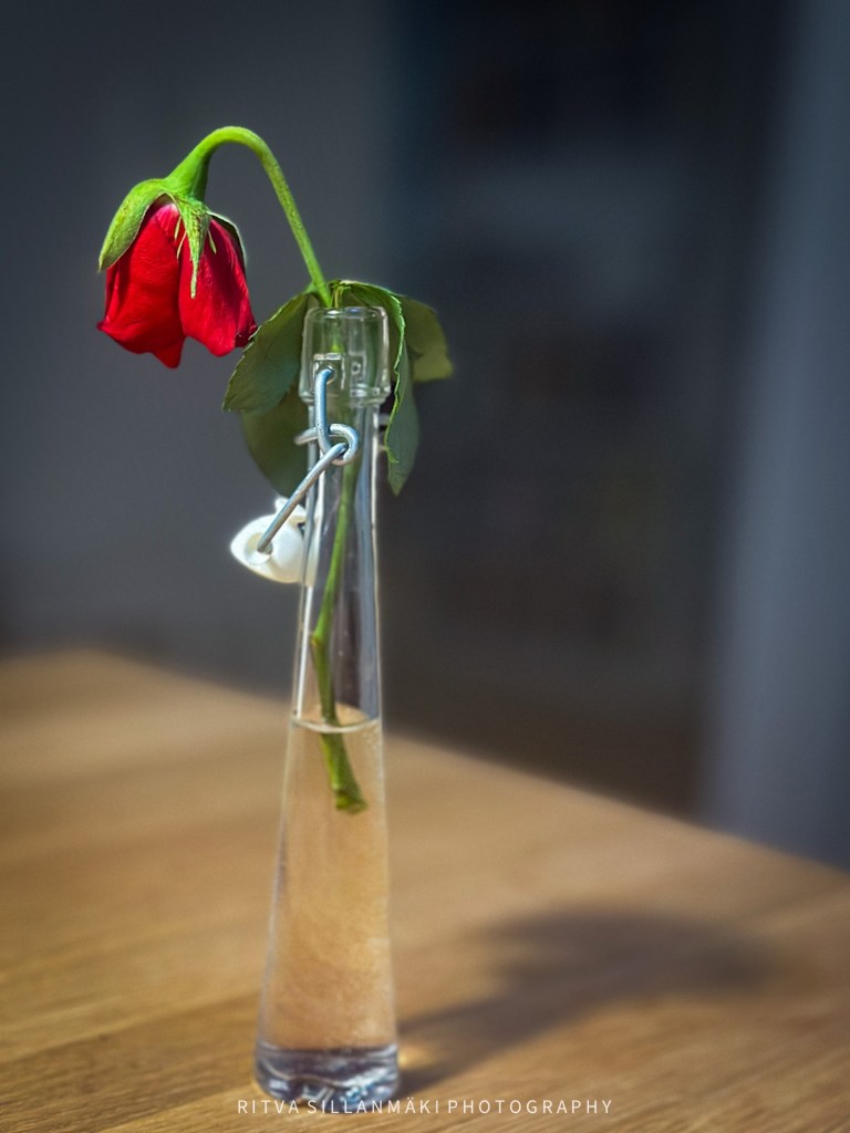
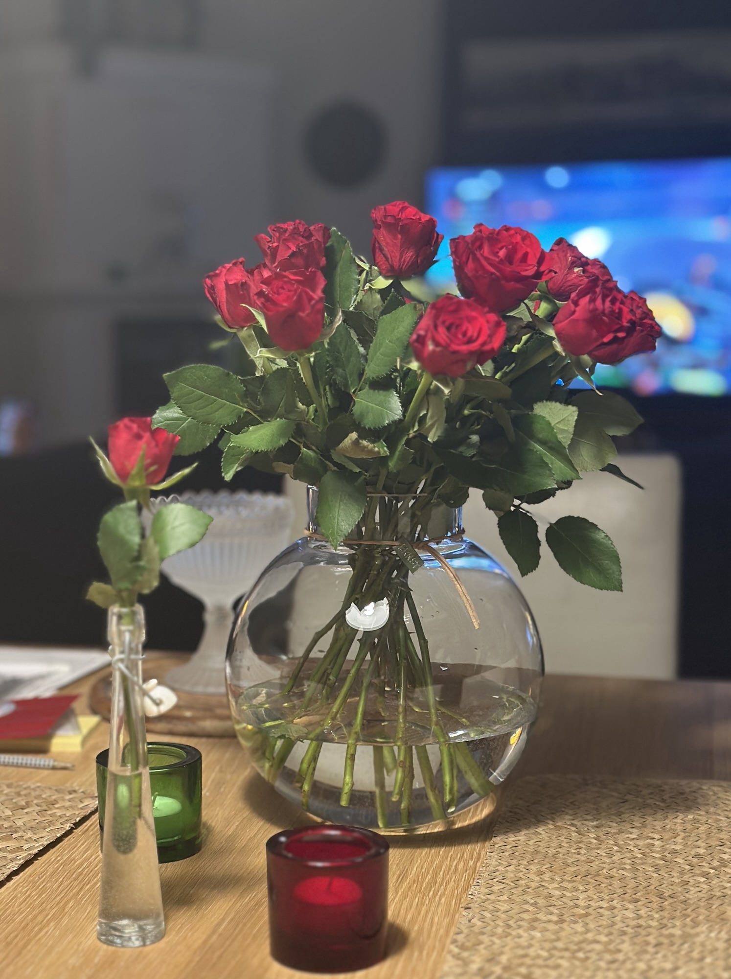
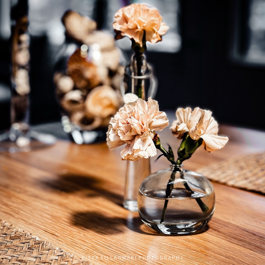
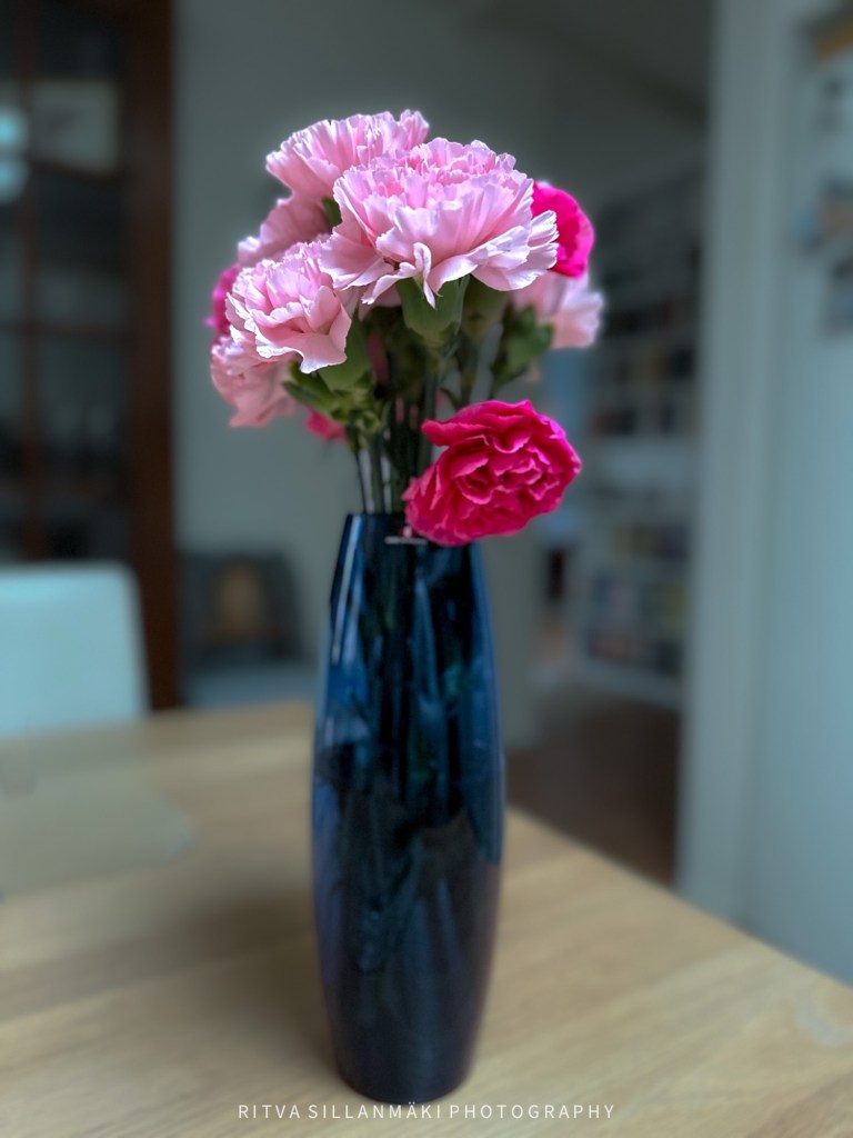
I got a request to show my new vase with flowers that I featured in my how to survive November round post. I am not happy with any of these, not even the edited one.But here they are for John’s Cellpic Sunday.
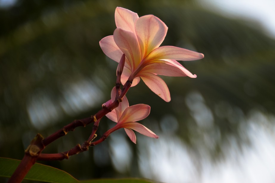
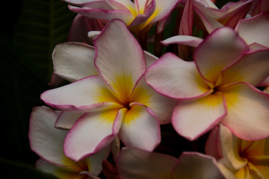
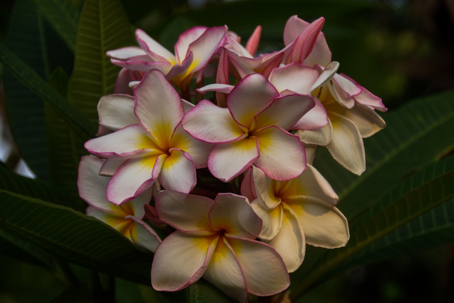
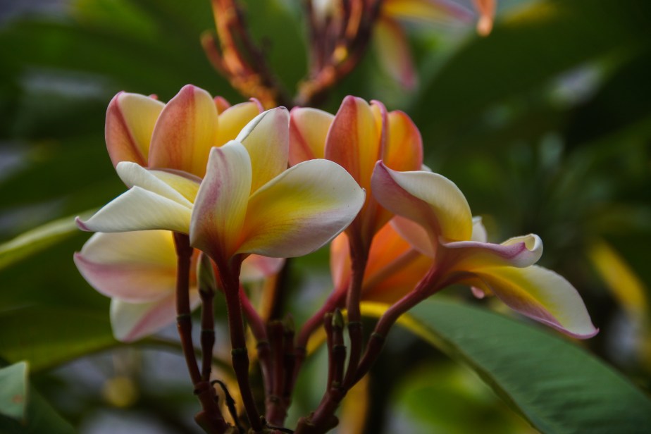
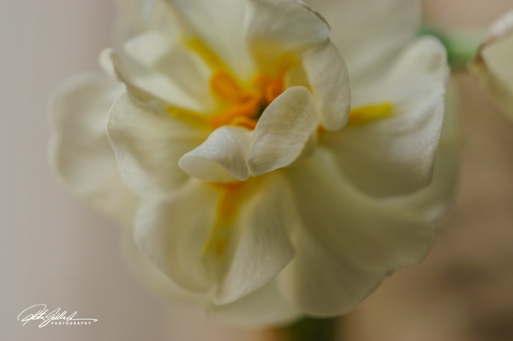
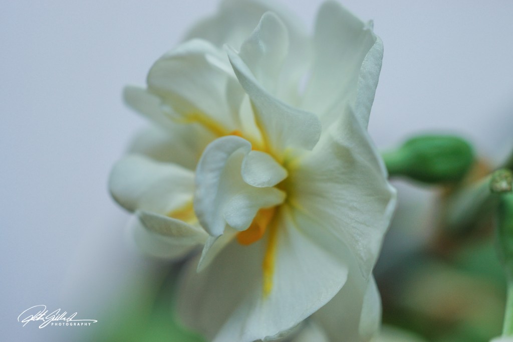
For this week’s edition of The Flower Hour, I present to you images of the flower commonly referred to as Plumeria or Frangipani. These exquisite and aromatic blooms are a delight for all the senses and carry a plethora of cultural significances from tropical regions across the globe. Plumeria is frequently incorporated into various celebrations and ceremonies, as it symbolically represents love, devotion, and beauty. They exhibit a wide array of colors, ranging from gentle pinks and whites to vivid yellows and reds.
I posted photos on November 7, showcasing the beautiful carnations that I had carefully bought, and yesterday I took these images of the flowers still left, vibrant and resilient. They have proved to give me a little bit of everyday happiness for nearly three weeks, brightening my space and lifting my spirits amidst the usual routine. The simple joys in life, allowing me to pause and appreciate their beauty, as they subtly transform each day.
I did lots of edits so I could get all these challenges into one post; my internet connection is acting up, and it kept breaking up constantly yesterday. I made comments, but they did not show up for me as done, etc. It has cut me off a few times already, so after this post, I am going to paint for the rest of the day. This is too frustrating for me. Wishing everyone a great day.
Oh to continue about frustrations, I learned this morning that out water would be got of for a day, hopefully less. But I found this out after the fact. Great start for the day, no coffee for me,
NovemberShadows and How to Survive November , also Monochrome Madness last but not least The Flower Hour #8 as all the photos are of flowers 😀
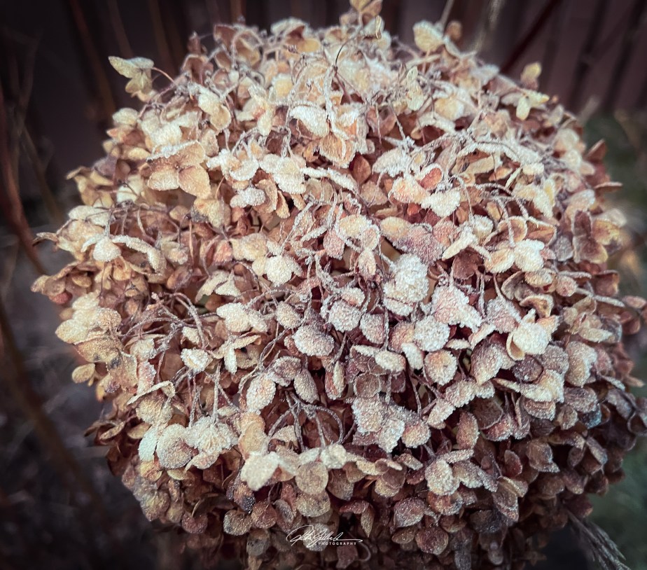
Today, I want to share something frosty for the How to Survive the November.
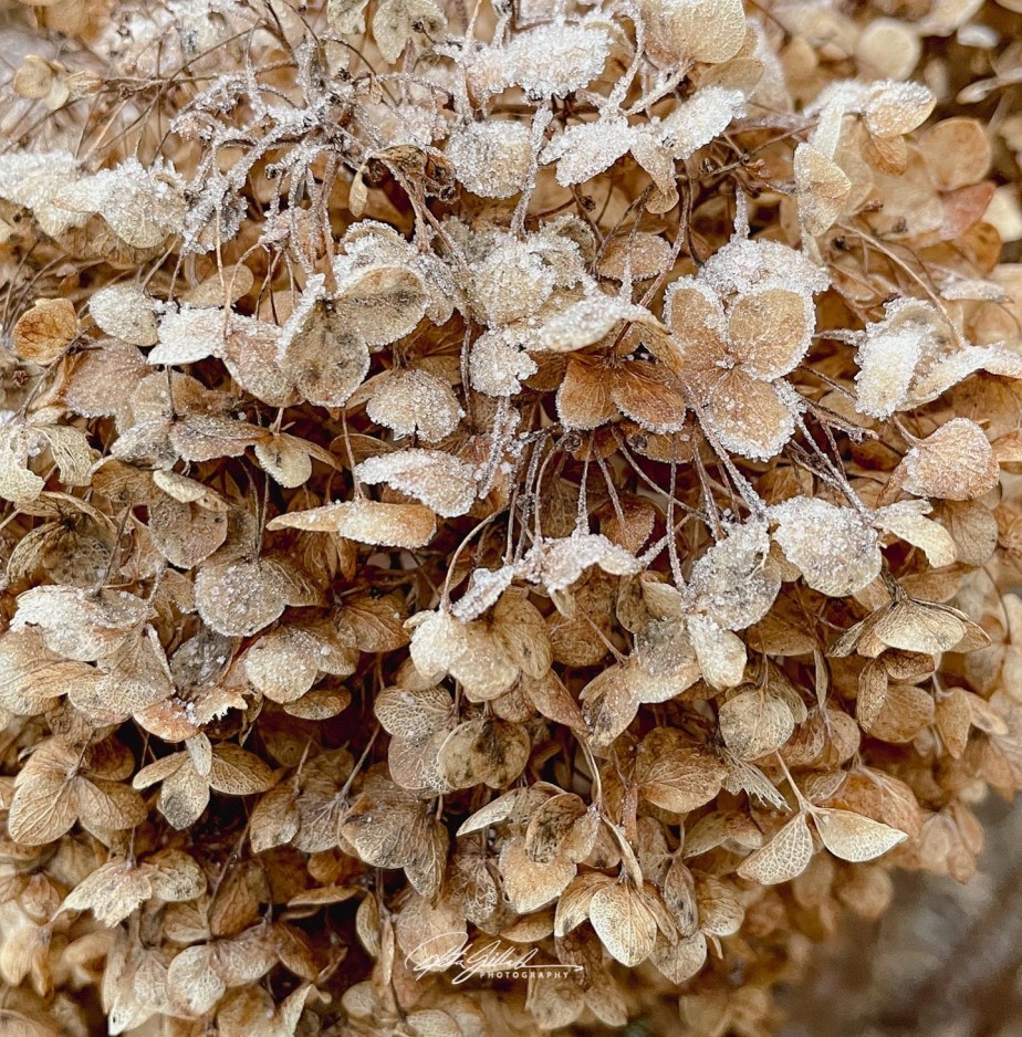
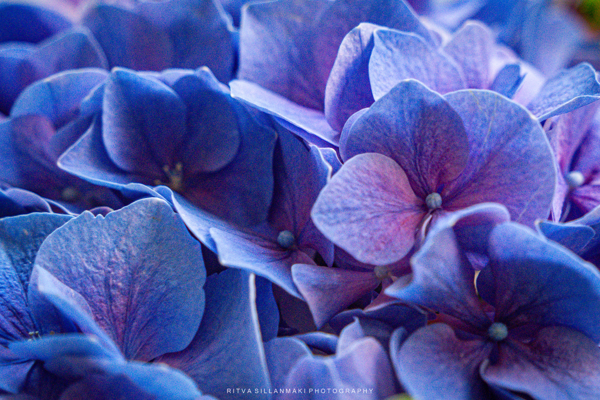
It’s super cold out there; right now, it’s -7C / 19F. These hydrangeas outside my window look like they’ve braved a freezing night, their delicate petals all frosty and glimmering. The sun’s shining and lighting up the flowers, which I managed to snap a pic of—the frost really does its thing, turning something basic into something special. I can’t help but admire how nature shows off its beauty even in the dead of winter, reminding me that there’s always something to appreciate, no matter how freezing it gets. I don’t need to look for anything else today; this round it up for me.

November begins, and we’ll keep this year rolling forward. The theme is ’round’, and you can interpret it any way you like. It can be a photograph, a painting, a drawing, a new or old picture, anything. Hopefully, it has ‘that certain something’.
Inlinkz- link for your entry is at the right column.
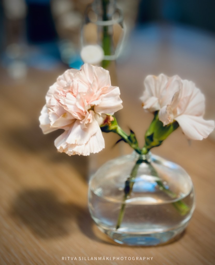
Flowers are good for all occasions and places, so I’ve forgotten to post flowers lately, but here is one for , a bit late but I don’t care if she doesn’t. Terri’s The #Flower Hour
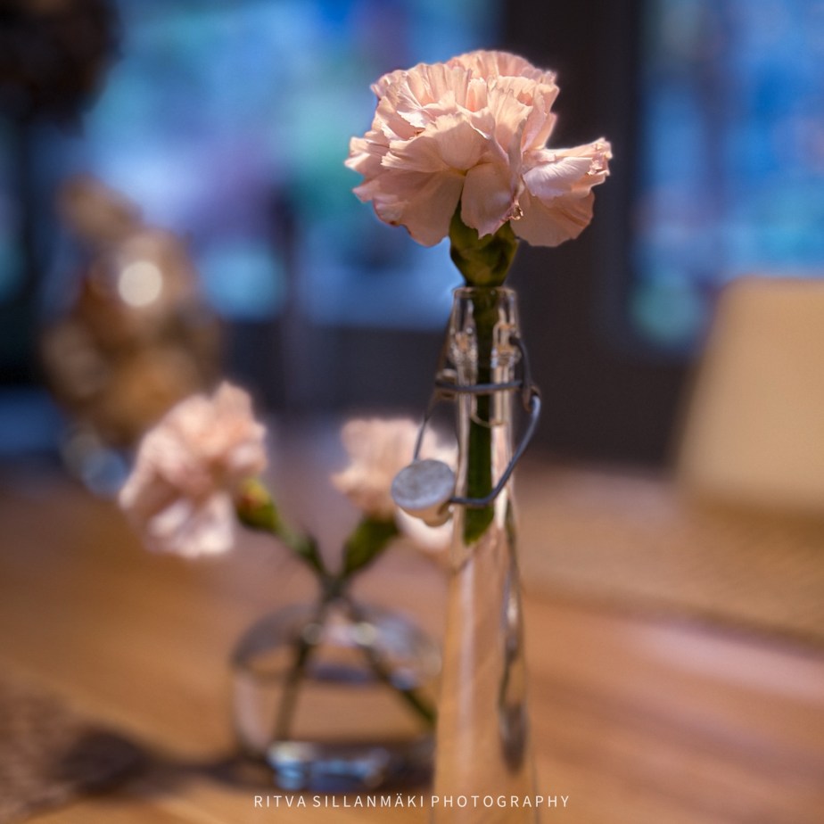
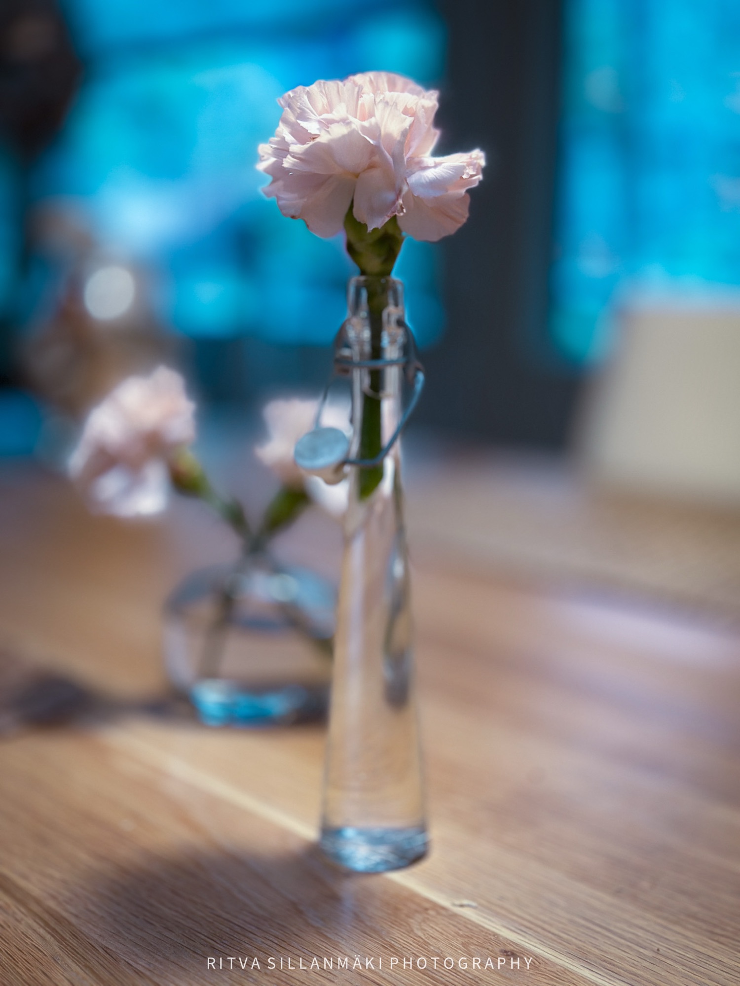
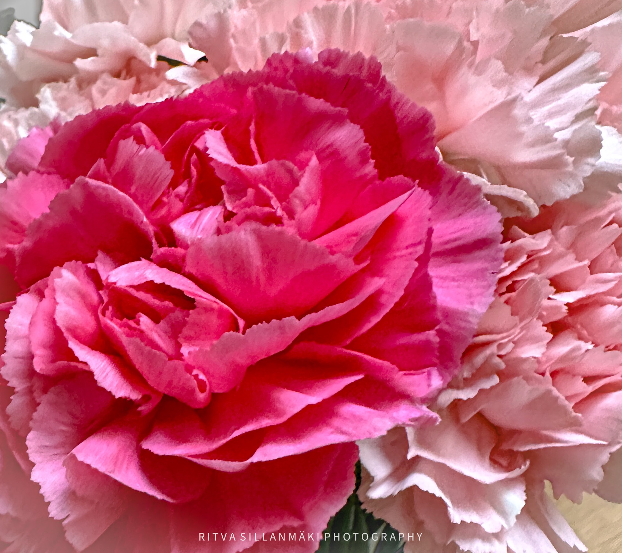
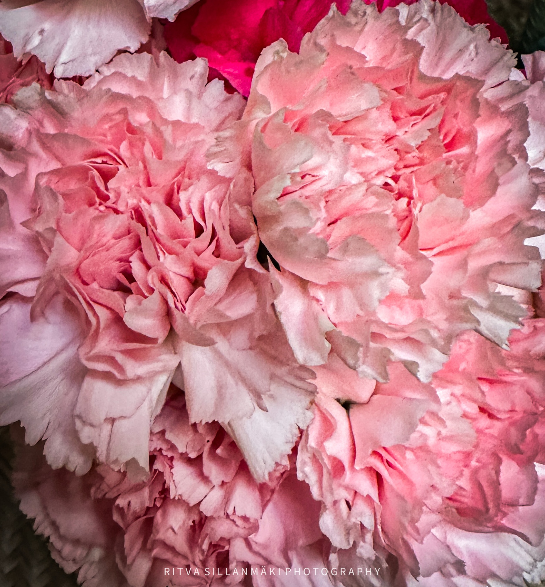
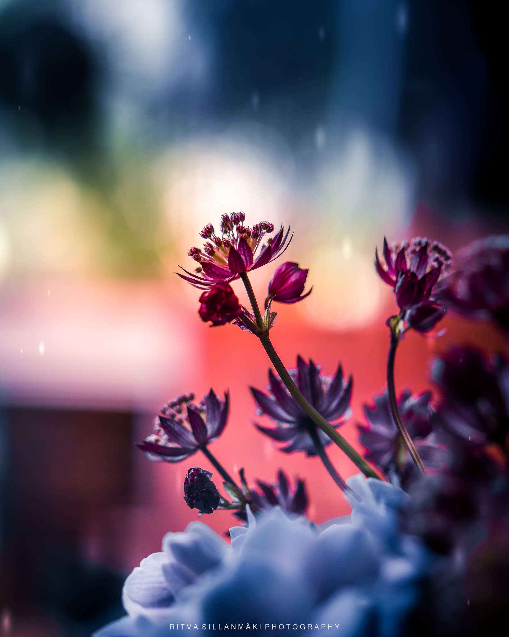
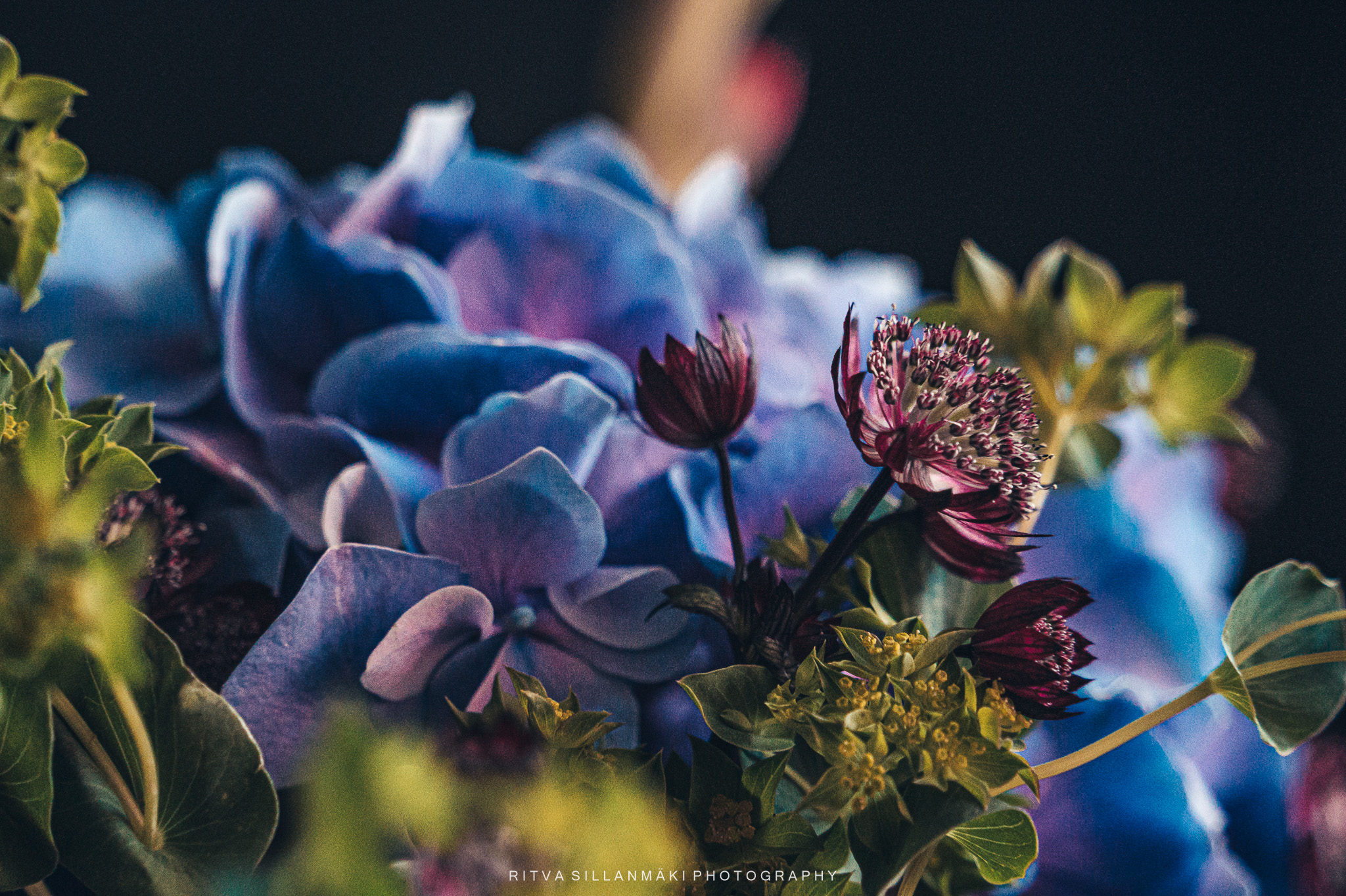
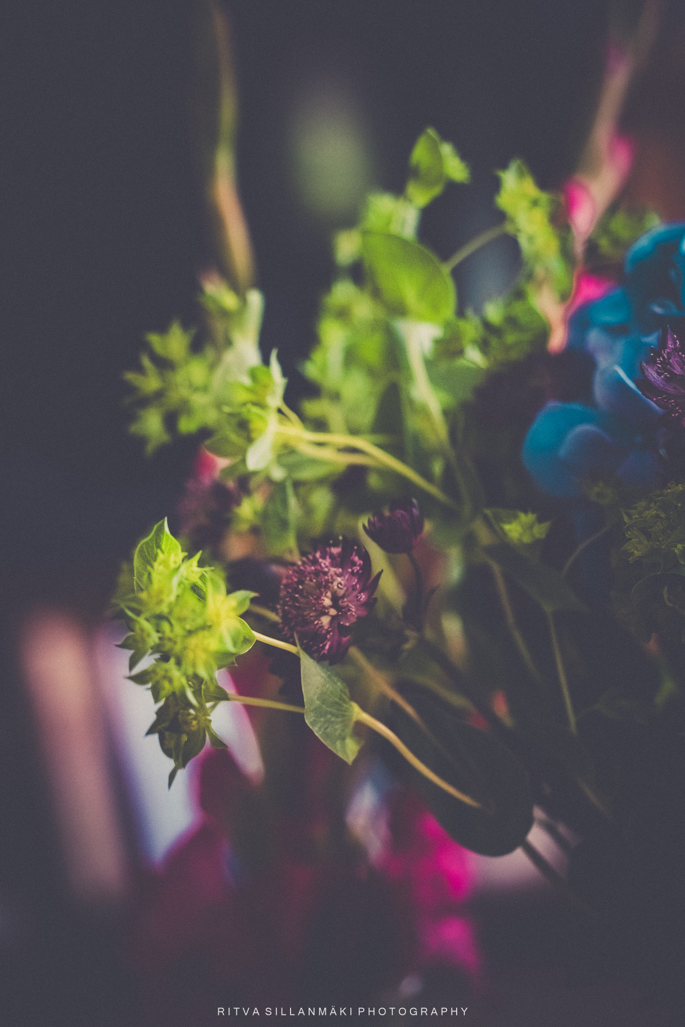
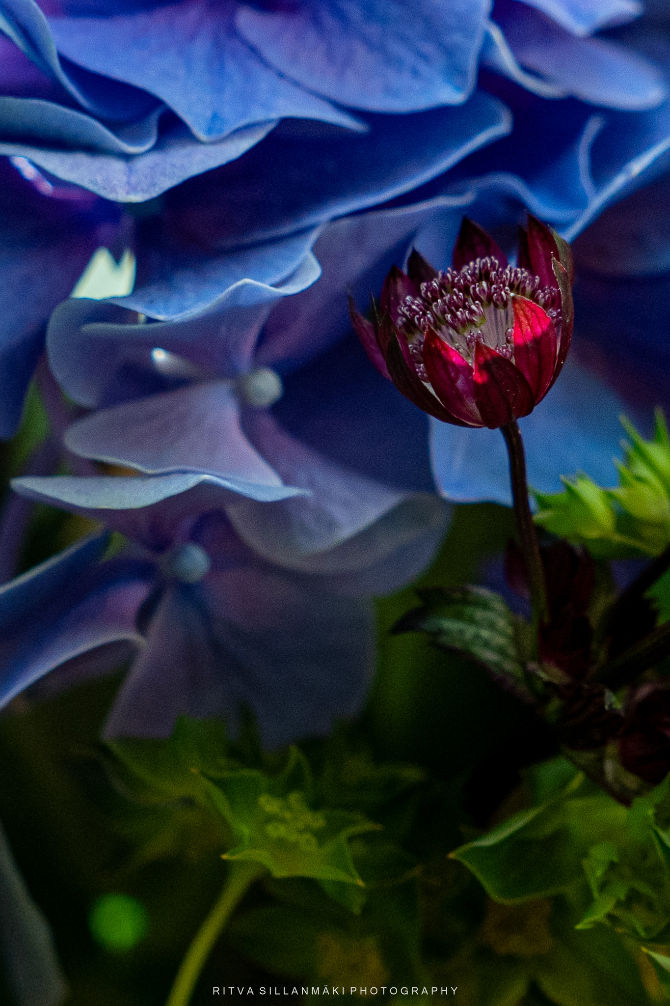
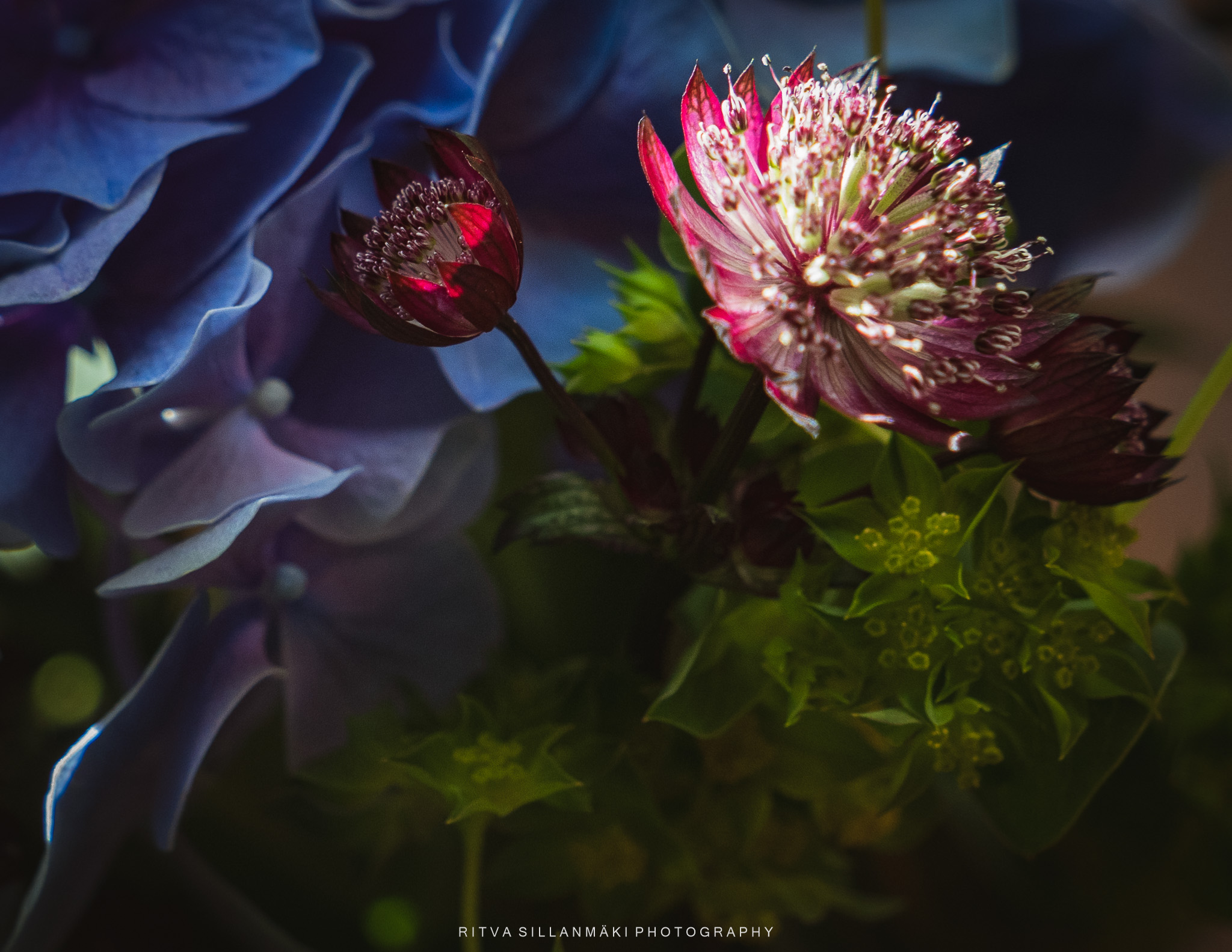
I have two photos with slightly different compositions; also, the chosen color schemes are different, one with blue tones and the other with warm tones. So different in mood—same flower. One feels more welcoming; the blue tones have a somewhat distant, unapproachable feel. Am I still talking about a flower? 😂
Carnations are such simple and pretty flowers that last a long time, and it’s no wonder people have loved them for ages! With their cool fringed petals and bright colors, these blooms come in all sorts of shades. Their staying power in a vase, makes sure they keep bringing some joy and color to your days for a while, so it’s easy to see why I buy them.
For Terri’s Flower Hour
These sunny and vibrant flowers are my choice to remember and a tribute to Cee, as all flowers are.

Frost-Covered Hydrangeas are like nature’s own little masterpieces, turning into stunning sculptures when winter rolls around. Their petals get decked out in sparkling ice crystals that catch the sunlight just right. Each flower, once bursting with color, now shows off a quiet kind of beauty, capturing that moment when nature shifts from cozy warmth to the peaceful chill of winter. These lovely blooms not only highlight the cool designs frost creates but also urge us to take a closer peek at their fading colors and shapes, reminding us of the never-ending cycle of life and how nature stays elegant, even when it’s resting.
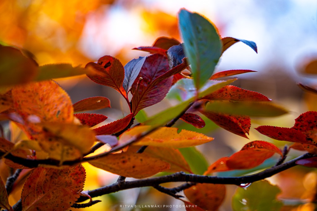
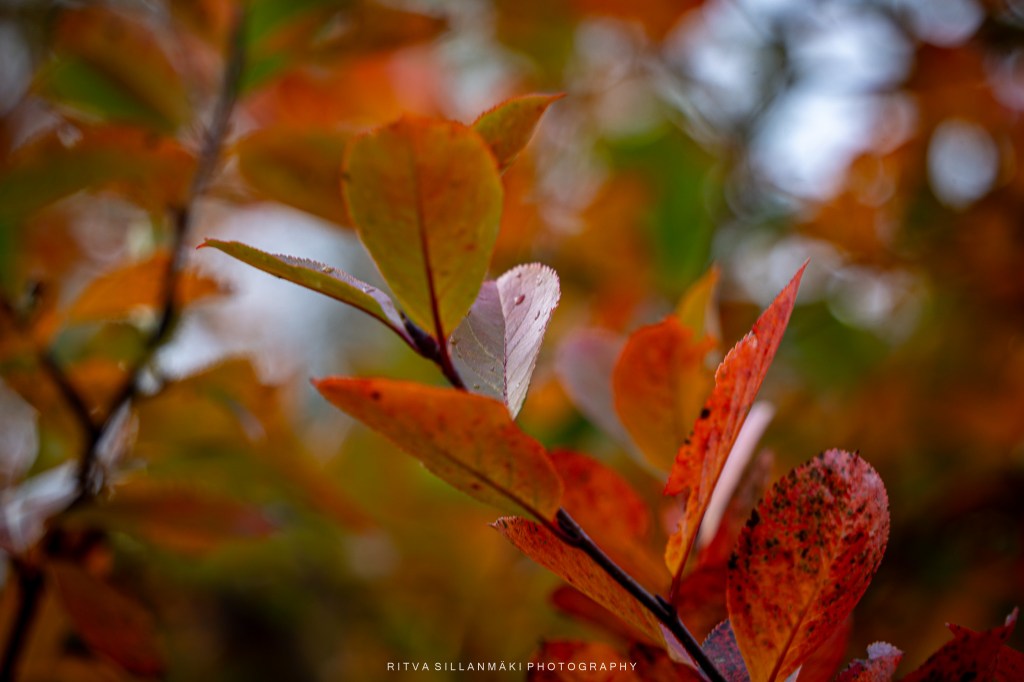
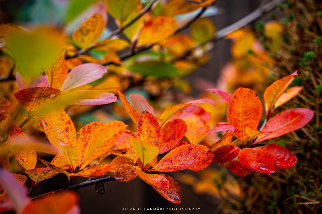
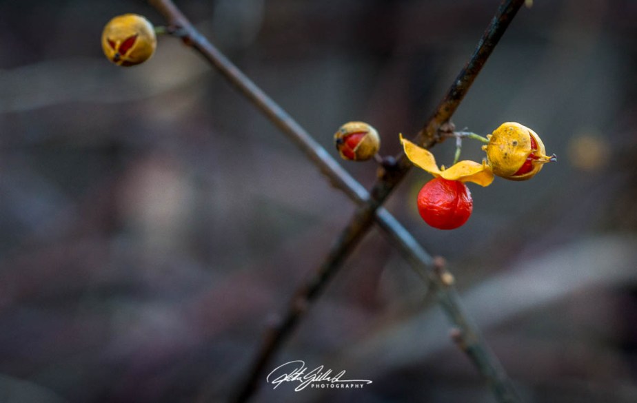
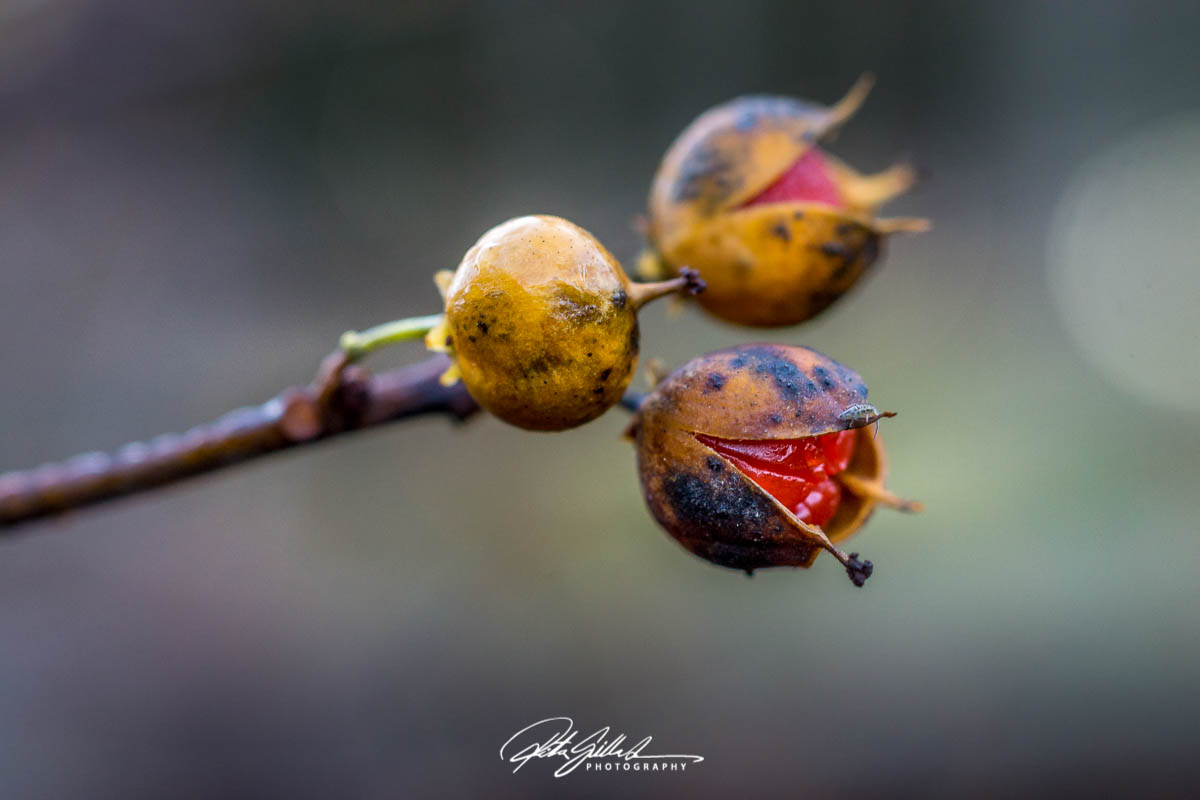
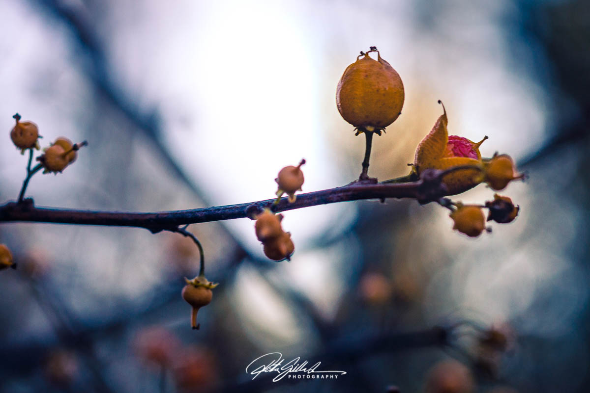
It is one day away from November, the grayest month of the year. This plan has not many leaves left, only few bright colored berries.
What we have to look forward to: November really feels ( it is, not just feels like ) like the gloomiest month, especially down south, where the thick clouds block out the sun. You can expect a mix of rain, frost, and sometimes a little light snow, with temps hanging around 0°C (32°F), usually between 1–4°C (34–39°F) during the day and dropping below freezing at night. The days get shorter, going from about eight hours of daylight at the start to six or even less by the end of the month. Plus, November tends to be super wet, filled with rainy days and overcast skies, and you might find some icy, slushy spots, although you can’t count on snow sticking around just yet.
It might be best to take this advice to heart: layering up is a must—think warm, waterproof jackets, thermal base layers, hats, gloves, and waterproof boots to tackle the cold and damp.


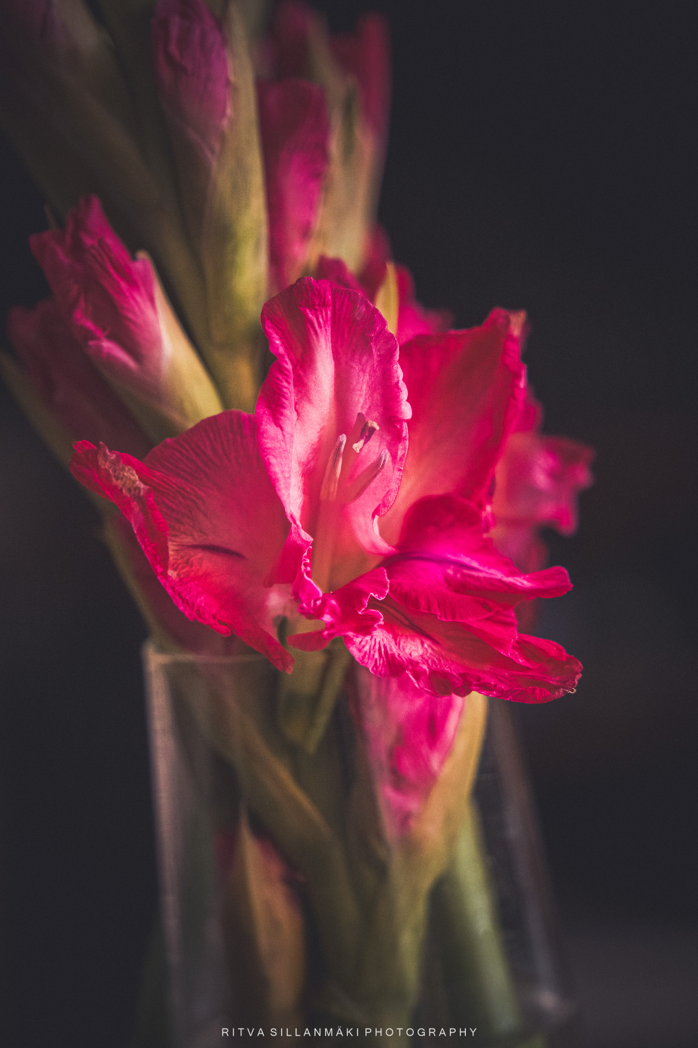
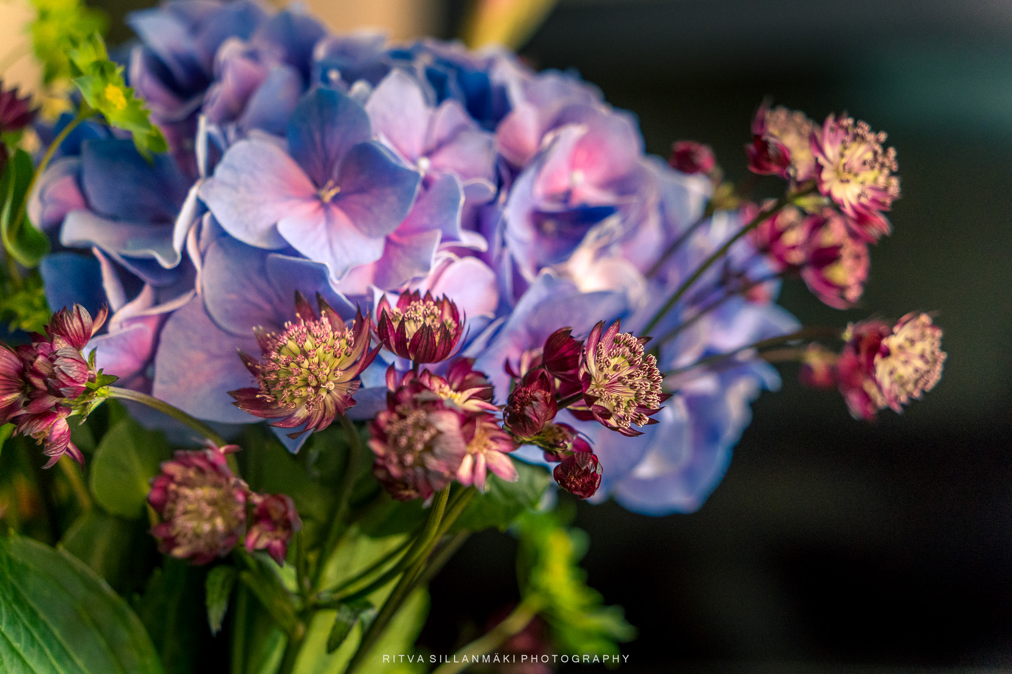
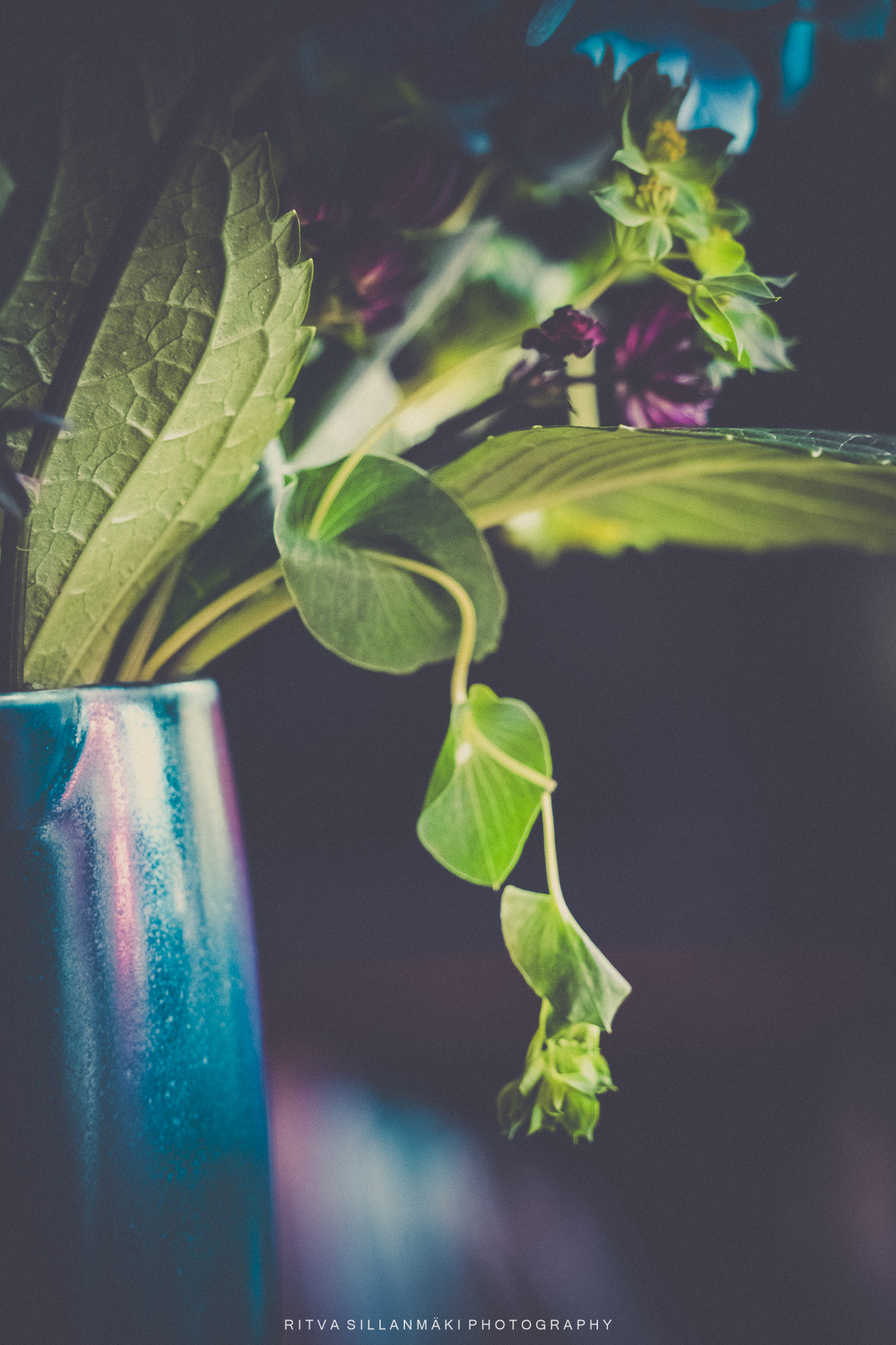
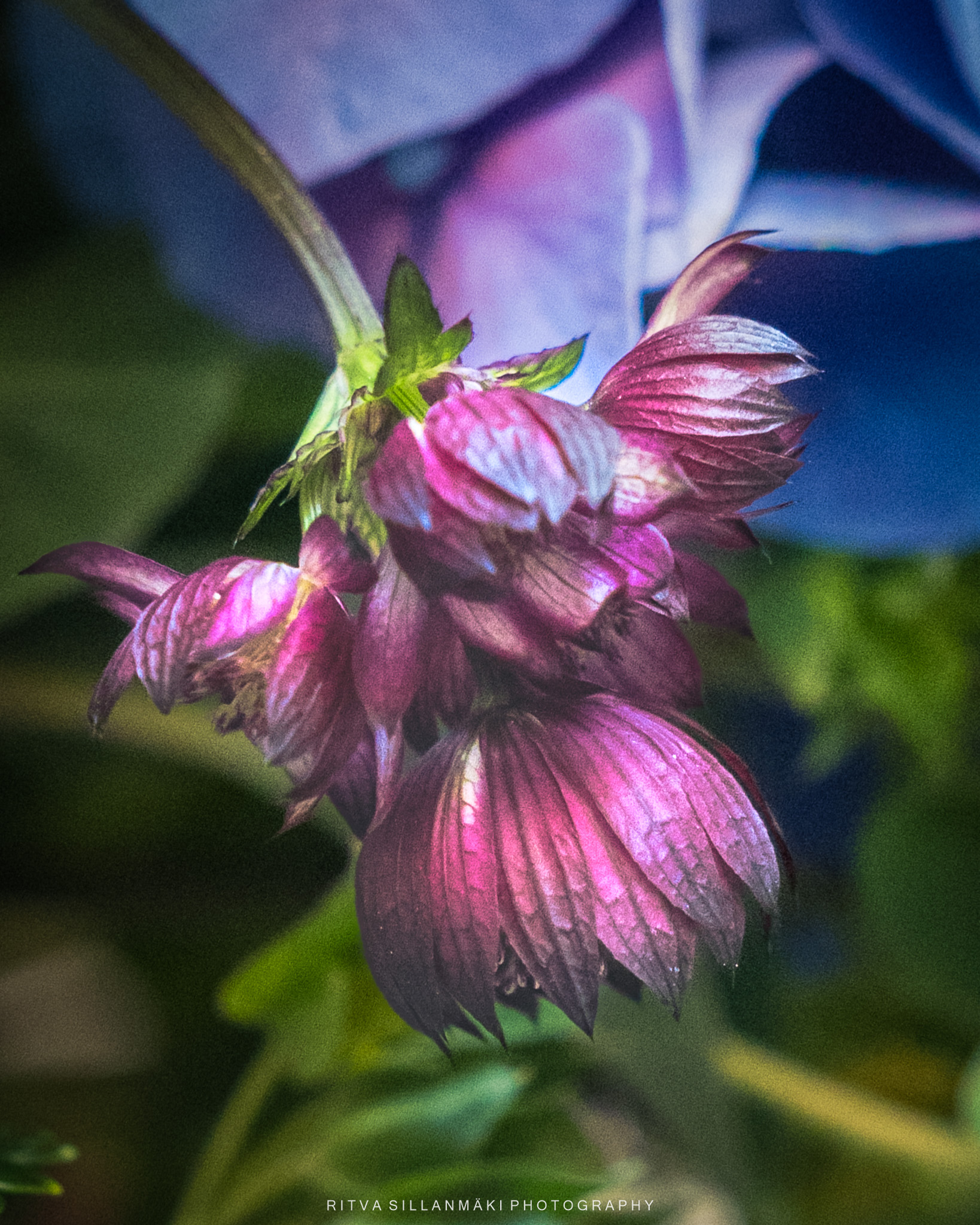
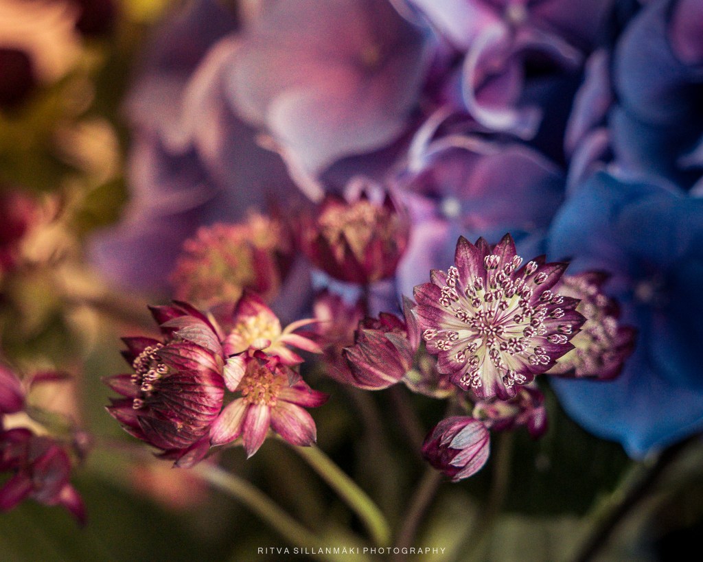
Mood Board – featuring blue and red tones for interior design. I’m beginning with the vibrant shades of blue hydrangea paired with a bold red flower, which will be the centerpiece of this color scheme. A whimsical pink gladiolus adds a playful touch, while a purple great masterwort contributes depth and personality to the overall look. To ground the design, lush greens and muted greens will be integrated through decor or accents, offering a natural essence that tempers the vivid colors. This blend of floral inspiration and striking hues cultivates a magical atmosphere, ideal for transforming any space into a chic and welcoming environment. However, which rooms would suit this palette? In the Nordics/Scandinavia, we tend to lean towards natural and subdued whites and beiges. Yet, I have witnessed beautiful vibrant designs in Britain. I’m curious why this contrast exists. One reason could be that during the dark winter months, a lighter interior provides the brightness we crave, while colors create a cozy nook for us to retreat into. Do you have any ideas?
For Terri’s The #Flower Hour
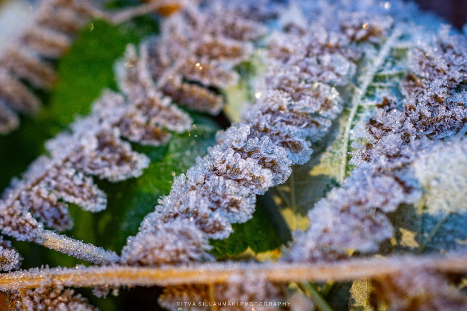
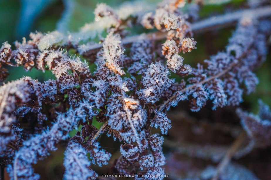
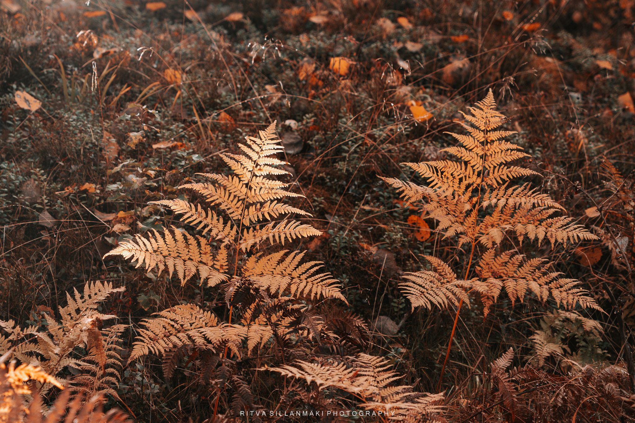
Still showing the beauty of frosty mornings, where nature unveils its delicate artistry. This time, the details of frost on ferns create a mesmerizing sight, transforming the ordinary into the extraordinary with intricate patterns that glisten under the soft light. I even did a small poem to enhance the post. The crystalline frost, like nature’s jewelry, adorns each leaf, reminding us of the beauty that often goes unnoticed in the chilly embrace of dawn.
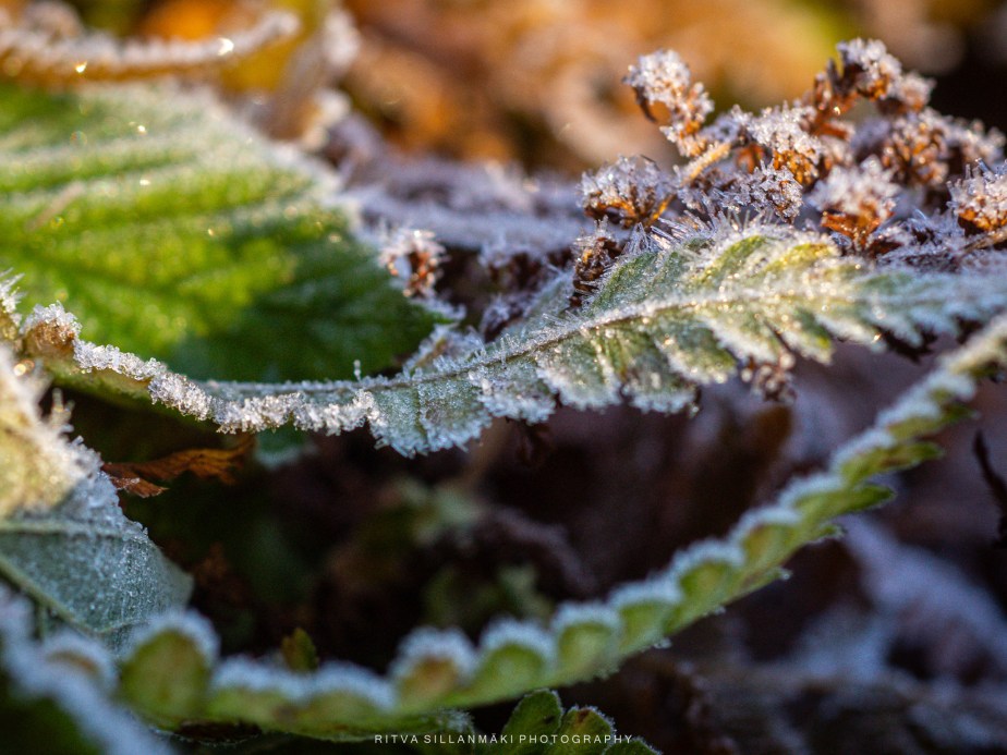
Ferns donning deep brown tones,
Glistening under the gentle morning glow,
An intricate display of fall colors,
Their fragile fronds, a transient charm,
Echoing the waning heat of the season,
Frost veiled, sparkling in the sun,
Nature’s shift, a serene moment of elegance.


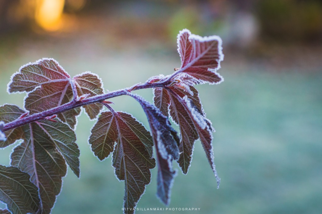
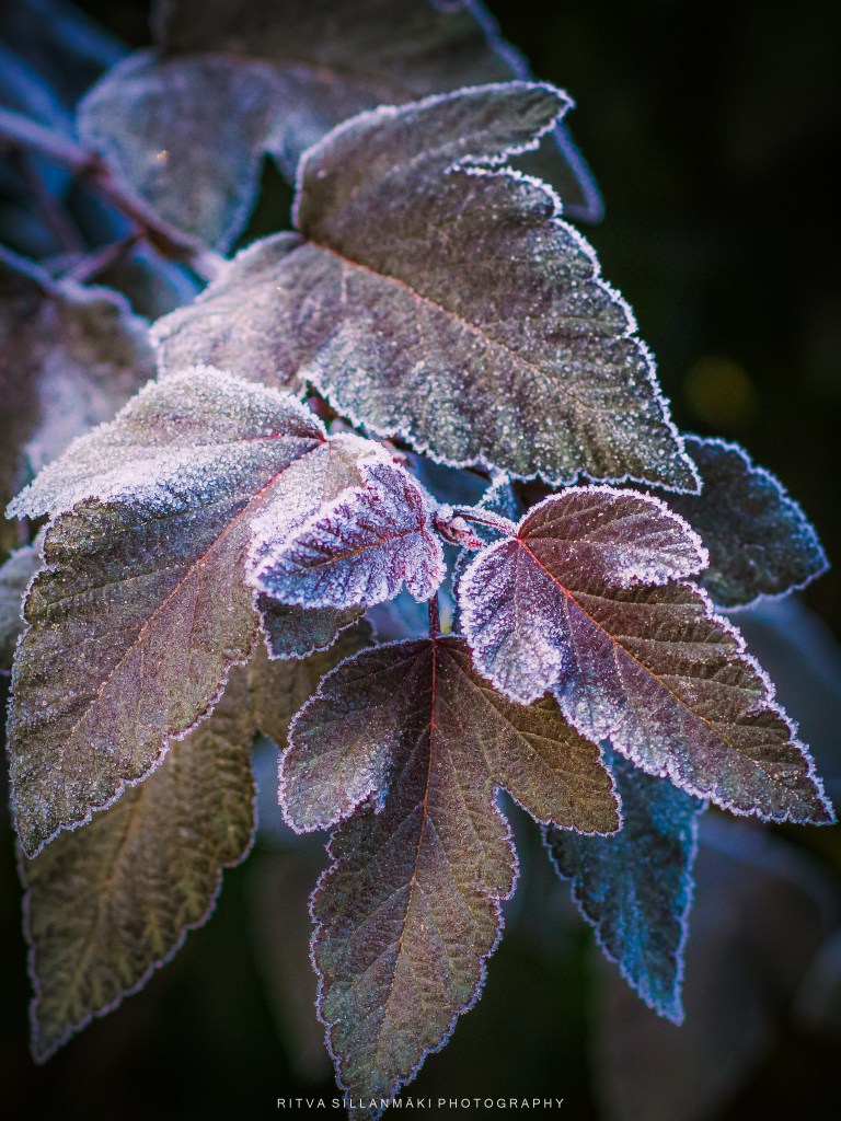
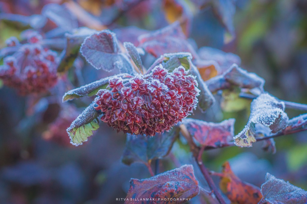
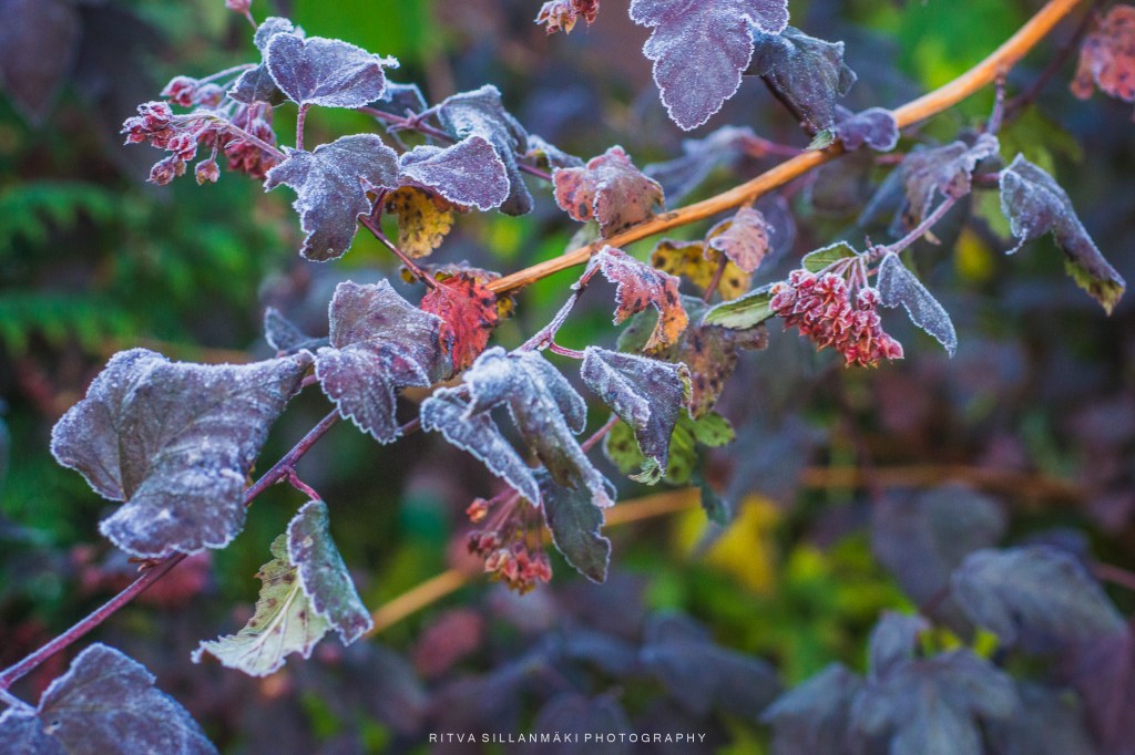
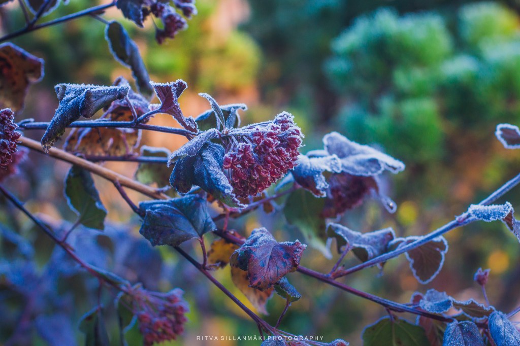
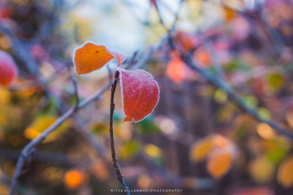
The beauty of winter’s first touch is truly special, the charming frost-kissed flowers and leaves shimmering in the gentle morning light; that delicate layer of frost seems to wrap everything in a cool embrace, transforming the ordinary into something truly beautiful for all to appreciate.

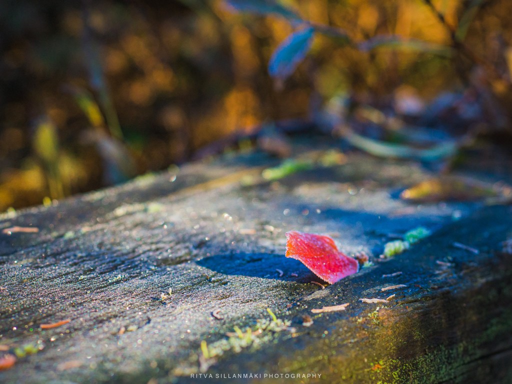
There were two colorful leaves, a vibrant dance,
Then frost whispered in, stealing their chance.
The chill embraced, and one took flight,
Now one lonely leaf lies on the ground, basking in the morning light
I loved the idea of a mood board, particularly one that features flowers arranged in soft pink tones, which create a serene and inviting atmosphere. I did my previous post about it. This beautiful color palette not only enhances the aesthetic appeal but also evokes feelings of warmth and tranquility, making it an ideal choice for any interior space. A bedroom adorned with such delicate hues can transform it into a personal sanctuary for relaxation and restful sleep, while a living room decorated in these soft shades creates a cozy and welcoming vibe, perfect for moments with loved ones.
Now I am introducing a new flower palette, incorporating soft yellows and gentle browns can enhance the warmth of the space, making it feel more intimate. Soft orange, especially in muted shades, can introduce a subtle pop of color without overwhelming the senses, while various tones of green can serve as a beautiful contrast, giving the room a fresh and vibrant feel. This combination of colors not only adds depth but also allows for a seamless blend of nature-inspired elements, ideal for anyone looking to create a harmonious living environment. What would these tones be suitable for, you might wonder? They could work wonderfully in spaces that seek to promote tranquility and comfort, such as reading nooks or meditation corners, making a profound impact on the overall ambiance.
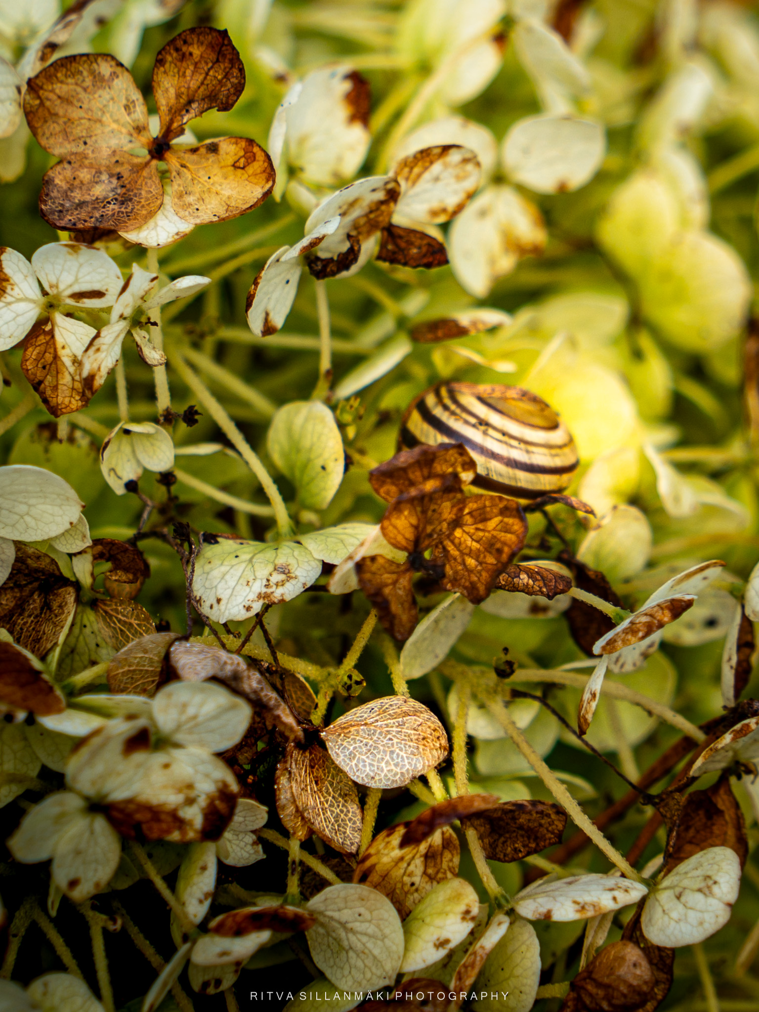
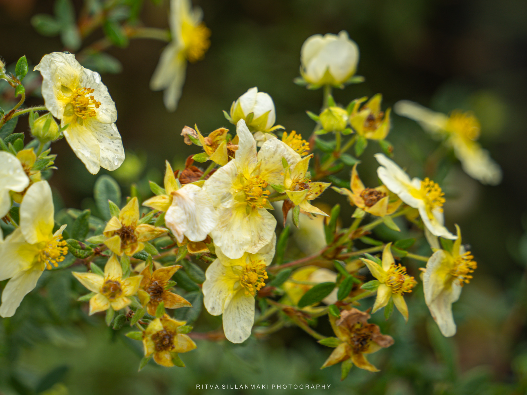
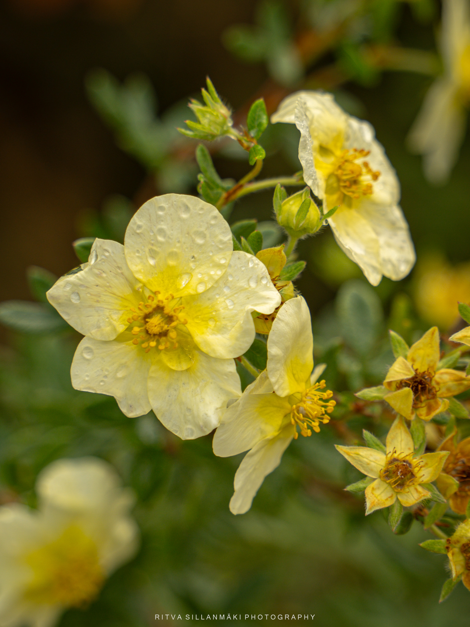
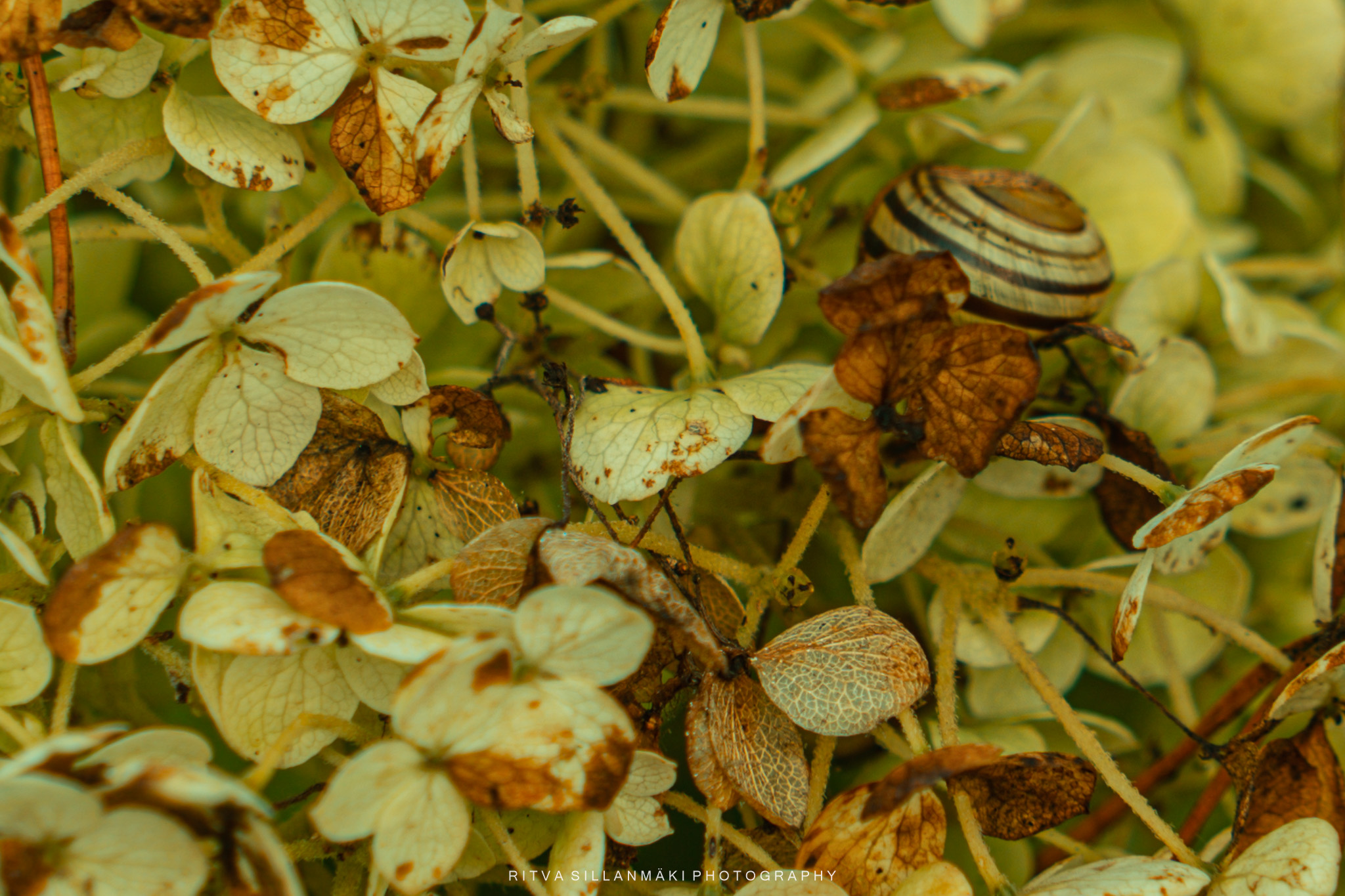
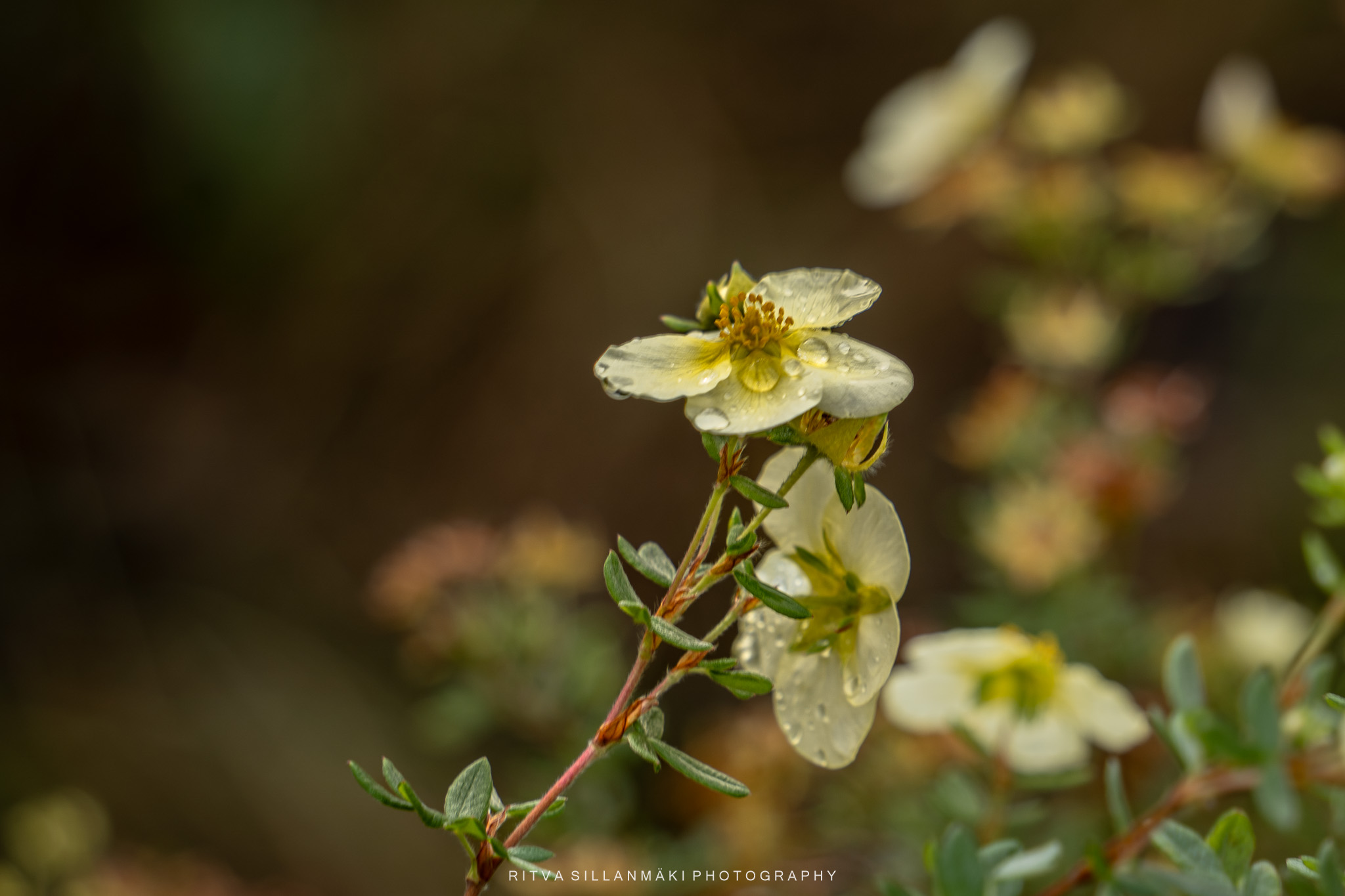
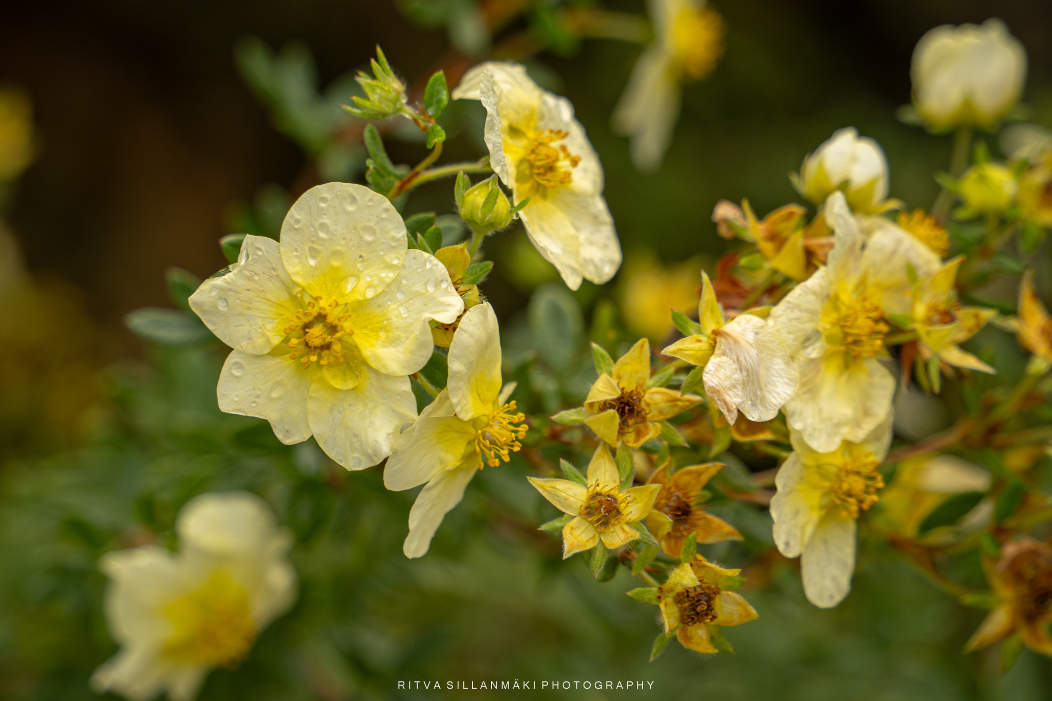
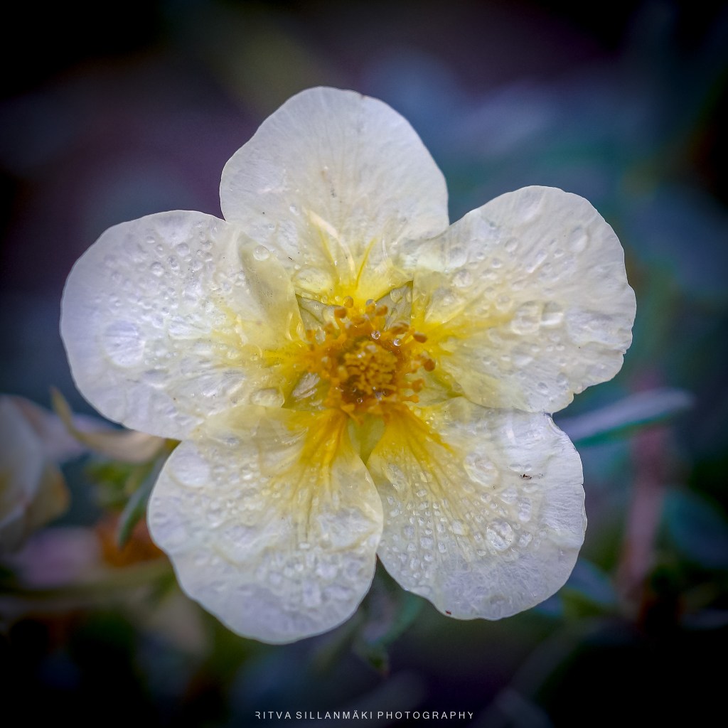
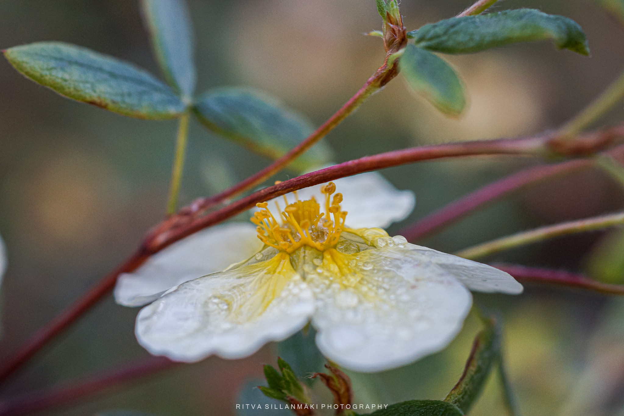
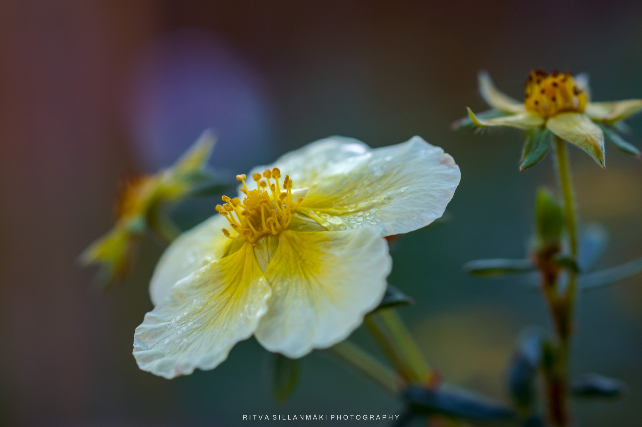
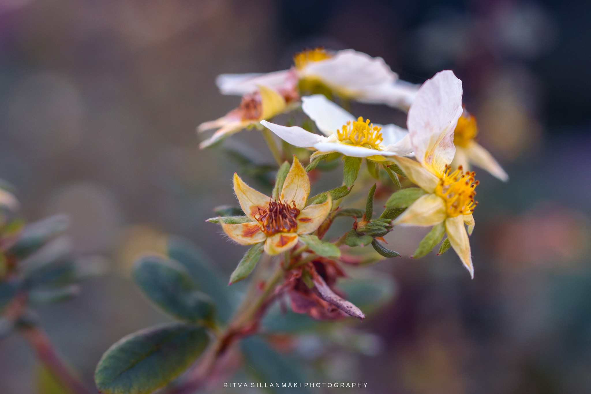
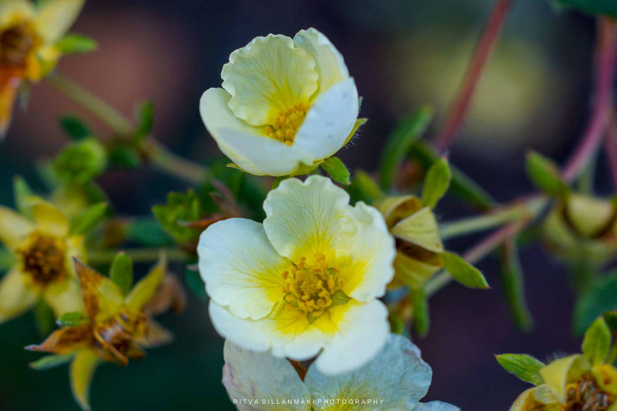
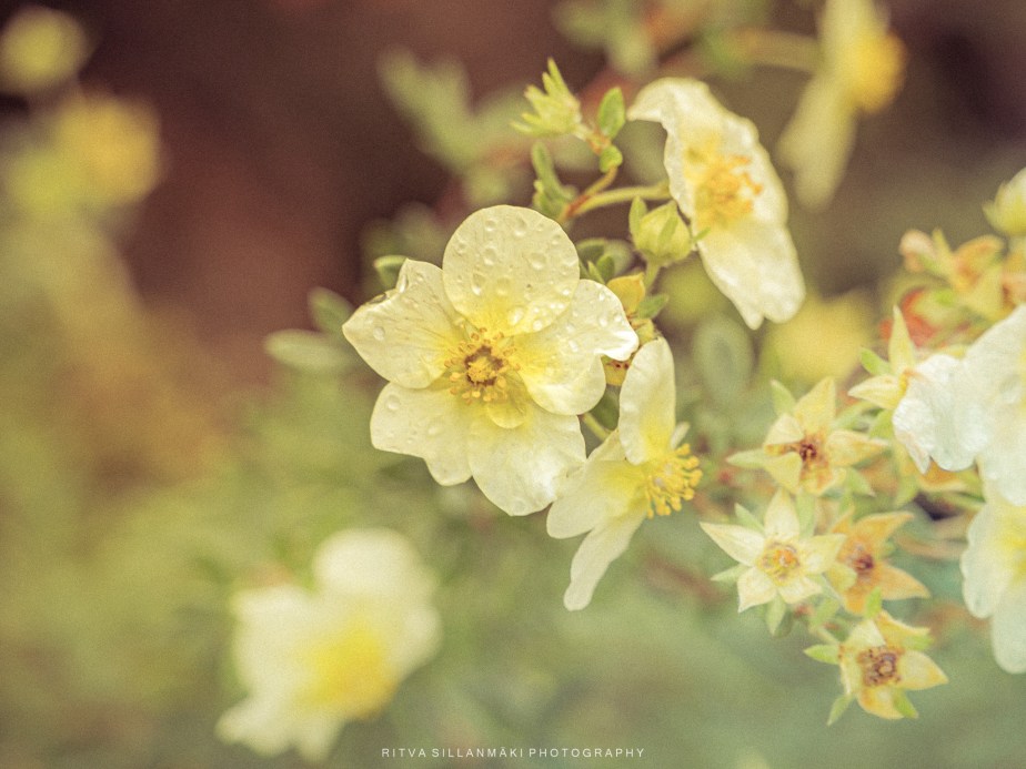
This color palette inspiration for the mood board began with shrubby cinquefoil, a vibrant plant admired for its stunning yellow flowers and lush green leaves. The warm glow of its golden petals brings forth a sense of life and energy, encouraging an appreciation for the natural beauty it embodies. Earthy shades and soft neutrals blend seamlessly with the striking accent of the cinquefoil, resulting in a lively yet harmonious aesthetic that remains inviting—ideal for any design endeavor aiming to connect on a profound level. The palette can also be reflected in the gently fading hydrangea arborescens, with a snail on it continuing the theme as seen on the header.
Posted for #theflowerhour
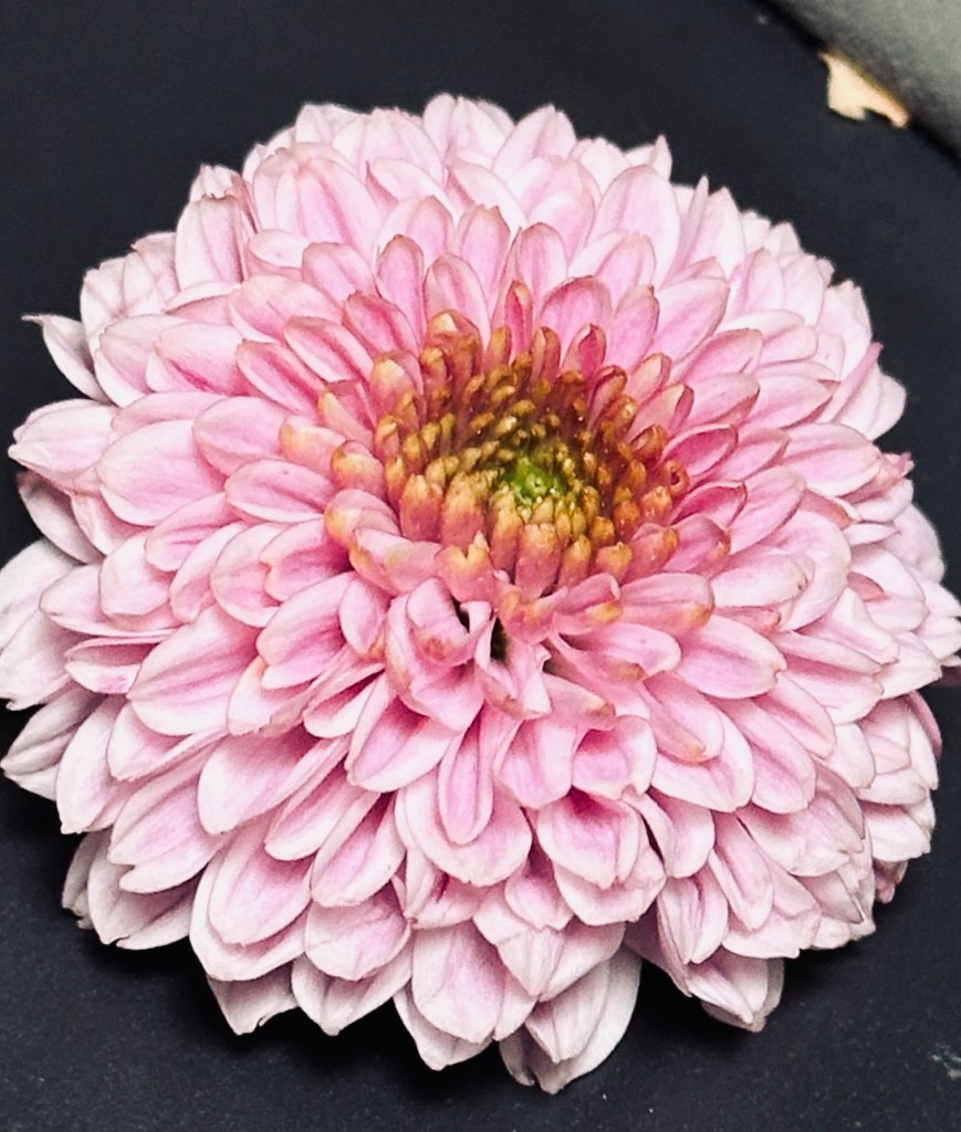
Mood Board: Imagine a captivating arrangement that lovingly embraces shades of pink, pristine white, gentle muted tones, soothing beige, soft yellow, and a touch of lush green. This harmonious palette can beautifully serve as the foundation for a mood board centered around a flower bouquet, evoking warmth and comfort. Picture delicate blossoms in varying hues of pink, alongside white flowers that radiate elegance and purity. The muted tones can be tenderly represented through softly colored foliage or gentle accents of beige in the stems and wrapping of the bouquet. To infuse an extra layer of warmth, consider adding buttery pale yellow that brings a sense of joy. Finally, let the accents of green from leaves add a refreshing touch, completing this heartfelt composition.