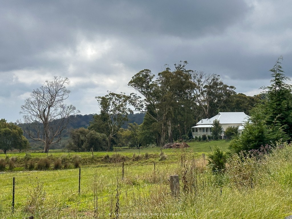
This was taken about a year ago, a rural landscape and farmhouse amidst lush greenery and distant hills in Mittagong, NSW, Australia. The scene was idyllic, under the cloudy sky. I did three edits and let the AI capture them; it was fun how it changed with each edit.This was fun, allowing me to explore various artistic interpretations and styles that breathed new life into the original image. Each version revealed a different aspect of the scenery, from subtle alterations in light and shadow to more pronounced changes in color saturation that transformed the overall mood of the photograph.
A scenic view of a rural landscape, farmhouse amidst lush greenery and distant hills in Mittagong, NSW, under a cloudy sky. Original image
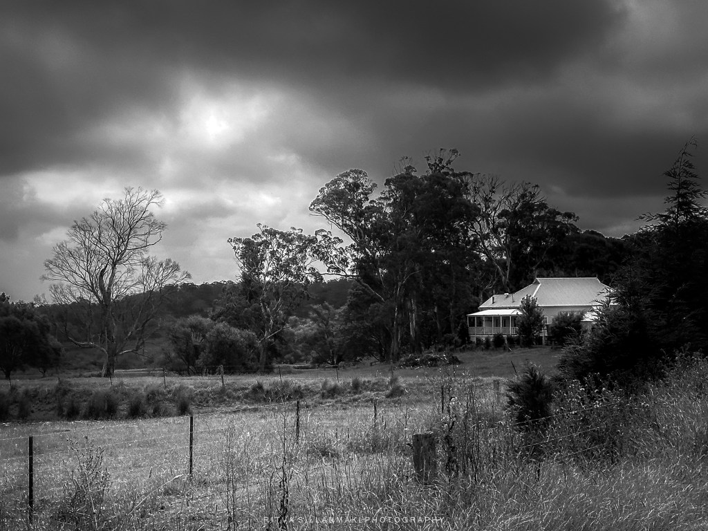
A black and white landscape featuring a house amidst a moody sky and surrounding trees.
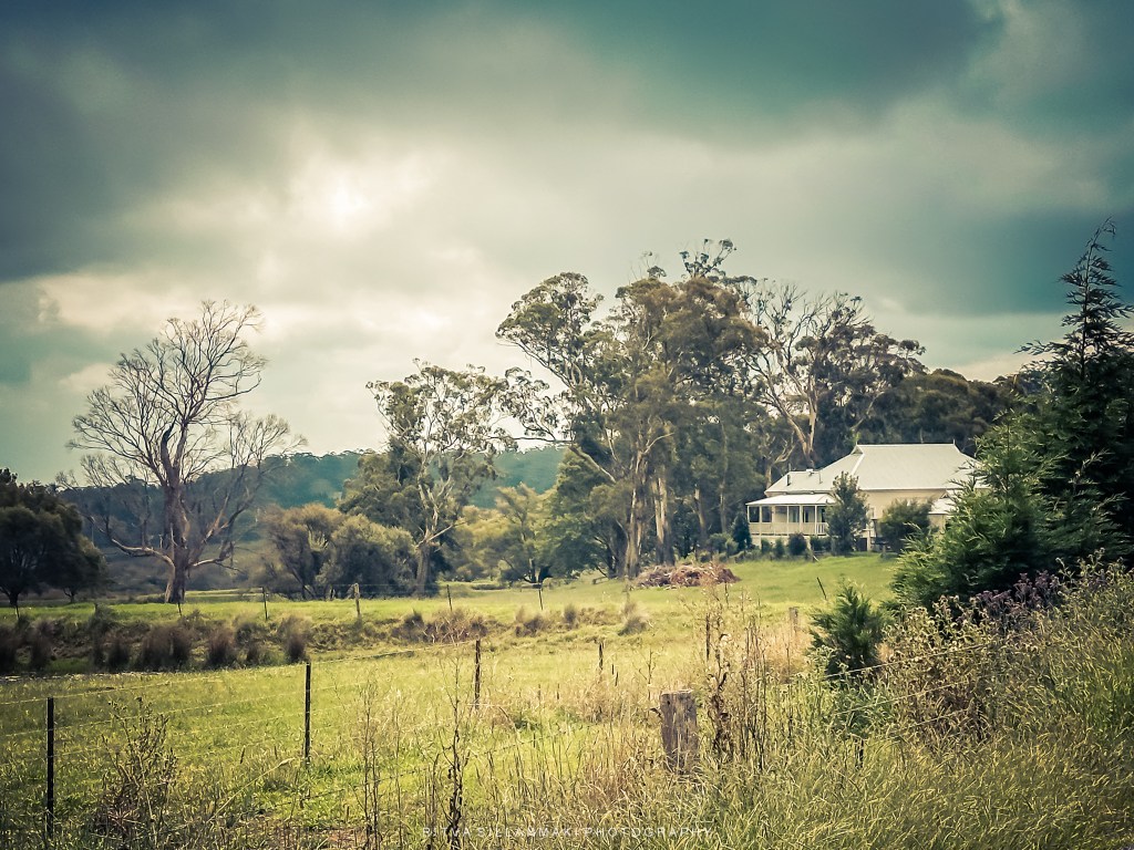
A tranquil rural landscape featuring a house surrounded by trees and open fields under a moody sky.( my additional text; A more Nostalgic and painterly effect.
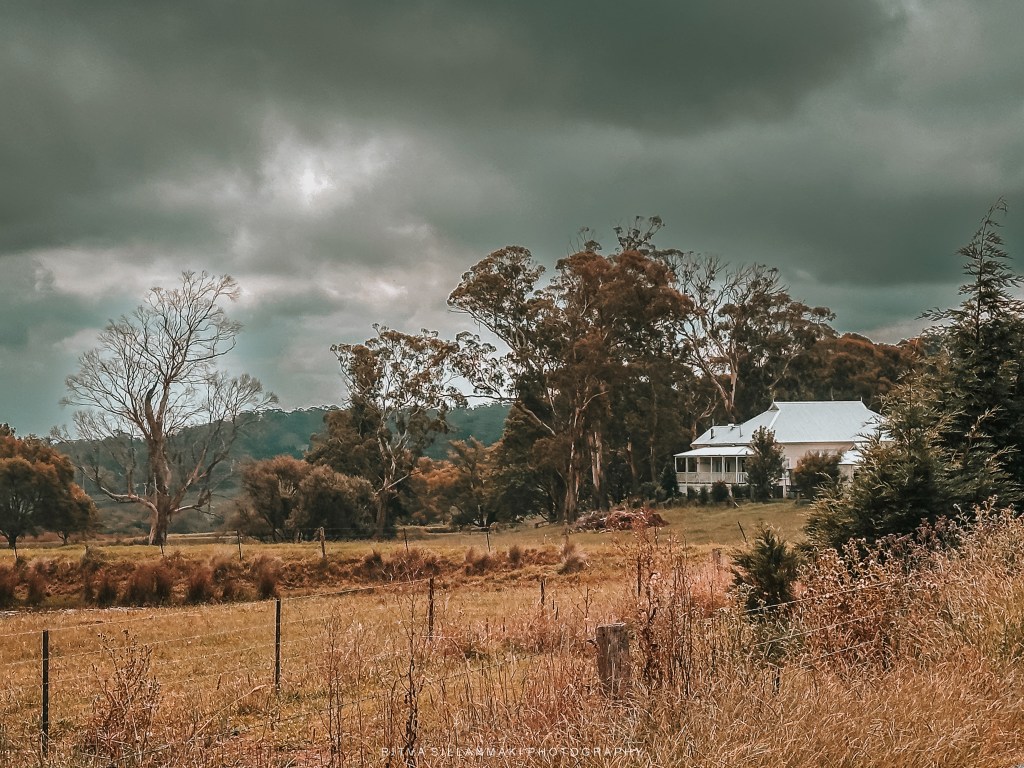
A serene rural landscape featuring a charming house surrounded by tall trees and rolling hills under a moody sky. My additional text, Changing colors to more fall colors.
This week, Egidio has encouraged us to showcase some of our rejected alongside our edited images to highlight the contrasts. I’ve encountered photographers who view editing as “cheating,” believing it undermines the integrity of the moment captured. Nevertheless, I regard editing as an equally vital skill as the art of photographing a subject or scene. It empowers us to emphasize particular features, enhance colors, and evoke emotions that may not be as prominent in the unedited image. Ultimately, the final image should represent not just what was observed but also the artist’s unique vision and perspective. By embracing both photography and editing, we can elevate our creations and convey more impactful stories through our visuals.
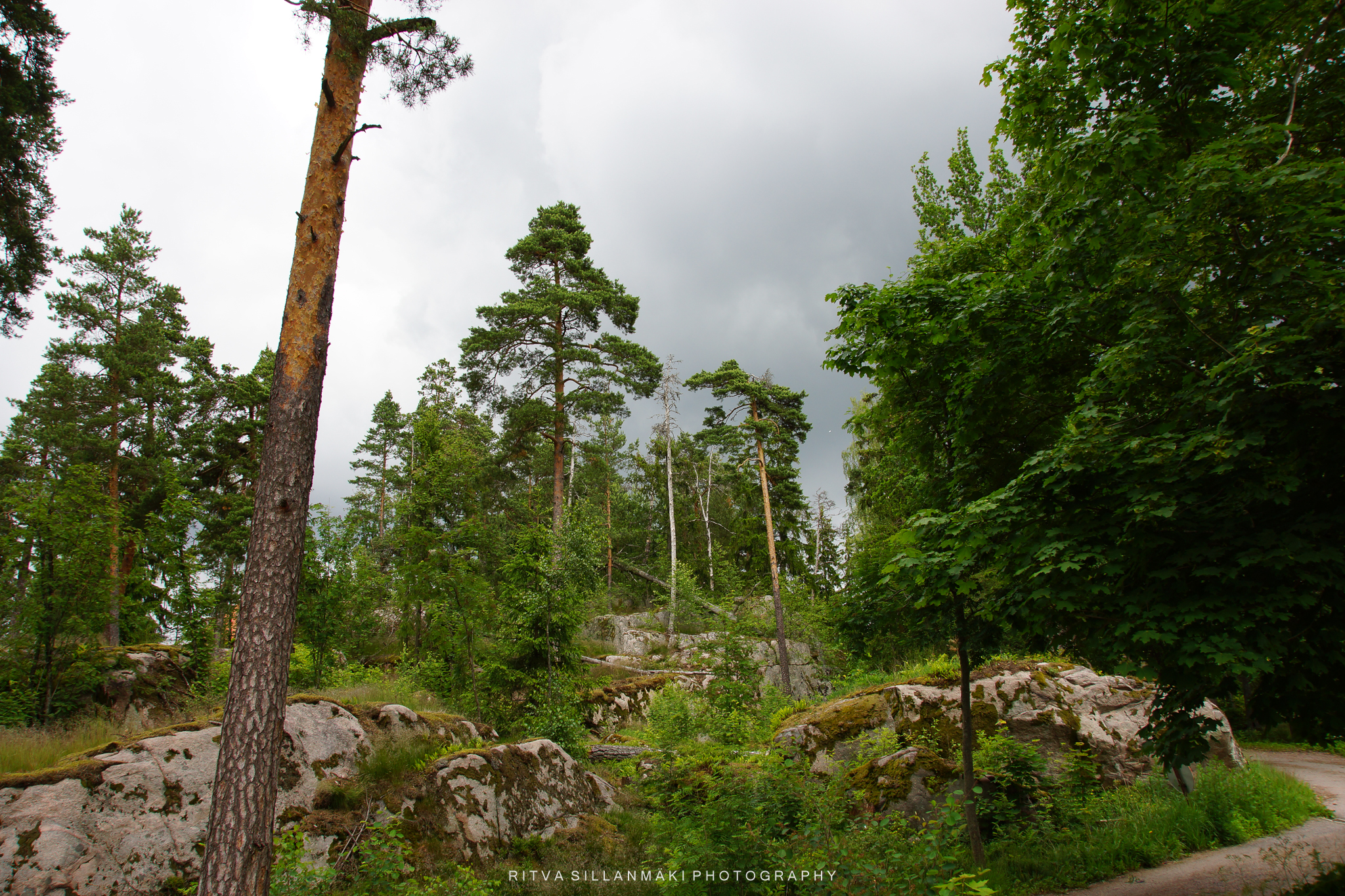
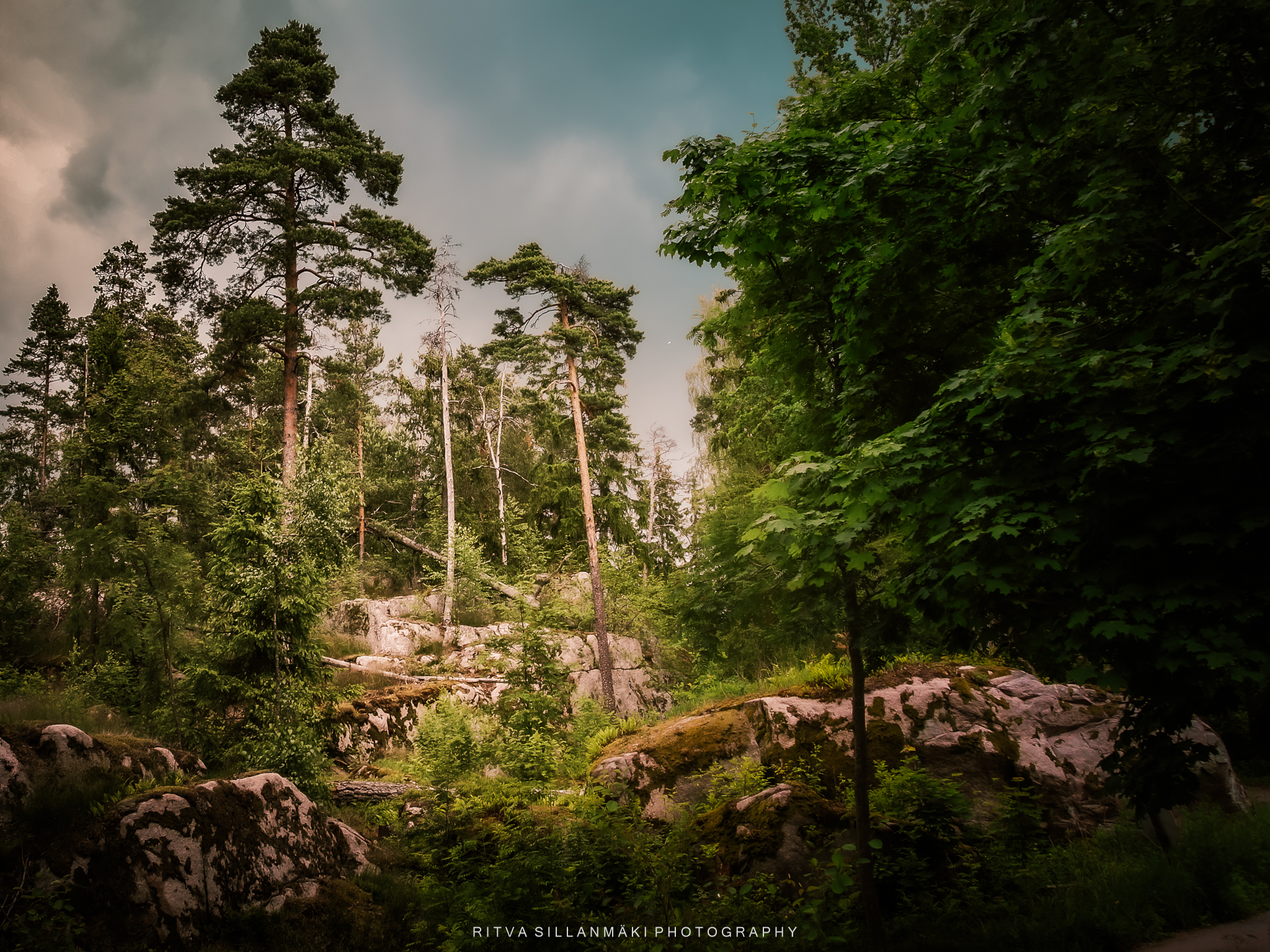
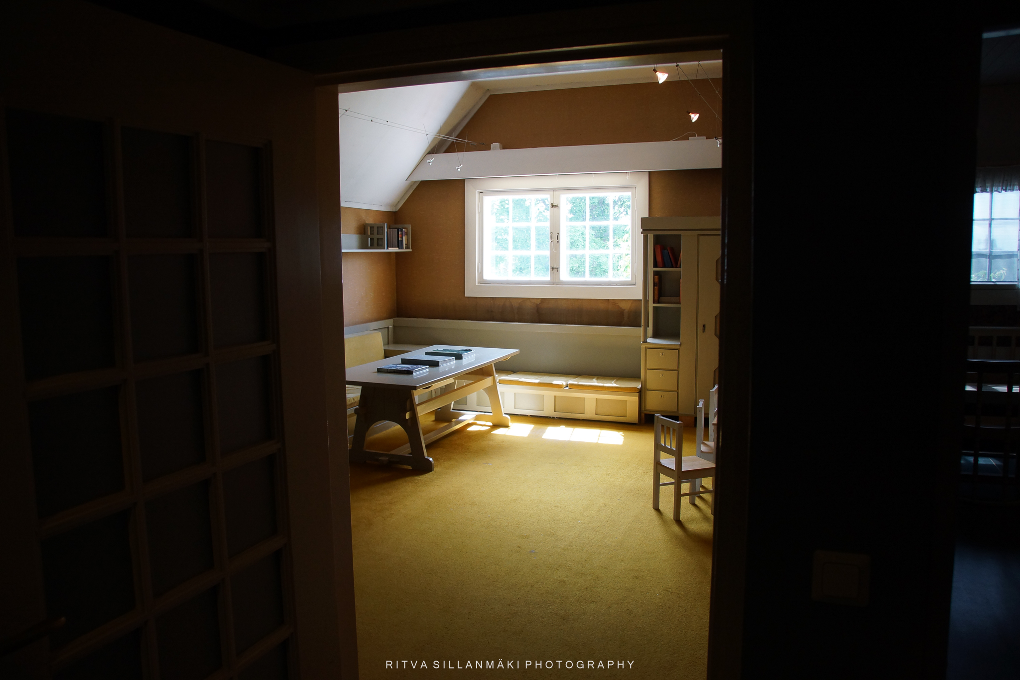
These are all from my visit to Hvitträsk and its surroundings some year ago except the last one. That was a so bad I did not pay any attention to it at all at the time, I just remember being very disappointed in it. I should have binned it, but luckily now with my approved editing skills I was able to do something with it.
The original image was flat and boring, and I never got around to publishing it, even though the picture has many layers and good elements. Perhaps I didn’t initially realize to crop it enough; for some reason, I wanted the trunk of the pine tree in the image even though it didn’t really fit there. The sky had remained flat and nothing really stood out.
Nature shines
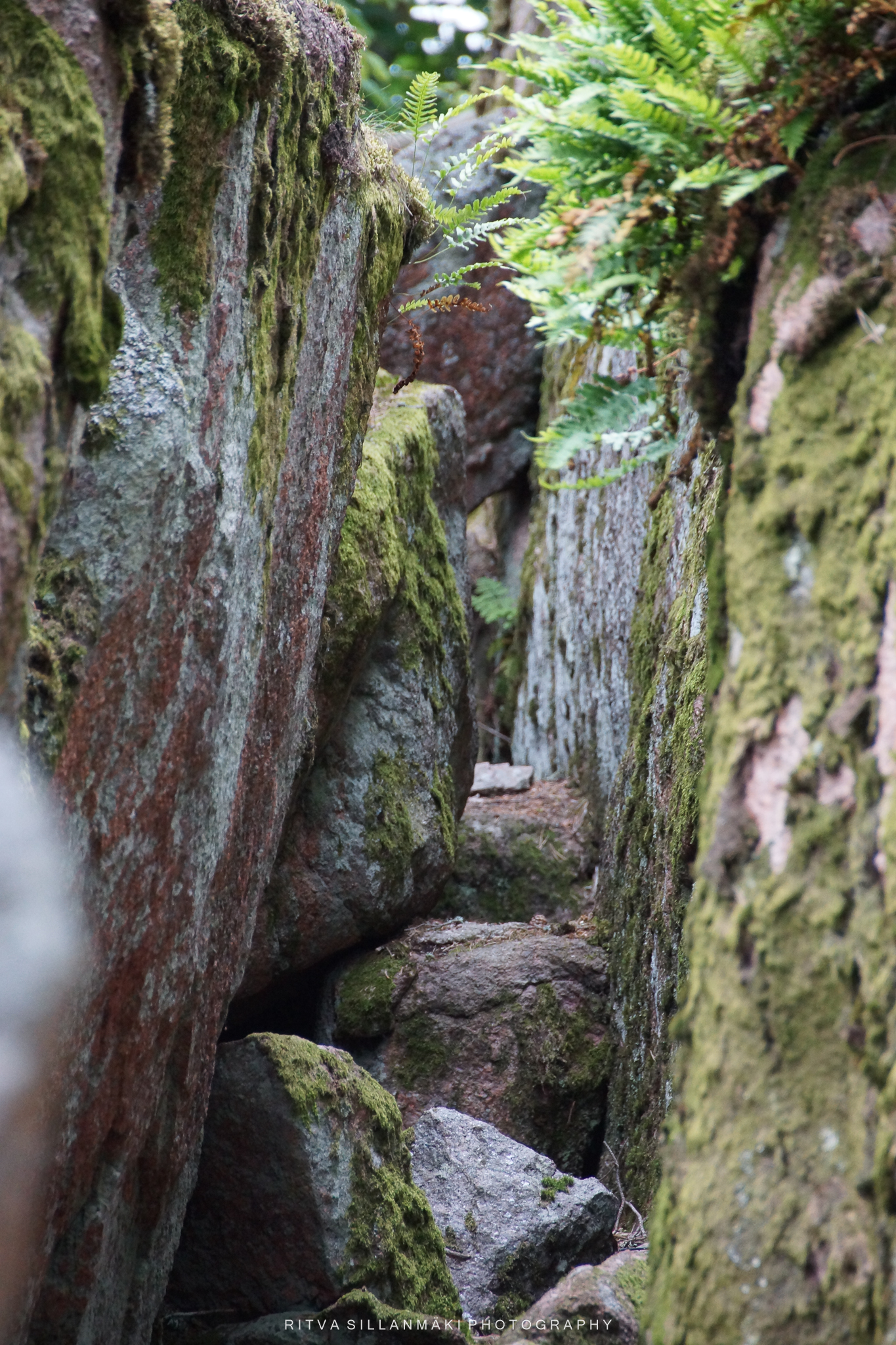
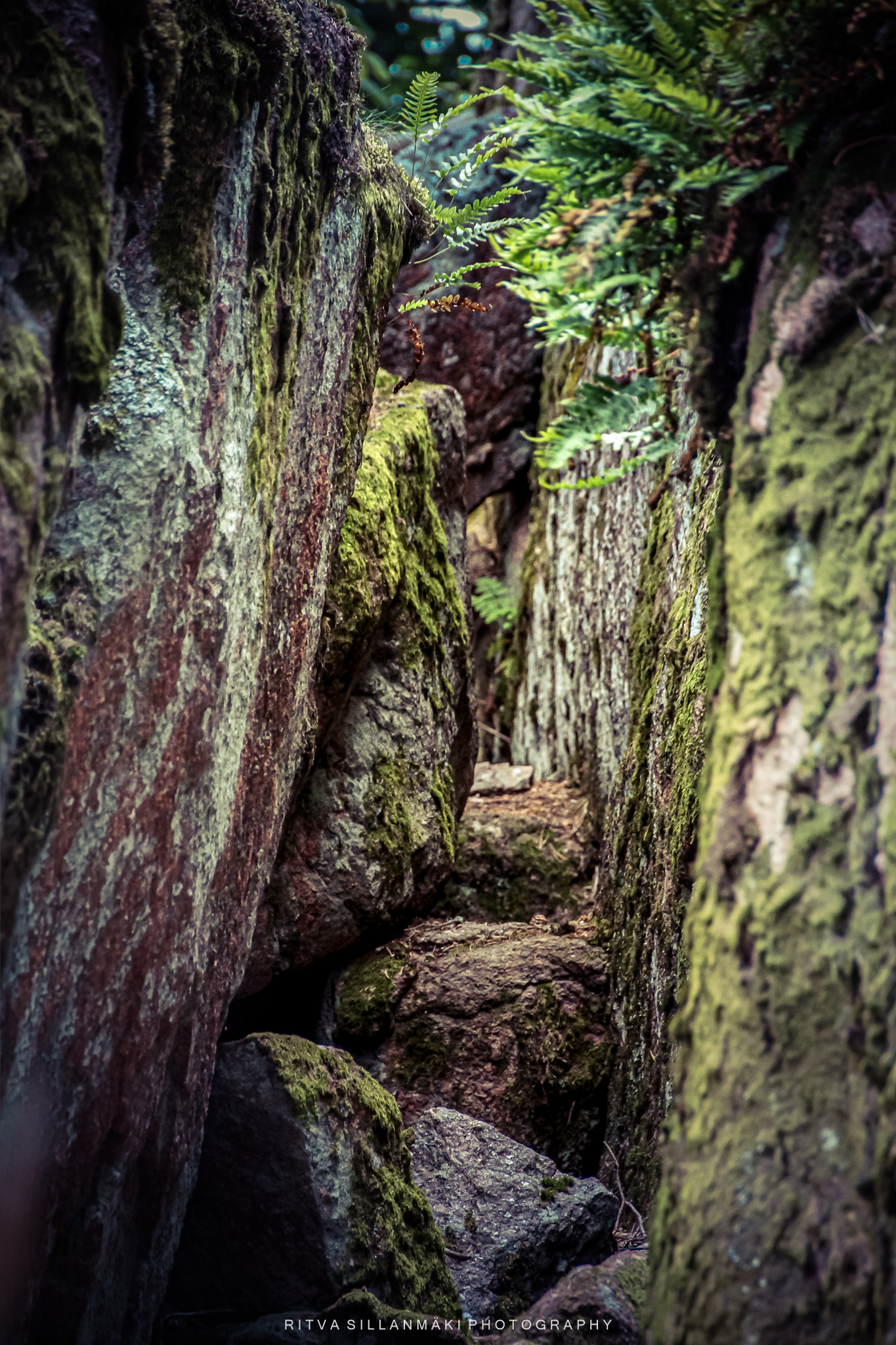
I was drawn to this blurry image; there was something about it that appealed to me, so I decided to rework it in the hope that it would present better with a slight adjustment of contrast and colors. The top of the image was slightly overexposed and clearly out of focus. I am not entirely satisfied with the edit as the colors changed too much from the original—primarily because I try to keep the image as natural as possible.
This could fall into the same category as the previous post, but this is in many parts very unfocused,
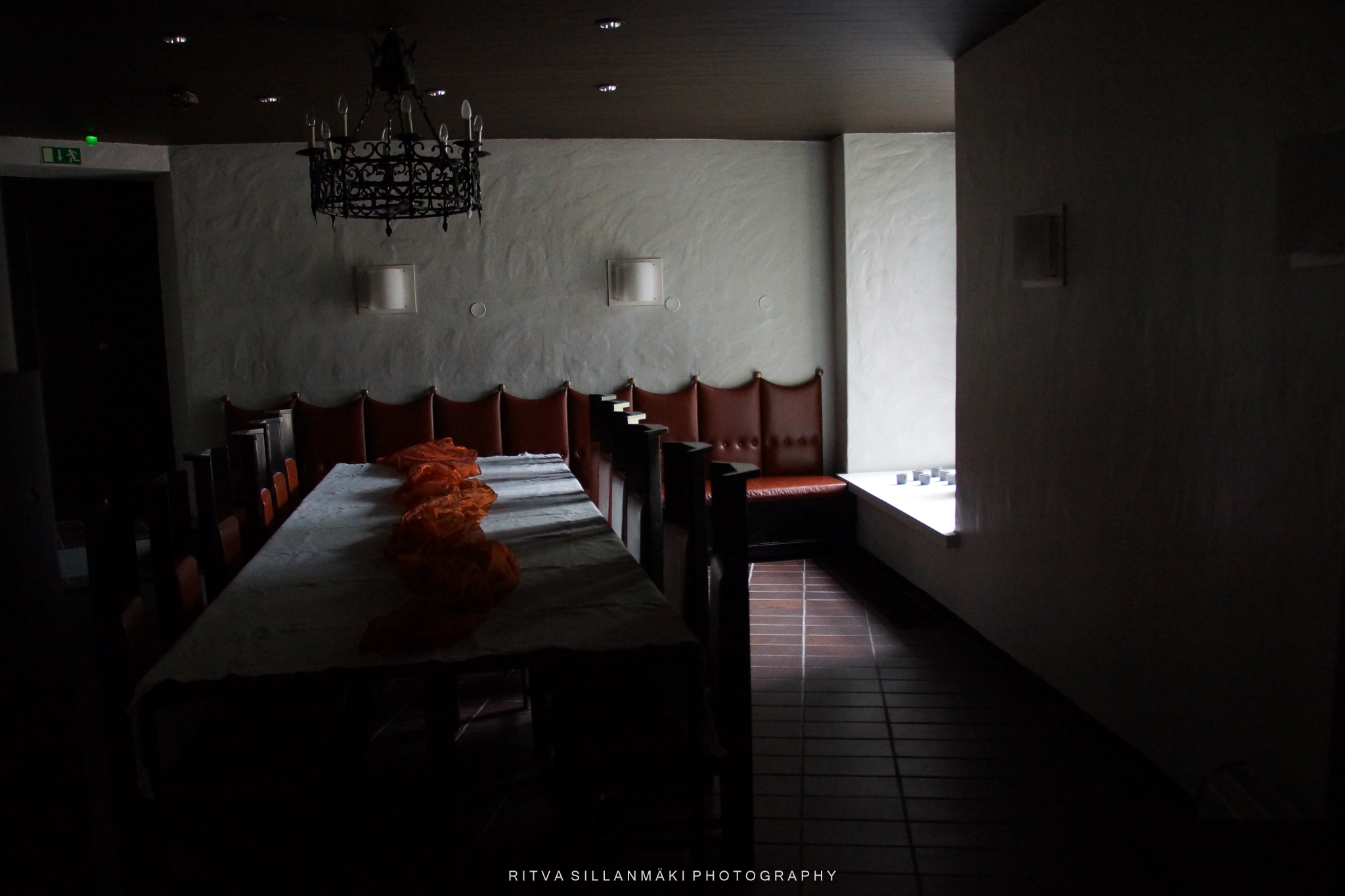
A dimly lit dining room featuring long wooden table in Hvitträsk
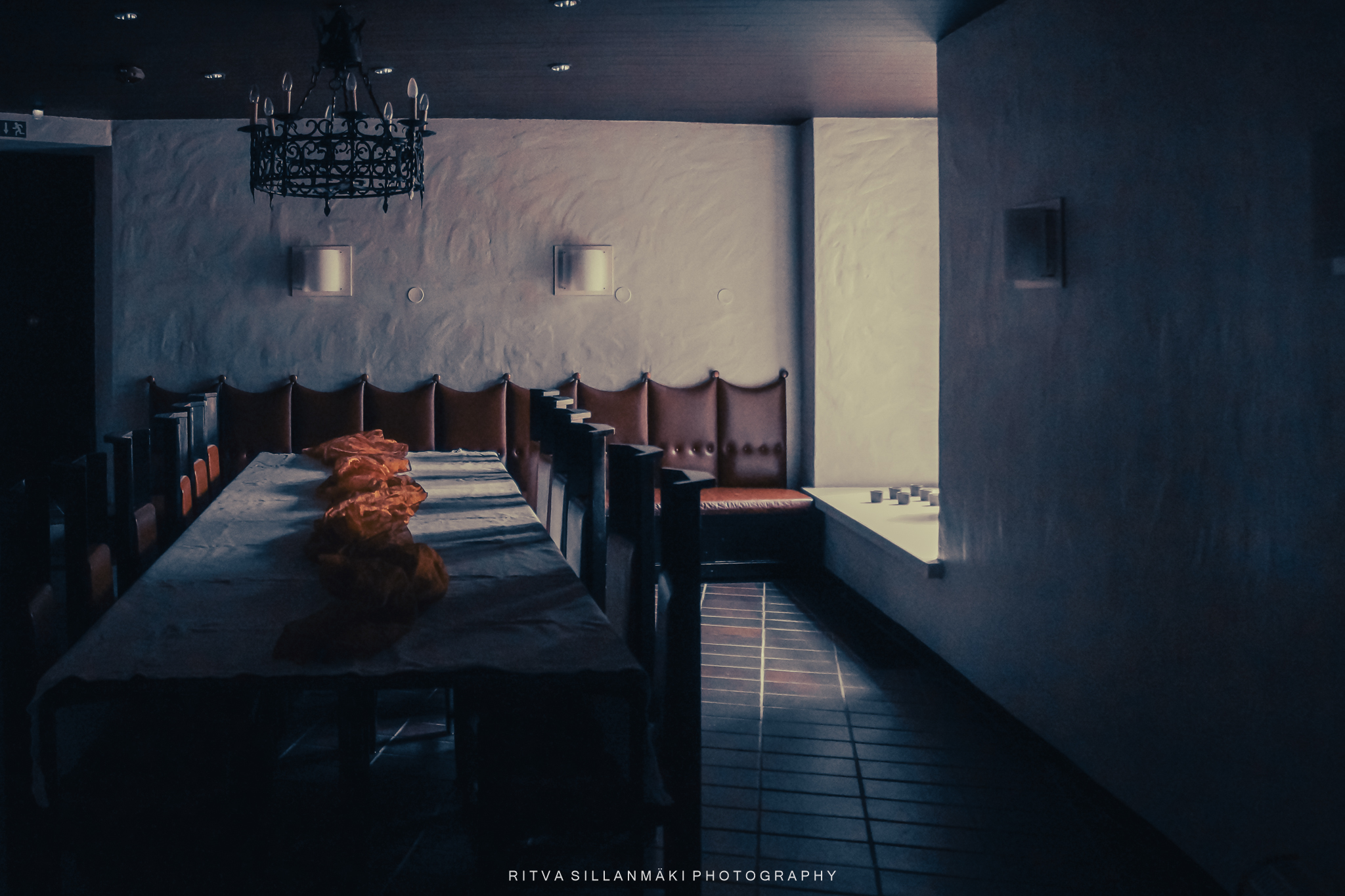
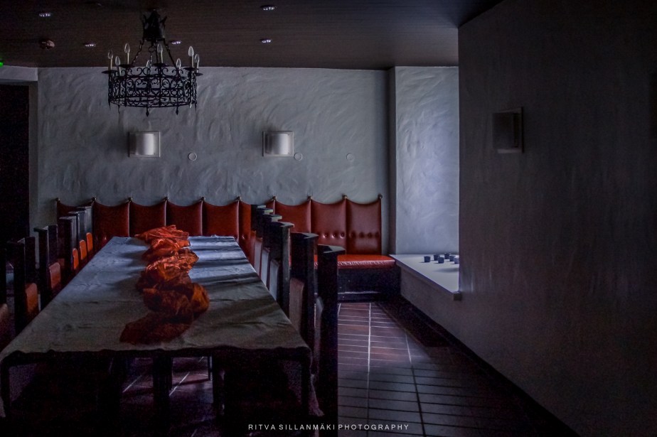
A dimly lit dining room with a long wooden table covered in a white tablecloth, adorned with orange fabric. Red upholstered leather benches line the walls, and a decorative chandelier hangs from the ceiling. In the image above, there is a lot of good, but the picture was left languishing in the archives a bit subdued, and I couldn’t find its purpose; now I decided to boldly edit it in a more cinematic direction. I spent some time battling against making it too colorful, so the third edit is the final result 👇, where I wanted to bring the fabric on the table into focus with light.
A dimly lit dining room featuring long wooden tables and contrasting red seating, evoking a warm yet subdued atmosphere.
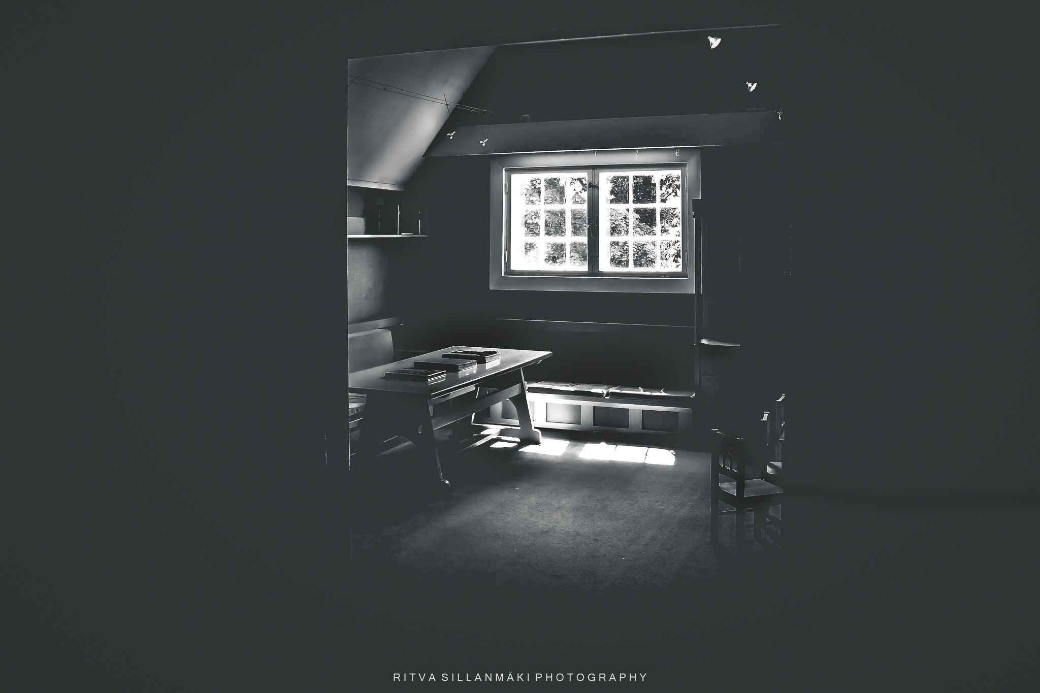
In this last image pair, I wanted to highlight the minimalism of the previous challenge and the black-and-white image as it is a style I really enjoy. I sought to create an atmosphere in the picture and wanted to draw attention to the window and the light coming from it and how it came to the room, and eliminating most of the furniture.
In this picture, I managed to save an image that was clearly overexposed and additionally had completely off coloring. I didn’t know what I had adjusted back then, but for some reason, this remained in the archives. I couldn’t edit this photo to color, but the black and white turned out rather well.
salvation of a bad photo
I would like to extend my gratitude to Egidio for encouraging us to present some of the effort that goes into crafting an image we are proud to share. Don’t forget to check out his original post here, and remember to use the Lens-Artist Tag in your response so we can find you post.
I am grateful to all who took part in last week’s B&W / Minimalism challenge; it highlighted the remarkable power of simplicity when done effectively. I was taken aback by the amount of interest it created and glad to find out that there are so many interested in this style of photography, which emphasizes the beauty of minimalism and the striking impact of black and white imagery. This challenge inspired participants to explore their creativity among those who share a passion for this art form. I loved seeing all your contributions, as each one told a unique story and showcased different perspectives, proving that less truly can be more in the world of visual storytelling.
Lastly, we invite you to join us next week for a challenge Tina will be hosting on Travels and Trifles. In the meantime, smile and try to stay positive
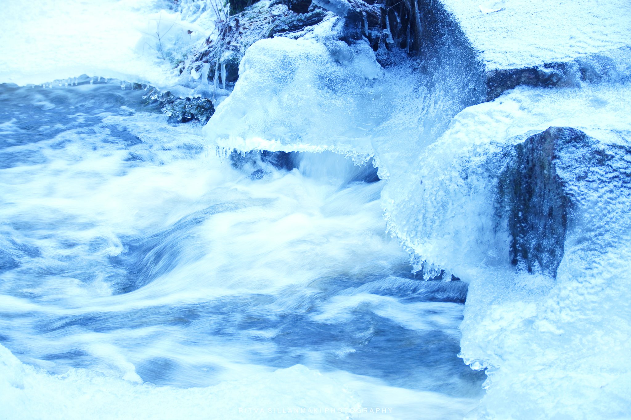
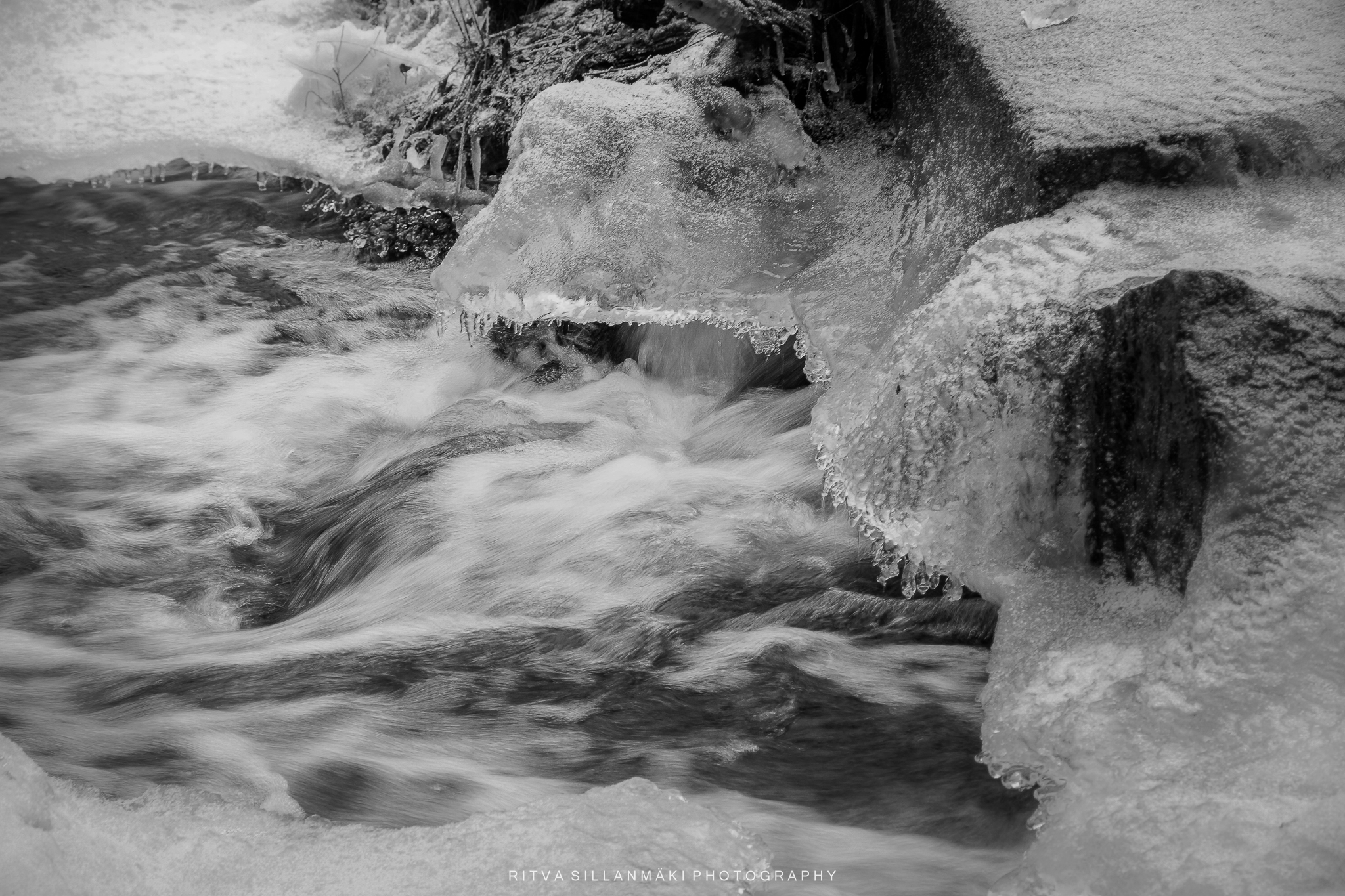
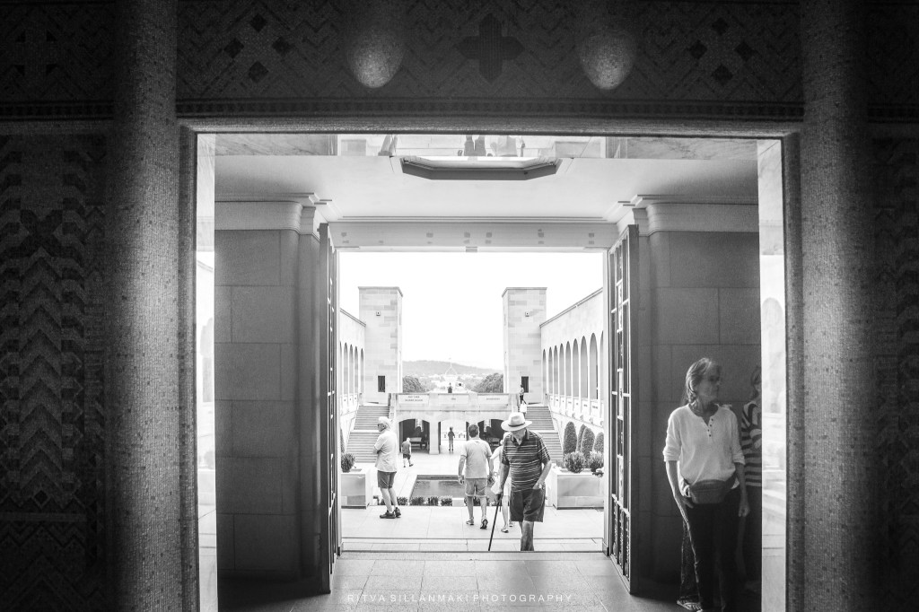
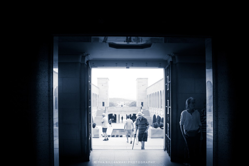
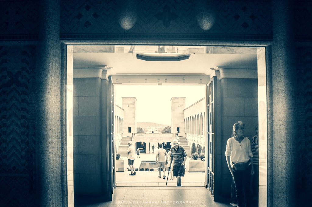
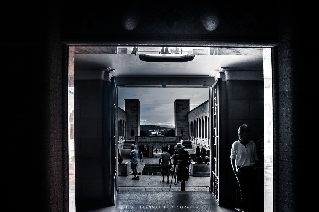
This is a topic free week for Leanne’s Monochrome Madness and I am at the moment experimenting with editing, playing with light and contrast to see how subtle adjustments can dramatically affect the overall impact of an image. As you change the elements, such as brightness, shadows, and highlights, how does it change how you perceive the image? Each adjustment can convey different emotions, stirring distinct feelings or memories within the viewer. Not all the changes are big, yet they can significantly shift the mood of the photo, influencing where your attention is drawn and what stories are told through the visual. The interplay between light and shadow can create depth, drawing you deeper into the scene, while contrast can emphasize particular features, guiding your gaze in a more intentional way. What do you think, was it worth my time to do these edits?
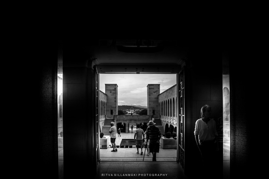
A monochrome photograph capturing the interplay of light and shadow as visitors walk through a stylized architectural space.
A doorway at the War Memorial in Canberra, Australia. This architectural feature not only embodies the solemnity of the site but also symbolizes the passage between the past and present, wherein the sacrifices of countless individuals who served their country are honored. As one approaches the doorway, the intricate details and sturdy materials evoke a sense of reverence, signifying the importance of the history encapsulated within the memorial.
the interplay of light and shadow at a historical site, inviting viewers to reflect on their own memories.A view through an archway, showcasing visitors at a historic siteExploring the interplay of light and shadow at an architectural site, inviting viewers to consider how subtle edits influence perception.A monochrome image capturing a doorway leading to a scenic view, accentuating the interplay of light and shadow.
I have often expressed that I enjoy editing photos, even though I tend to post mainly realistic images, having them look like I saw them. On that note, all of my images have been edited, mostly I adjust the light and contrast—highlights and shadows—to enhance the overall feel of the photograph. Contrast plays a crucial role in making certain elements stand out and giving depth to the image. I do it so that it reflects the image I saw in my mind’s eye—hence the title; the world as I see it. Photography, for me, is not just about capturing moments but also about expressing my unique perspective and interpretation of the scenes before me, allowing viewers to experience the beauty and intricacies that I wished to convey. Through careful editing, I strive to invite others into my vision, ensuring that they appreciate the subtleties that might go unnoticed in a more straightforward representation.
Original image without the edits other that cropping it.
I am going to start editing cityscapes, buildings, and industrial places in a more creative way. For a long time, I have wanted to venture towards this direction, and now I am excited to explore various artistic approaches that can bring a fresh perspective to my work. I plan to experiment with techniques such as dramatic lighting, unique angles, and vibrant color palettes to enhance the visual appeal of my photographs. By prioritizing these innovative methods in my editing process, I hope to creatively showcase buildings and cityscapes, transforming my photographs into something more artsy and captivating.
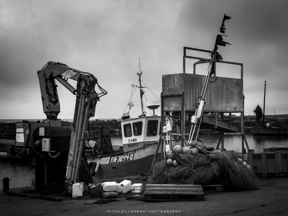
Converted to an black and white
I am going to explore various angles to highlight architectural details. Finding unique vantage points can elevate the way buildings are presented in your images. Adjusting contrast can enhance the structural elements of buildings, making them stand out.
Vintage or black-and-white filters can transform standard images into stunning artistic representations.
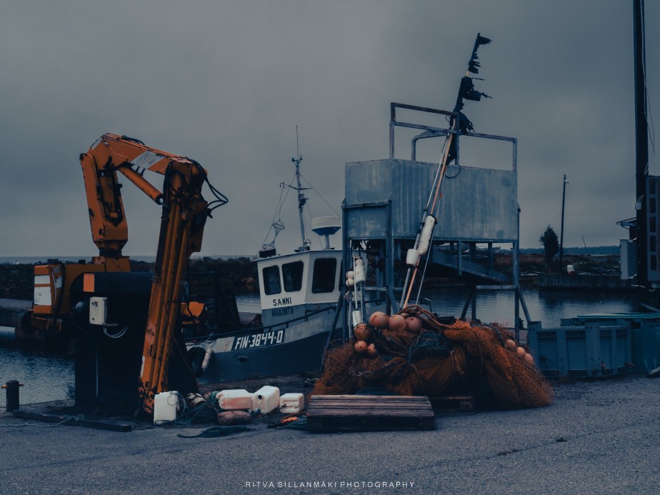
Blue and gray tones –
Use color grading to enrich urban atmospheres.. Pay attention to the distinct textures found in urban environments, such as brickwork or glass in post-processing to create depth and interest in your cityscape photos. Play with the color tones in the image.
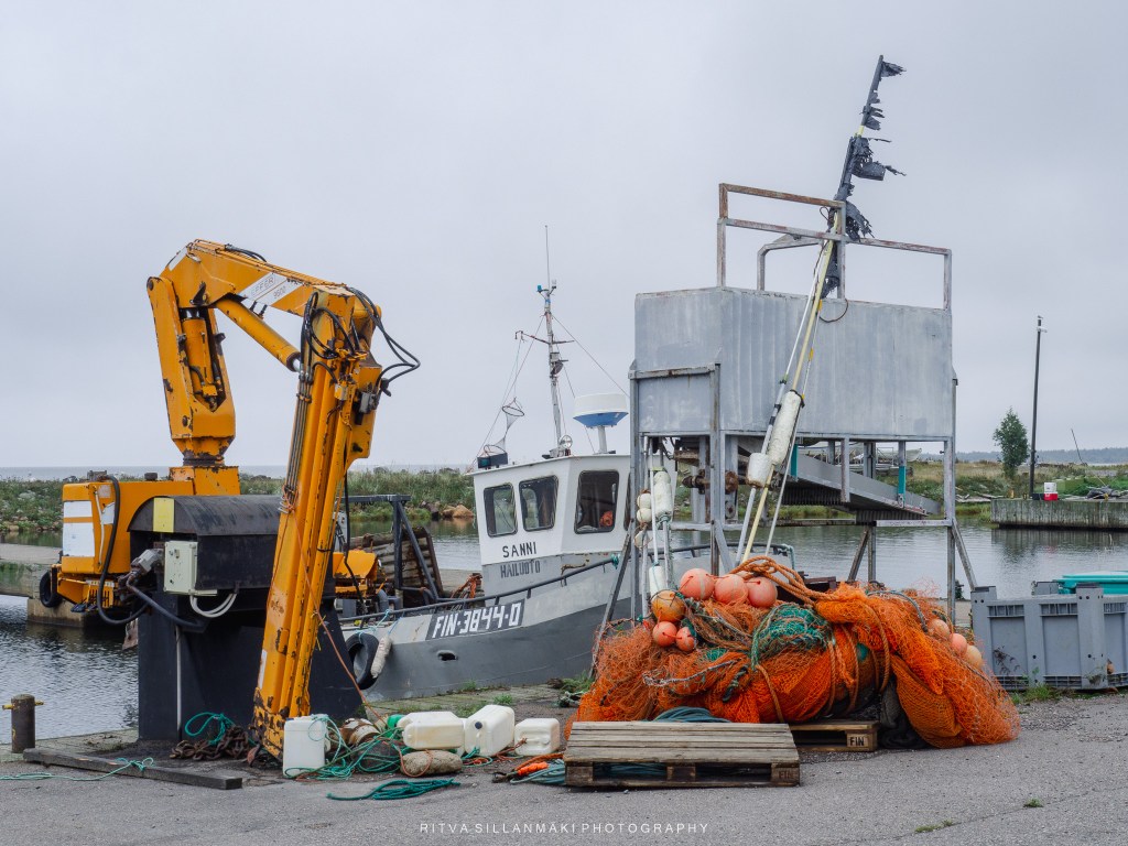
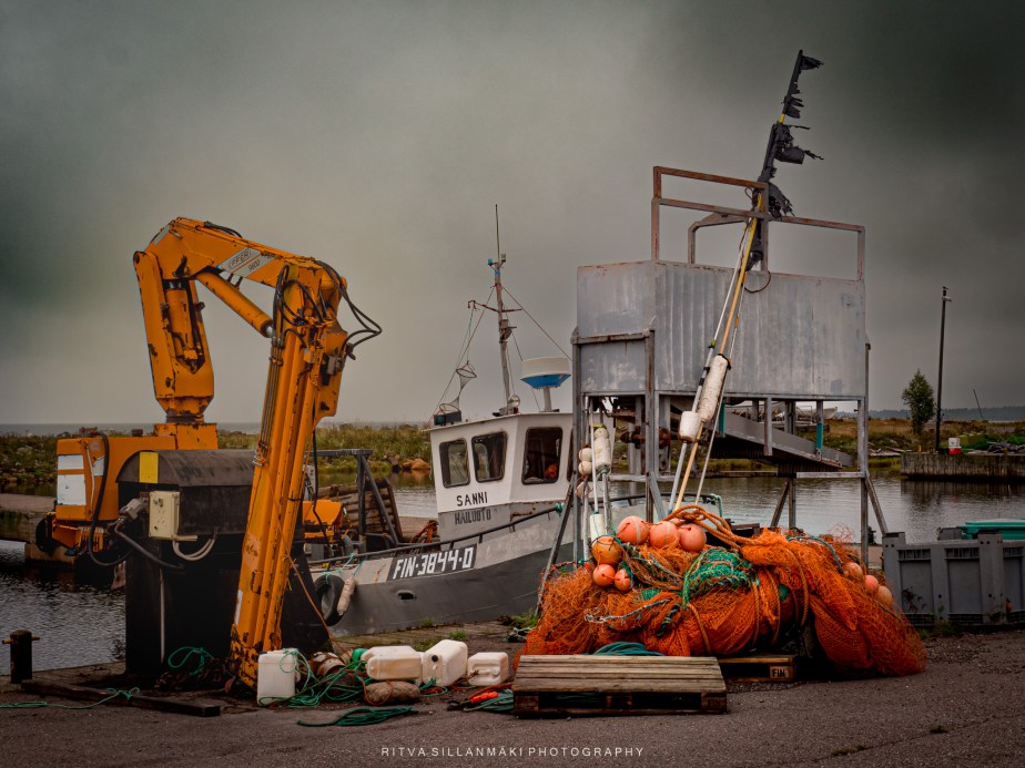
Fishing dock, placing the interest in the subject matter and bright colors
Use filters to create effects that align with the character of buildings and cityscapes.
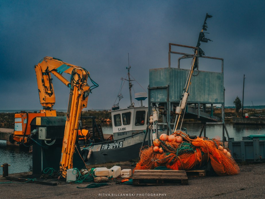
Fishing Dock in warm tone and still focusing on the bright subjects