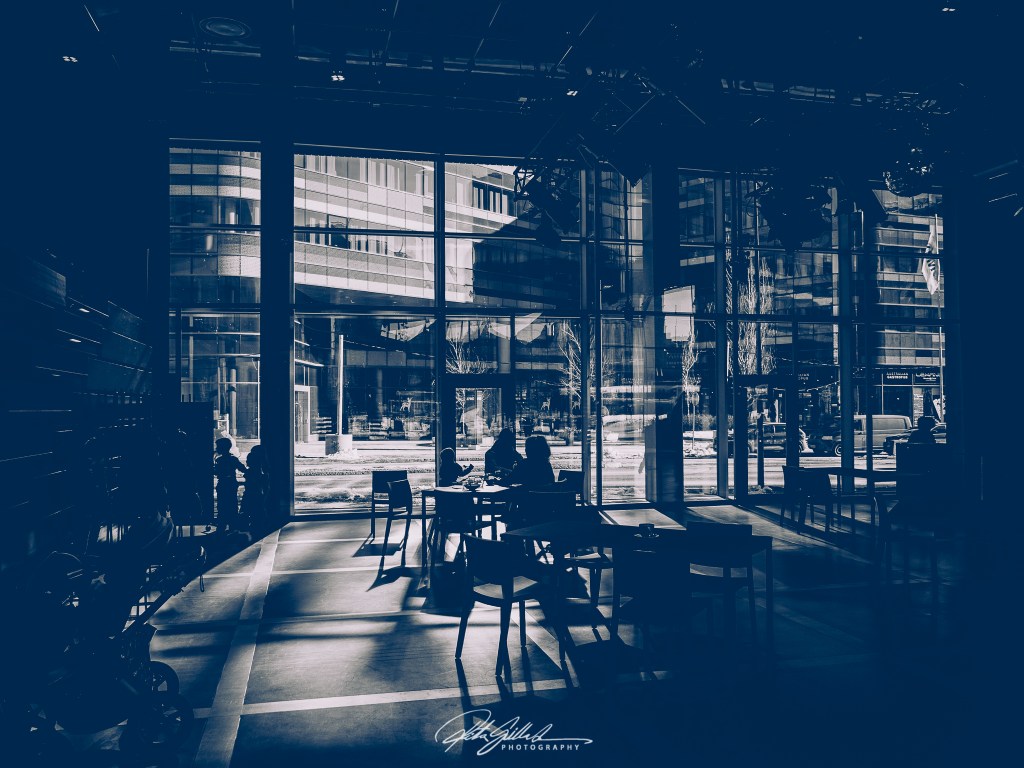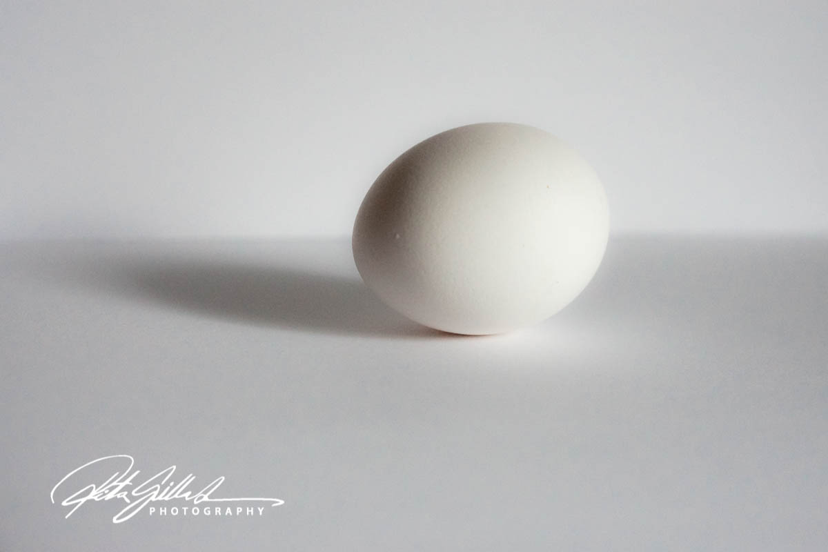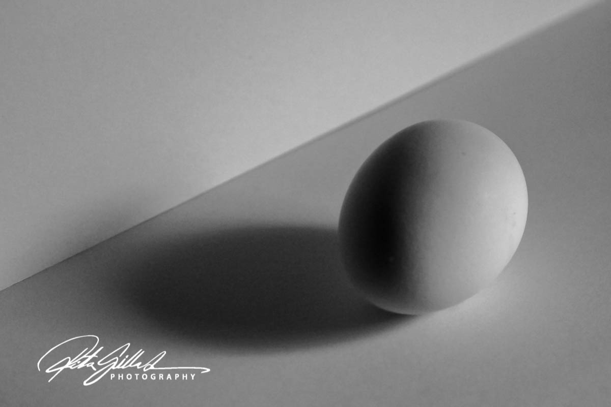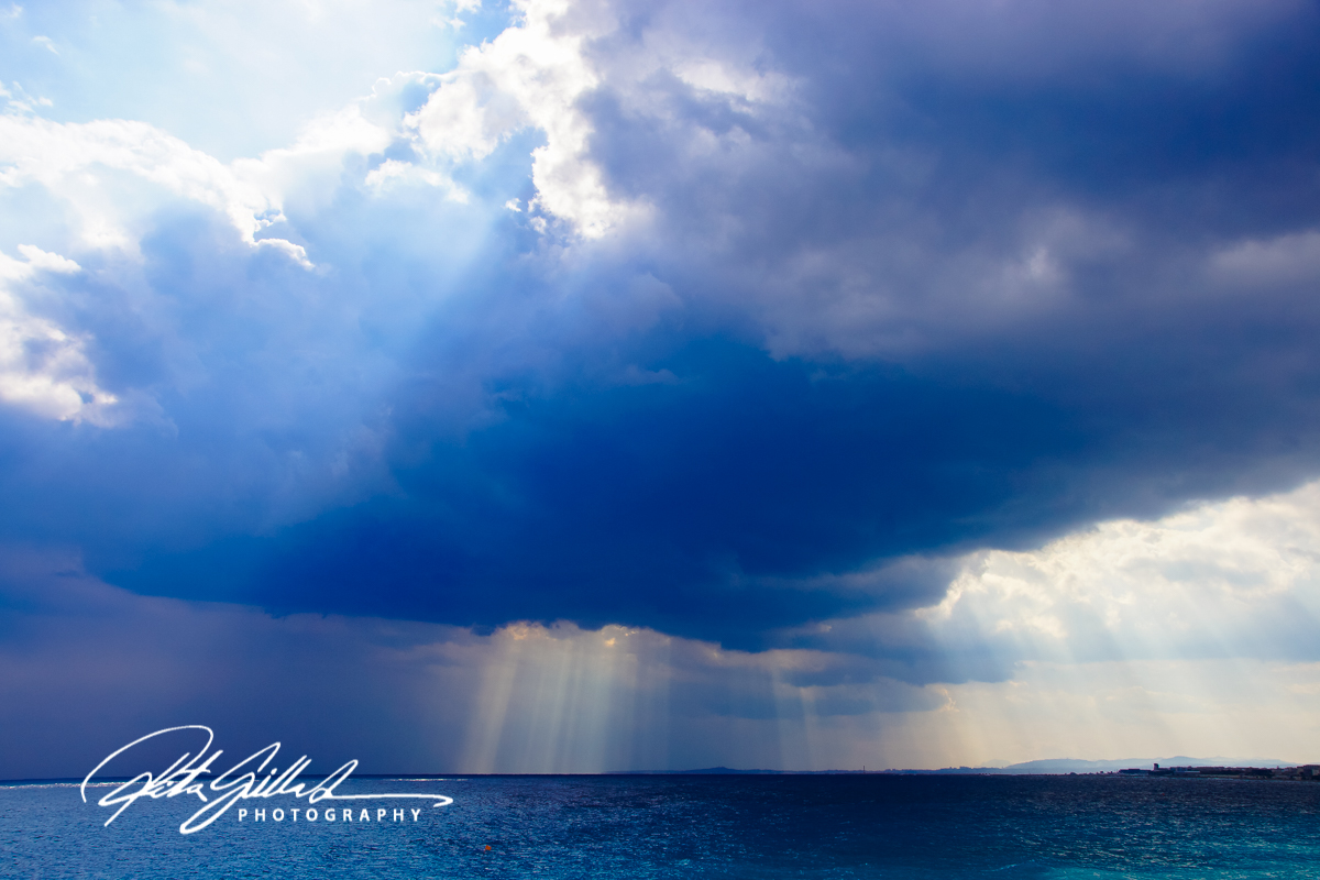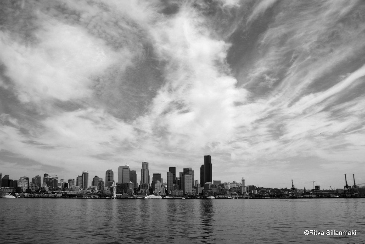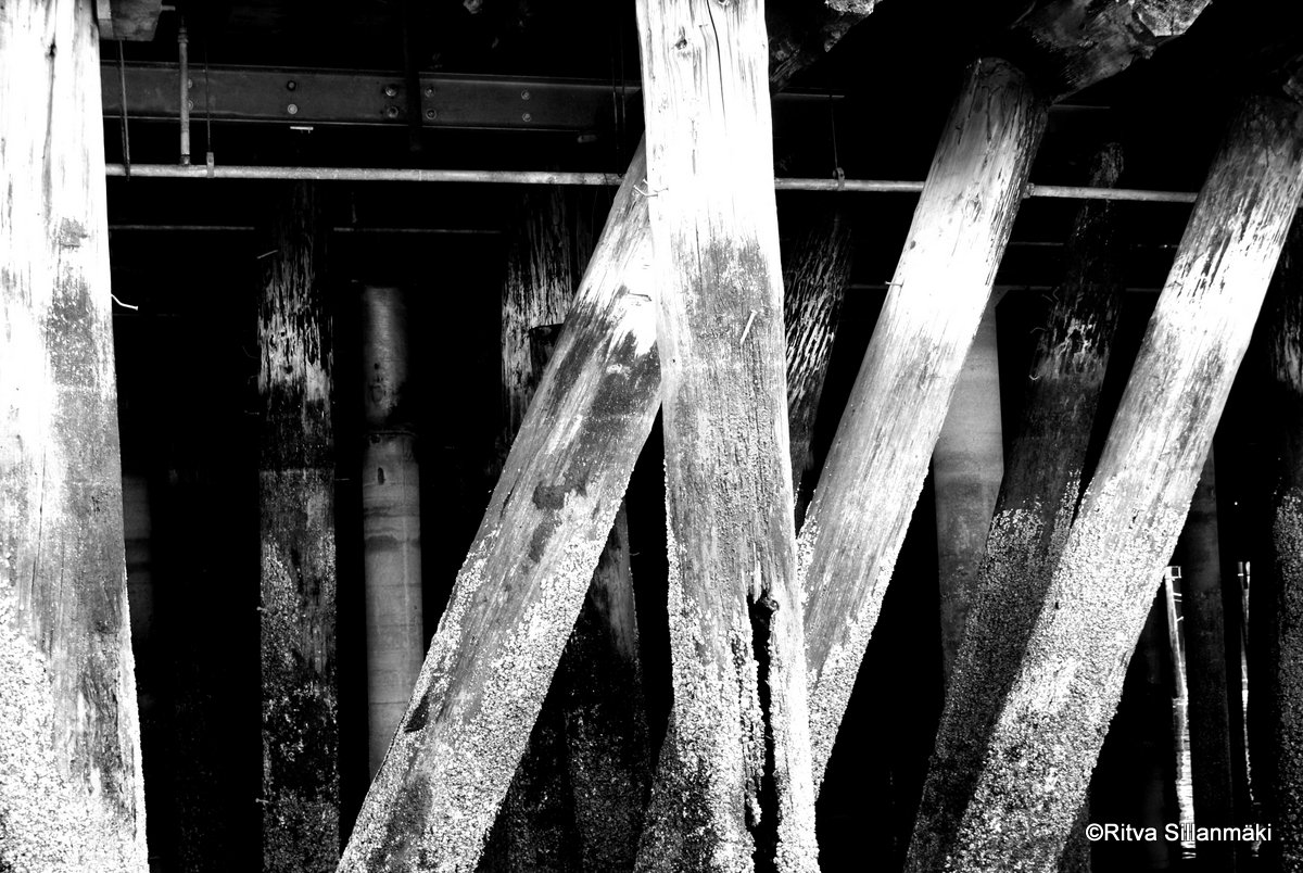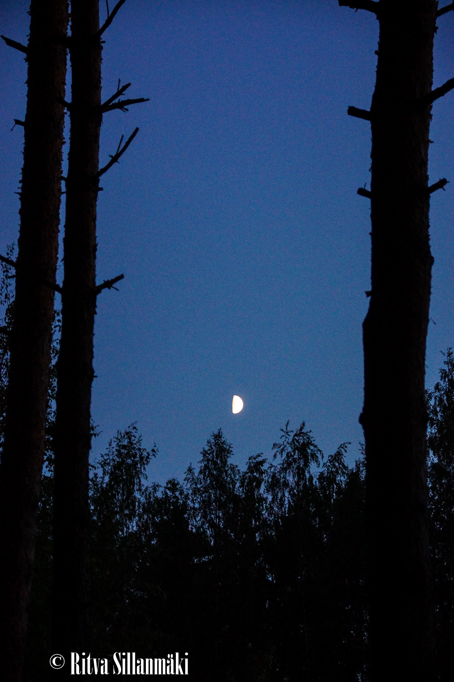
Prompted by lovely Margaret, for Leanne’s Monochrome Madness. What she’s asking for are photos of subjects you’d normally choose to shoot in colour exactly because of their vibrant colours. The challenge lies in translating these vivid visuals into the stark yet expressive world of black and white photography. Can you transform these familiar hues into a captivating monochrome experience that holds its own allure? It’s an exciting test of creativity, pushing the boundaries of one’s artistic vision. Let’s see how I do in this intriguing endeavor, experimenting with contrasts, shadows, and textures to create images that resonate even without their natural colours.


Do you care for some strawberry cake? I found red rather tricky, so it did not appear too dark.


When considering the color purple, one might wonder how to make it truly pop without resorting to the use of stark white. There are various ways to enhance its vibrancy and create a more lively appearance. Utilizing textures or patterns alongside can also enhance its visual appeal, ensuring that it stands out while maintaining its rich character.


Art, when transitioning to monochrome, demands a keen understanding of color nuances and their emotional impact. This absence of color reveals the core essence of a subject, challenging artists to express their vision through shades of black, white, and gray. The monochromatic style highlights form and texture, encouraging deeper viewer engagement and interpretation, making it a compelling exploration for both artists and audiences in a colorful world.


So how did I do.?