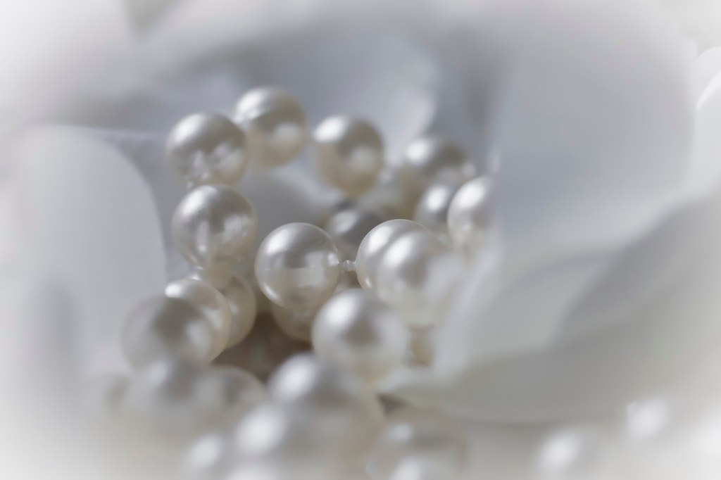
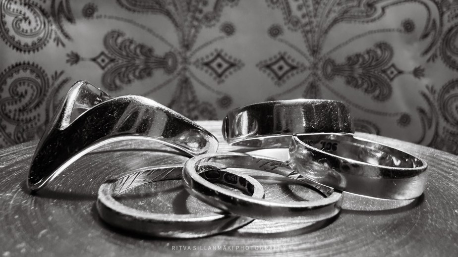
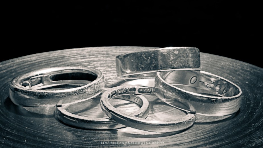
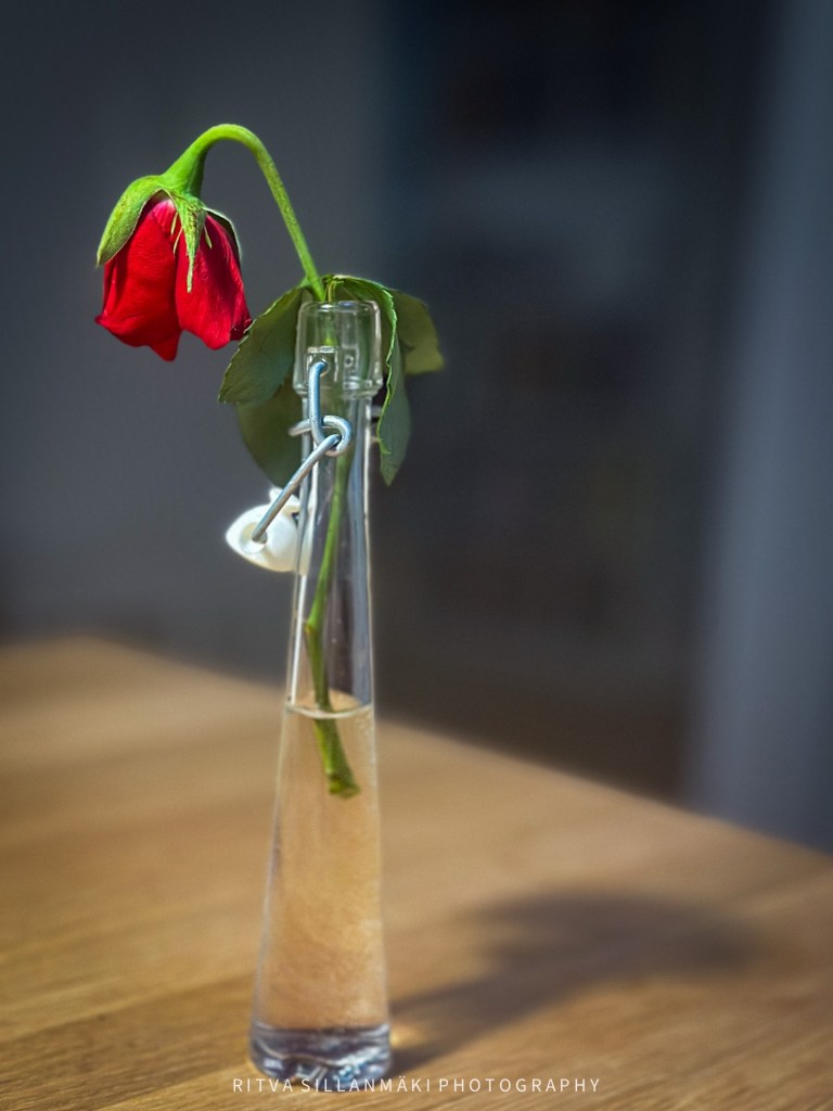
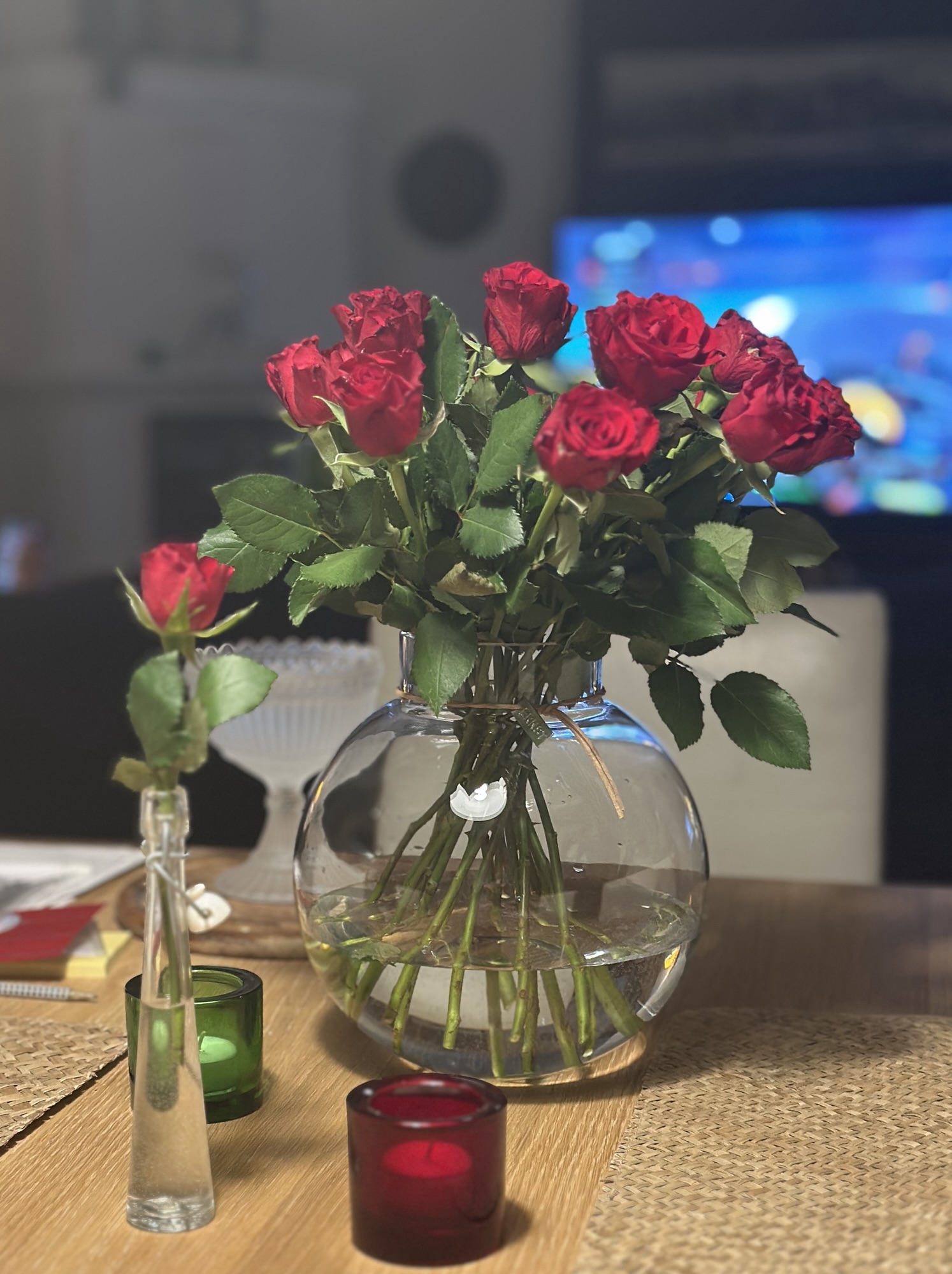
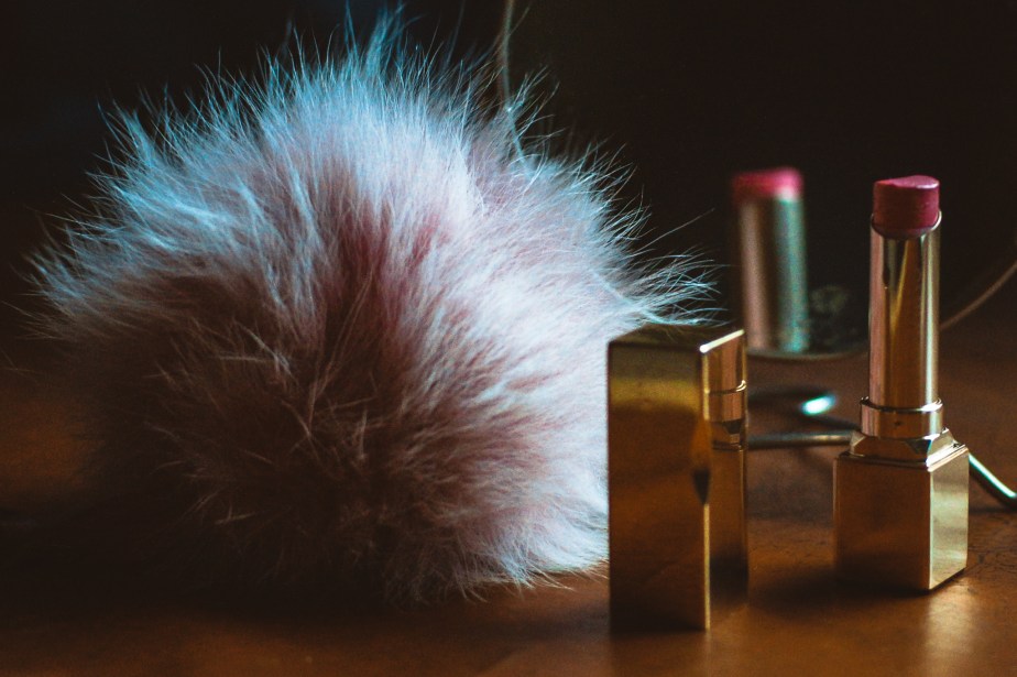
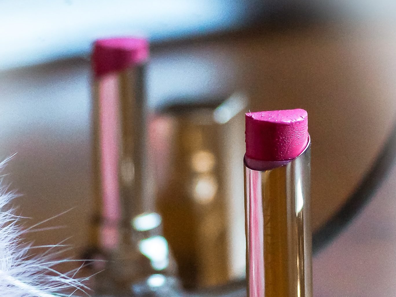
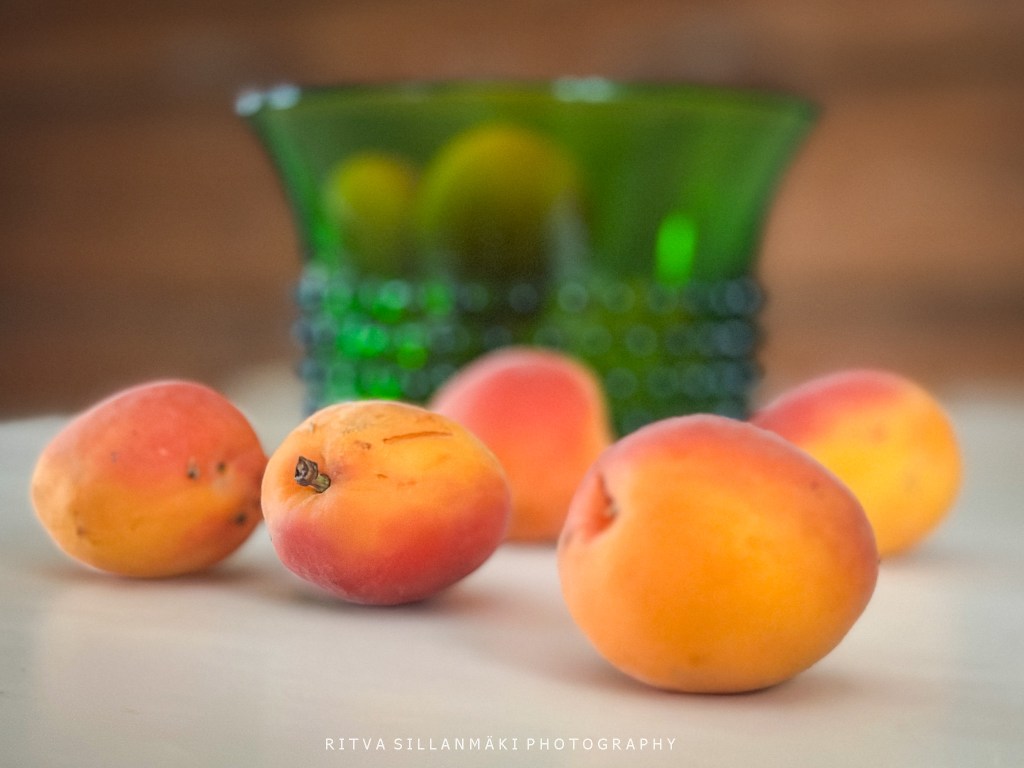
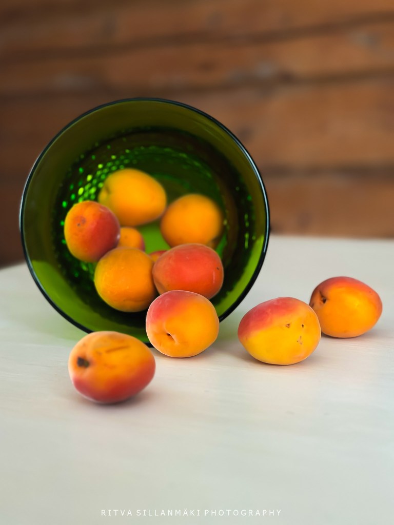
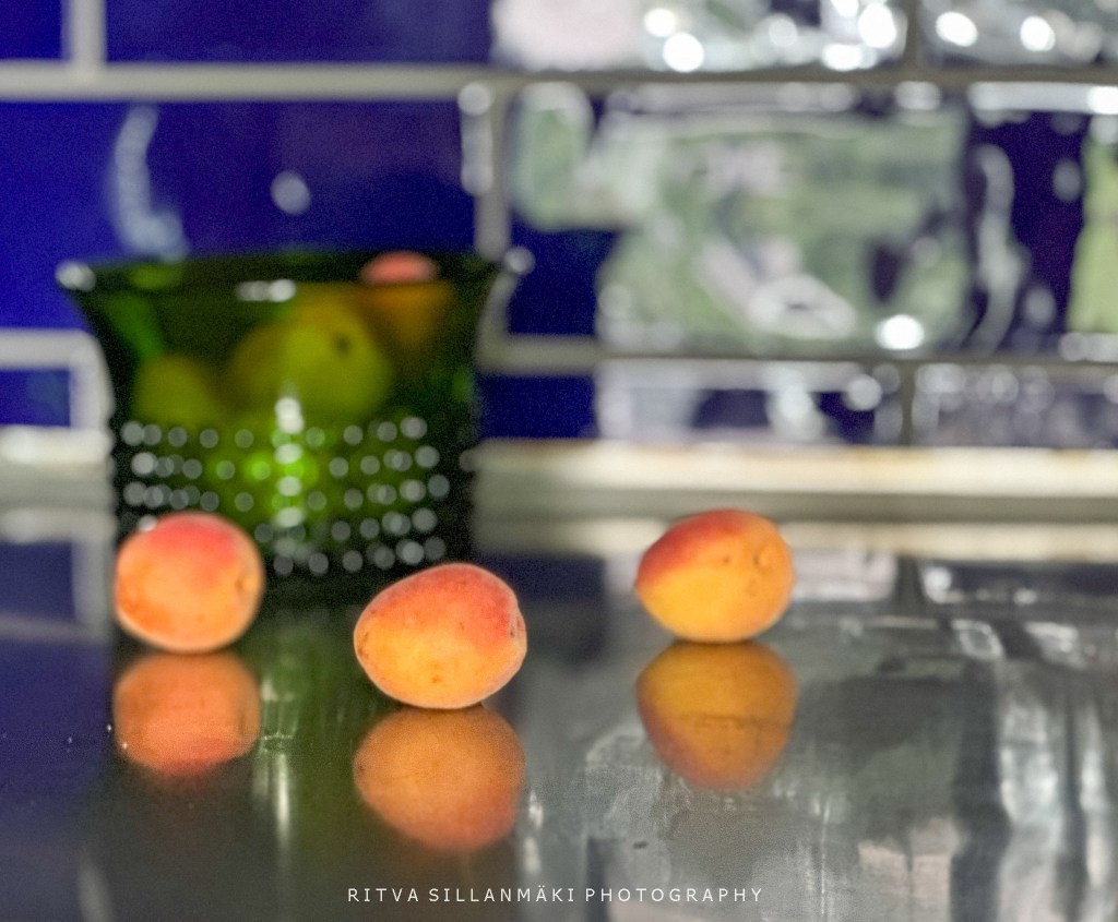
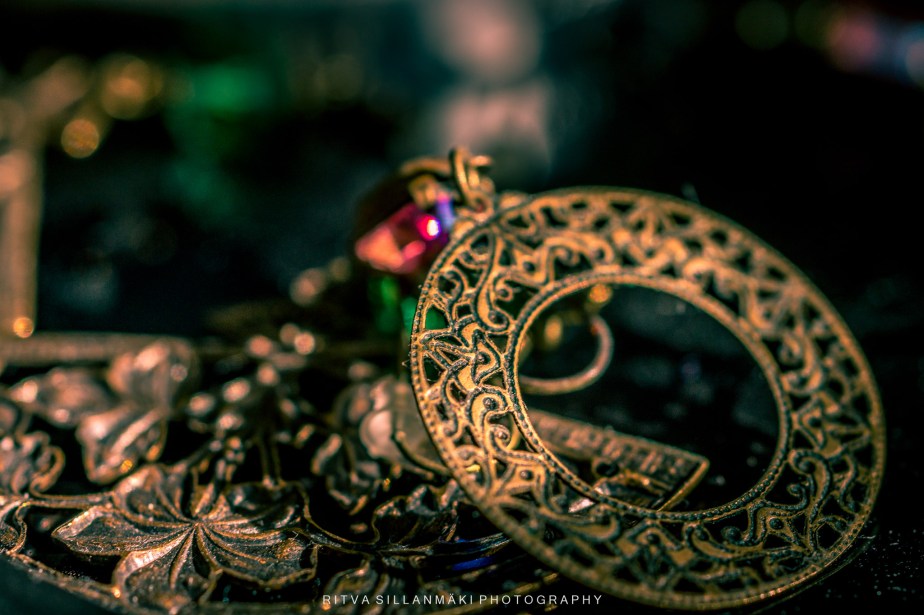
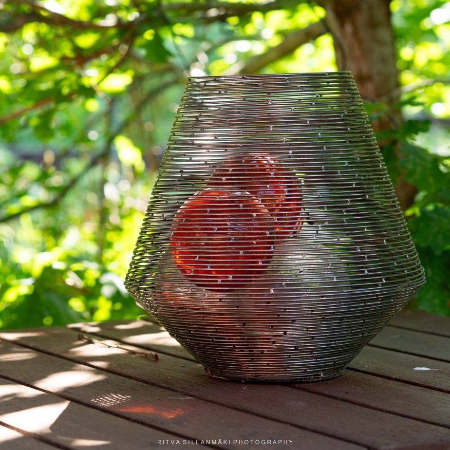
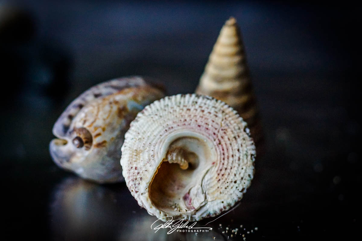
Here are my photos for Last on the Card for May 2026 hosted by Bushboys World

I took this a close-up of a spruce tree branch with fresh, light green new growth at the tips of the needles with my Sony 7III . I wanted the focus to be sharp on the vibrant, young shoots, while the background is blurred with various shades of green and soft light bokeh, creating a dreamy and tranquil atmosphere. The composition highlights the contrast between the fresh spring growth and the more mature, darker green needles, evoking a sense of renewal and natural beauty. The mood is peaceful and refreshing, typical of a serene forest scene in springtime. I shoot in RAW so slight editing has been done.
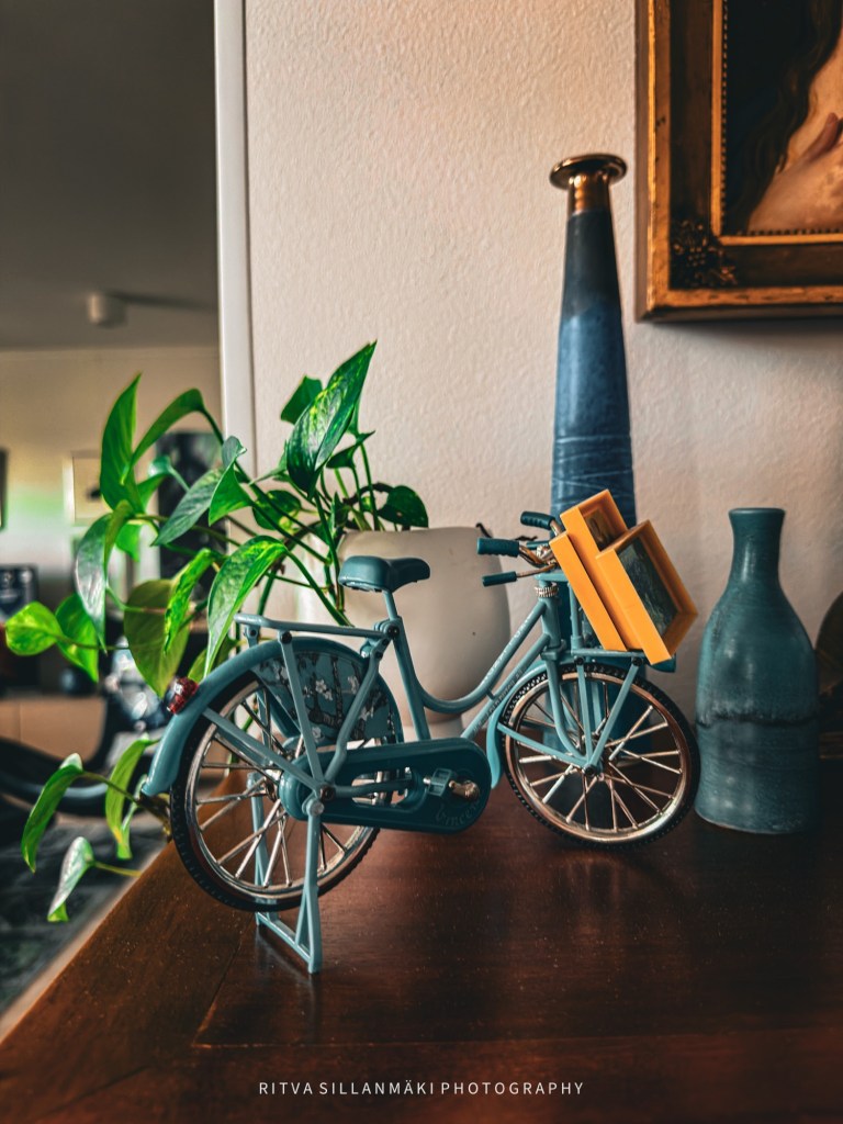
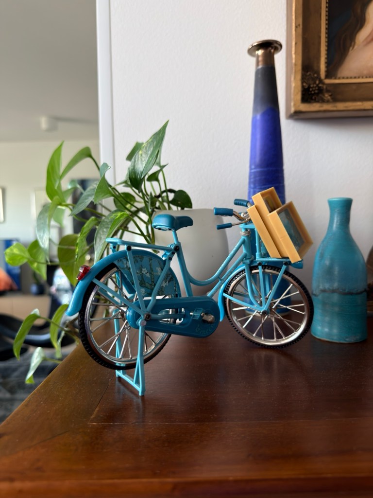
I snapped a quick photo of this decorative bike that totally represents the Netherlands—there are bikes everywhere there! It was taken at my friend’s place. The shot features a close-up of a cute blue miniature bicycle resting on a wooden surface. It has some really neat details like a saddle, handlebars, pedals, and wheels with silver spokes, plus there’s a tiny wooden crate on it filled with little frames. Behind the bike, there’s a vibrant green leafy plant in a white pot that adds a nice natural vibe. In the background, you can see two ceramic vases—one’s taller and gradient blue, while the other is shorter with a rustic look—next to part of a framed painting with a fancy gold ornate border, which really gives the whole space a cozy and artistic feel. As you can maybe guess, it is taken with my IPhone 17 Pro. I always edit my photos, so here are both, original and edited.

")
")