Driving into the mist


I have had luck with sunny Sundays, two in a row. I went for a drive searching to find Ruska ( one word in finish language to describe the process of nature turning to the beautiful colors of autumn)
Here few more photos from that day.
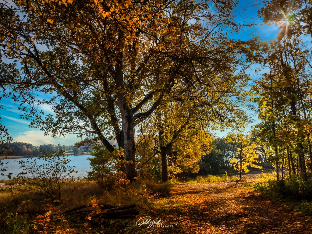
I found some lovely spots. I will share some now and some other posts as usual I have lots of shots and I like to share 🙂 Hope you like them.
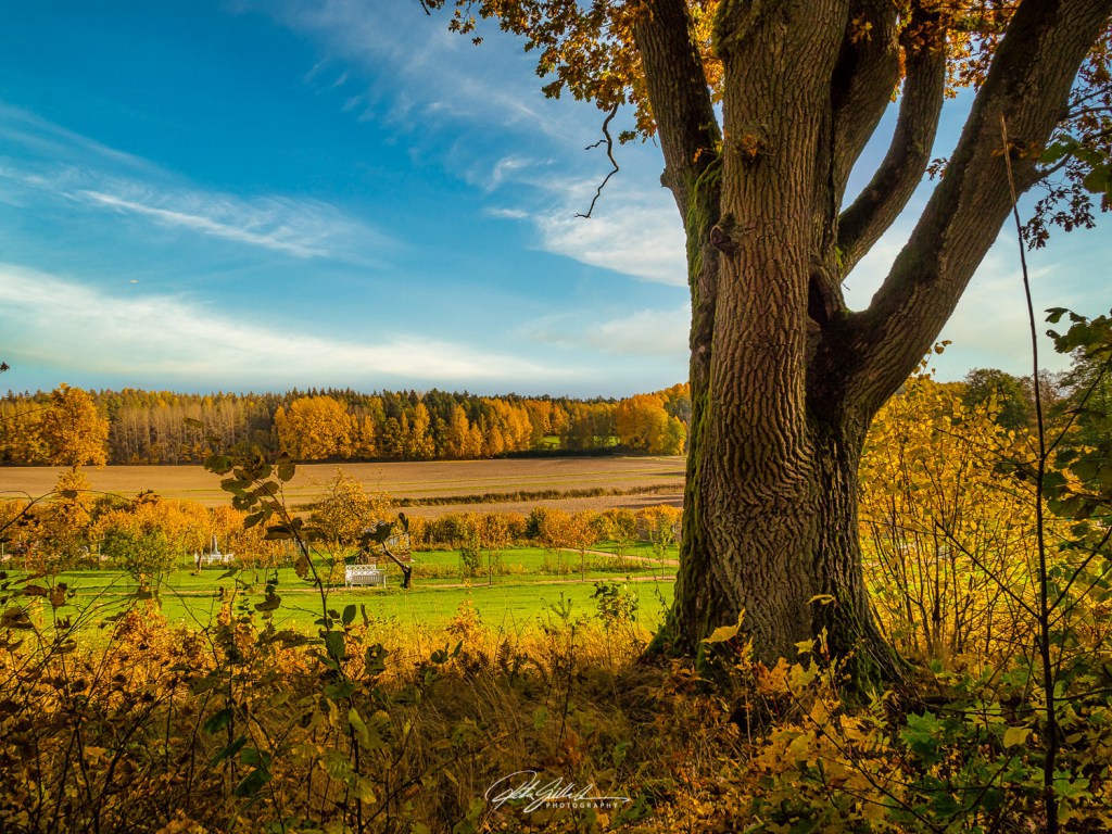
This colorful time passes so quickly as the leaves fall and sooner than we want to be, we are already surviving November. I have several years been doing that here on my blog with fellow bloggers.
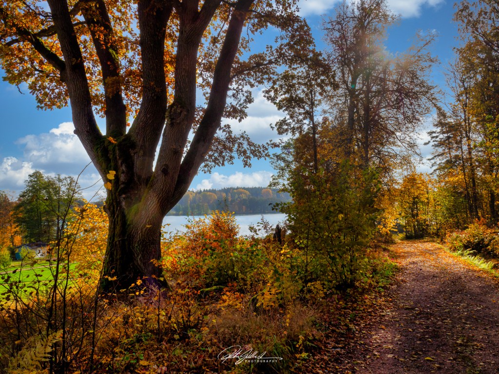
I have had luck with sunny Sundays, two in a row. I went for a drive searching to find Ruska ( one word in finish language to describe the process of nature turning to the beautiful colors of autumn)
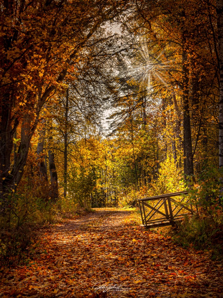
I found some lovely spots. I will share some now and some other posts as usual I have lots of shots and I like to share 🙂 Hope you like them.
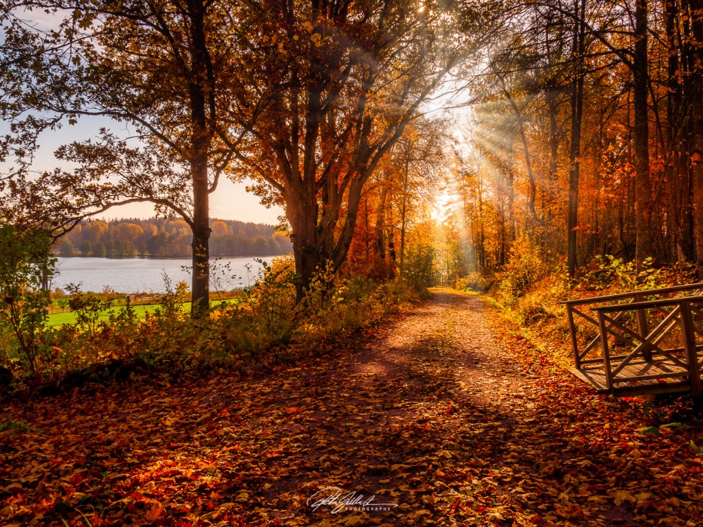
This colorful time passes so quickly as the leaves fall and sooner than we want to be, we are already surviving November. I have several years been doing that here on my blog with fellow bloggers.
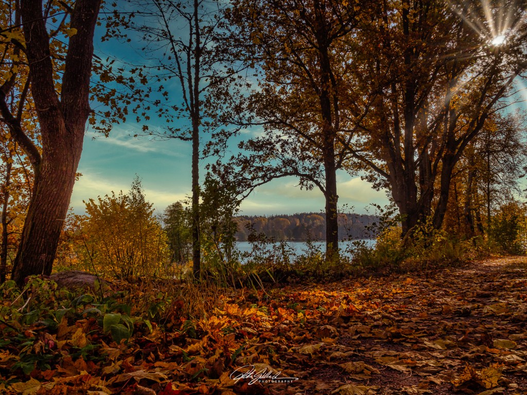
Time flies and older you get, the quicker it goes in my growing experience. Just now it was September and well month has passed. The days are getting shorter, darkness is slowly beginning to unfold around us ( is that correct way to say it? ) Well anyways, these are the colors of early October at my backyard.
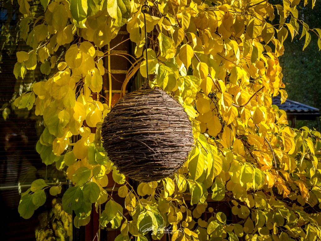

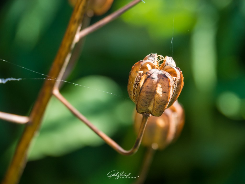
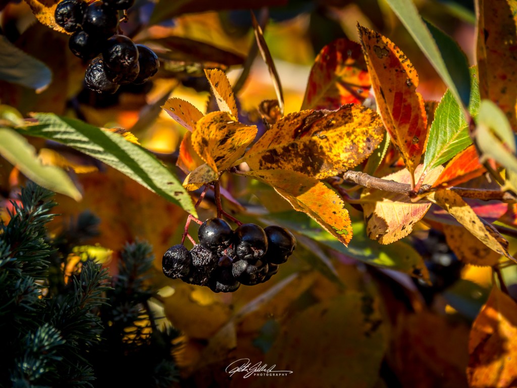
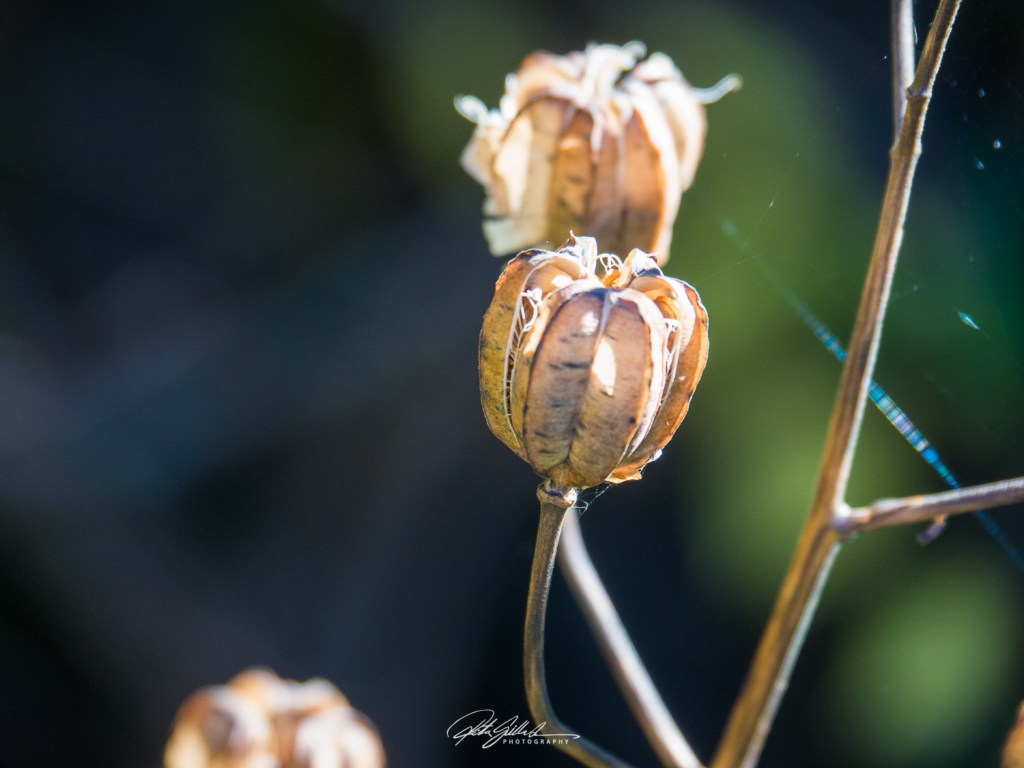
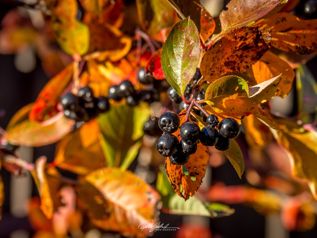
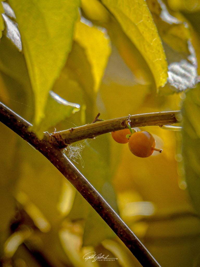

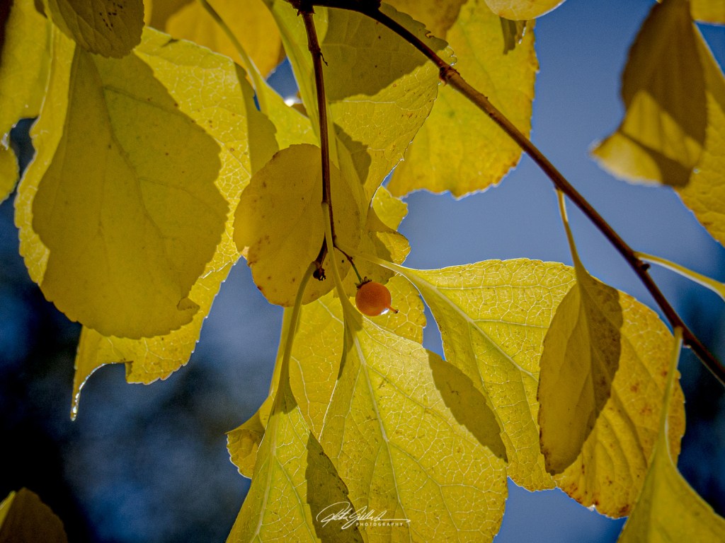

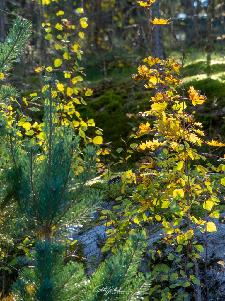
We have had rather gray and rainy September, the forecast was predicting that to this weekend also so we decided to stay at home. But no, rather we had a nice weather, Sunday particularly was lovely.
These are my sunny Sunday shots.
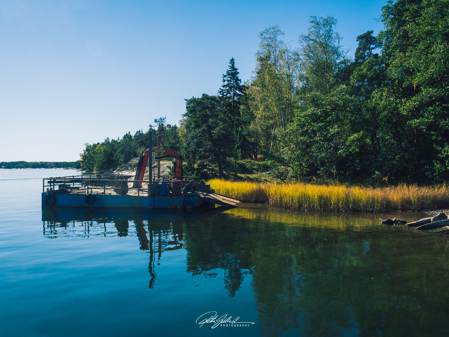


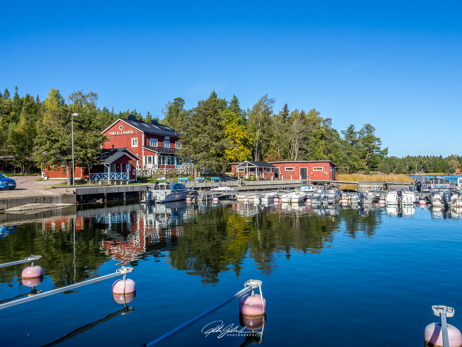


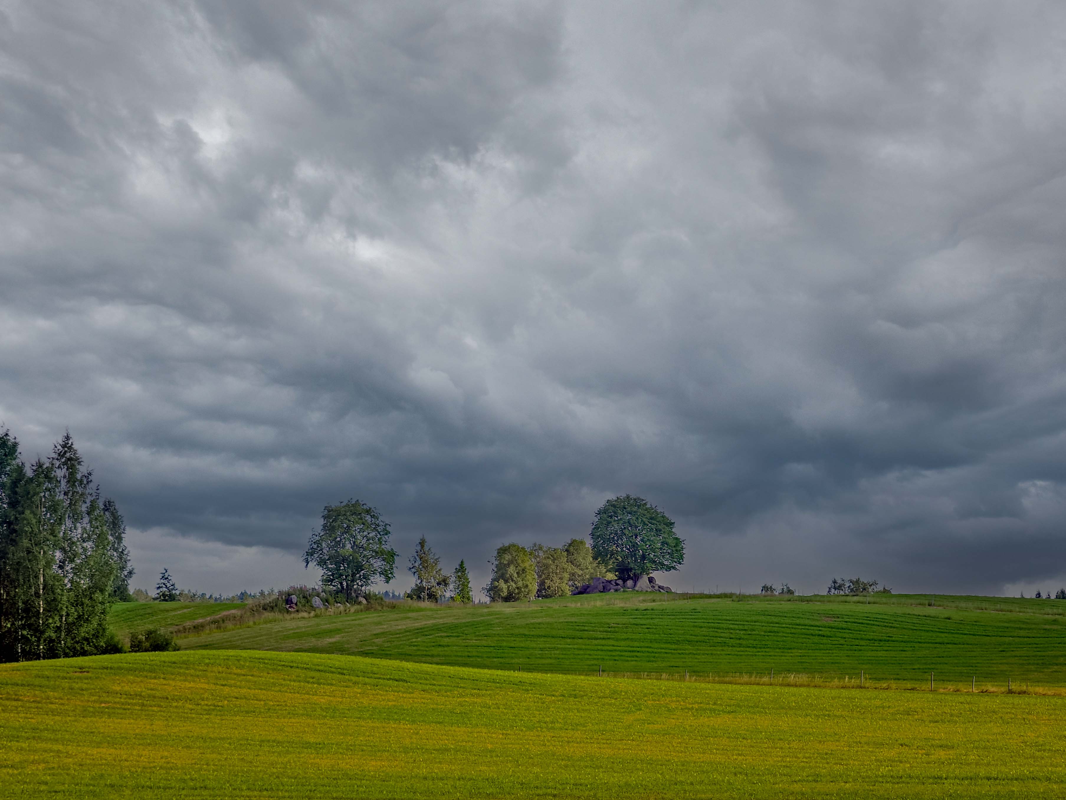
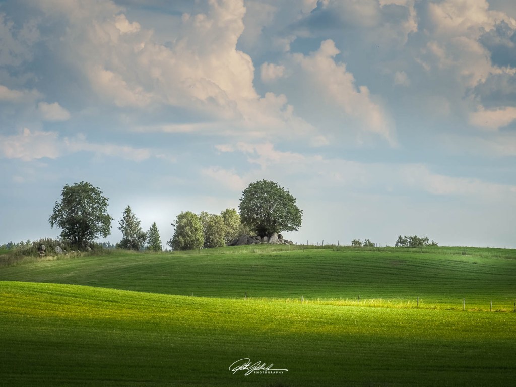
Sunny day clouds or dark clouds in the sky this sight makes me want stop and take a photo.
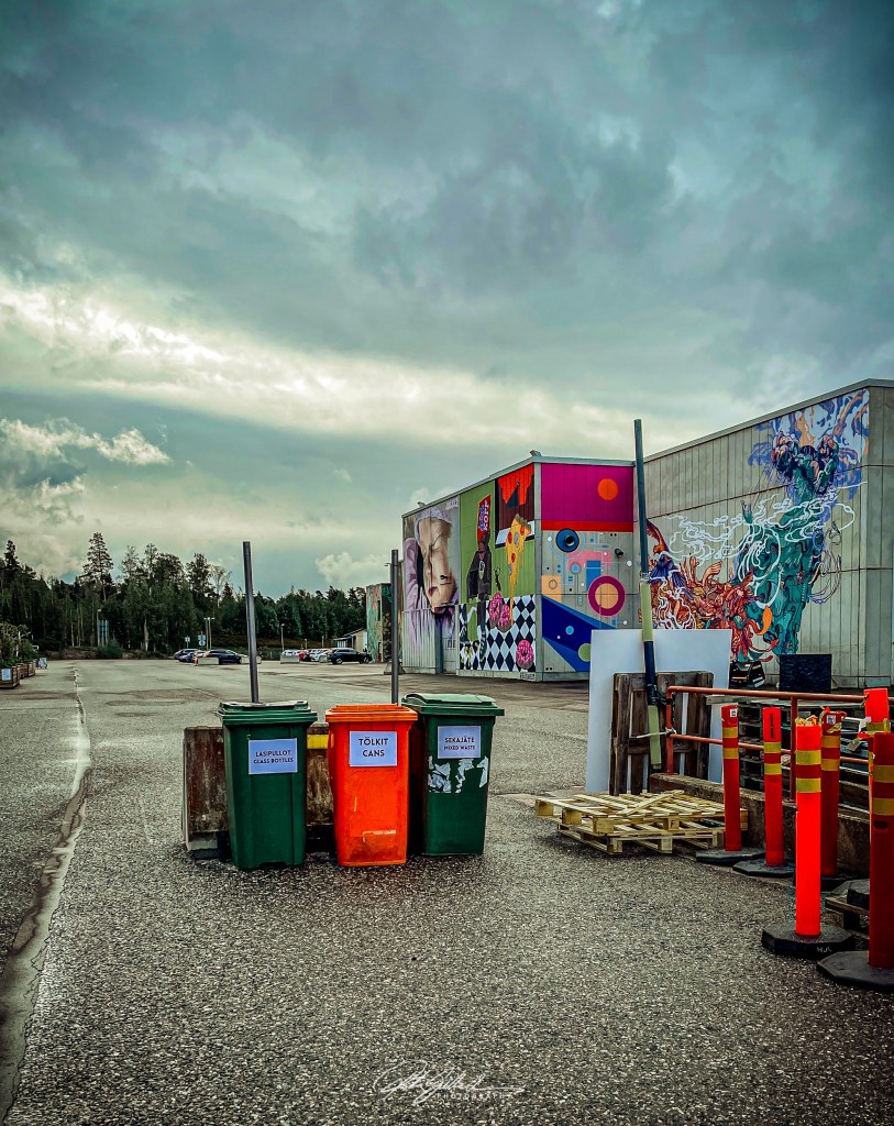
No words, no explanations. Just random shots of September.
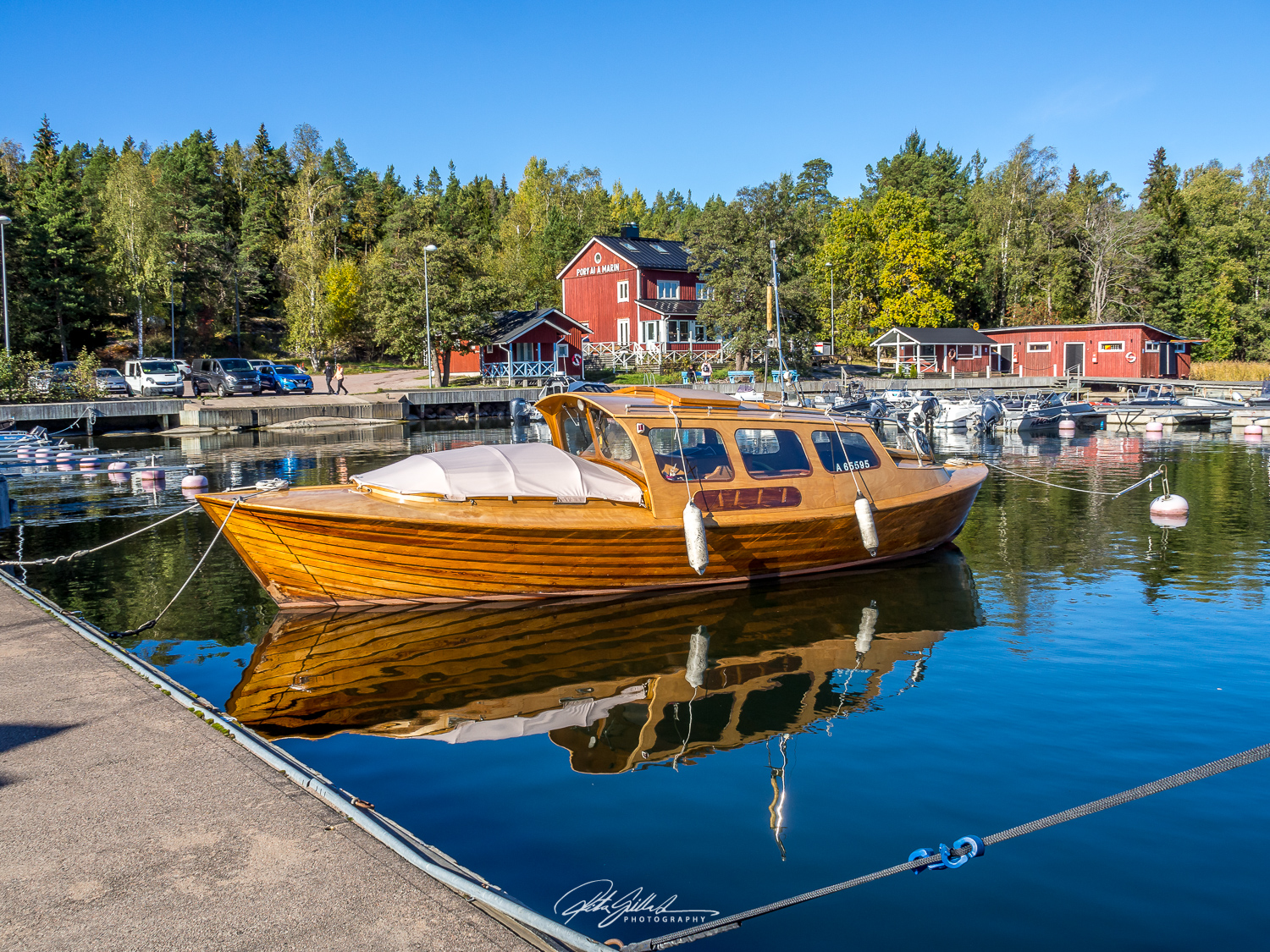
The color of calmness and clarity. Turquoise stabilizes emotions and increases empathy and compassion. It emits a cool calming peace, gives us a boost of positive mental energy that improves concentration and clarifies our mind, and creates a balance that clears the path to spiritual growth.
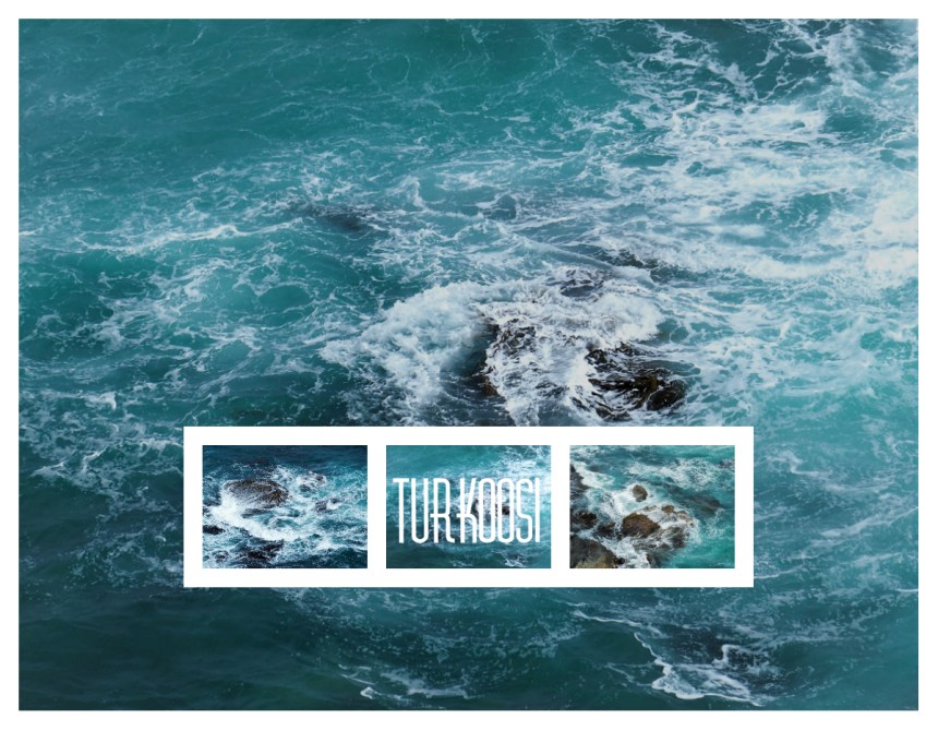
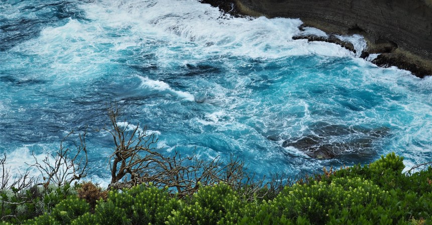
“A turquoise given by a loving hand carries with it happiness and good fortune.”

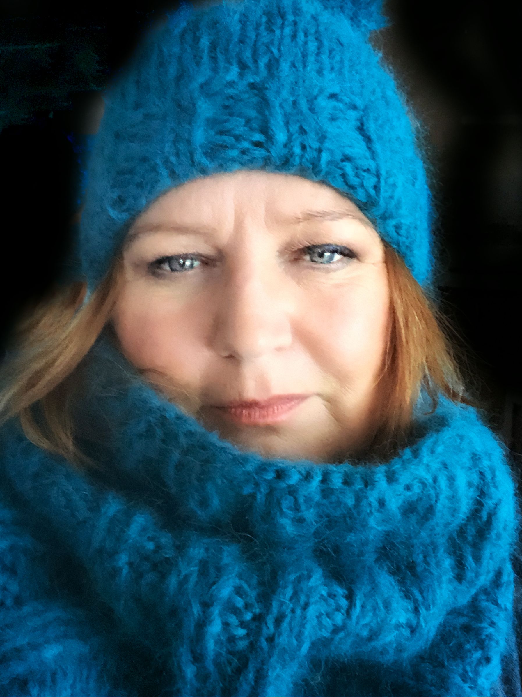

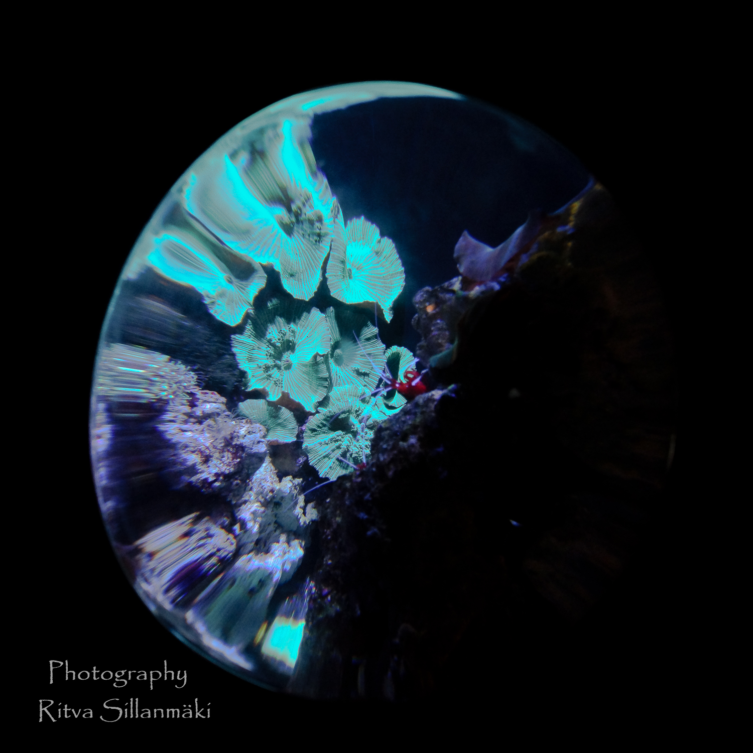

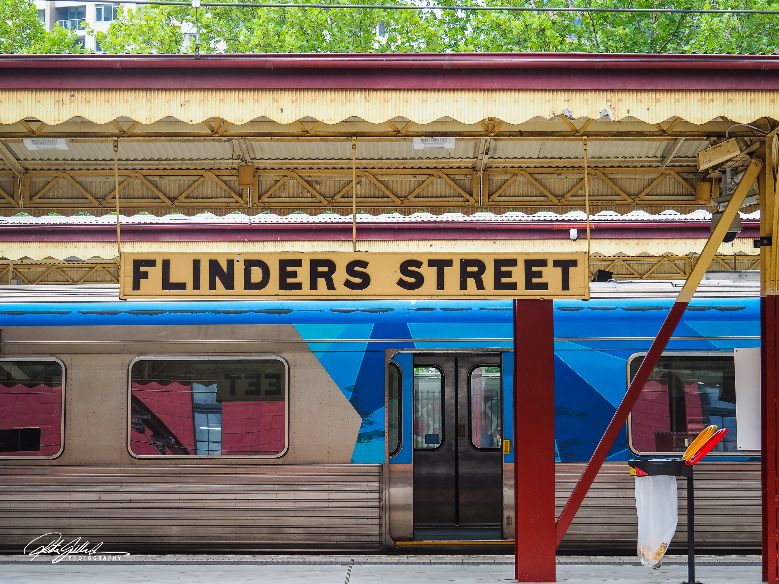
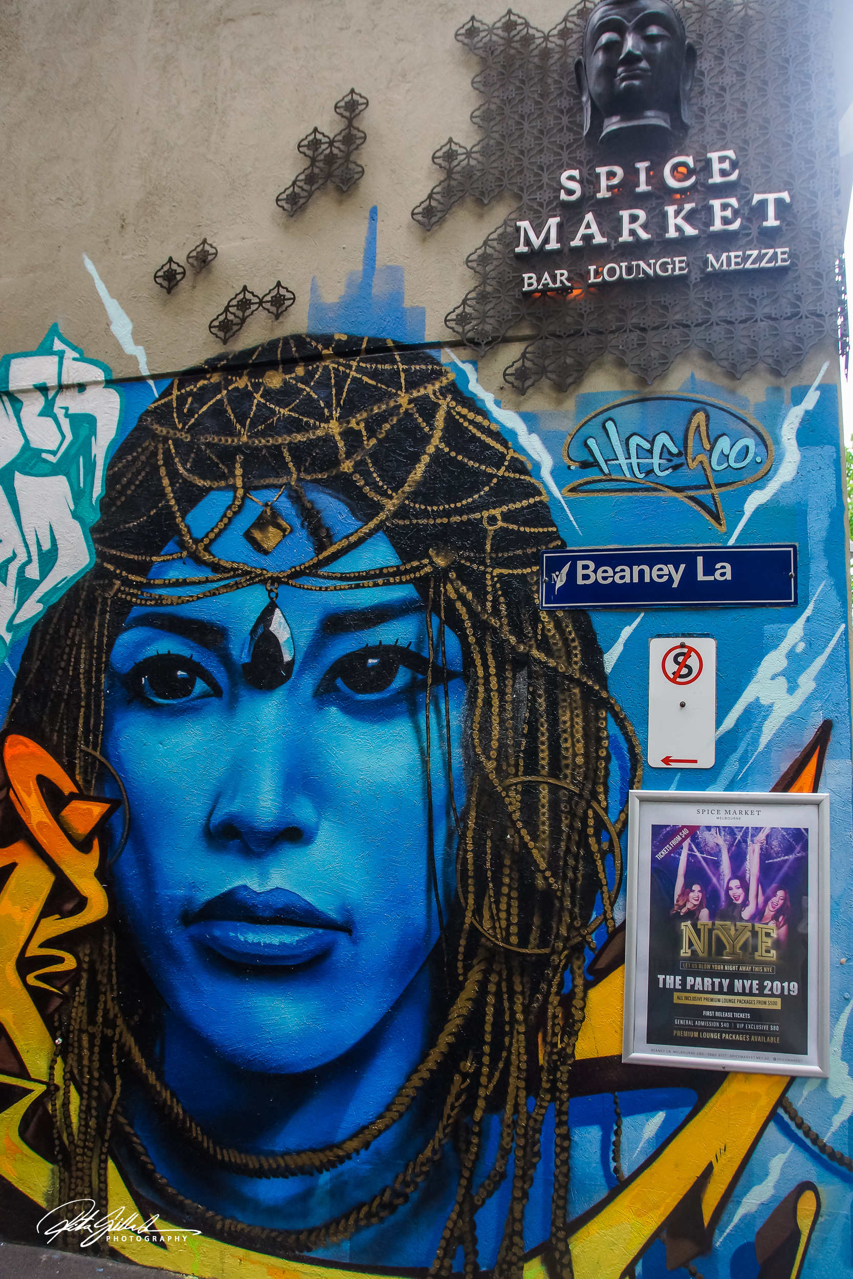
Comprised of green, blue, and yellow tones, turquoise is a striking combination of these color wheel beauties. Never one to boast, turquoise is radiant without knowing it. With its humility and shifting charm, there’s much to love about this greenish-blue shade..
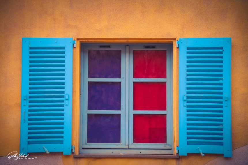

Aqua is closer to green than blue. It is refreshing, uplifting, creative and cheerful, while at the same time being strong and independent.
Aquamarine strengthens creativity and inspiration. It soothes and balances the mind and the emotions.
Blue-green (or teal) is an advanced turquoise shade that symbolizes credibility and reliability. It is known to promote engagement and spiritual development.


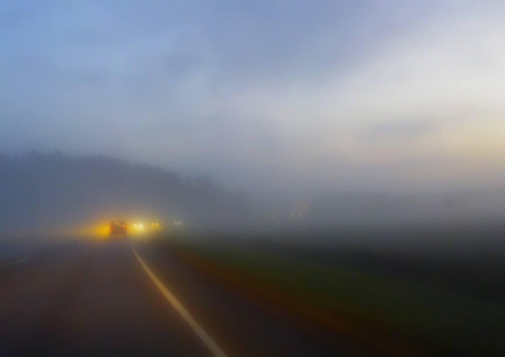
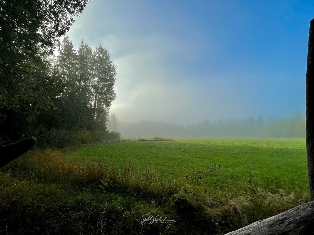
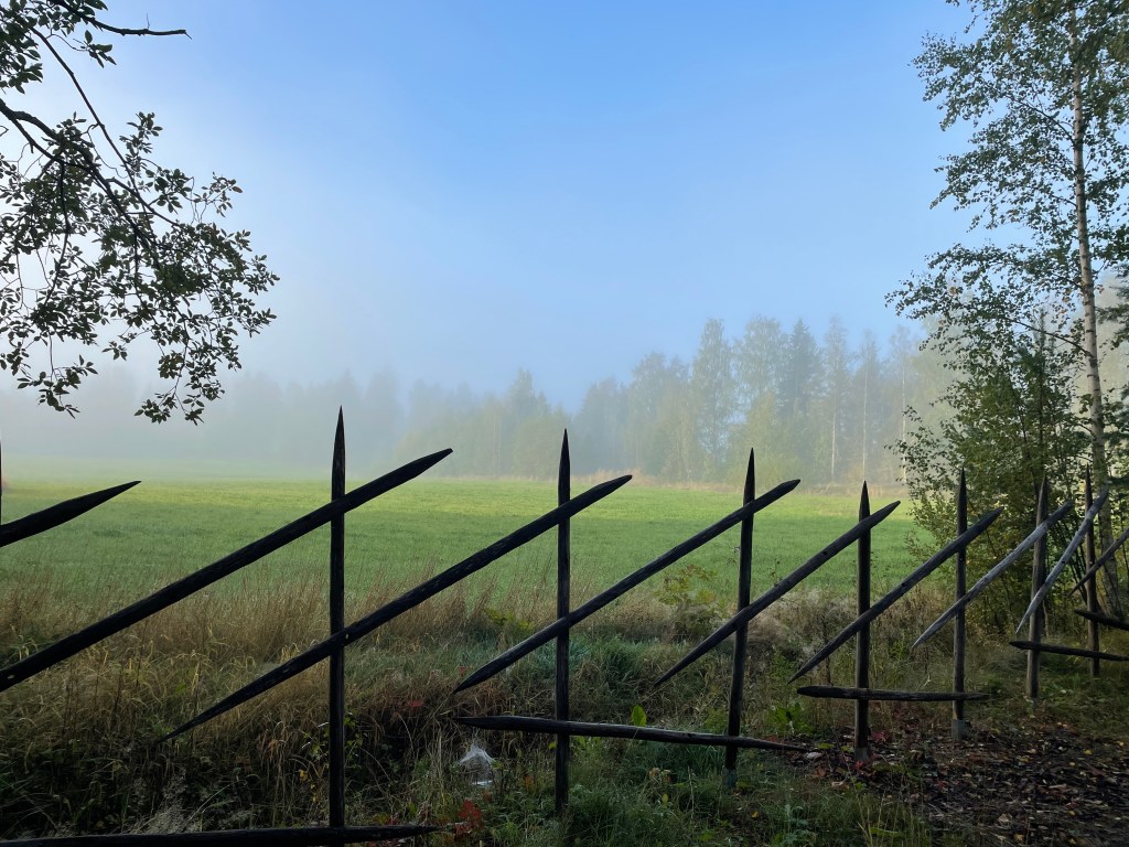
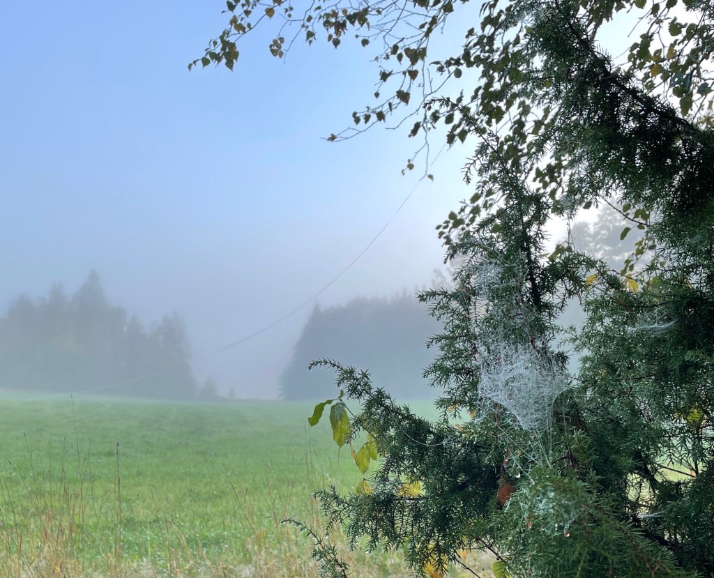
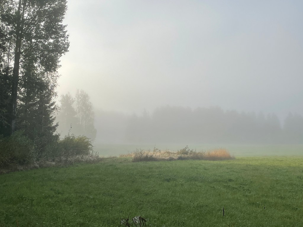
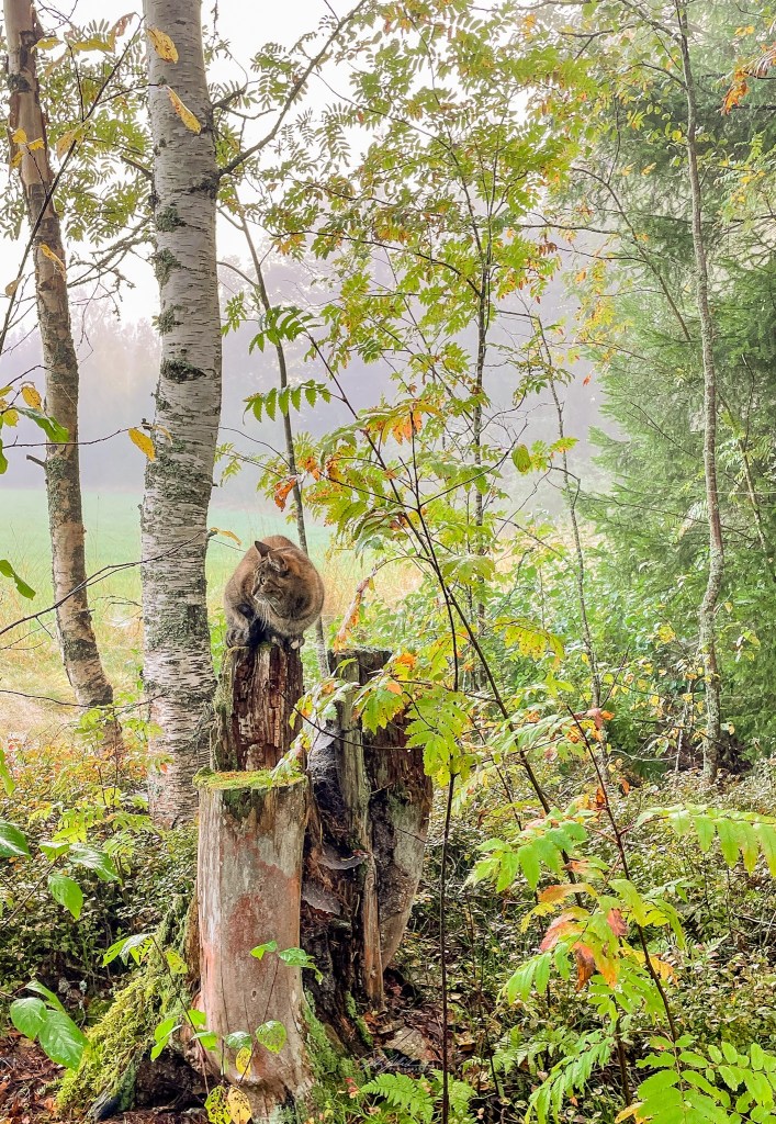
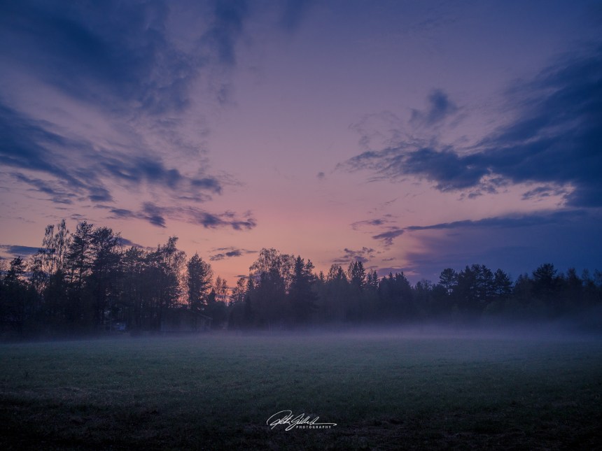
Foggy skies greeted us first thing in the morning, I took my time before I went outside to take some photos. I had my furry little friend following me. These I took with my mobile, and little bit later I took the camera for a walk.
We took an early start to the weekend. We left nice weather behind and headed towards the rain, summer house. We could see the clouds turning dark grey over the highway.
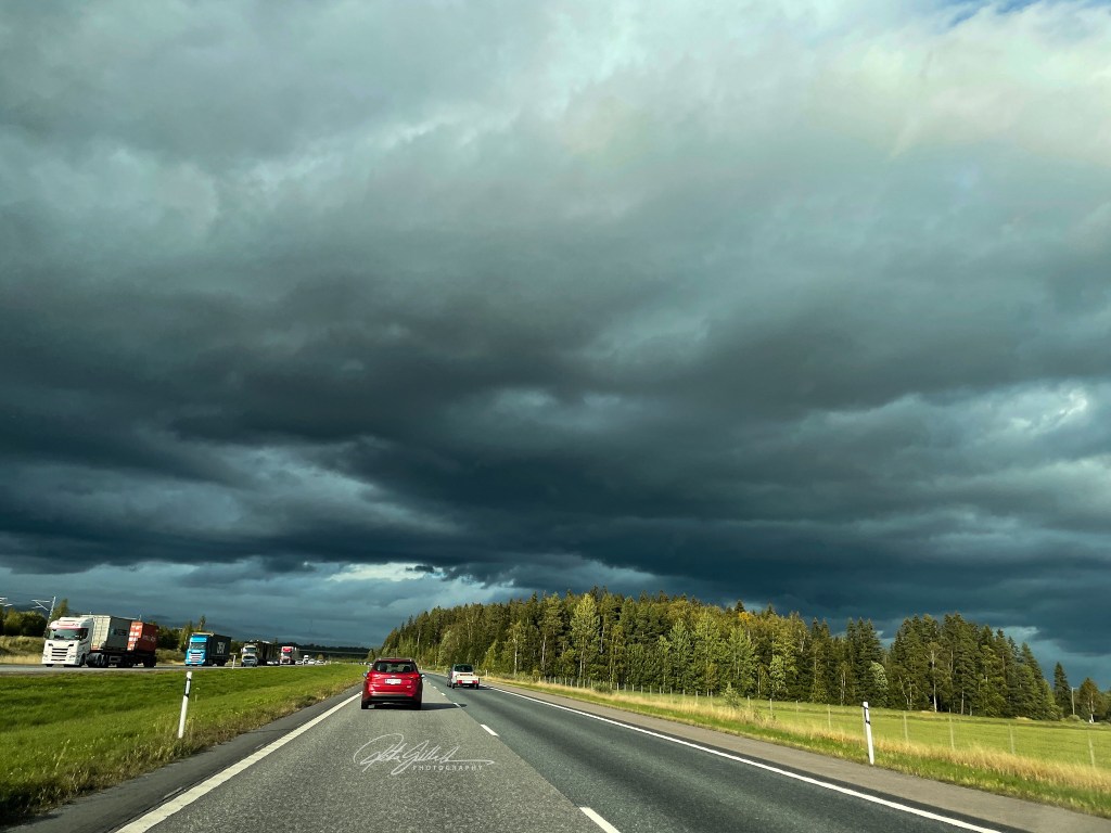
And it rained when we got there and continued to do so all night. Luckily we were nice and warm inside with the fireplace giving us warmth and nice atmosphere
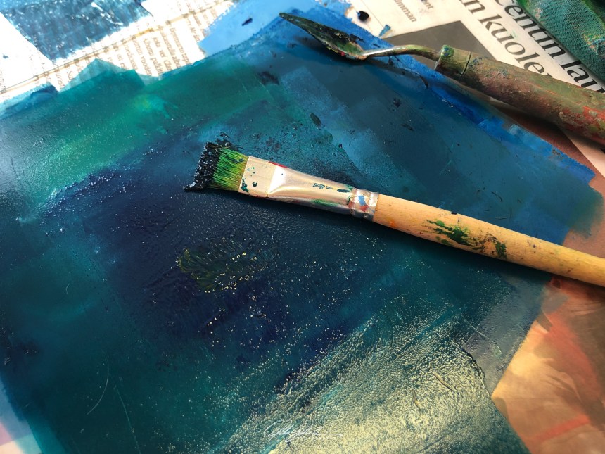
The color of trust and loyalty. Blue has a calming and relaxing effect on our psyche, that gives us peace and makes us feel confident and secure. It dislikes confrontation and too much attention, but it is an honest, reliable and responsible color and you can always count on its support.


“How sweet to be a cloud. Floating in the blue!” – A. A. Milne
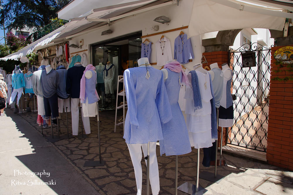
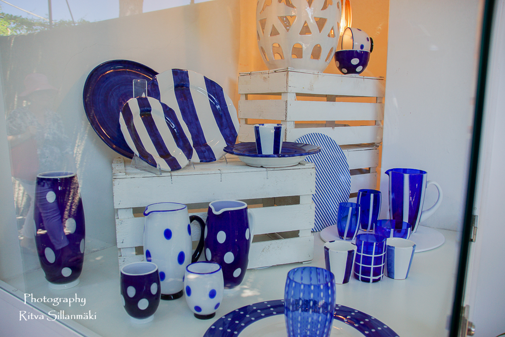

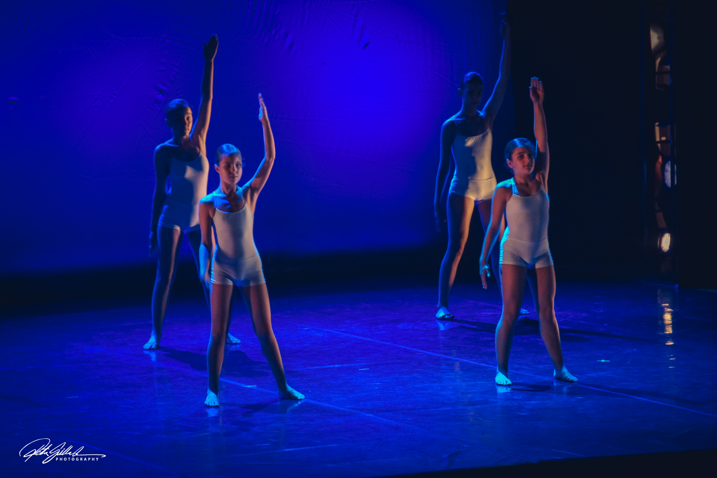
Blue inspires us to live in the present and bid farewell to our stress. By creating an air of serenity, it does just that. On a particularly challenging day, consider looking up at the sky. You’ll find an oasis of calm gazing up at the clouds.

“Everyone can enjoy the blue sky. The world is fair.” – Jukô Nishimura
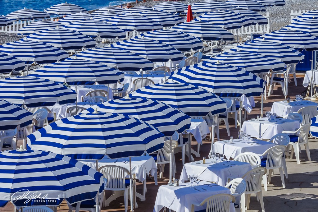
Where calmness is present, so too is the color blue. In addition to its peacefulness, blue also offers direction and empathy. Though these attributes are promising, blue is also fragile and somewhat cowardly. These varying qualities make blue the perfectly balanced shade that so many love, trust, and adore.

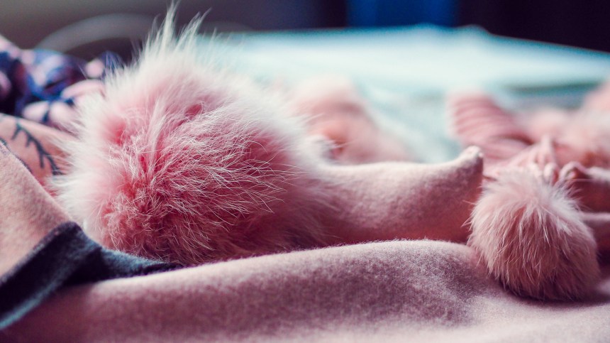
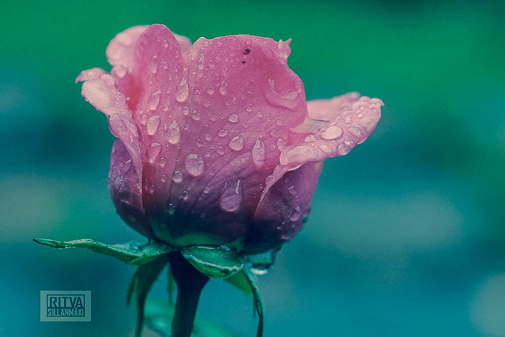
PINK! The color of love and compassion. Pink is kind and comforting, full of sympathy and compassion, and makes us feel accepted. Its friendly, playful spirit calms and nurtures us, bringing joy and warmth into our lives. Pink is also a feminine and intuitive color that is bursting with pure romance.
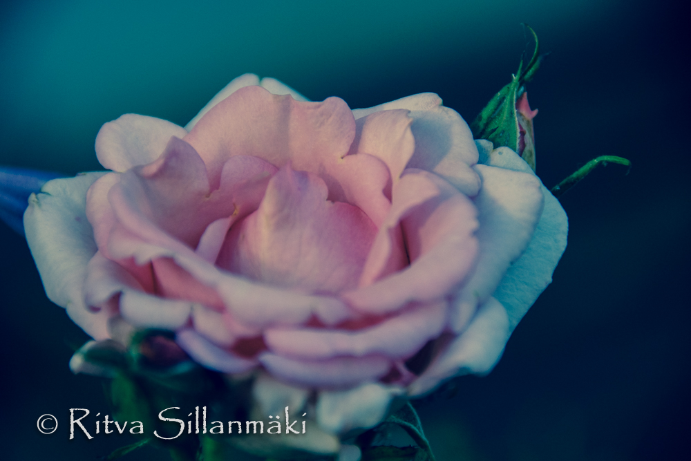


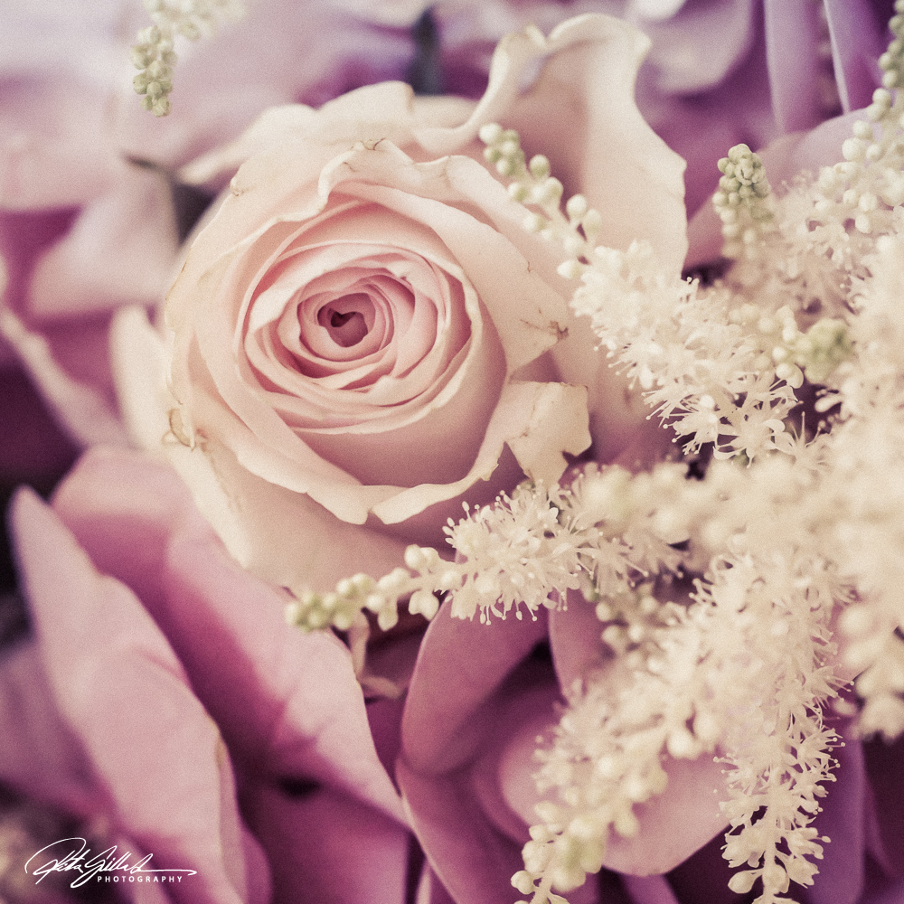
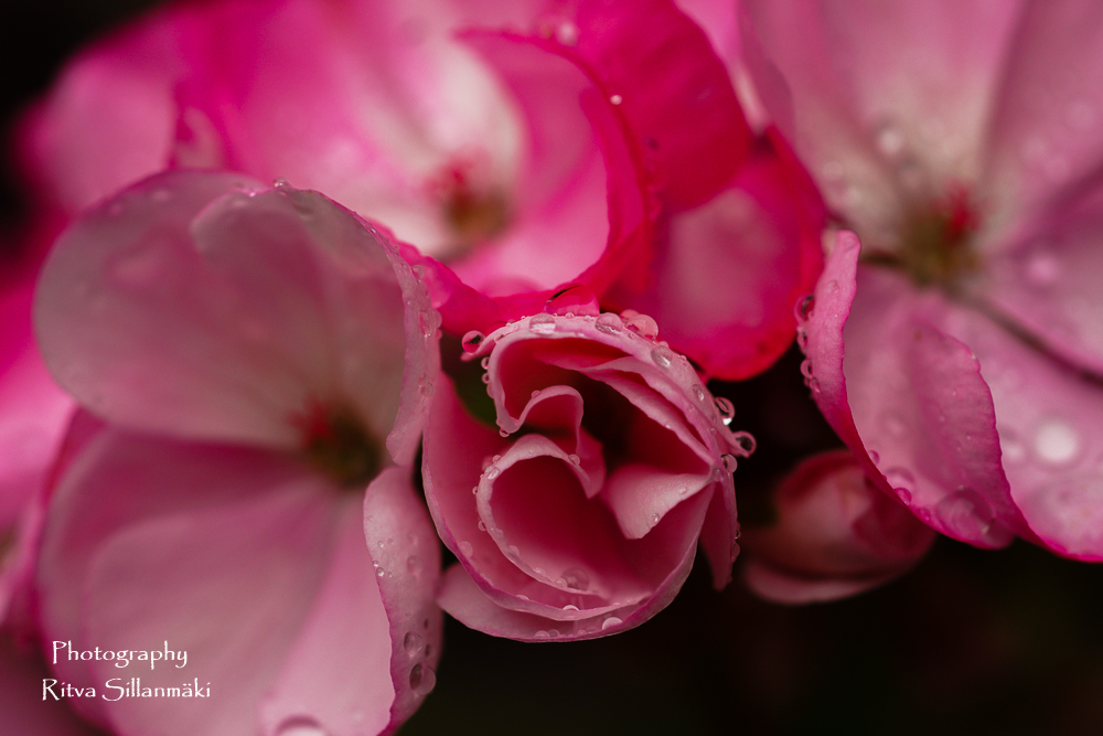
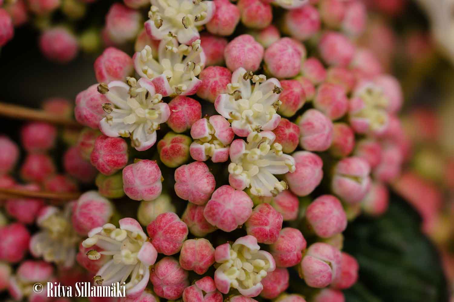
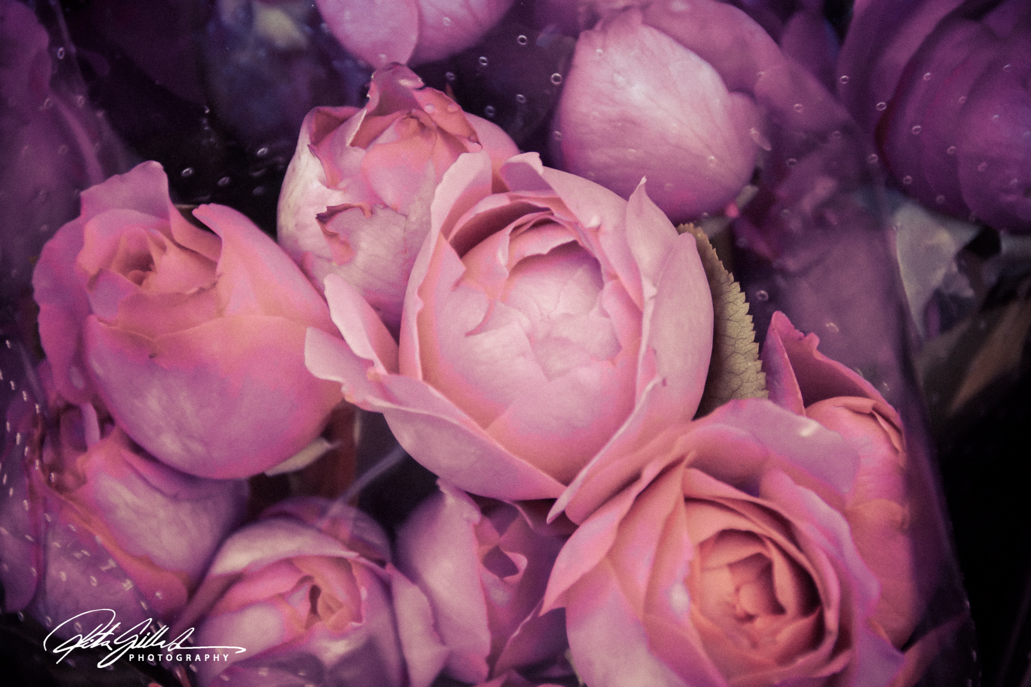
Pink isn’t just a color, it’s an attitude
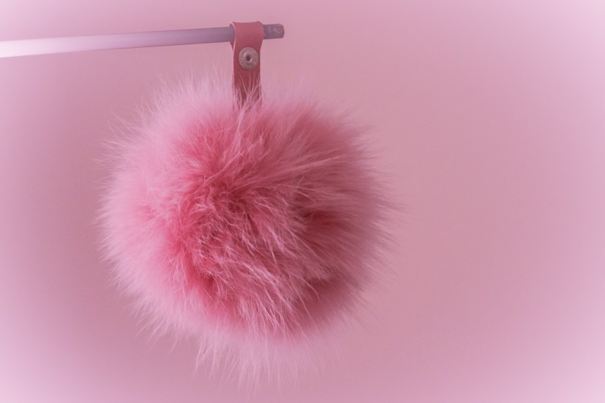
Leading with passion, kindness, and understanding, the color pink embodies all that is good in the world. Pink seeks to make others feel accepted by offering an unmatched level of sympathy. As an exceedingly approachable color, pink doesn’t intimidate or threaten. Instead, it offers the opposite effect. Those who encounter this euphoric shade are often overcome with unbridled joy.
Simply put, the color red can’t be described in a word or two. It embodies so many wonderful Oozing with positivity, the color pink provides warmth and comfort. When we see the color pink, it inspires us to cling to hope. There’s no obstacle too big for pink to overcome. With its steadfast optimism, pink is perpetually upbeat. In addition to boosting morale, pink also offers signs of good fortune. If you see the color pink often, it could mean that success and good health await you.
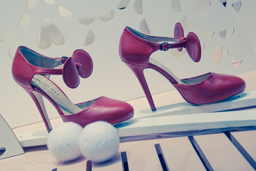
RED! The color of passion and energy. Red draws attention like no other color and radiates a strong and powerful energy that motivates us to take action. It is also linked to sexuality and stimulates deep and intimate passion. Red is ubiquitously used to warn and signal caution and danger.
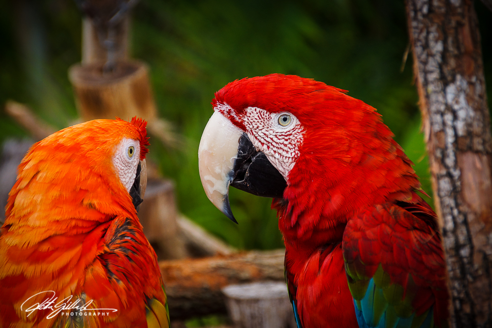
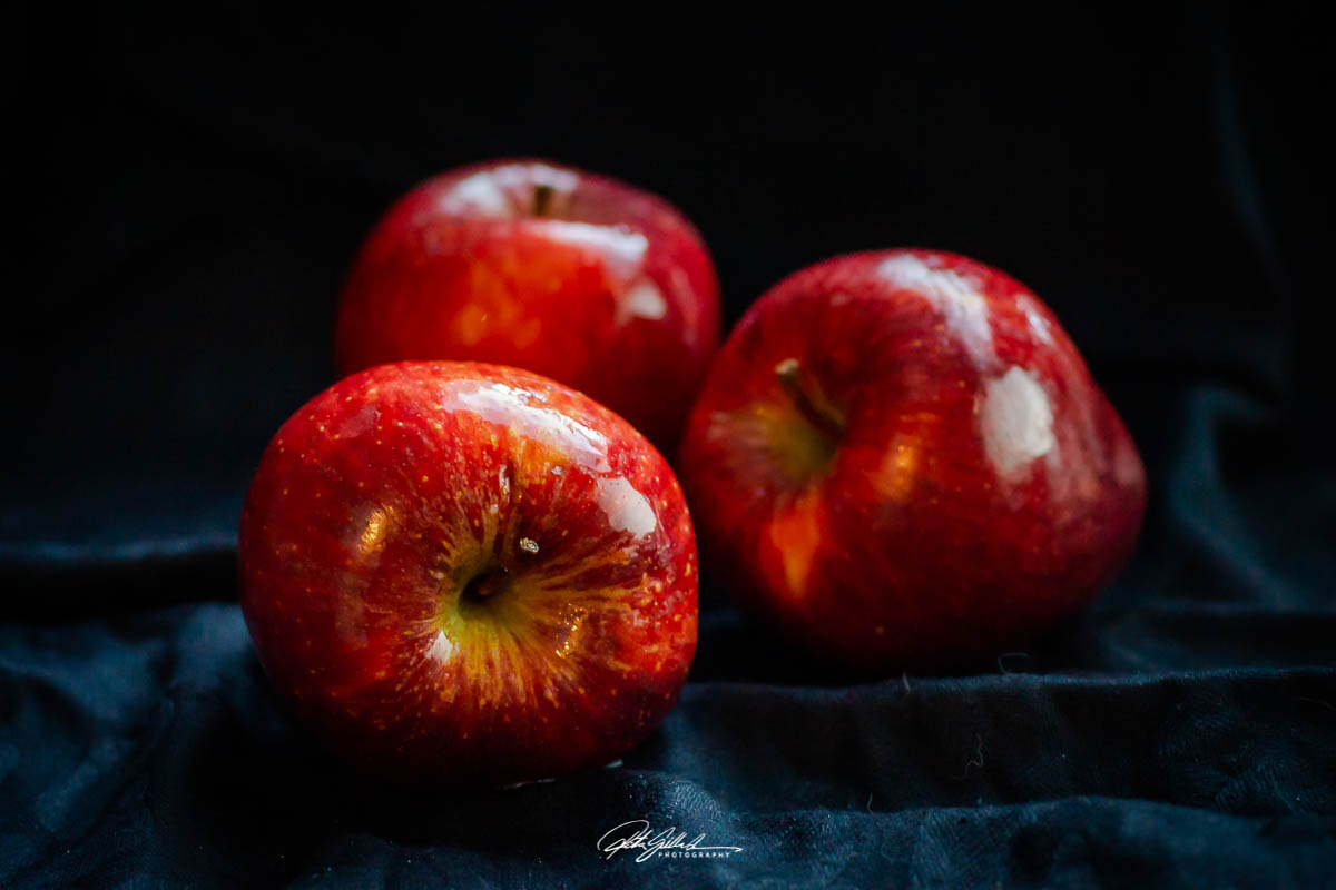
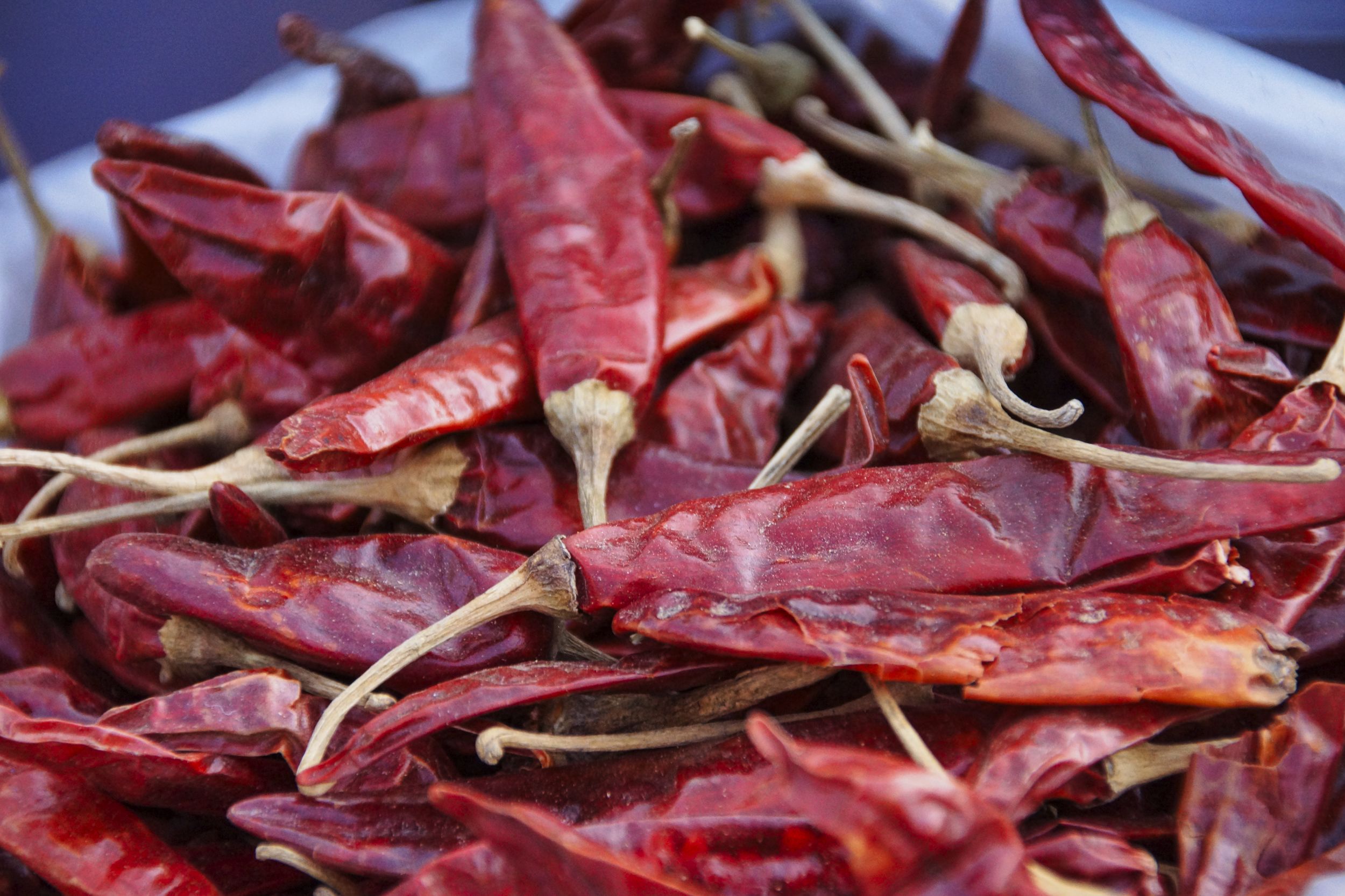
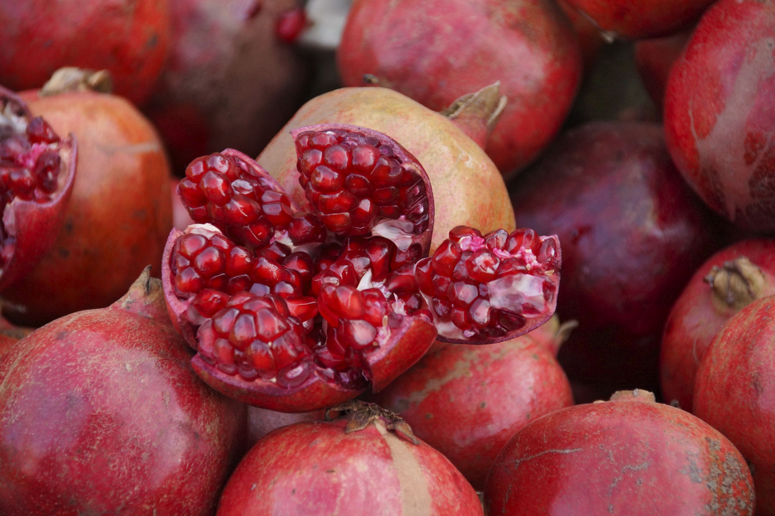

“Red is the archetypal color, the first color humans mastered, fabricated, reproduced, and broke down into different shades, first in painting and later in dyeing. This has given it primacy over all other colors through the millennia.” – Michel Pastoureau

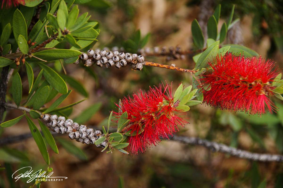
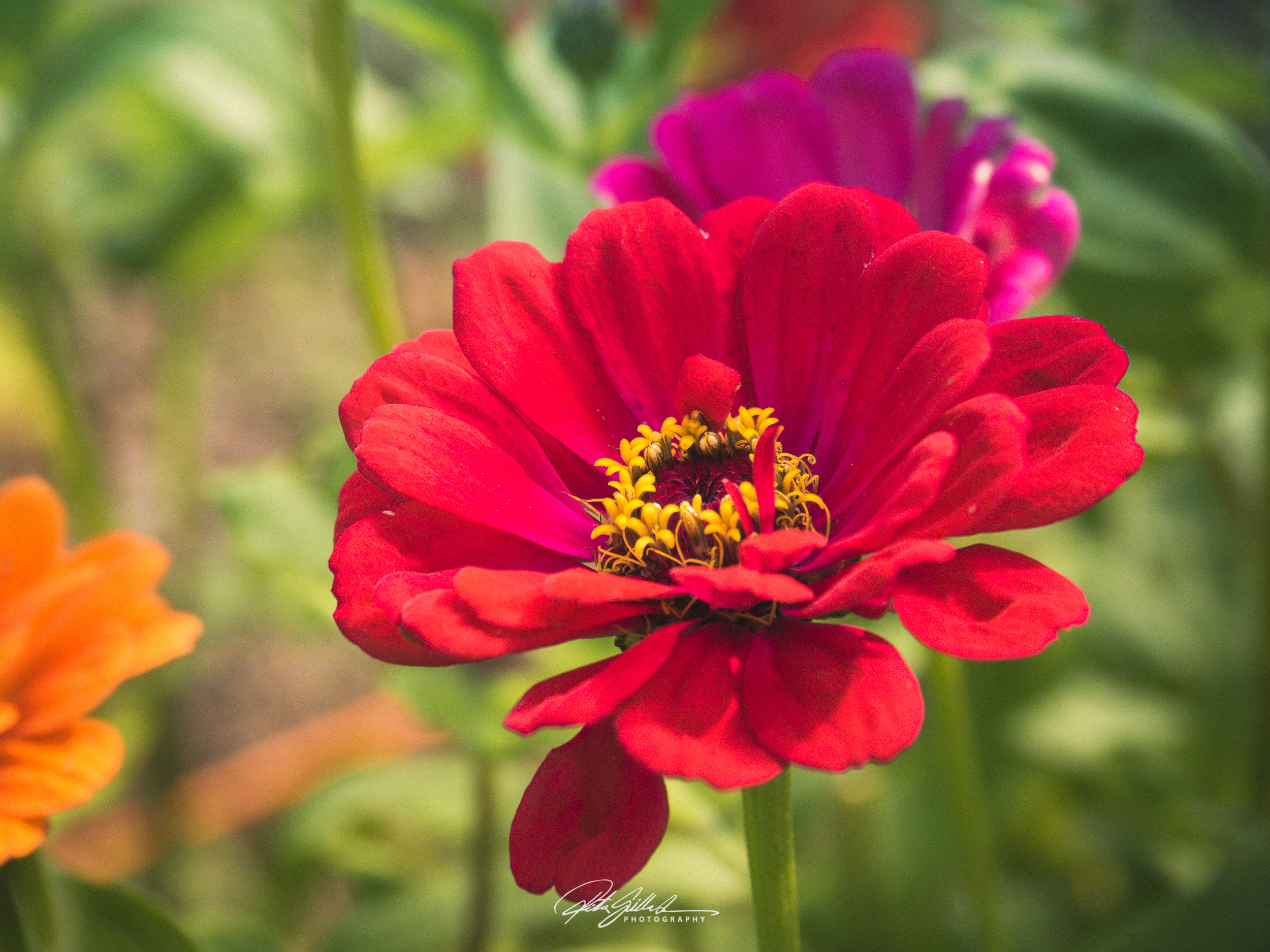


A striking, bold, and captivating hue, red is perhaps the most dominant of colors. Often seen while navigating the roads, red lets us know when caution is warranted. Though seeing the color red may give us pause, it also provides tremendous warmth. When this scarlet shade rears its cherry head, we can’t help but feel protected. In essence, the color red serves to safeguard us against harm.
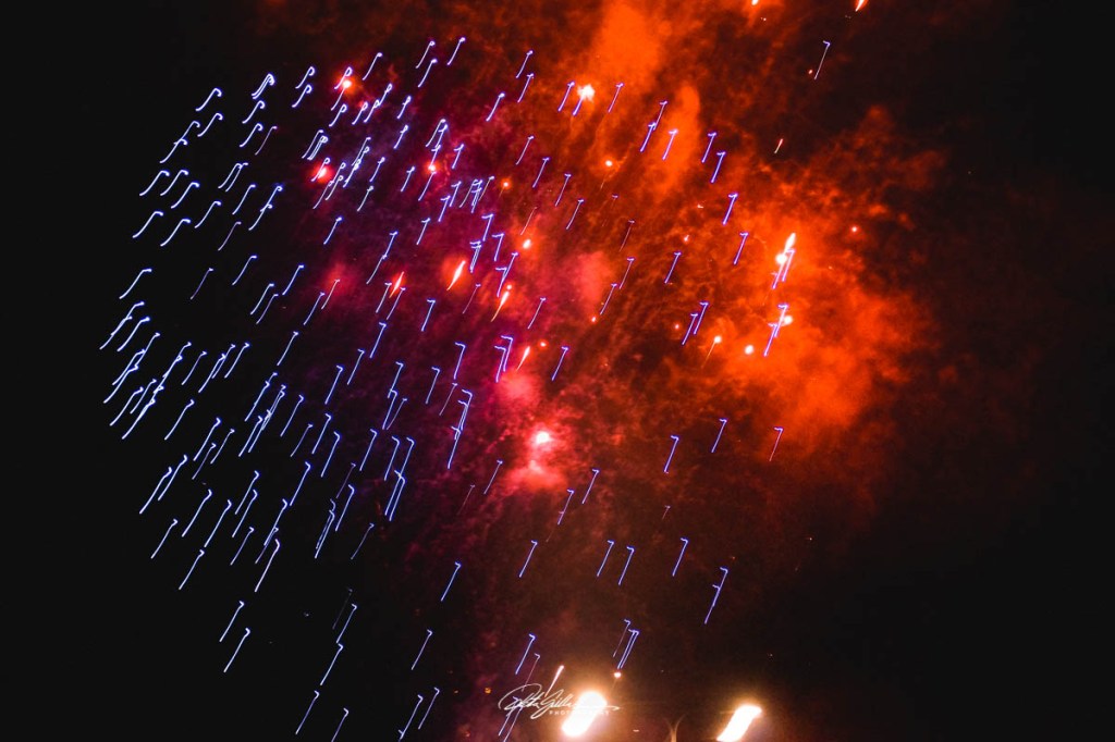
Simply put, the color red can’t be described in a word or two. It embodies so many wonderful qualities, including love, kindness, and familiarity. On the other hand, it can resurrect feelings of despair and melancholy. In between its positive and negative traits lies cultural interpretations, subliminal messaging, and warning indicators.

ORANGE! The color of enthusiasm and emotion. Orange exudes warmth and joy and is considered a fun color that provides emotional strength. It is optimistic and uplifting, adds spontaneity and positivity to life and it encourages social communication and creativity. It is a youthful and energetic color.
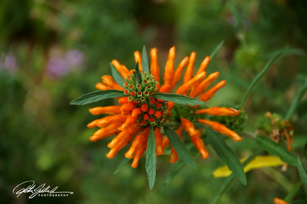
“Orange is the color of the sun. It is vital and a good color generally, indicating thoughtfulness and consideration of others.” – Edgar Cayce
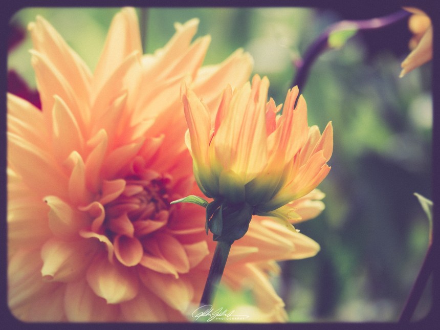
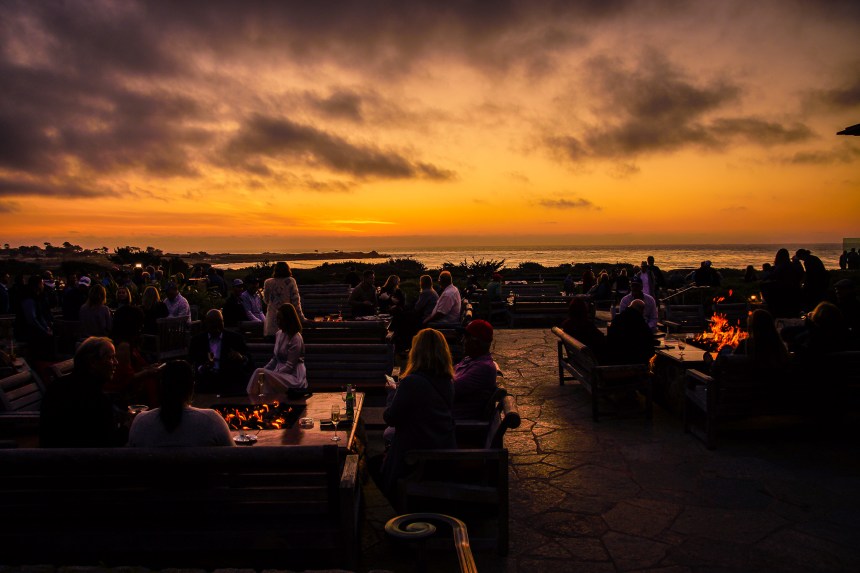
“The sky takes on shades of orange during sunrise and sunset, the colour that gives you hope that the sun will set only to rise again.” – Ram Charan
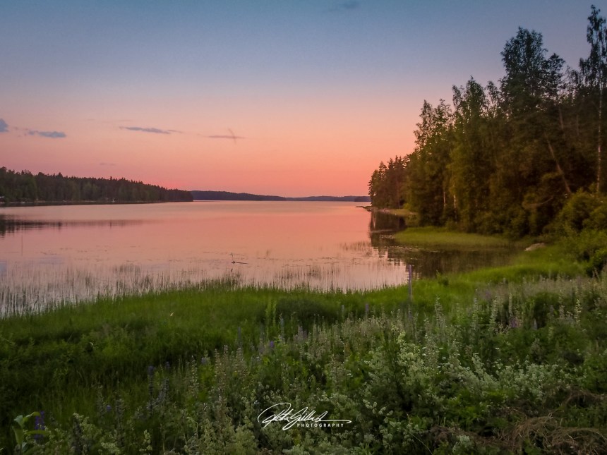
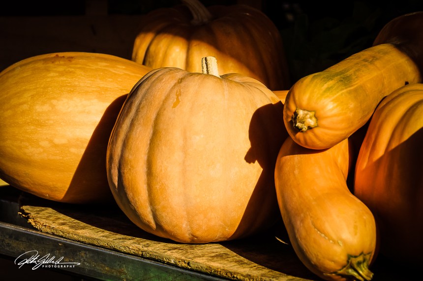
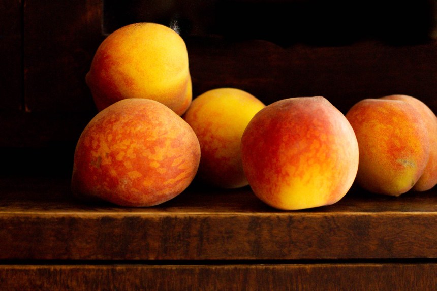

Yellow! The color of happiness and optimism. Yellow is a cheerful and energetic color that brings fun and joy to the world. It makes learning easier as it affects the logical part of the brain, stimulating mentality and perception. It inspires thought and curiosity and boosts enthusiasm and confidence.

“It is the color closest to light. In its utmost purity it always implies the nature of brightness and has a cheerful, serene, gently stimulating character. Hence, experience teaches us that yellow makes a thoroughly warm and comforting impression.” – Johann Wolfgang Goethe
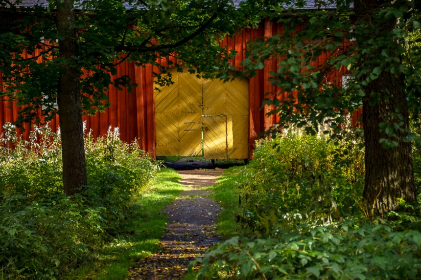
In the world of safe hues, like black, red and white, yellow shouts: “Look at me. I’m happy!”

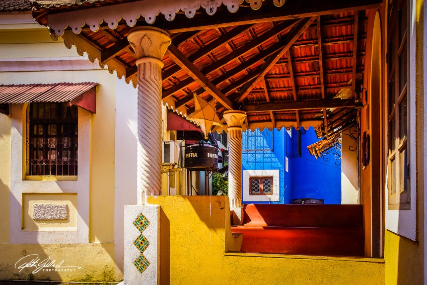
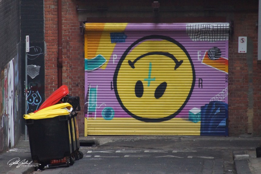

Green! Where do you look to find the meaning of green? Is it in the pale yellow-green of newly sprouted blade of grass? Can it be found in the dazzling sparkle of an emerald? Or does green’s meaning reside in the aromatic depth of a drizzly pine forest? Green inspires and vitalizes us in all its hues.

Green is calming, stress-relieving, and–a bit paradoxically–invigorating.
The color meaning of green is vitality, freshness, growth, wealth, balance, health, & youthfulness.
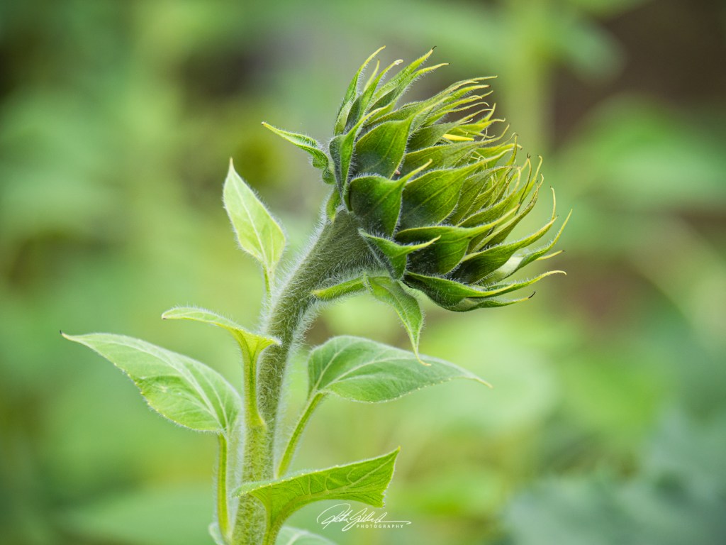
Green is everywhere. It’s the most common color in the natural world, and it’s second only to blue as the most common favorite color

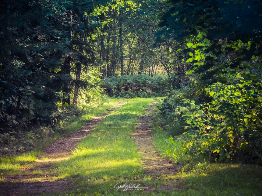
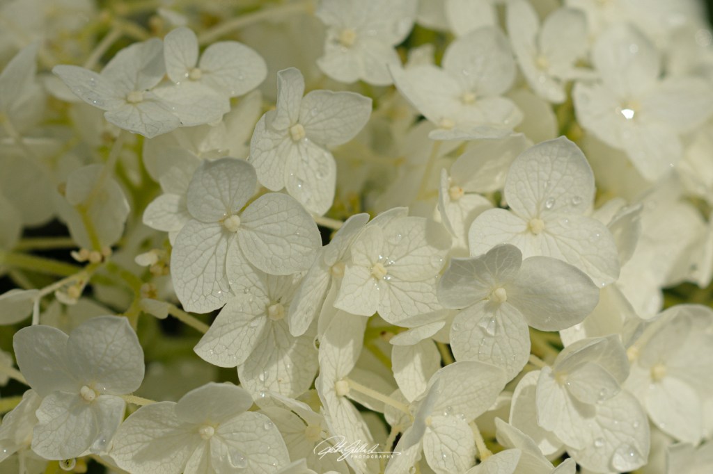
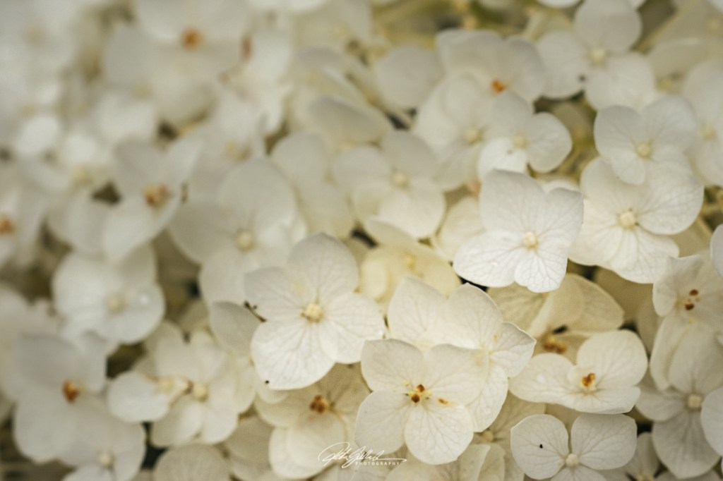
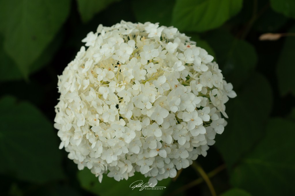
I am taking the easy way out from dilemma, going with color theme, mostly. Most likely the photos will be of flowers, but I might surprise you and myself, who knows what colorful things I will find to photograph.
“Color in a picture is like enthusiasm in life.” – Vincent Van Gogh

“Mere color, unspoiled by meaning, and unallied with definite form, can speak to the soul in a thousand different ways.” – Oscar Wilde
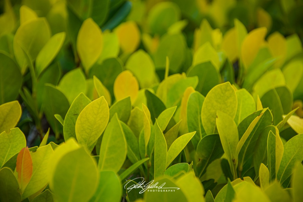
Color is, on the evidence of language alone, very bound up with the feelings.

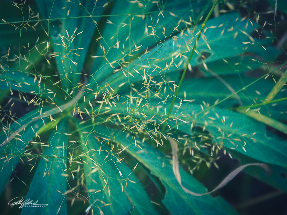


Something I noticed is that I was not able to do all thirty-one posts of Something I noticed. I truly tried. SO this is my last post on this theme. I saw this decoration on a gate

I think I am going to go floral next month? Flowers to celebrate the colors of the season? Or should I call it color of the day…I may repeat the the color many times, who knows. This all is still under consideration.
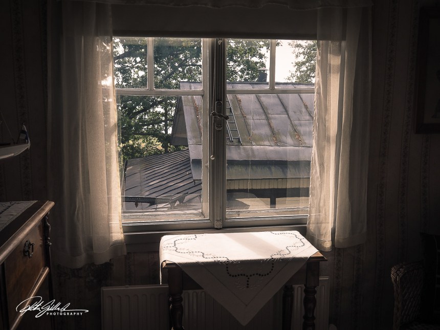
Something I noticed, the beautiful light coming in, the white curtains and tablecloth. the window view is not the most spectacular one, but many times that is the case.
Still, I hope you are enjoying it anyway.
Simplicity is the theme in this one, I think.
Something I noticed, the beautiful light coming in, the white curtain, and green walls to match the colors on the other side of the window, hope you are enjoying the same sight now.
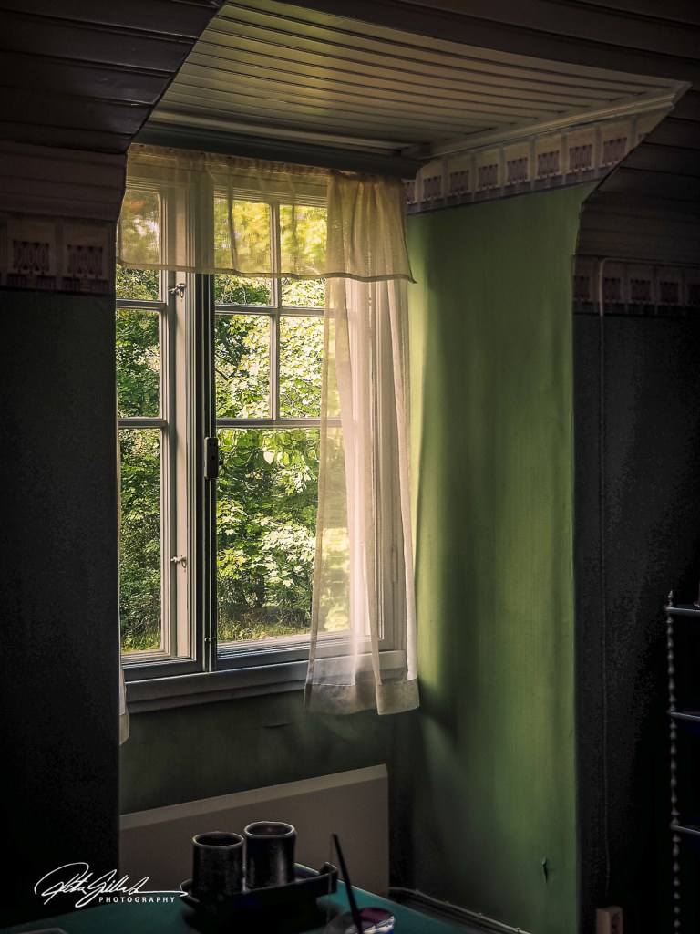
I also did a black and white version as the contrast and light kind of demanded me to do so, you know what I mean. 🙂 This time the color one appeals to me more.
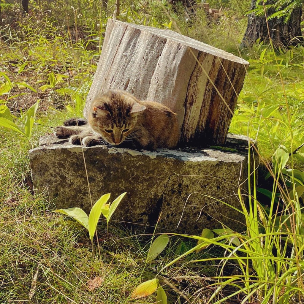
Something I noticed while sitting in the early autumn afternoon was my lovely little cat Tinka enjoying the same moment with me.
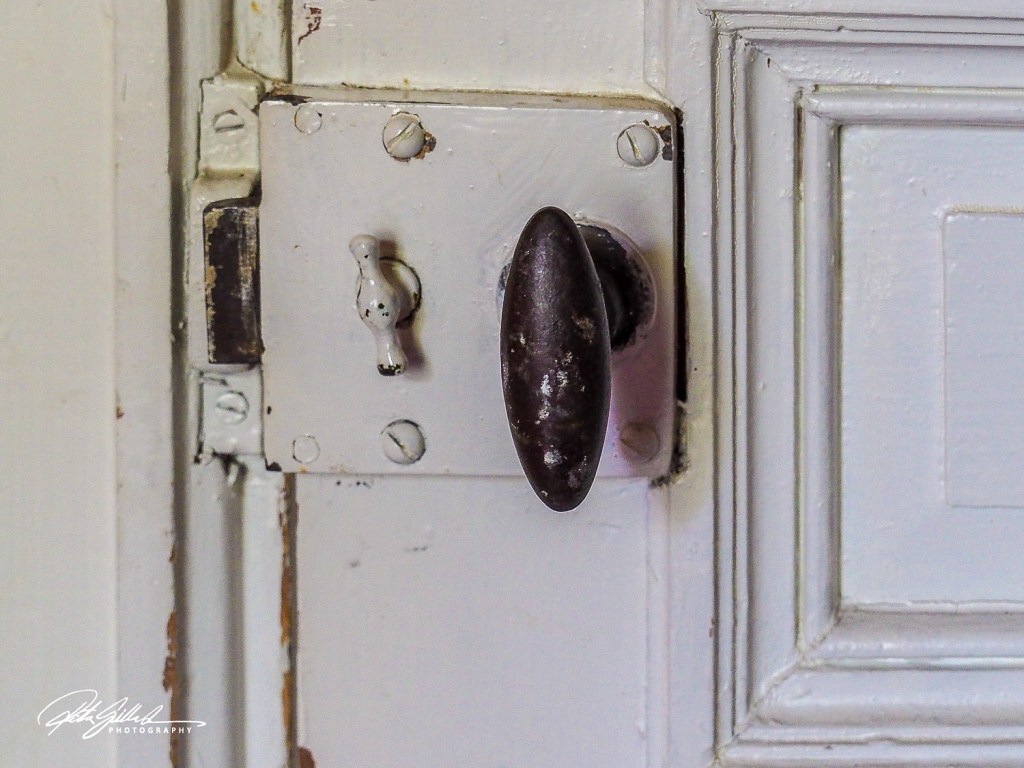
Come on in, something I noticed when entering the room was this old door knob.
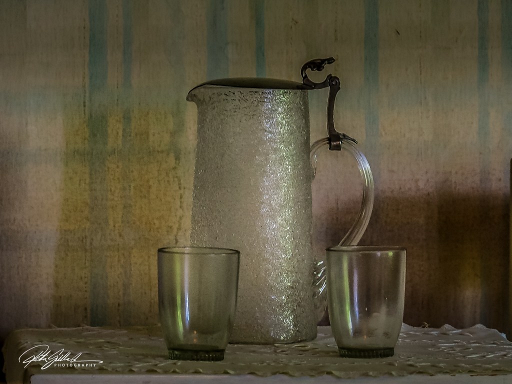
Old tableware, that’s what something I noticed and the very old wallpaper.
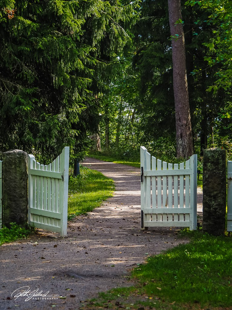
Gates are not so common nowadays, so it was something noticed. A white gate with an inviting path.
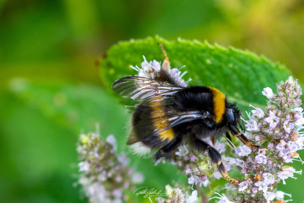
When looking carefully, something I noticed was this bumble bee. That’s all for today.
These flowers are something I notice everyday when I sit by my computer as they can be seen from my window. Pretty, are they not ?
