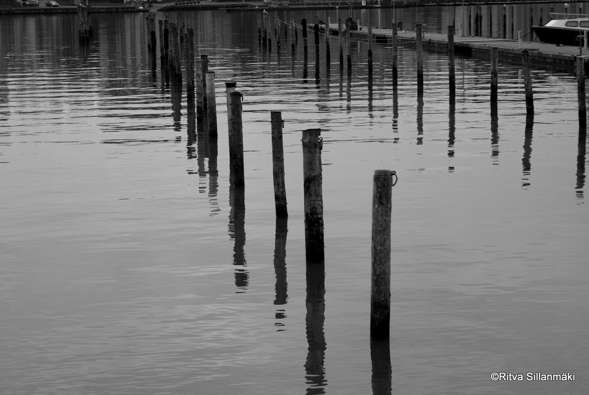
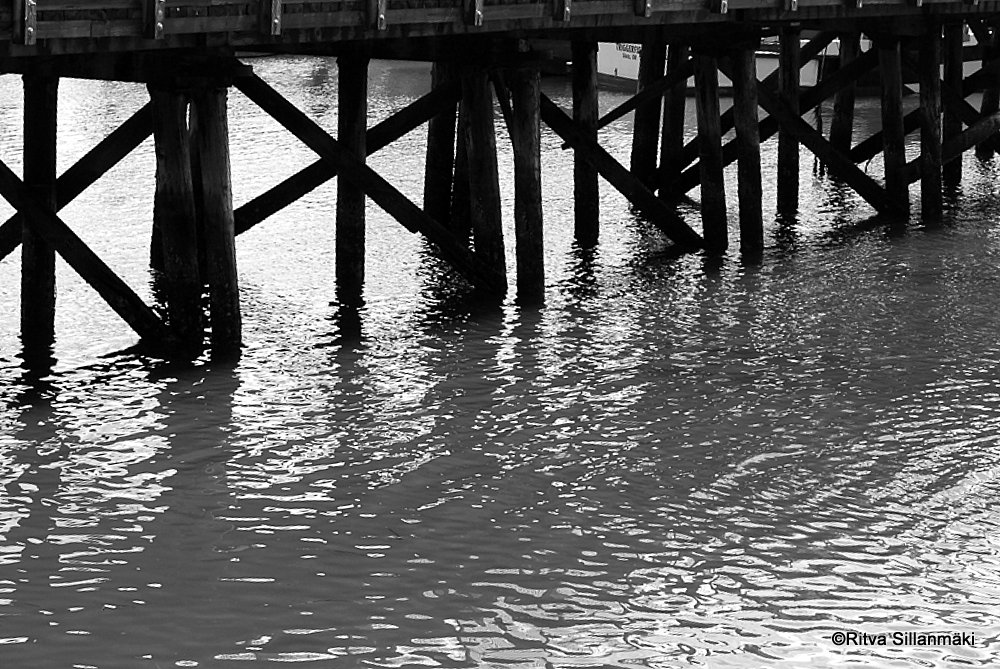
This challenge is a cool chance to dive into how using color versus black & white photography can totally change your selected images. Patti from P.A. Moed Creative Exploration in Words and Pictures invites us to join on this inspiring journey, as her awesome post gives us some solid tips on tackling the challenge! By exploring the feelings that different color vibes can bring out, you’ll see how certain shades can really capture the energy of a moment, while black & white shots can help showcase textures and contrasts, making your storytelling deeper.
So, the deal is to share pairs of the same image in both color and black & white. She asked us to keep it to just 3 pairs, which was pretty tricky since picking only three that really showed what I was going for was tough. But after thinking it through, I managed to do it! The photos I picked really show off the differences in vibe, texture, and light between the two styles. It’s so cool to see how color brings warmth and life, while black & white gives off this classic feel and a deeper emotional punch. I’m also diving into how the editing choices play into each shot—without color, you really focus on the shapes and forms, while bright colors change the whole energy. So, what do you think? Are you more into the timeless charm of black & white, or do you like the rich colors more?
Finally, use the lens-artists tag and leave a link your post to Patti’s original post.
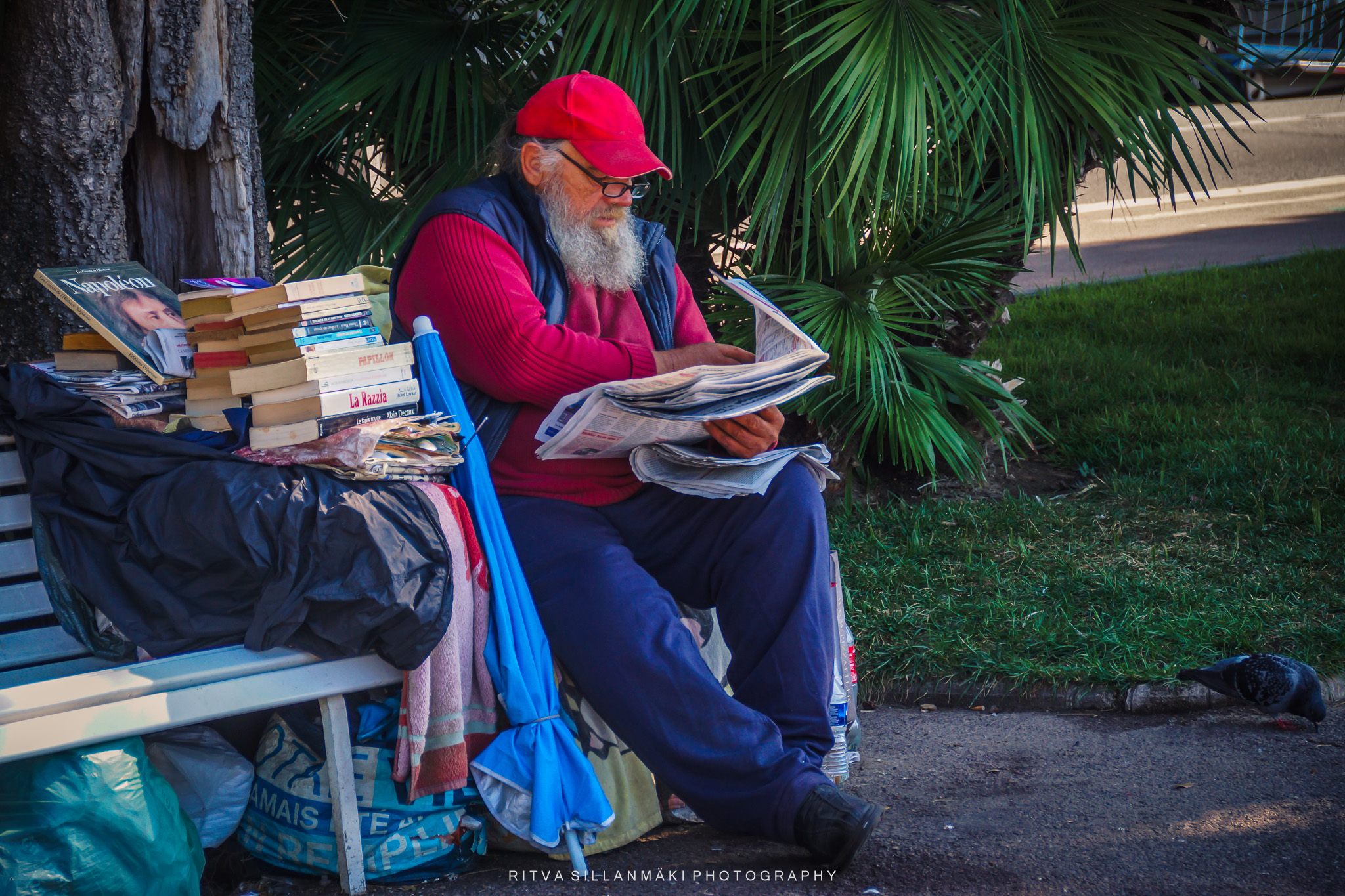

This man seated on a bench by the road, engrossed in reading a newspaper while surrounded by his books in France captured my attention. He is dressed in striking red and blue hues, and the light blue umbrella beside him, along with the collection of books and garbage bags. The color version certainly stands out more, whereas the black and white rendition conveys a more subdued ambiance—maintaining the focus on the individual reading rather than the surrounding elements. Furthermore, the intended message plays a crucial role—what do I wish to communicate through this image? If the objective is to emphasize the man, the black and white option is preferable; however, if I aim to highlight the environment as well, the color version would be better.
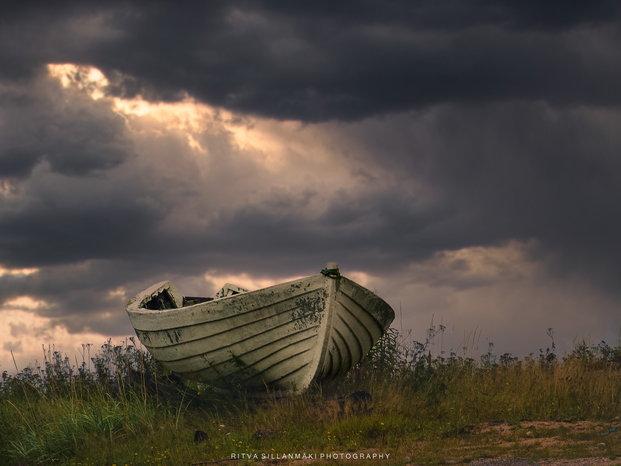

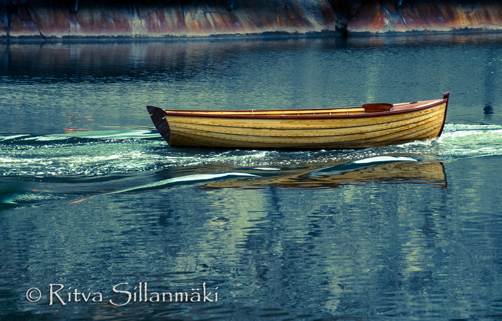
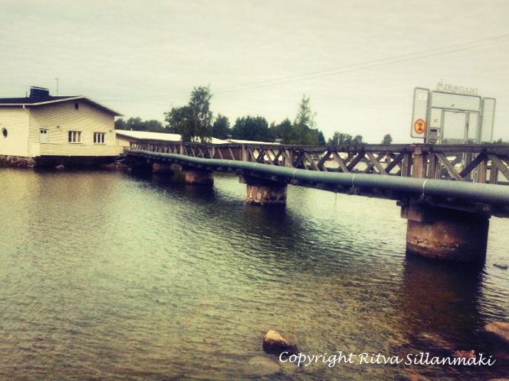
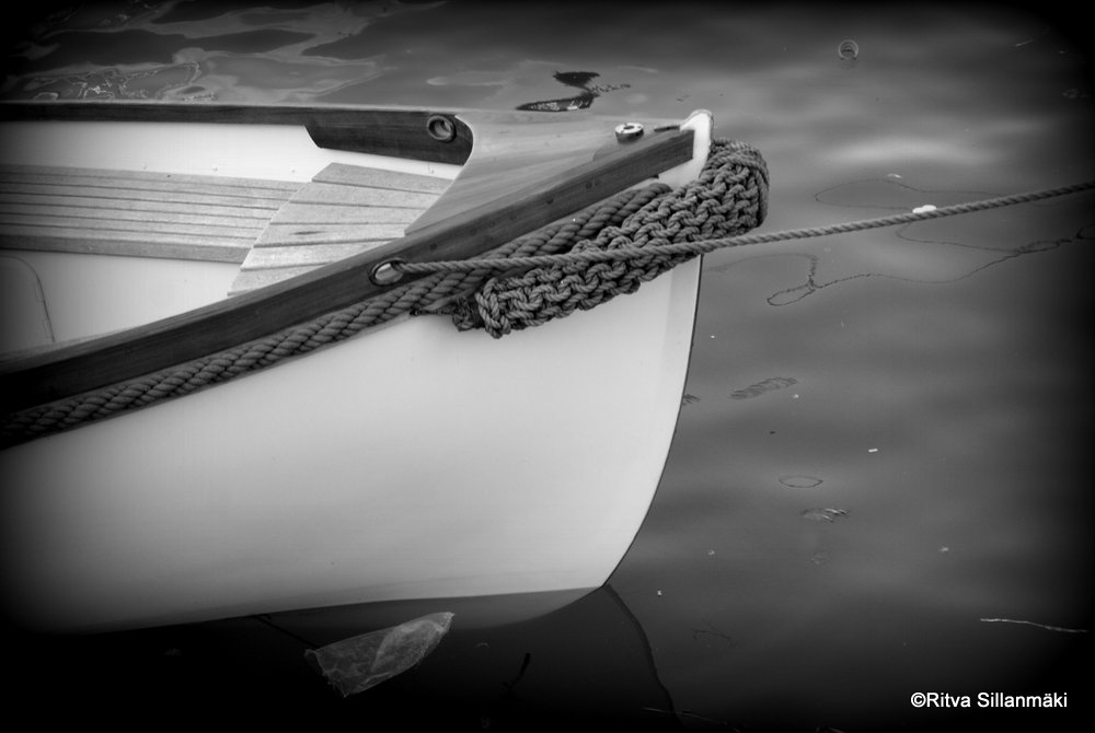
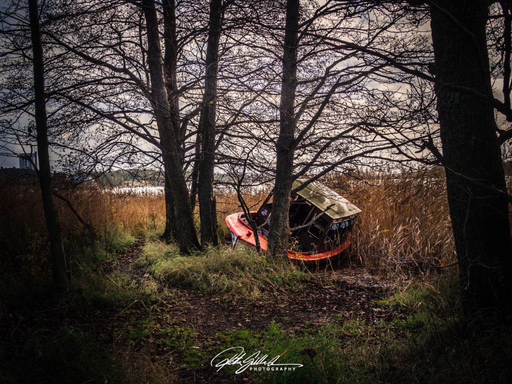
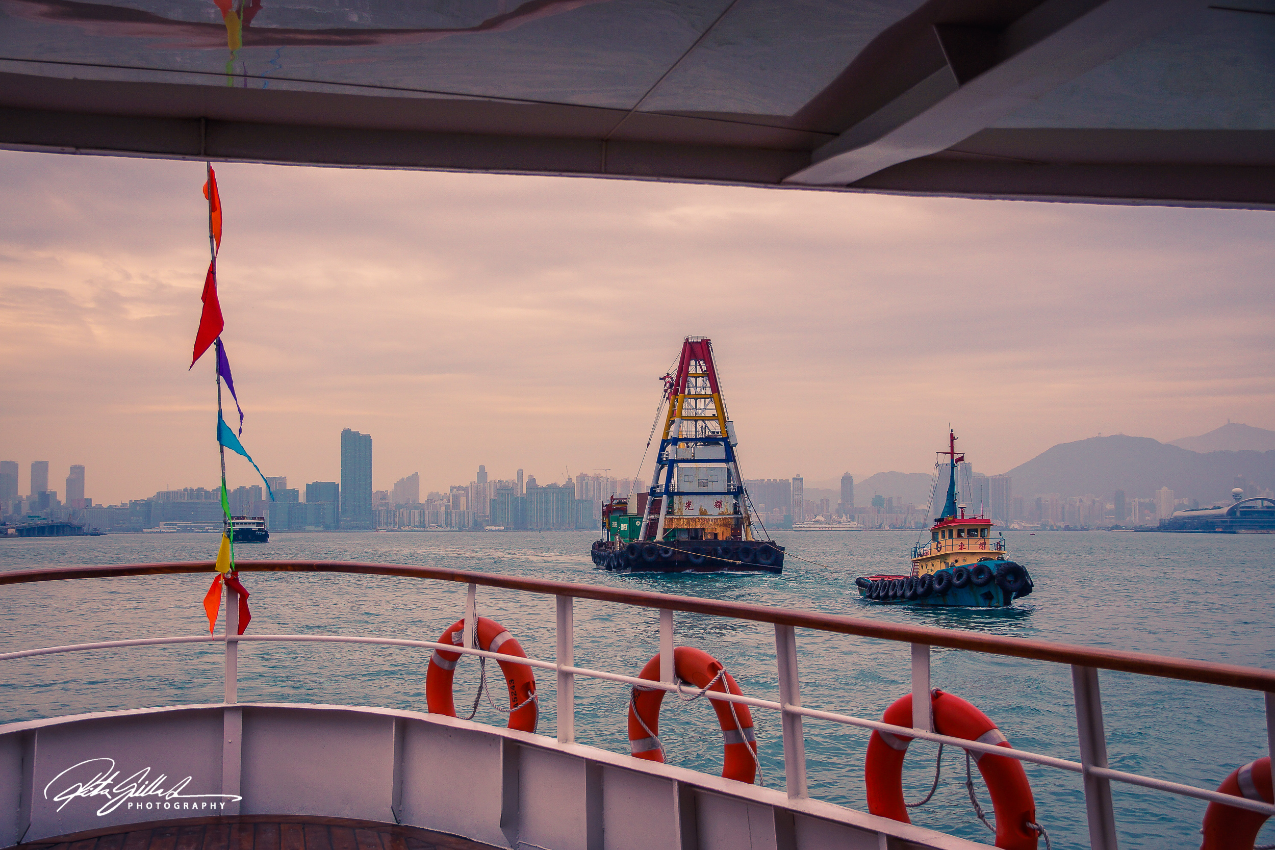
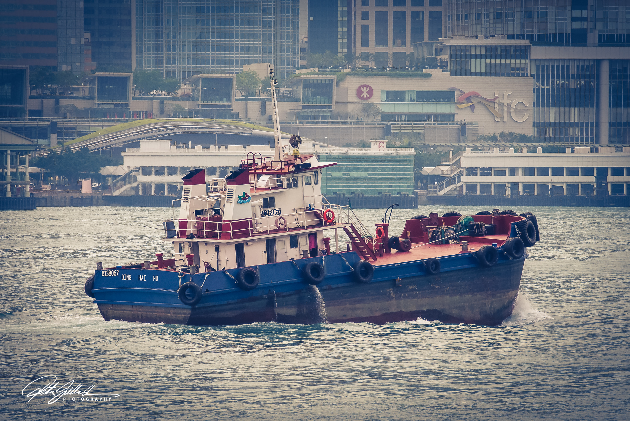
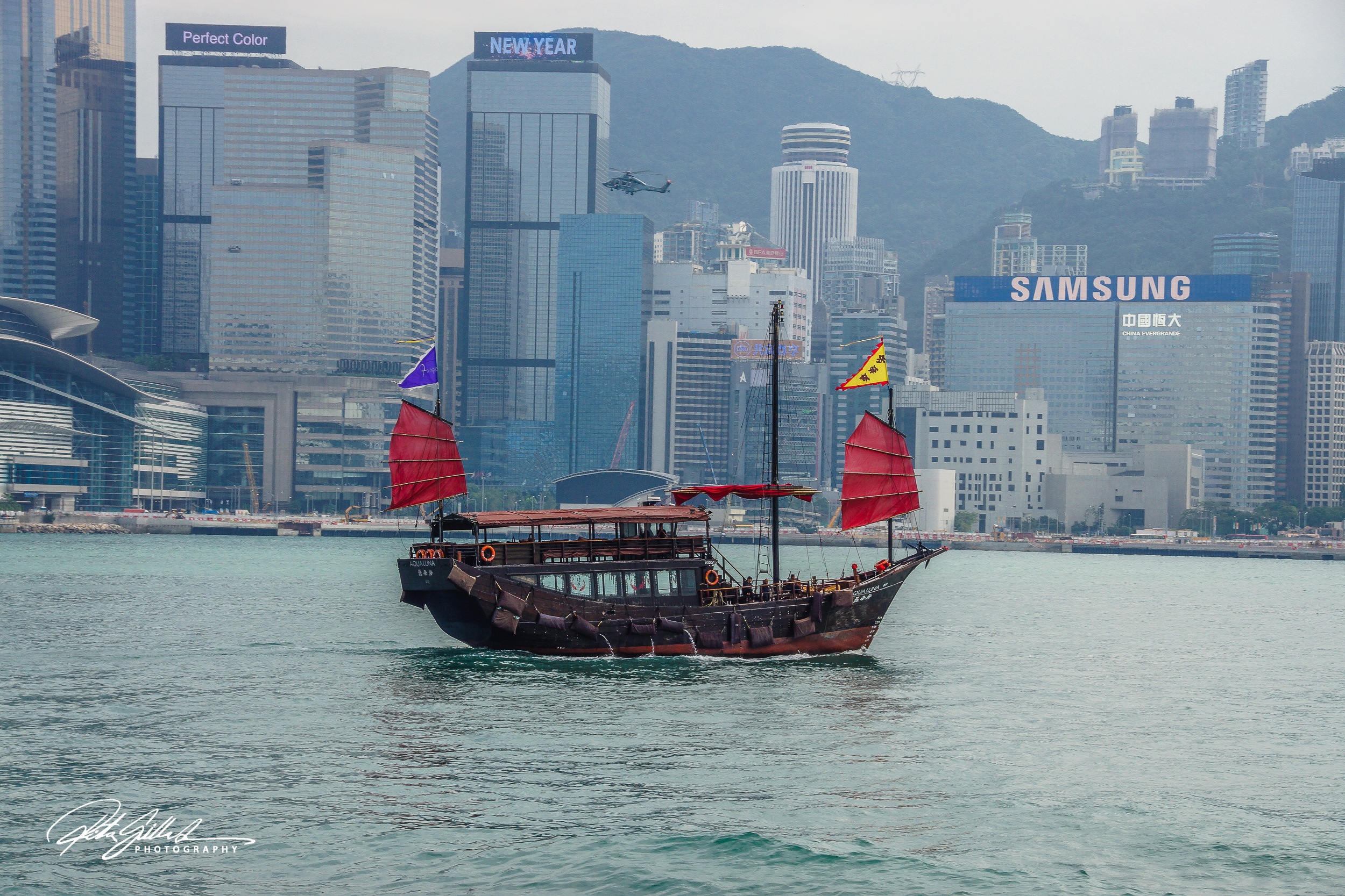
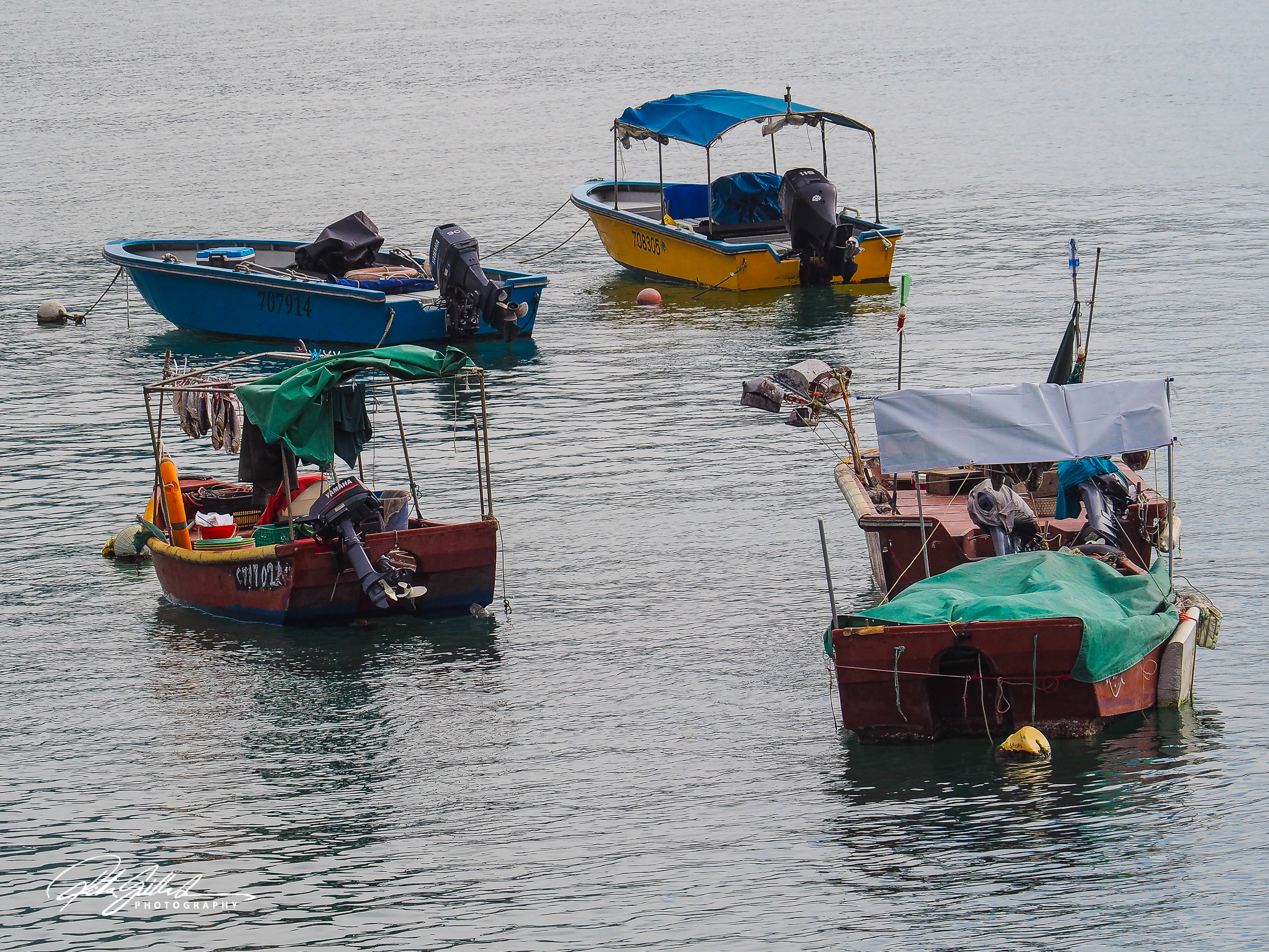
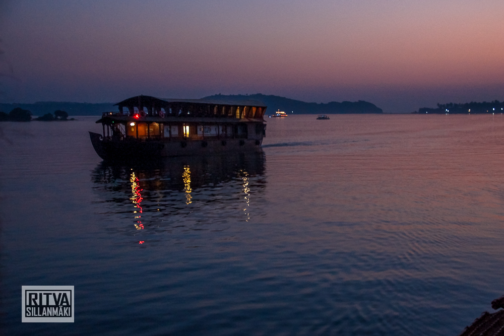
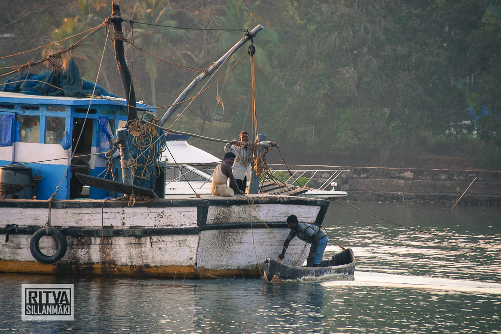
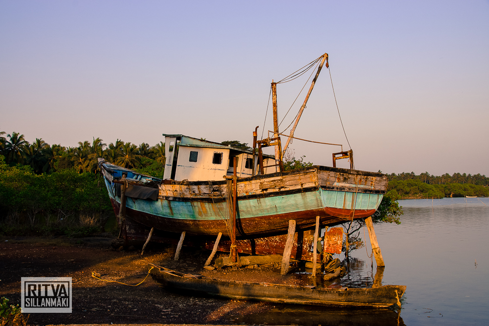
This boat image I chose showcases the clouds that give texture, creating a dynamic backdrop for the scene. The boat itself is minimalistic and weathered, adding a sense of history and character, which contributes to its roughness, ultimately enhancing its appeal, at least in a photograph. The editing process, I have found, is not the same for each variant; it is not a direct transition of color into a Black and White version. They are edited differently for distinct emotional and visual impacts. I think whenever you transition to black and white, you need to look at the image from a new perspective, considering what elements you choose to highlight. The color version conveys more about the time of day and the mood, which is more subdued; while in the black and white version, the boat emerges as the main focal point. Interestingly, for some reason, I made the mood lighter, almost brighter, in that version, contrasting with my usual tendency to render black and white images darker and moodier, utilizing more contrast. I like this version for its unique interpretation, but still, I find myself leaning towards the color variant due to its vibrant storytelling and emotional resonance. Analyzing both versions makes me appreciate the nuances involved in editing, as each choice not only alters the visual presentation but also shifts the narrative context within the photograph.
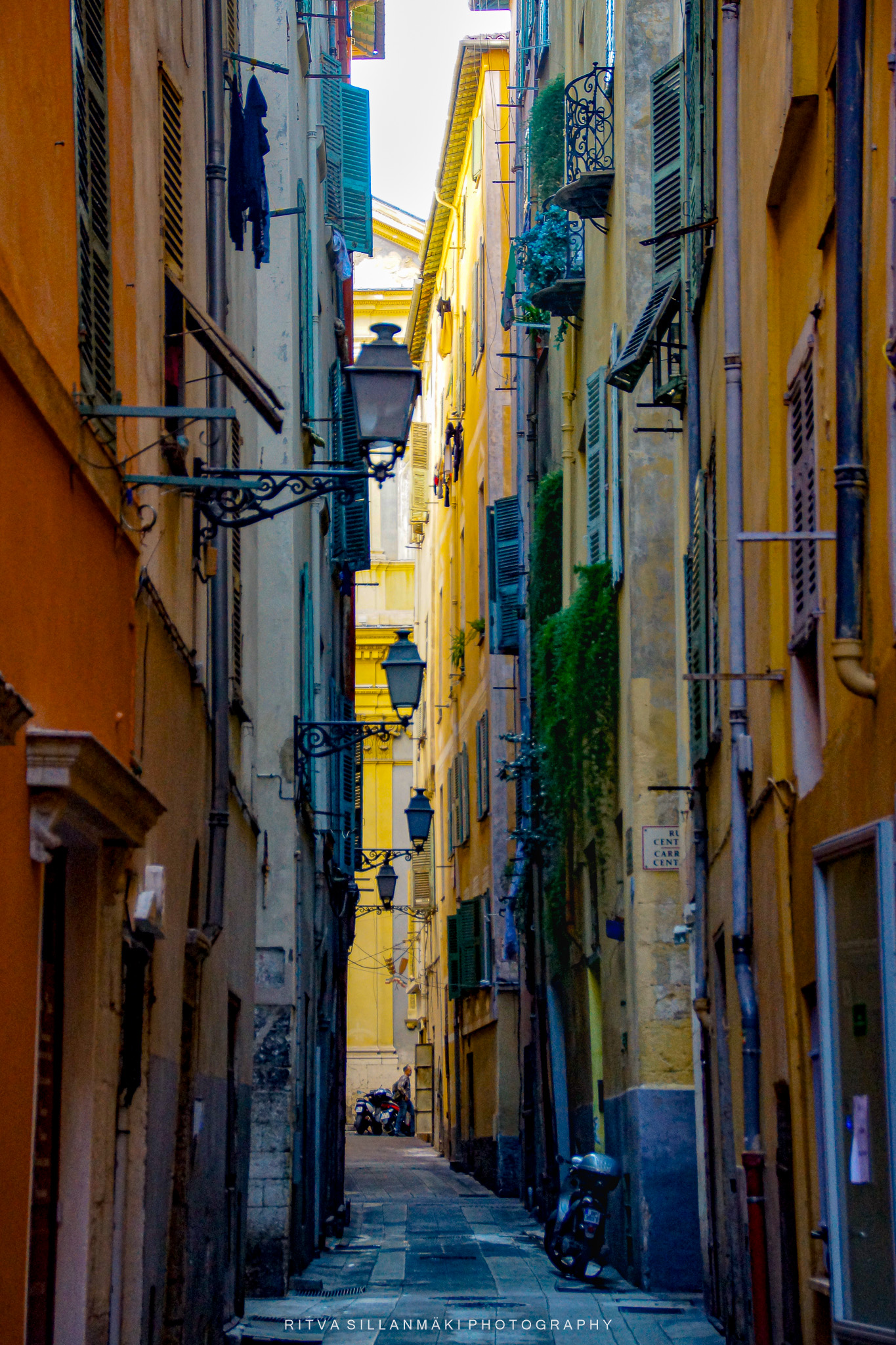
This is a charming alleyway in Nice, France, flanked by tall buildings that are closely positioned and adorned with a variety of vibrant colors. Numerous windows, some ajar, feature shutters, while ornate street lamps are gracefully mounted on the walls, capturing my attention with their charm. A cobblestone pathway extends toward a brighter area in the distance, where a few motorbikes are parked, creating a leading line that draws you in. The buildings exhibit beautiful shades of yellow, orange, and beige, with hints of lush greenery visible on the walls and balconies. The overall atmosphere is lively and inviting, evoking a sense of adventure in this historic city. The narrowness of the alley, combined with the height of the buildings, fosters a feeling of intimacy and warmth, while the bright colors and light at the alley’s end enhance its welcoming nature. All of this truly appeals to me.
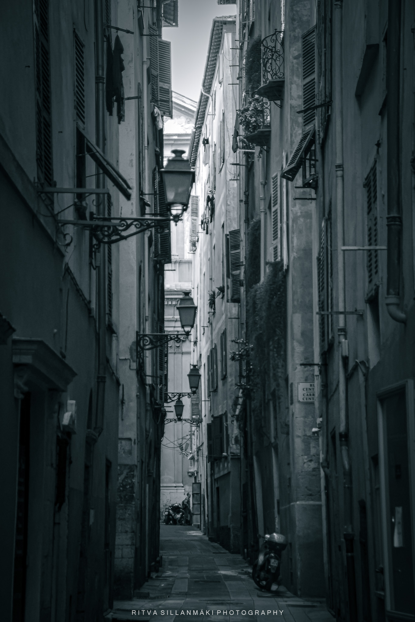
Conversely, the black and white color scheme imparts a classic, nostalgic quality that emphasizes the textures and architectural details of the structures, showcasing their timeless beauty. This image is noteworthy as it encapsulates the essence of an old European town, characterized by its narrow streets and rich historical architecture in a remarkable way. Despite the absence of color and the quiet demeanor of the alley, the scene conveys a contemplative mood, fostering feelings of solitude and introspection. I find myself captivated by both the vibrant colors and the elegance of the black and white aesthetic—each offers a distinct allure that enhances the character of this alley. Yeah, black and white … for this one.
Last week we got to enjoy beautiful cuddly cats and dogs and some other wilder animals also. Are you a cat or a dog person these were all a joy to see, thanks Tina for this sweet theme, loved it.
Next week, Ann-Christine returns with her first new challenge for the year. It will go live at noon EST in the USA. Tune in to find out another exciting challenge.
Don’t forget to use the “lens-artists” hashtag when creating your post so we can easily find it in the Reader and linking it to original post.Please see this page to learn more about the Lens-Artists Challenge and its history
PS. I am still on vacation so my participation is very limited at the moment.


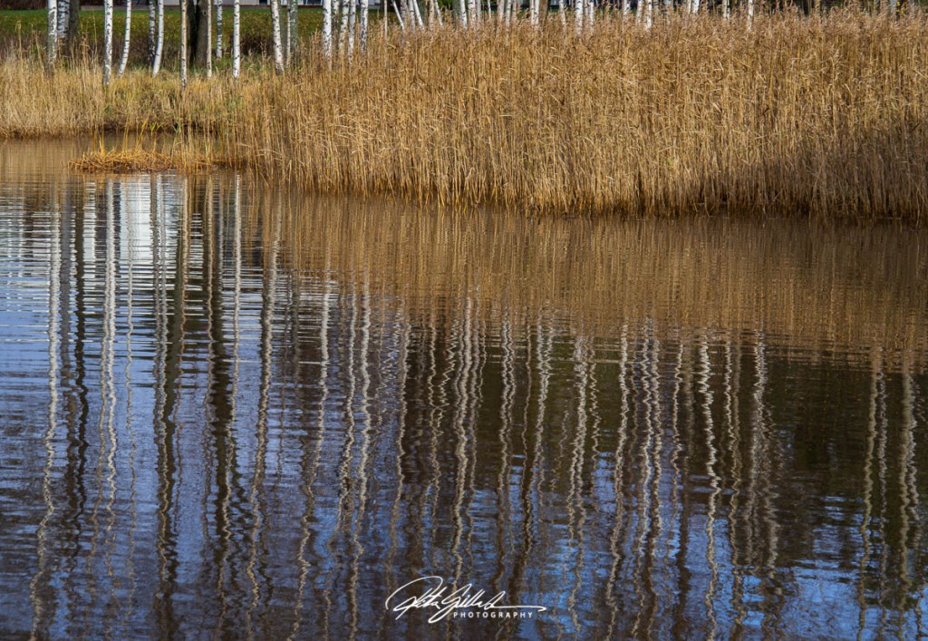

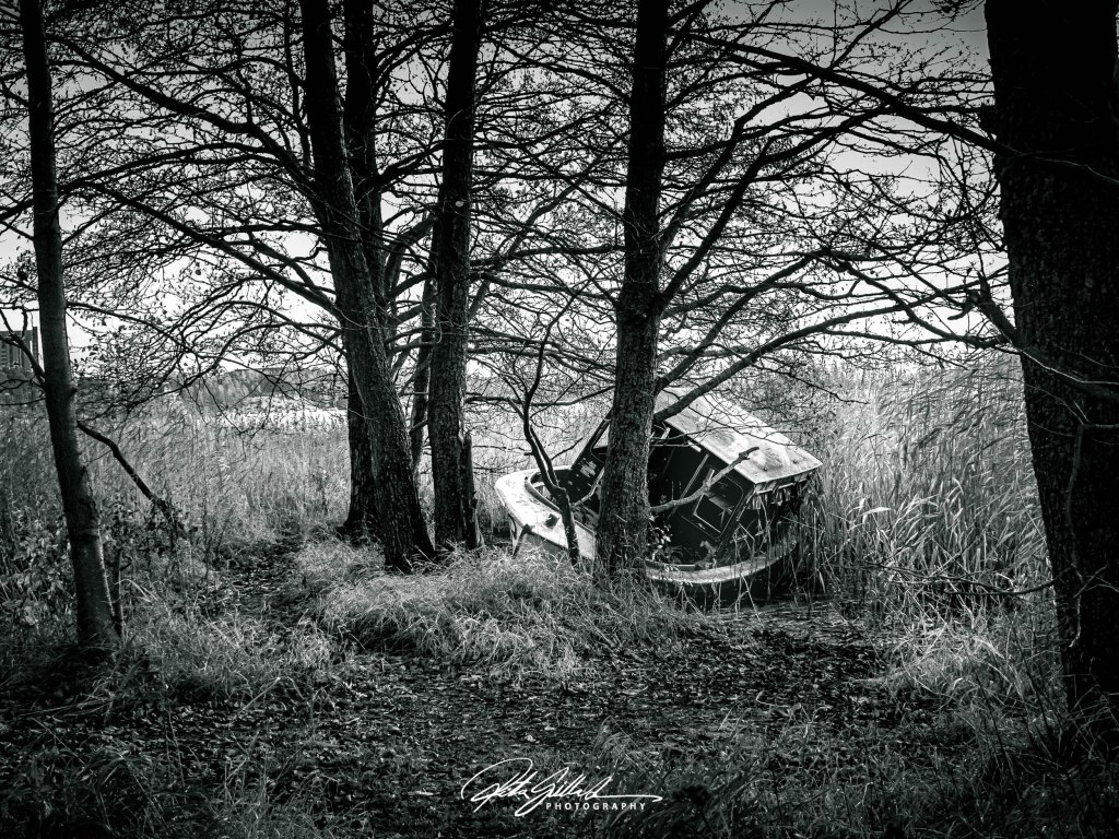

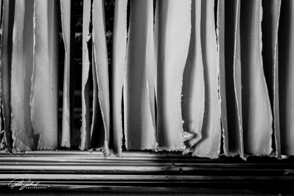
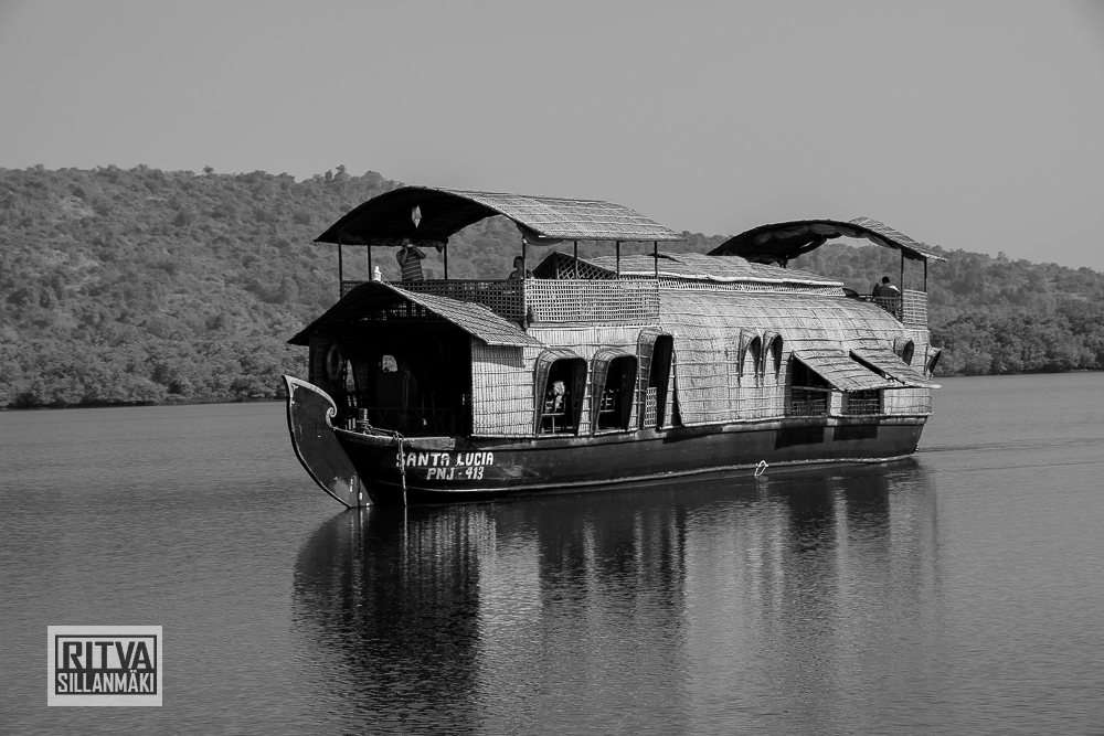


 These book covers, red currants, and the boat are all scarlet. The red currant is for an other post but it suited this so well.